Luxury brands are desired by everyone, even those who can’t afford them. This is because what they’re actually selling is a dream, an ambition of owning something that only an elite few can have. Most people fantasize about riding the world’s fastest sports car, wearing that 20-carat diamond ring, or savoring the taste of gracefully aged world-class wine. This just shows that through emotional attachment, luxury brand logos are able to capture the attention of all markets whether it’s A, B, C, D even when their actual target are the upscale ones. Here are the top luxury brand logos that have been capturing the public’s heart for years.
1. Chanel
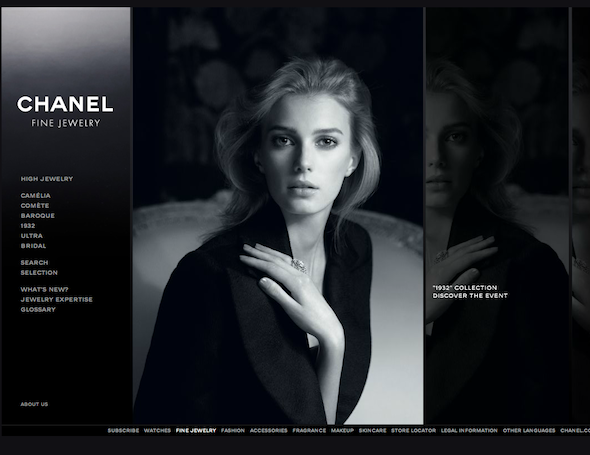
Chanel is the first brand that comes to mind when we talk about luxury fashion brands. Part of this can be attributed to the simple yet powerful logo designed by Coco Chanel herself in 1925. The two interlocking C’s have a round structure and are joined in a way that is similar to how jewelry chains are linked together. This hints at the brand’s inclusiveness and exclusivity. Today, Chanel’s double C logo represents elegance, luxury, and class.
2. Swarovski
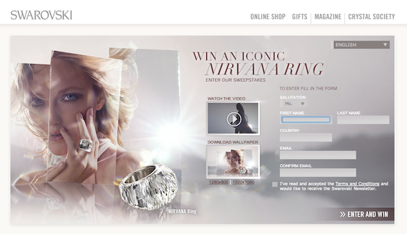
The Swarovski swan logo is so powerful that people don’t know that the brand changed logos twice. The first was an edelweiss flower, which was then changed to an S.A.L. logo. The latter was replaced by the graceful and elegant swan logo only in 1988. The pixilation at the swan tail-end represents light refraction by a crystal. The dark blue background is suggestive of water, which is another clear substance.
3. Hermes
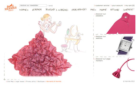
This world-famous luxury brand started as a leather goods store, hence the duc carriage logo. The font used has no round edges at all and is extremely square. This helps connote the image of being serious and straightforward, which is suitable for a leather goods store. The Hermes logo exudes antique excellence and represents heritage.
4. Van Cleef & Arpels
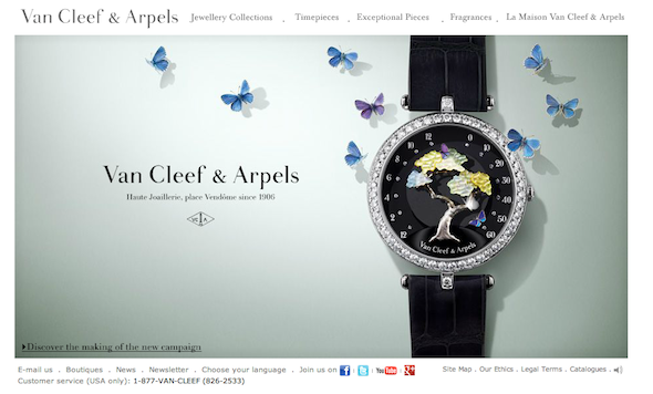
This French luxury brand is renowned for its high-quality goods ranging from perfumes to watches and jewelry. The logo consists of a large diamond that refers both to the brand’s luxury status as well as to their strikingly elegant jewelry. The brand’s initials, VCA, are prominently displayed along with a pole that was traditionally used to denote French shops. This original logo has never been changed and has been in use for almost a century already, so it contains many references to the company’s history.
5. Givenchy
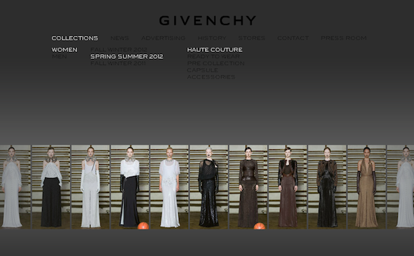
Like the Hermes logo, Givenchy’s logo doesn’t make use of rounded edges in order to give it a straightforward and serious image. Four G’s are arranged in such a way as to make the logo look like a big square with small spirals within it, connoting spinning and movement. The logo implies that while the brand is already established, it is continuously changing to launch new trends.
6. Versace
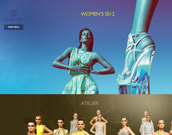
Unlike other luxury fashion brand logos, Versace’s logo is illustrative. It makes use of an image of Medusa, a character from Greek mythology who turned anyone who looks into her eyes into stone. According to Gianni Versace, Medusa’s image is very appropriate for his brand because she is the embodiment of fatal attraction. It is able to project the image of being glamorous, sultry, seductive, and sensuous, which are characteristic of the brand’s clothes.
7. Louis Vuitton
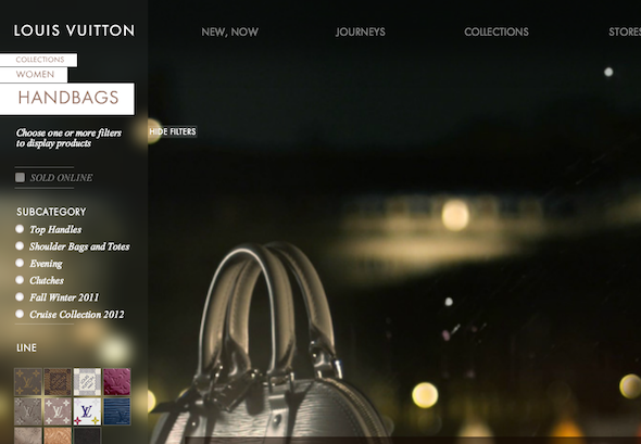
Everyone is familiar with Louis Vuitton’s monogrammed bags, luggage, and fashion accessories. The initials L and V are layered over each other in order to give the logo a distinctive and easily recognizable structure. They are in a very heavy serif typeface to imply significance and boldness, while the whole company found below the initials are in small unassuming writing. What makes Louis Vuitton’s logo attractive is this contradiction of humility and substance.
8. Dom Perignon
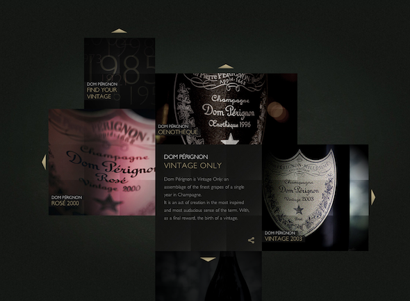
This champagne is very popular among the elite and is envied by those who cannot afford to spend several hundred dollars on one bottle. The company’s logo is very simple with the name printed in a large cursive script that is softened by rounded edges. It appears as if it were handwritten to give it a more personal touch. The logo also features a small golden shield, which represents tradition and wealth.
9. Christian Louboutin
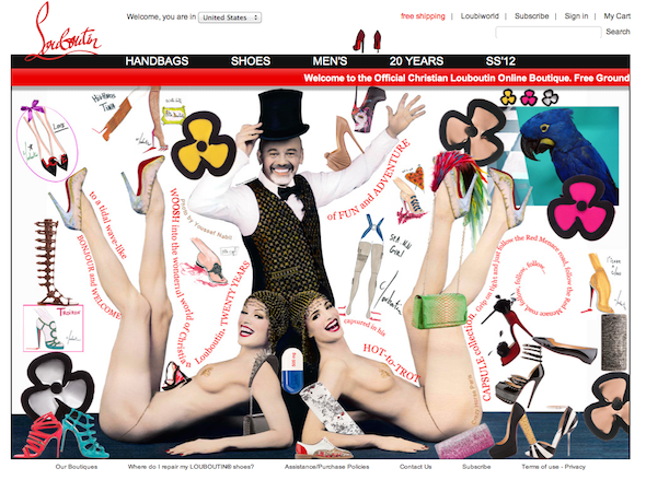
Like many luxury brand logos that takes advantage of contradictions, the Christian Louboutin logo melds together opposites – a serious newspaper-like font and a flashy handwritten one. The L in Louboutin is wittily curved in such a way so that it would also form the C in Christian at the same time. The wave like structure of the logo evokes a feeling of movement, which represents innovation that is key to consumers coming back over and over again for the newest shoe styles.
10. Mercedes-Benz
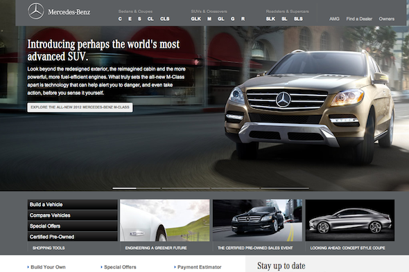
The three-point star of the Mercedes-Benz logo was created in 1909 by Gottlieb Daimler to represent the brand’s dominance in land, air, and water transportation. To place a better emphasis on the star, a silver circle was placed around it. What the logo basically says is that wherever you find yourself in, the only vehicle to trust is a Mercedes-Benz.
