Woods Of Fairfax: Elegance Amidst the Oaks
Situation: Creating Brand Identity for 600-Unit Apartment Community
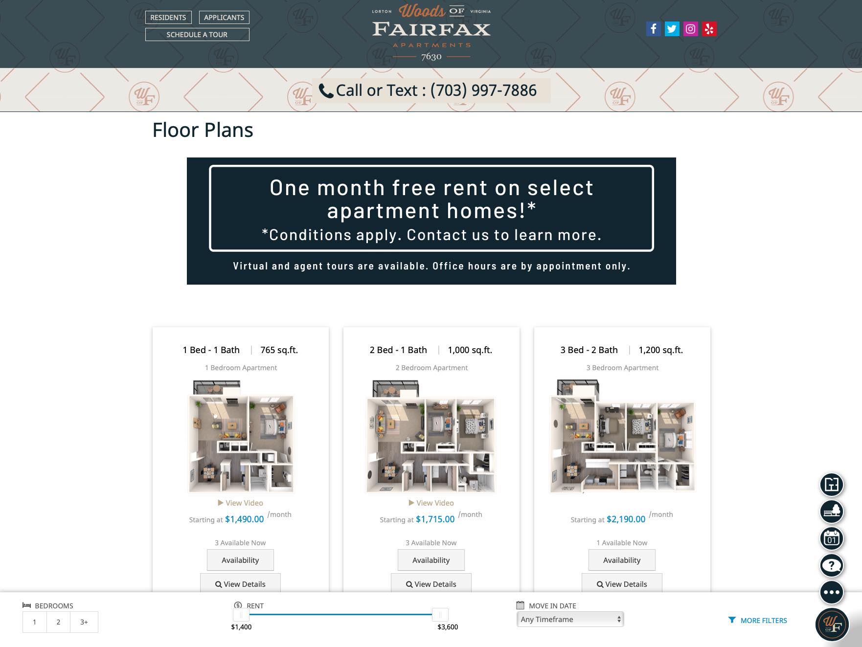
Woods Of Fairfax is a 600 unit apartment community located in Lorton Virginia (Fairfax County) just outside of D.C… and is a relaxed community just 15 minutes from the Metro station and 30 minutes from Washington D.C that provides apartment homes in Fairfax, County, VA. This newly renovated community offers one, two, and three-bedroom apartment homes with quartz countertops and plank flooring. Residents enjoy amenities such as a fitness center, bark park, swimming pools with sun decks, grill stations, play parks, and more.
The apartment community market requires brands that communicate lifestyle, amenities, and location benefits. Woods Of Fairfax needed a brand identity that would encapsulate the essence of this apartment community, positioning it as epitome of suburban sophistication just a stone’s throw from Washington D.C.
![]()
Task: Create Brand Identity Encapsulating Community Essence
Spellbrand meticulously crafted a branding narrative and identity. The challenge required:
- Suburban sophistication: Brand identity that positions as epitome of suburban sophistication
- Dual nature: Visual identity that reflects contemporary living harmonized with pastoral charm
- Community essence: Brand that encapsulates essence of apartment community
- Location benefits: Brand that communicates proximity to Washington D.C and Metro station
- Amenities communication: Brand that showcases amenities and lifestyle
Nestled in the serene embrace of Lorton, Virginia, Woods Of Fairfax Apartments presents a retreat of tranquility and refined living. This case study unveils how Spellbrand meticulously crafted a branding narrative and identity that encapsulates the essence of this apartment community, positioning it as the epitome of suburban sophistication just a stone’s throw from the bustle of Washington D.C.
Working with the team at Spellbrand has been fantastic! I spent time researching companies that would help me build brands for each asset that are all in different locations and more specifically build a brand that could help tell each of their unique stories. Spellbrand did just that. The process was easy. To provide them with my initial thoughts through a nicely-outlined input form they sent to me and they took that information and created a number of awesome designs. I was able to incorporate “the story” easily with a design we selected. I’m excited to get it into action and see what’s in store for the next project. Also, each person I worked with has been super responsive, knowledgeable, and awesome to work with! Kudos to Mash, Mike, and Eva! I really enjoy working with you!
Jenny RichardWoods Of Fairfax
Action: Strategic Brand Development
Brand and Positioning Strategy
The strategic branding of Woods Of Fairfax required a delicate balance—capturing the ease of suburban living while resonating with the upscale sensibilities of potential residents. The approach was multifaceted:
This brand strategy:
- Balances suburban ease: Captures ease of suburban living
- Resonates with upscale: Resonates with upscale sensibilities of potential residents
- Creates multifaceted approach: Multifaceted branding approach
- Reflects dual nature: Reflects contemporary living harmonized with pastoral charm
Visual Identity and Brand Experience
The visual identity had to reflect the community’s dual nature—contemporary living harmonized with pastoral charm.
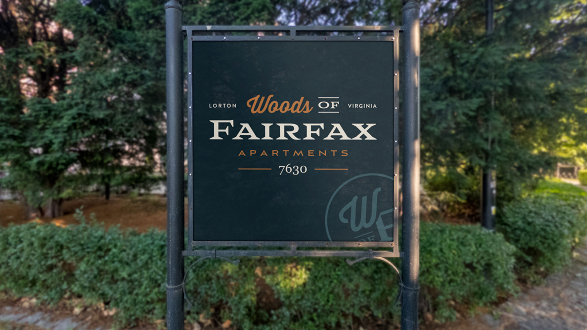
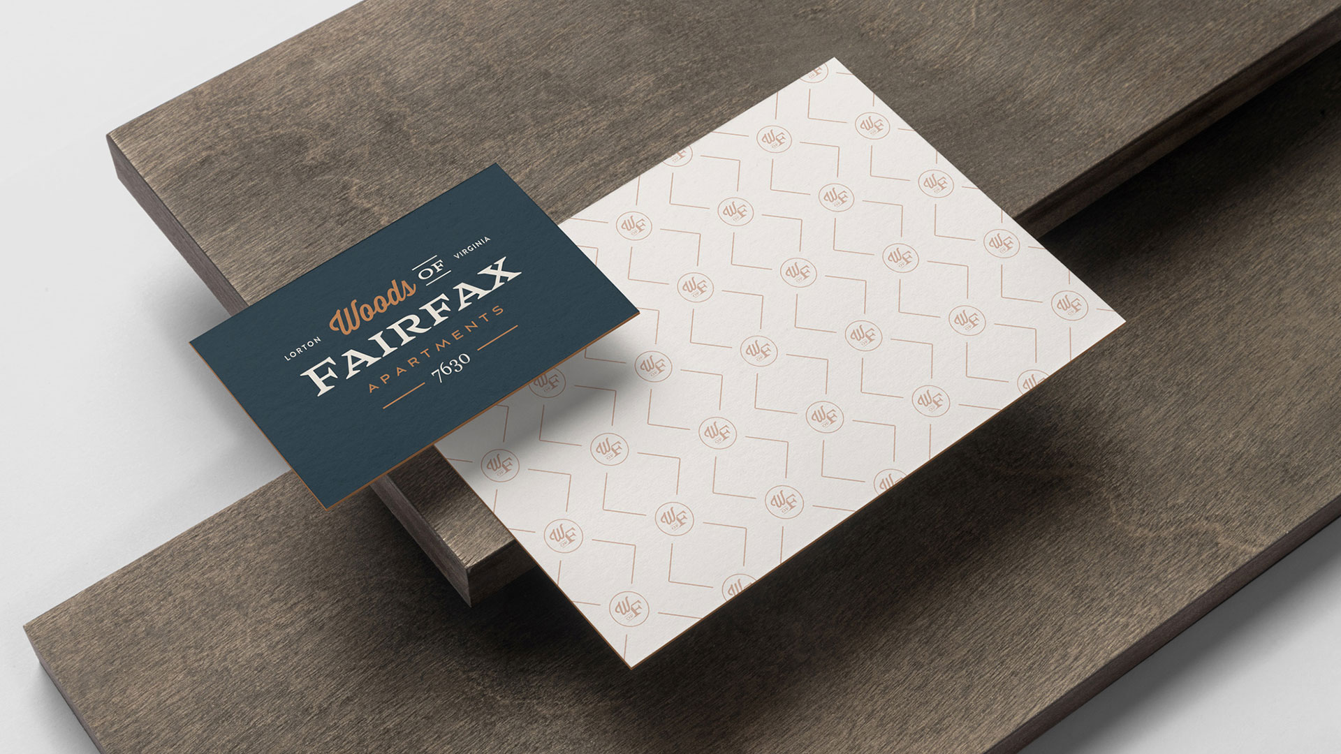
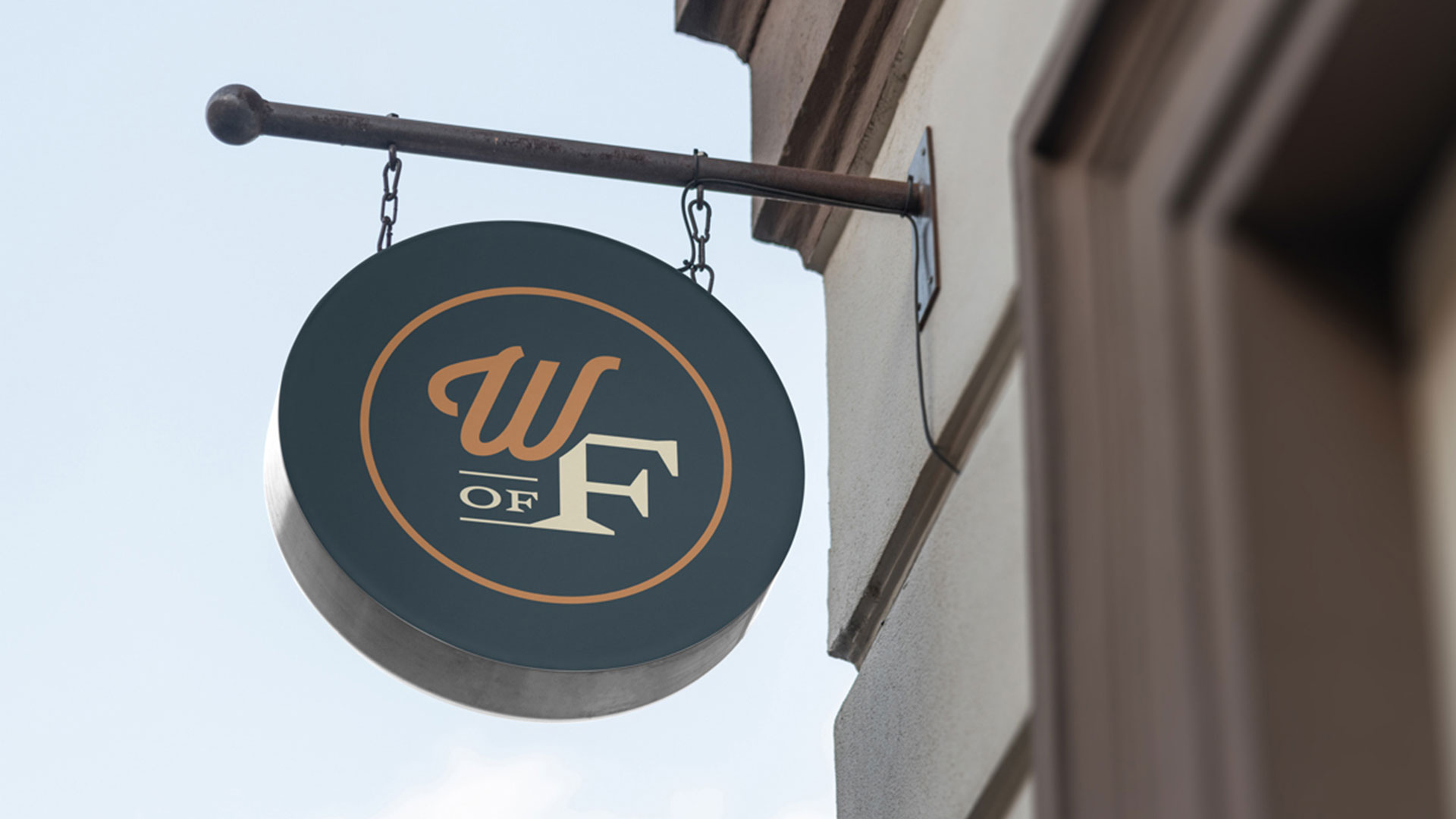
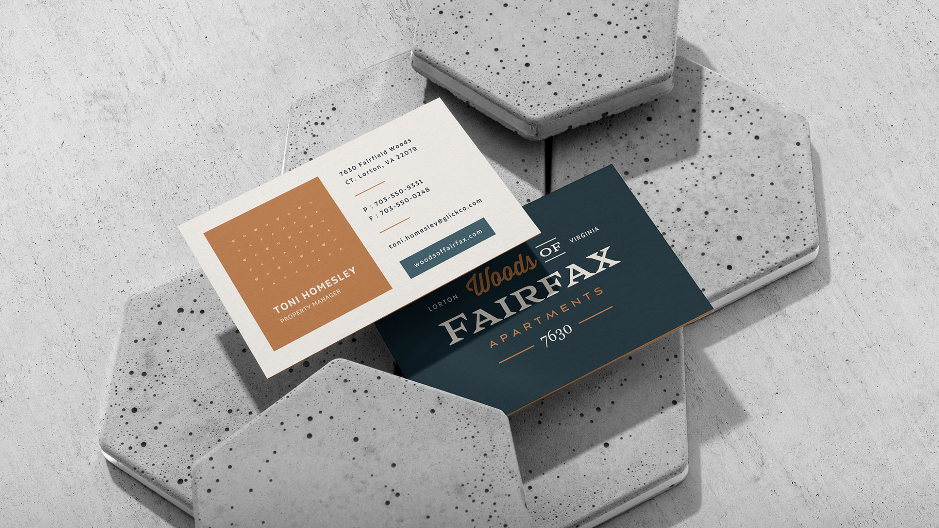
- Logo Design: The logo is a testament to elegance in simplicity. The typographic treatment is sophisticated and modern, suggesting a space where design and comfort are paramount.
- Color Palette and Design Elements: A palette inspired by nature, with rich earth tones and lush greens, imparts a sense of peace and ties in the outdoor spaces with the interiors.
- Iconography: The secondary icon, a clever composition of typographic elements, serves as a versatile symbol that complements the primary logo, perfect for signage, decals, and digital applications.
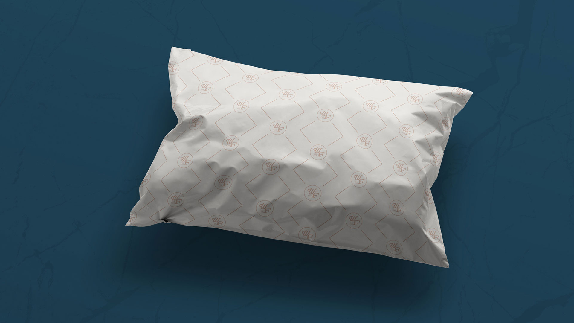
Brand Pattern and Collateral:
A custom brand pattern transcends mere decoration; it weaves the brand’s essence into the fabric of the community’s life.
- Brand Pattern Application: The pattern can be utilized on a variety of materials, unifying various elements—envelopes, merchandise, pillows—to create a tangible brand experience.
- Marketing Materials: Marketing collateral, from brochures to digital ads, echoes the brand’s story, inviting prospective residents to imagine a life amid Woods Of Fairfax’s elegance.
In-Community Experience and Amenities:
Woods Of Fairfax isn’t merely an apartment complex—it’s a microcosm of a balanced life, where every corner is curated for comfort and community.
Digital Presence and Engagement:
Woods Of Fairfax’s online persona is a digital extension of the community’s allure, designed to captivate and convert potential residents.
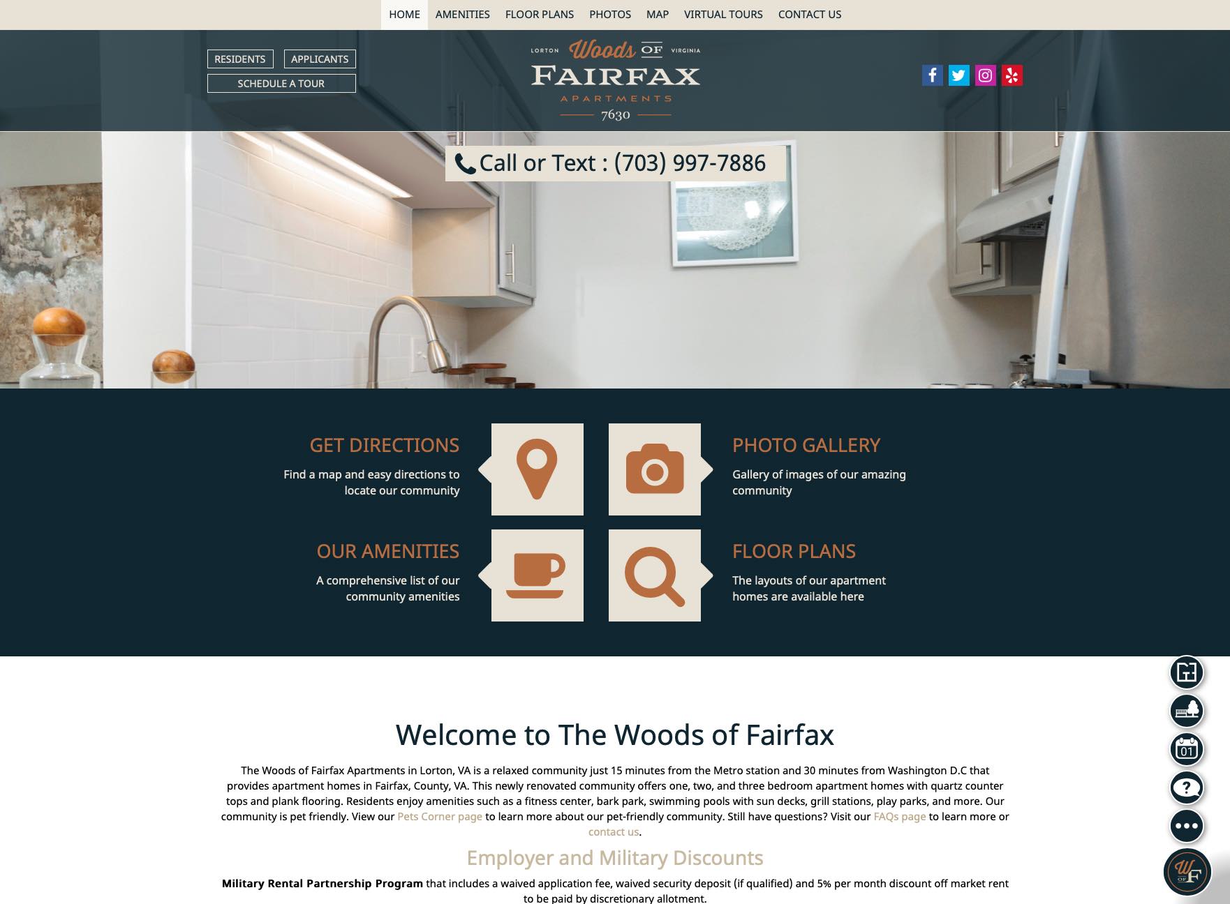
- Website Experience: The website serves as a virtual tour guide, showcasing the apartments’ serenity and the vibrant lives residents can lead. It is replete with detailed floorplans and amenity highlights.
- Resident Engagement: The brand extends into the digital space with resident portals and social media, fostering a sense of community and keeping the engagement lively and ongoing.
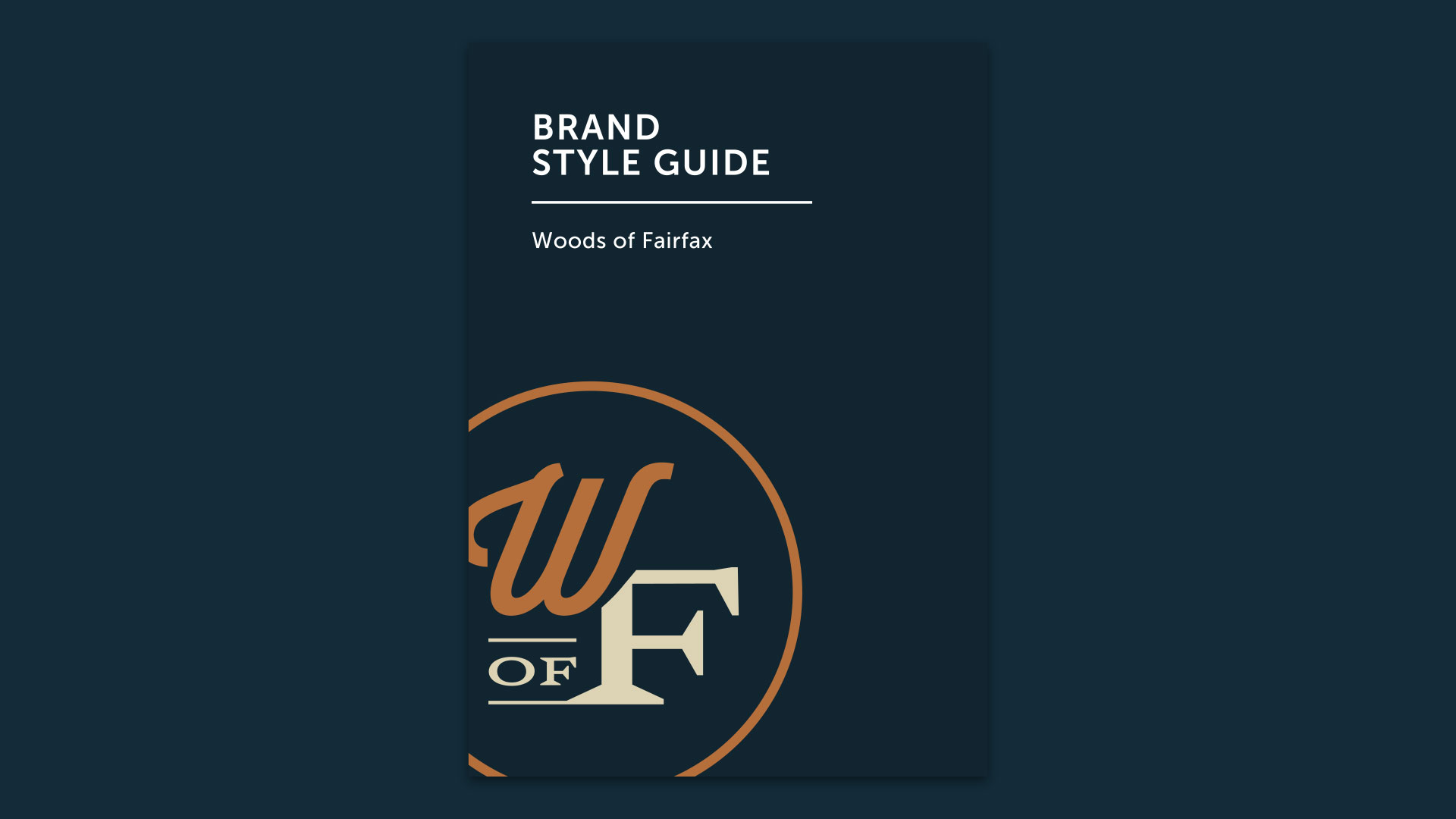
Result: Brand Identity That Encapsulates Community Essence
The Woods Of Fairfax brand story, as envisioned by Spellbrand, is a tapestry of tradition and modernity. The comprehensive brand transformation delivers:
Strategic Outcomes
- Suburban sophistication: Brand identity successfully positions as epitome of suburban sophistication
- Dual nature: Visual identity successfully reflects contemporary living harmonized with pastoral charm
- Community essence: Brand successfully encapsulates essence of apartment community
- Location benefits: Brand successfully communicates proximity to Washington D.C and Metro station
- Amenities communication: Brand successfully showcases amenities and lifestyle
- Complete brand system: Logo design, color palette, iconography, brand pattern, and marketing materials create unified experience
Implementation Success
The branding journey from concept to reality has transformed Woods Of Fairfax into an emblem of suburban luxury, beckoning those who yearn for a life that’s the best of both worlds. The elegant logo design with sophisticated modern typographic treatment, combined with nature-inspired color palette with rich earth tones and lush greens, and versatile secondary icon perfect for signage, decals, and digital applications, creates a brand identity that reflects the community’s dual nature—contemporary living harmonized with pastoral charm. The brand successfully positions Woods Of Fairfax as a 600-unit apartment community located in Lorton Virginia just outside of D.C, offering newly renovated one, two, and three-bedroom apartment homes with quartz countertops and plank flooring, with amenities including fitness center, bark park, swimming pools with sun decks, grill stations, and play parks. This is not just an apartment community; it’s a landmark of Lorton’s living, ready to be discovered and adored by its discerning residents.
Brand Name Strategy: Creating “Woods of Fairfax”
The name “Woods of Fairfax” was developed through Spellbrand’s strategic brand naming process. Our team researched the competitive landscape, target audience, and brand positioning to create a name that would resonate in the market and support long-term brand growth.
The naming process included linguistic analysis, trademark screening, domain availability verification, and brand storytelling to ensure “Woods of Fairfax” would be distinctive, memorable, and legally protectable. Learn more about our brand naming service or explore our full naming portfolio.