INDOSPEC: The Art of Creating Sub-Brands
Situation: Creating Parent Brand and Sub-Brand System
INDOSPEC is a leading technology provider and supplier in the energy sector covering mechanical, electrical, plumbing, PV power generation, energy management solution, and property industry.
Indospec wanted help with creating a parent brand identity and a set of sub-brands for each of their market specializations. The result is a beautiful primary brand logo design and a series of stunning sub-brand marks for each of the sub companies.
The energy sector requires brands that communicate expertise across multiple specializations while maintaining visual cohesion. INDOSPEC needed a brand identity system that would work as a parent brand framework while allowing each sub-brand to represent its unique market specialization.
Task: Create Parent Brand and Sub-Brand System
The challenge required:
- Parent brand framework: Design structure for primary brand that sets stage for sub-brands
- Sub-brand consistency: Sub-brands that are similar yet unique across specializations
- Market specialization: Each sub-brand represents different market segment
- Visual cohesion: All brands work together as a family
- Scalable framework: Framework that works for future sub-brands
Action: Strategic Brand Development
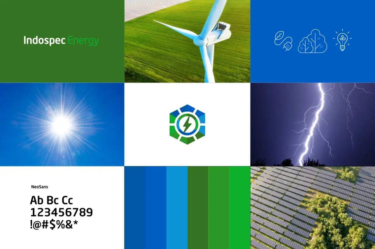
INDOSPEC Parent Brand: Hexagon Framework
We started by creating a framework of design structure and elements for the primary brand logo design that would then set the stage for any subsequent sub-brand logos that we would create. This meant that we had to take great care to create a design structure that would look similar and still unique when implemented across different sub-brands.
After much research and ideation, we decide to go with an emblematic icon design style with a hexagon as the base structure with elements of the market segment that the brand was specializing in. The result is a beautiful parent logo design that works equally well across all the sub-brands.
This design approach:
- Provides hexagon base: Consistent structure across all sub-brands
- Creates emblematic style: Professional, cohesive brand family
- Incorporates market elements: Each sub-brand incorporates relevant industry symbols
- Ensures visual consistency: Similar yet unique implementation
- Enables scalability: Works for future sub-brands
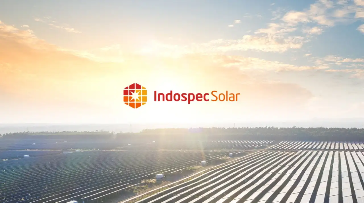


Solar Power Sub-brand Logo
Taking the structure and visual language of the primary brand logo, we create this elegant logo for the solar energy sub-brand of INDOSPEC. We took the core components of the solar ecosystem – the Sun and a solar panel and then integrated it with the parent hexagon structure to create this beautiful icon.


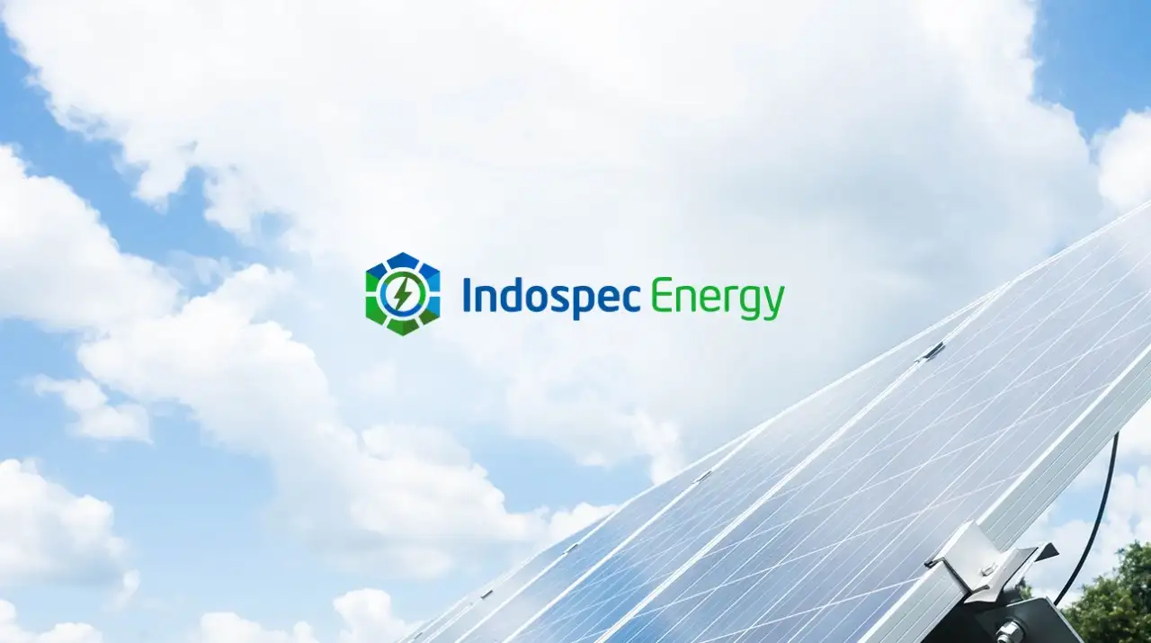
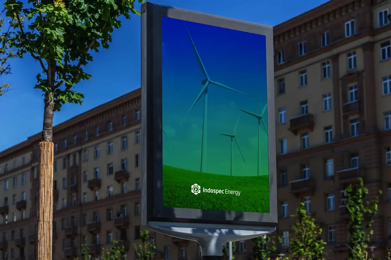
Green Energy Sub-brand Logo
The Green Energy sub-brand of INDOSPEC utilizes the concepts of green, ideas, and technology to communicate what this sub-brand specializes in. All these elements are integrated into the hexagon to give the logo a unique yet familiar look.
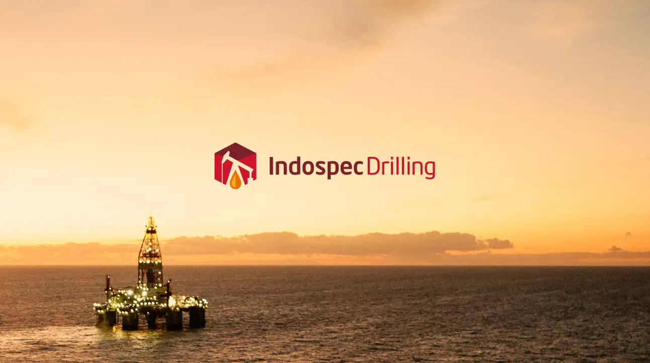
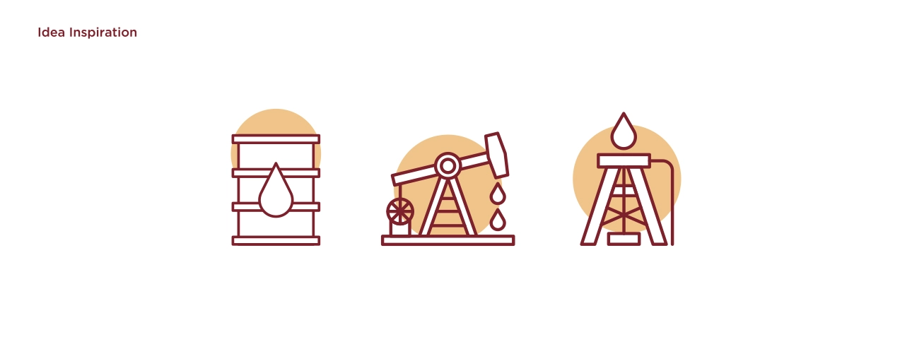

Oil Drilling Sub-brand Logo
The Oil Drilling sub-brand of INDOSPEC brings the idea of an oil drop, an oil drill, and an oil drum to create an intricate yet simple iconic representation of the oil drilling sector. The design is unique yet confirms the parent brand and sits nicely in the family of brands.
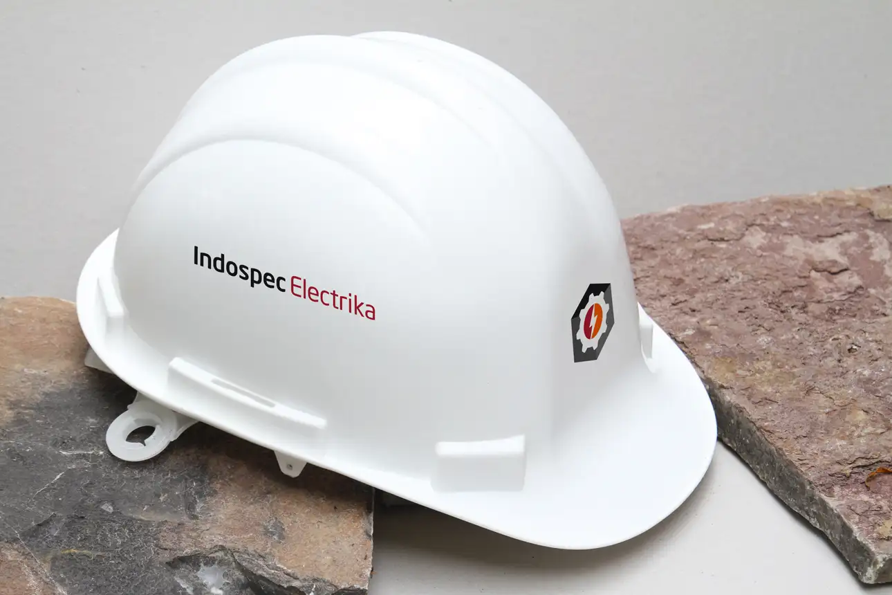
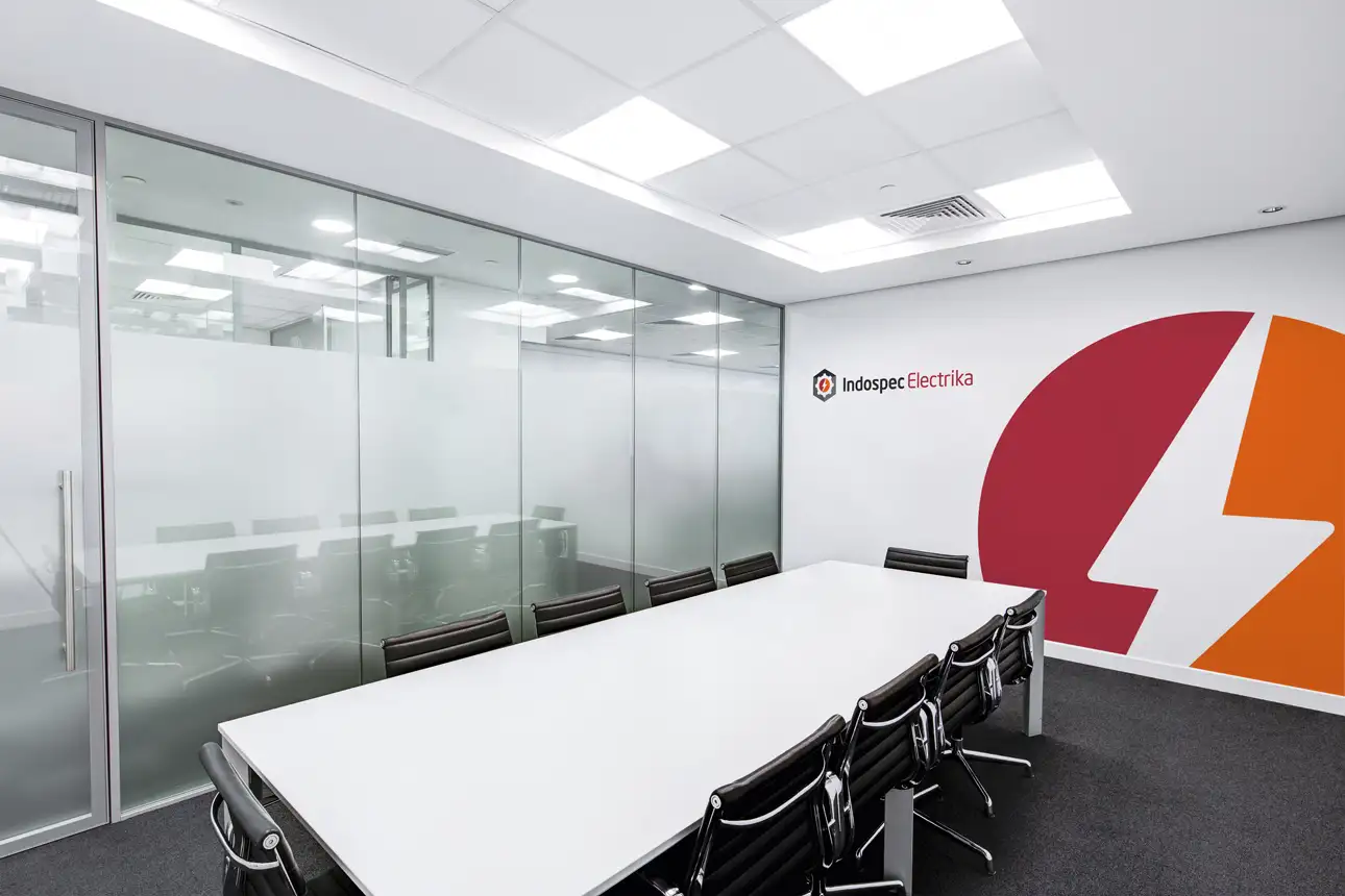
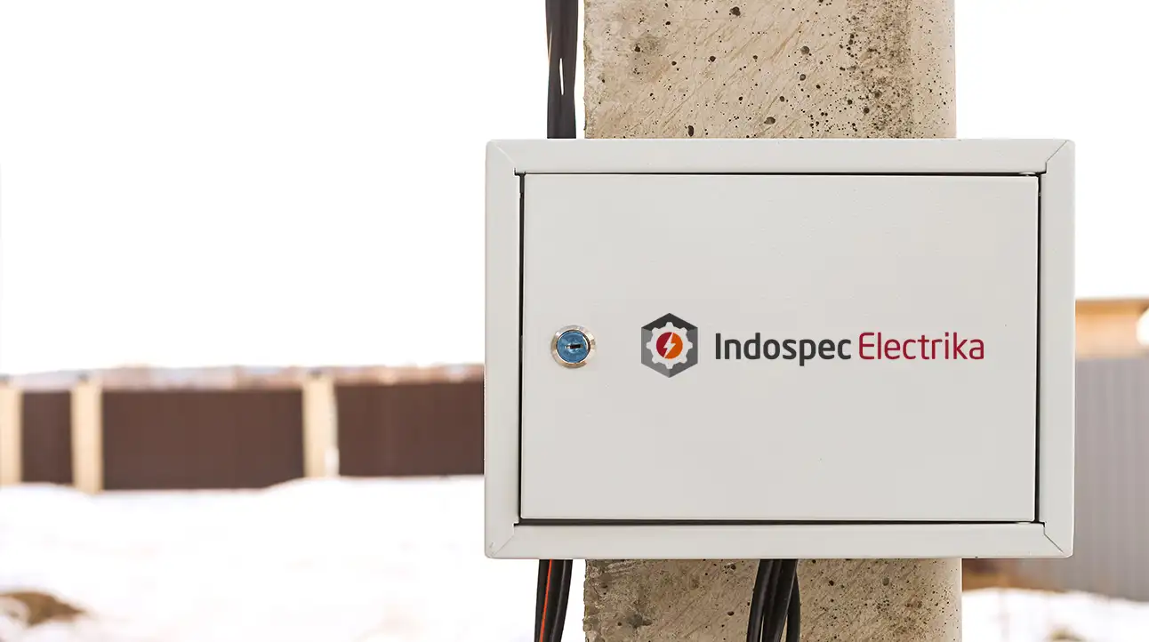
Electric Company Sub-brand Logo
The Electric Power company sub-brand of INDOSPEC incorporates the idea of power for industries as that is the mission statement of this sub-brand. The logo looks stunning and in the image of the parent logo with its own unique flair and strength.
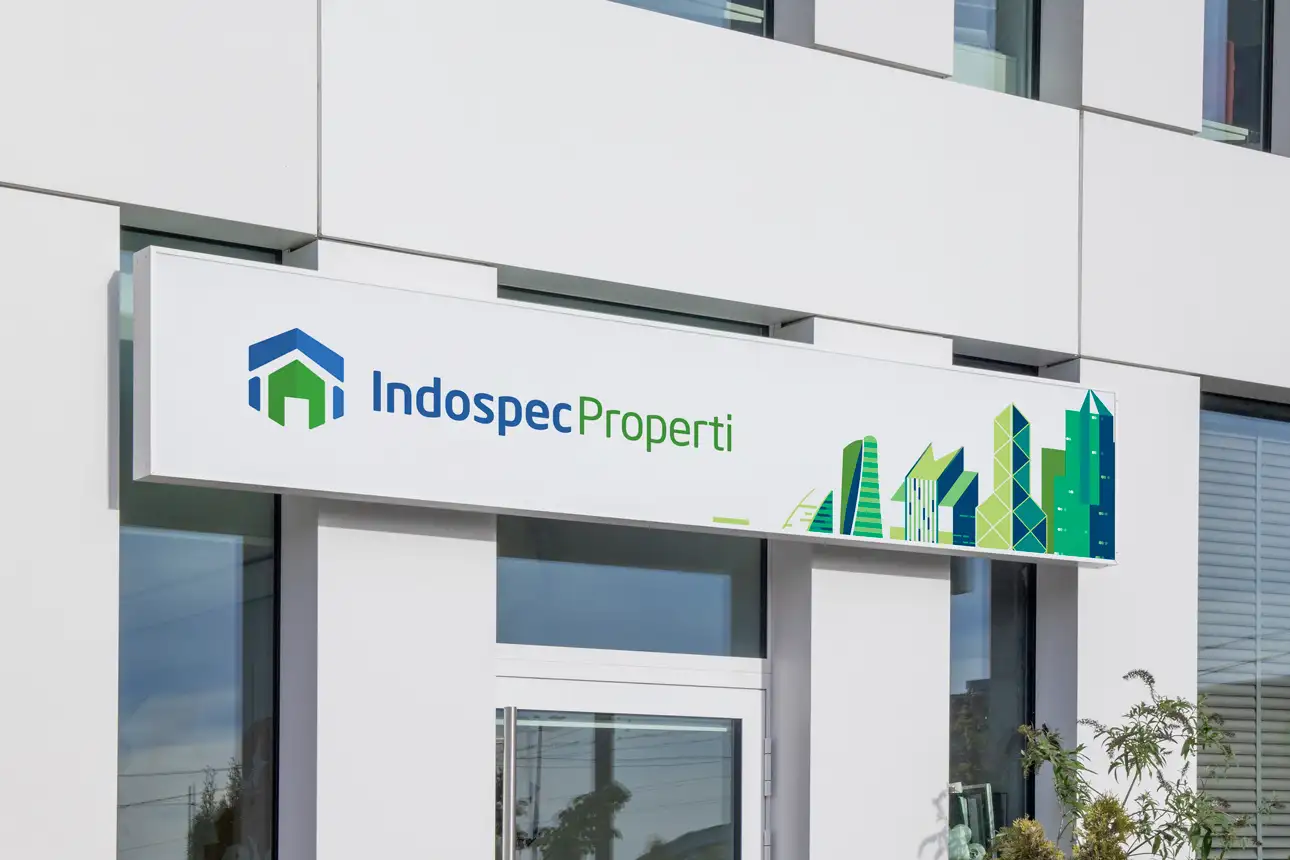

Property Developer Sub-brand Logo
The property development wing of the INDOSPEC brand works with clients from around the world who want to invest in Indonesia. To be able to work with different regions and cultures of the world we decided to keep the icon very basic and universal. We chose a green hour icon enclosed by a larger blue icon – almost like how the Earth is covered by the sky!
Result: Cohesive Brand Family System
The brand identity system we created for INDOSPEC successfully establishes a parent brand with a hexagon-based framework. The comprehensive brand transformation delivers:
Strategic Outcomes
- Parent brand framework: Design structure successfully sets stage for sub-brands
- Sub-brand consistency: Sub-brands successfully are similar yet unique across specializations
- Market specialization: Each sub-brand successfully represents different market segment
- Visual cohesion: All brands successfully work together as a family
- Scalable framework: Framework successfully works for future sub-brands
- Complete brand system: Hexagon-based parent brand, sub-brand marks, and visual language create unified experience
Implementation Success
Today, INDOSPEC uses this comprehensive brand identity system to represent their diverse market specializations. Each sub-brand logo maintains visual consistency with the parent brand while incorporating unique elements that represent their specific market specialization – from solar power and green energy to oil drilling, electric power, and property development. The brand successfully positions INDOSPEC as a leading technology provider and supplier in the energy sector with a cohesive brand family that maintains visual consistency while allowing each sub-brand to communicate its unique specialization through the hexagon-based framework, with parent brand framework that works equally well across all the sub-brands.