Artisan Kettle: The Connoisseur’s Retreat in Chocolate
Situation: Elevating Organic Chocolate Brand to Next Level
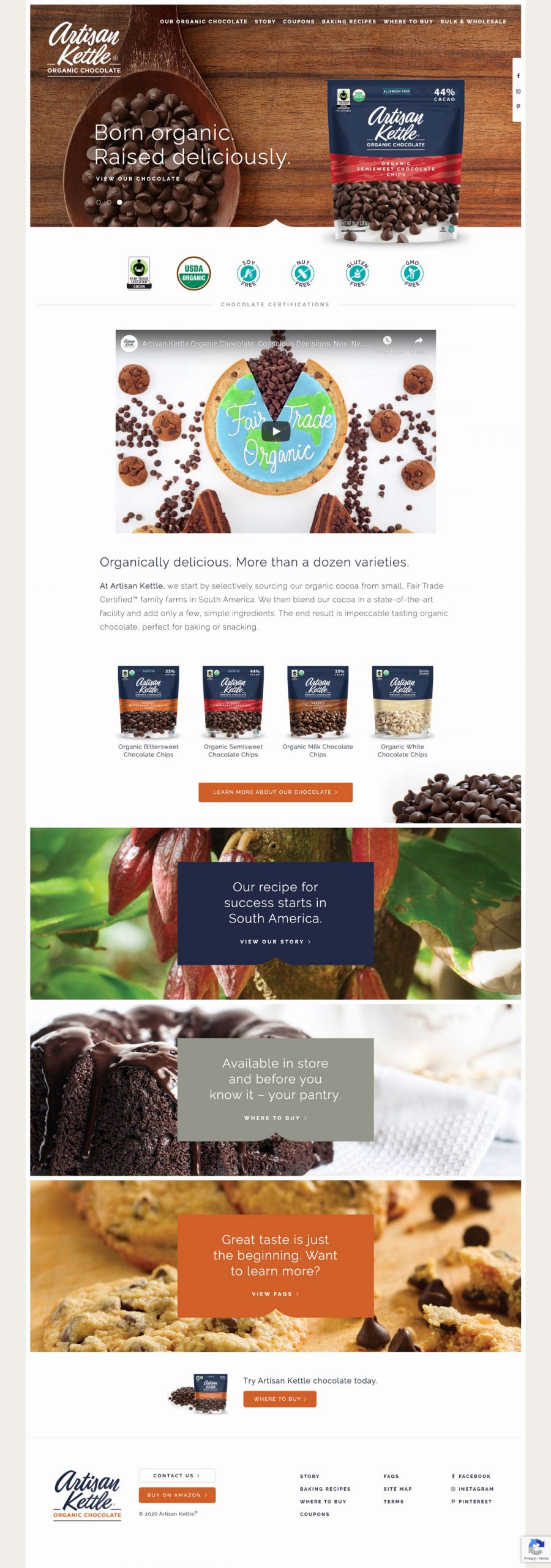
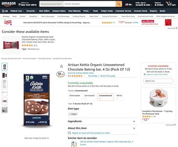
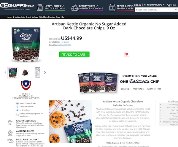
Artisan Kettle is passionate about providing the world with great-tasting chocolate that is both organic and Fair Trade Certified. They craft and produce their own chocolate in order to provide an exceptional product. Currently, they offer Artisan Kettle in the baking aisle and have eleven different items. Soon, they will also be entering the fine organic chocolate bar category. In the future, they may enter the organic candy category.
The organic chocolate market is growing, but many brands struggle to differentiate themselves beyond organic and Fair Trade certifications. Artisan Kettle, an organic baking chocolate line created by former Kraft Foods’ brand manager Beth Goeddel, needed a rebrand that would elevate the brand and take it to the next level, inspiring a whole new set of audience as it rolls out across the US market.
Task: Elevate Brand to Next Level
The challenge required:
- Brand elevation: Rebrand that elevates brand and takes it to next level
- Audience expansion: Messaging that inspires whole new set of audience
- Market differentiation: Stand out in competitive organic chocolate market
- Premium positioning: Position as connoisseur’s retreat, not just organic chocolate
Action: Strategic Brand Development
Brand Strategy: The Connoisseur’s Retreat
As with everything we do at Spellbrand, the brand strategy is at the core of the brand’s essence and dictates success or failure. For Artisan Kettle, we created a brand strategy that positions them as the connoisseur’s retreat in the realm of chocolate—a bold stand against the commoditization of chocolate and an embrace of the craft at its most authentic and ethically grounded.
It’s not merely positioned; it’s planted firmly at the intersection of indulgence and ethics, offering a gourmet experience that’s guilt-free and grounded in responsible practices.
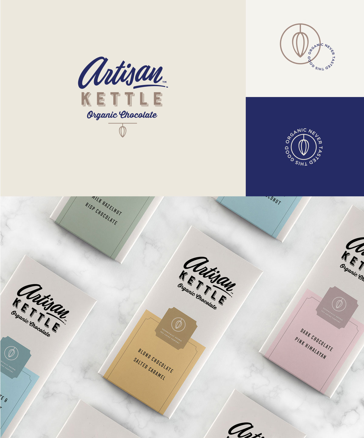
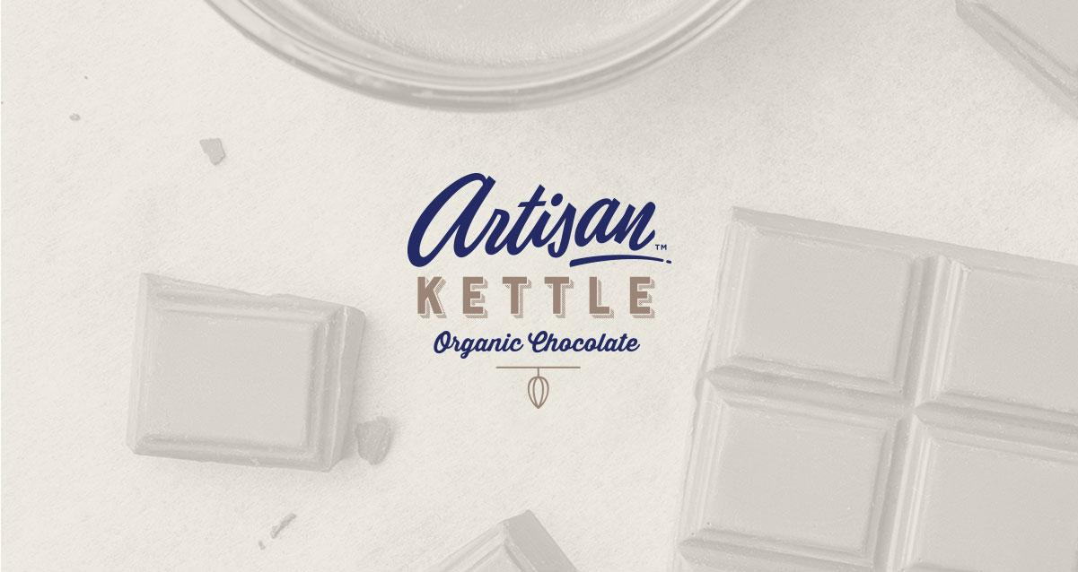
Logo Design: Contrasting Typography
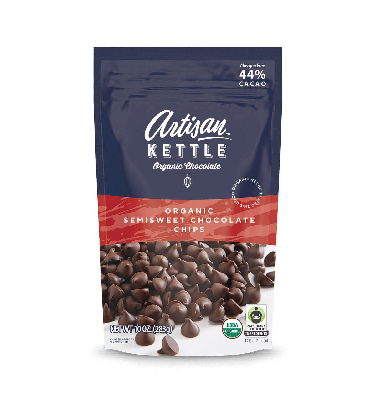
The combination of opposite fonts in terms of their strength and weight creates an easily readable logo of all sizes. When your logo design has to go on to packaging and other touchpoints where the logo would have to have scaled-down, it would help to differentiate the various text elements through the use of effective fonts that contrast and complement each other.
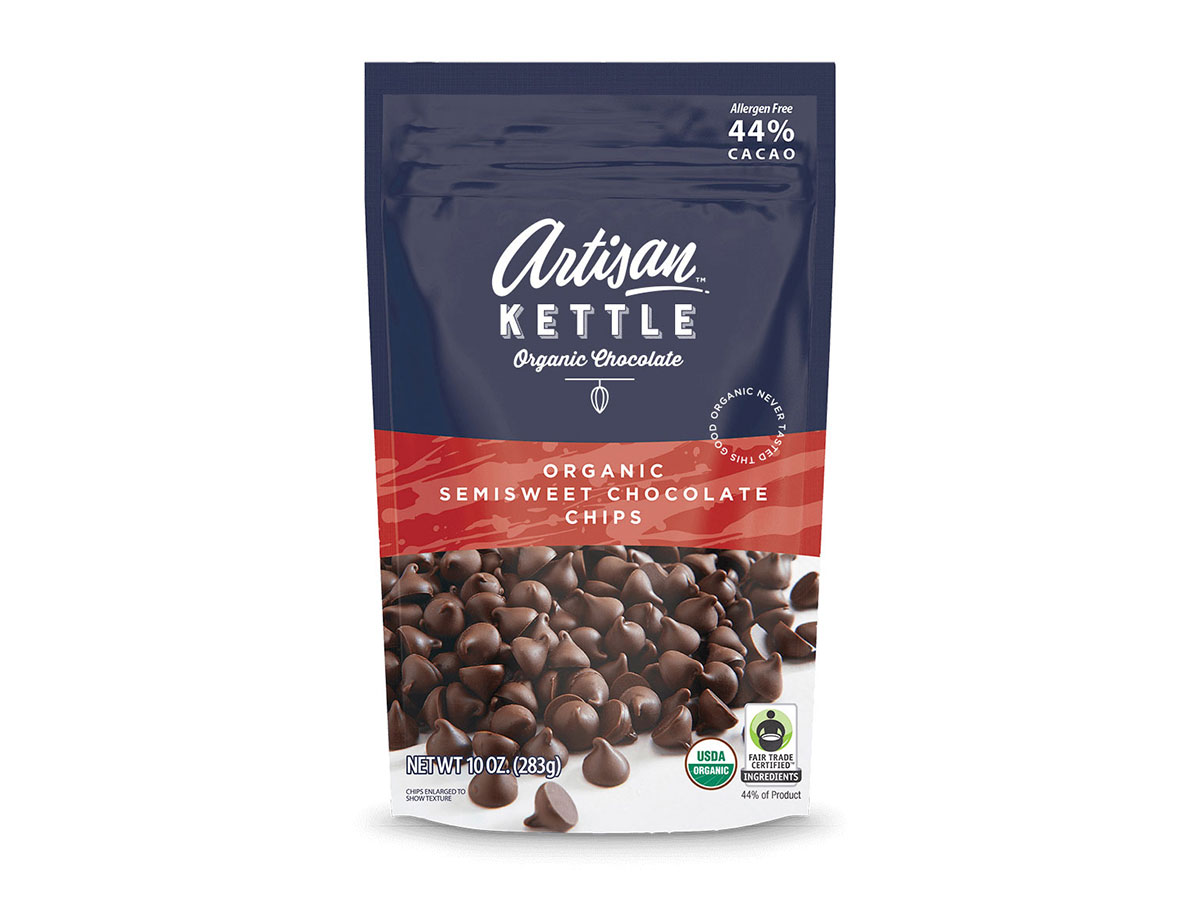
The typography that we created aligns perfectly with the package design of chocolate chips and other products that the client already had on the shelves. The elegance of the brand becomes apparent with the new typography and the delicate yet powerful iconic treatment.
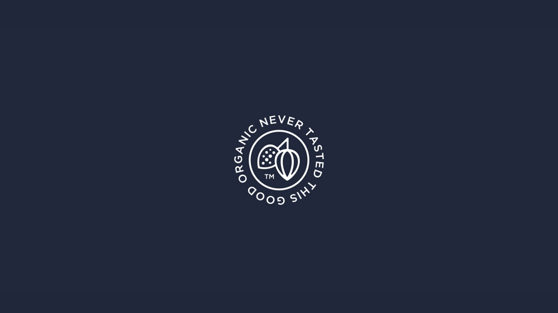
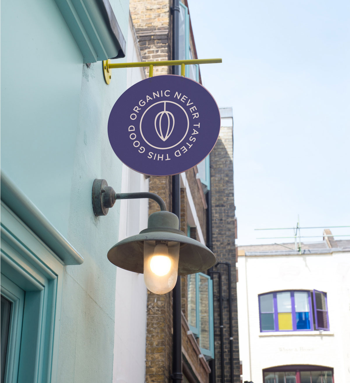
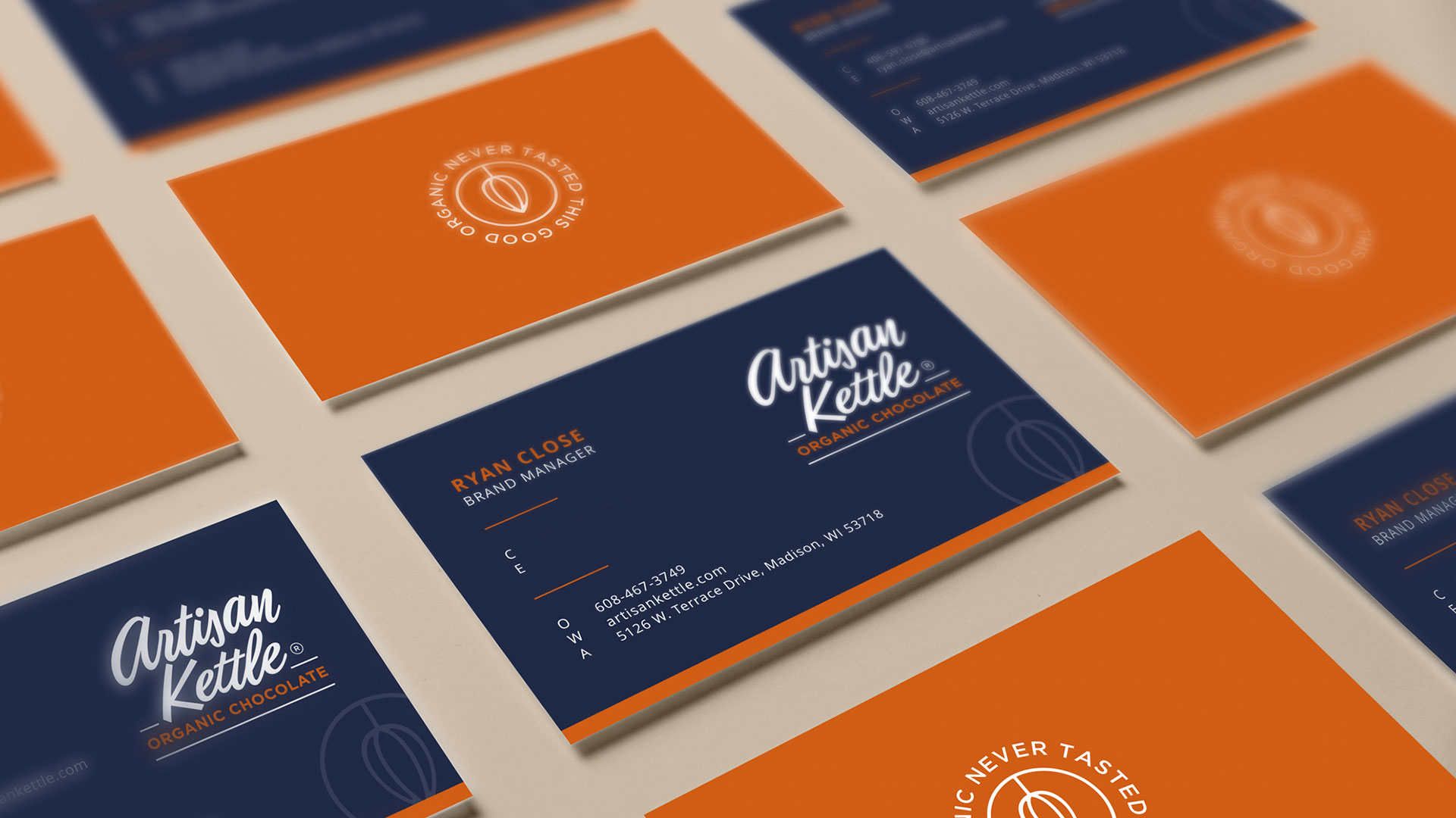
Secondary Brand Mark: Stamp of Authority
The business card uses both the primary logo design as well as the secondary icon to create perfect brand recall. The use of the accent color to make the business card bold and eye-catching is strategic and works well at events, on the counters in supermarkets, and as insets with packaging.
The secondary icon is very elegant and works well as a stamp of authority that can be used on the packaging, marketing collateral, merchandise, apparel, and more. We can’t stress enough the power of a secondary brand mark and how you can use it to elevate the brand to the next level.
Brand Identity & Visual Language
The visual identity of Artisan Kettle speaks with a voice that’s both grounded and graceful. With its clean, contemporary typeface, the logo design conveys simplicity and sophistication—a nod to the modern consumer who values transparency and quality. The iconic treatment is subtle yet impactful, symbolizing Artisan Kettle’s commitment to craftsmanship and quality. It stands as a stamp of excellence on every product.
The chosen font balances strength and delicacy, ensuring legibility across sizes, an essential factor in branding across various media. It’s not just about being seen; it’s about being recognized and remembered. The typeface’s elegance corresponds with the chocolate’s quality—fine, crafted, and exceptional.
The secondary brand mark complements the primary logo by acting as a quality seal, guaranteeing authenticity. It’s an emblem of trust that can adorn everything from packaging to promotional materials, signaling to consumers that this is a brand of high standards.
The color palette is rich yet restrained, featuring deep chocolate tones accented with vibrant colors that hint at the chocolate’s origins and the richness of flavors. This combination doesn’t shout from the shelves; it invites the consumer into a narrative of taste and quality.
The visual language of Artisan Kettle is an open conversation with the customer. It speaks in a confident, clear tone that communicates the brand’s core values—organic, Fair Trade, and crafted with care. It’s a visual identity that doesn’t just stand out in the premium chocolate sector; it stands for something—a symbol of indulgence with integrity.
Why This Positioning Works
- The Taste-Audience Fit: Premium consumers want more than taste; they want the story, the ethics, and the experience. We give them an adventure in every bite—a journey from South American farms to their discerning palates. It’s a taste of the exotic, accessible at their nearest high-end grocer.
- The Ethical Edge: Artisan Kettle isn’t just selling chocolate; it’s selling principles. Fair Trade isn’t a badge; it’s our business model. We tell the story of every farmer, every field, and every fair practice that goes into making a bar of Artisan Kettle chocolate.
- The Exclusivity Effect: Our chocolate isn’t for everyone, and that’s by design. It’s for the mindful, the thoughtful, the ones who pause to savor. Our marketing reflects that exclusivity—limited batch releases, member-only tasting events, and packaging that’s more artifact than wrapper.
- The Environmental Elegance: We make green look good. Artisan Kettle’s sustainability isn’t just a commitment; it’s a canvas. We use eco-friendly packaging that customers proudly display—bold design meets biodegradability.
- The Connector Concept: Chocolate is a conversation starter, a connector. Artisan Kettle isn’t just a part of that conversation; we’re leading it. We build bridges between the growers and the gourmet, the soil and the shelf, the roots, and the recipes.
Result: Brand That Redefines Chocolate
Pushing the envelope means taking a stance and sticking to it unapologetically. Artisan Kettle doesn’t whisper its values—it declares them with the confidence of a brand that knows its worth and the worth of the ethical and taste standards it upholds. The comprehensive brand transformation delivers:
Strategic Outcomes
- Brand elevation achieved: Rebrand successfully elevates brand and takes it to next level
- Audience expansion: Messaging inspires whole new set of premium consumers
- Market differentiation: Bold stand against commoditization sets brand apart
- Premium positioning: Positioned as connoisseur’s retreat, not just organic chocolate
- Ethical excellence: Brand planted at intersection of indulgence and ethics
Implementation Success
Today, Artisan Kettle uses this comprehensive brand identity to attract premium consumers who want great-tasting organic and Fair Trade Certified chocolate. The brand successfully positions Artisan Kettle as the connoisseur’s retreat in the realm of chocolate—a bold stand against commoditization and an embrace of craft at its most authentic and ethically grounded. It’s a beacon for the future of indulgence, a paradigm shift wrapped in foil, poised to redefine what it means to enjoy chocolate consciously.