Poster design is an art form and for decades has been at the forefront of brand message communication and a business tool. With social media becoming the defacto marketing choice, posters may seem to be losing ground but for certain markets, businesses and audience they still hold a powerful place.
In this article, we look at 10 inspiring poster design branding and how they work to communicate the brand story. As always, please note that this a list based on my preference and experience as a brand builder.
GIG POSTERS
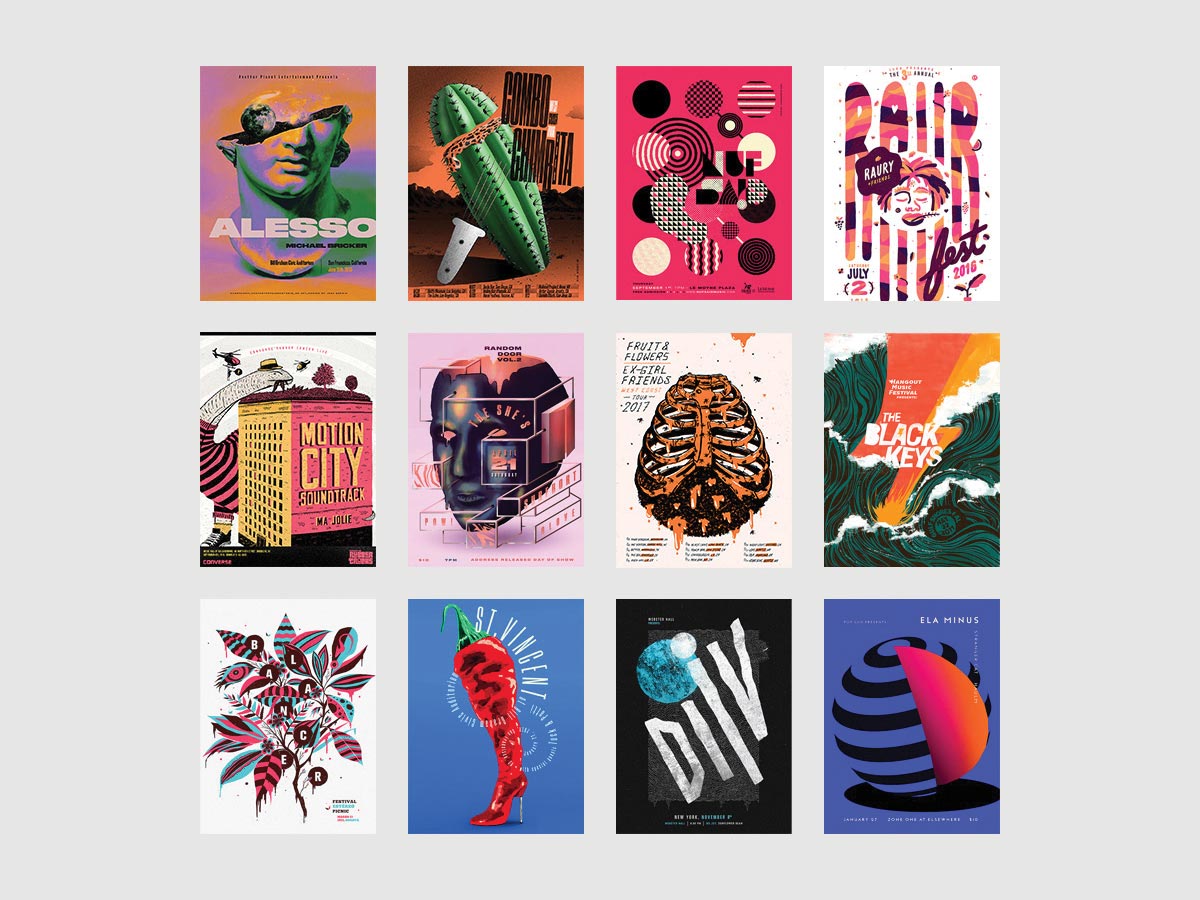
This series of powerful posters created by Jose Berrio, showcase a bold and colorful design branding. Each poster has one bold illustration that ties into the event/gig in question.
For example, for the Alesso at Bill Graham Civic Auditorium held in San Francisco, the poster design includes a beautiful illustration of a Greek marble bust head that is half completed and the moon coming out of the head. This ties in beautifully with the production company as well as the kind of music that Alesso is famous for.
Another beautiful poster is for Combo Chimbita “West Coast Tour” which shows an illustration of cactus severed in half and a hairbrush to tie the band and music to the African roots. (Source)
POSTERS SERIES FOR LOS ANGELES
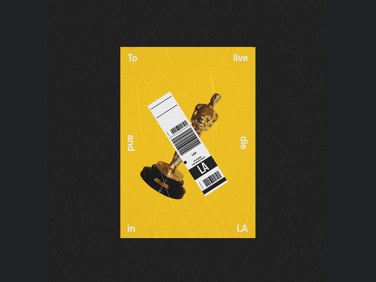
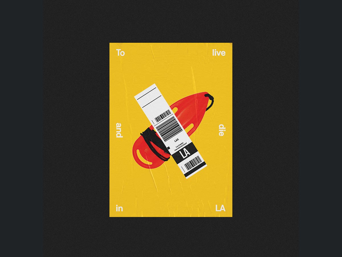
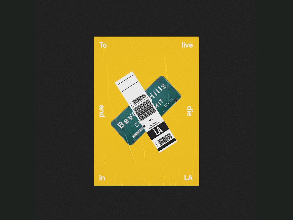
This is a simple yet powerful series of posters designed by Danilo De Marco andStudio K95 dedicated to the city of Los Angeles. The posters are simple and striking with a powerful message. The intention of the posters is to communicate the iconic nature of the city of Los Angeles. Designed to be shown at the LA Fashion Film Festival, these posters show different iconic images and items of Los Angeles plastered over by a baggage tag from an airport. The message is all about inviting people to Los Angeles and to experience the icons that have made the city unique and memorable – these include things like the Oscars statue, a beach guard tether, a Beverly Hills number plate and so on. (Source)
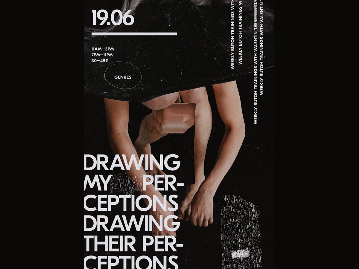
DRAWING PERCEPTIONS POSTERS
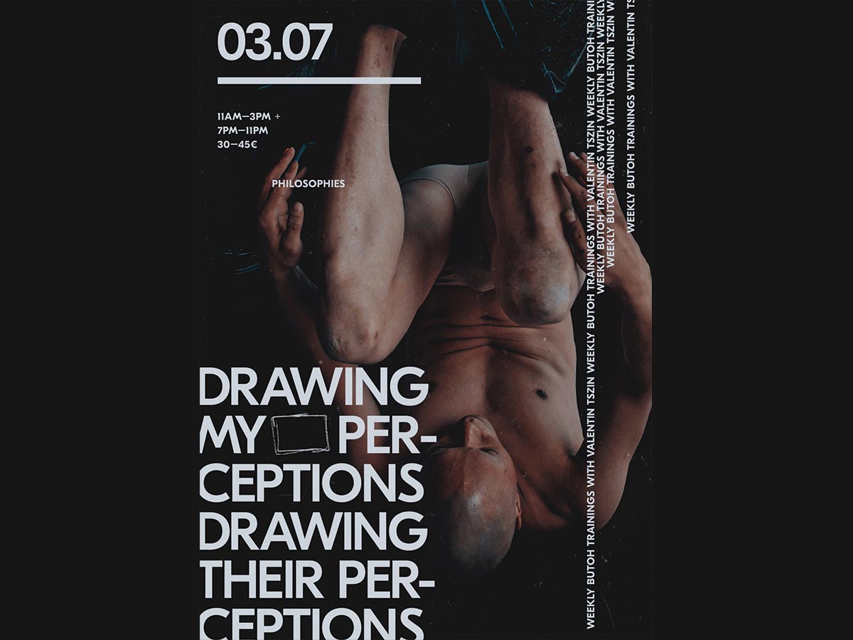
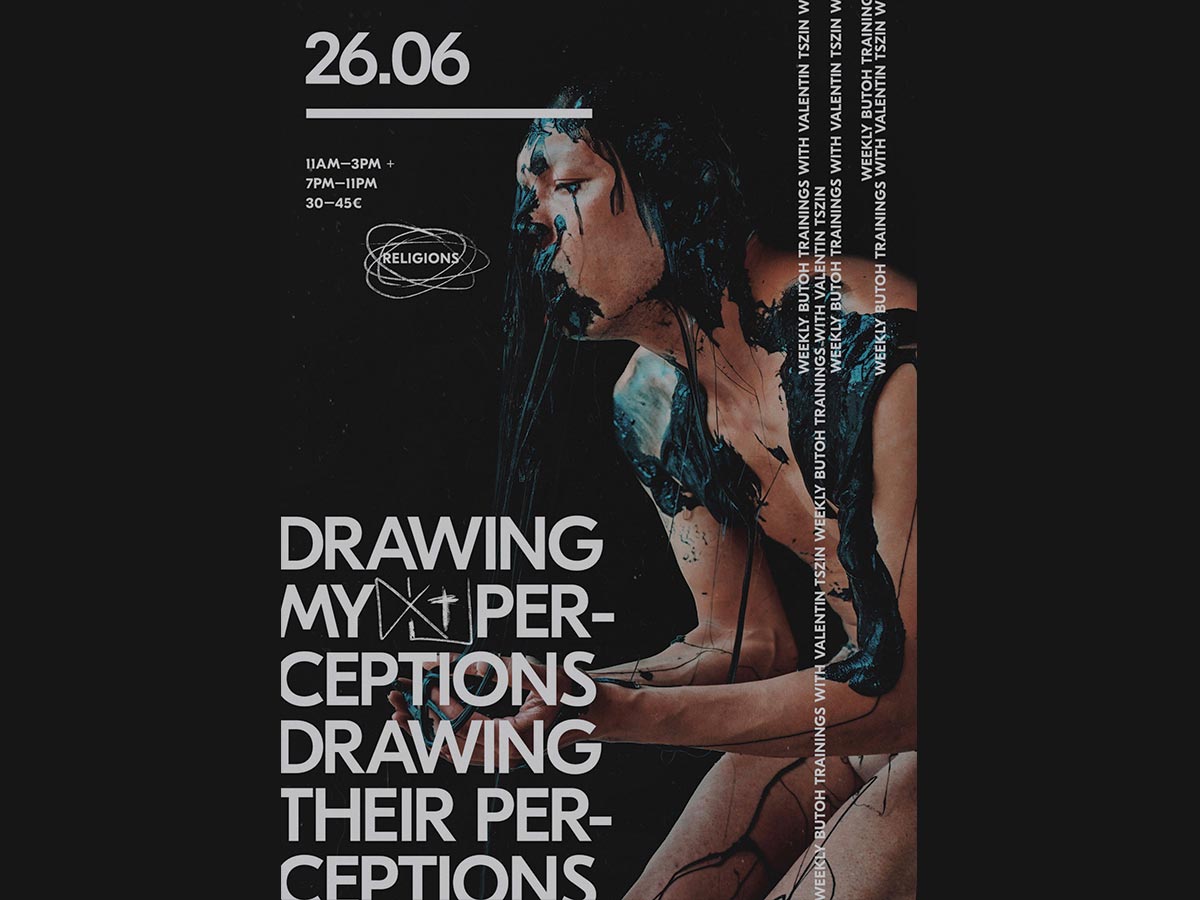
This stunning series of posters designed by Sergey Skip was for a butoh dance course conducted by the famous artist and dance researcher Valentin Tszin in Berlin. The training course is aimed at performance artists, dancers, actors, and creative and talented people who question reality and the possibilities of reality. The course has 12 sessions and the designer created one poster for each session.
The posters show dancers in different positions and create an impact with full format close-up photos that are supported by large blocky typography. The result is a set of posters that are recognizable and interesting. The photos create a sense of mystery surrounding the dance and the dancers. (Source)
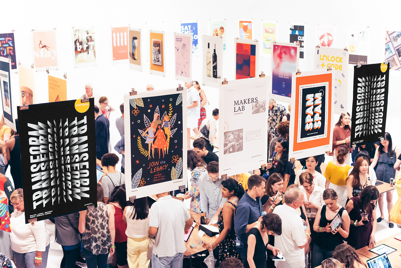
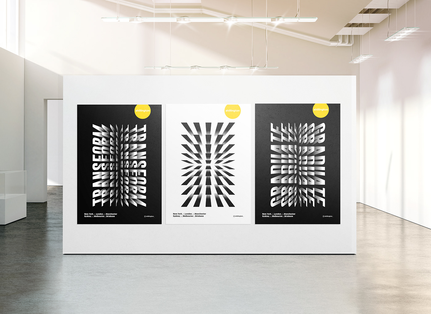
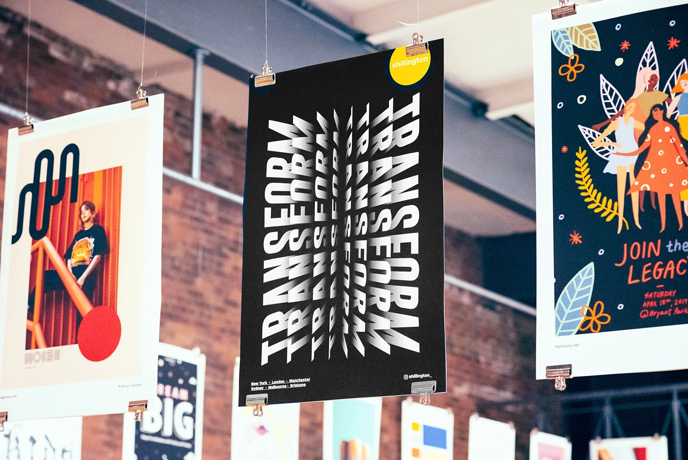
TRANSFORM EXHIBITION IDENTITY
This series of interesting poster branding designs were created by Shanti Sparrow Design for the Transform exhibition event for the Shillington School of Design Summer graduation. Inspired by the journey a student takes from being a curious observer to becoming a passionate designer, the poster designs reflect the transition that happens. One of the posters, for instance, has the word “Transform” that sort of transforms from left alignment to the right as various layers progress. These posters and the overall identity was rolled out internationally in New York, London, Sydney, Manchester, Brisbane and Melbourne campuses. (Source)

ELECTRONIC PLAYGROUND POSTER COLLECTION
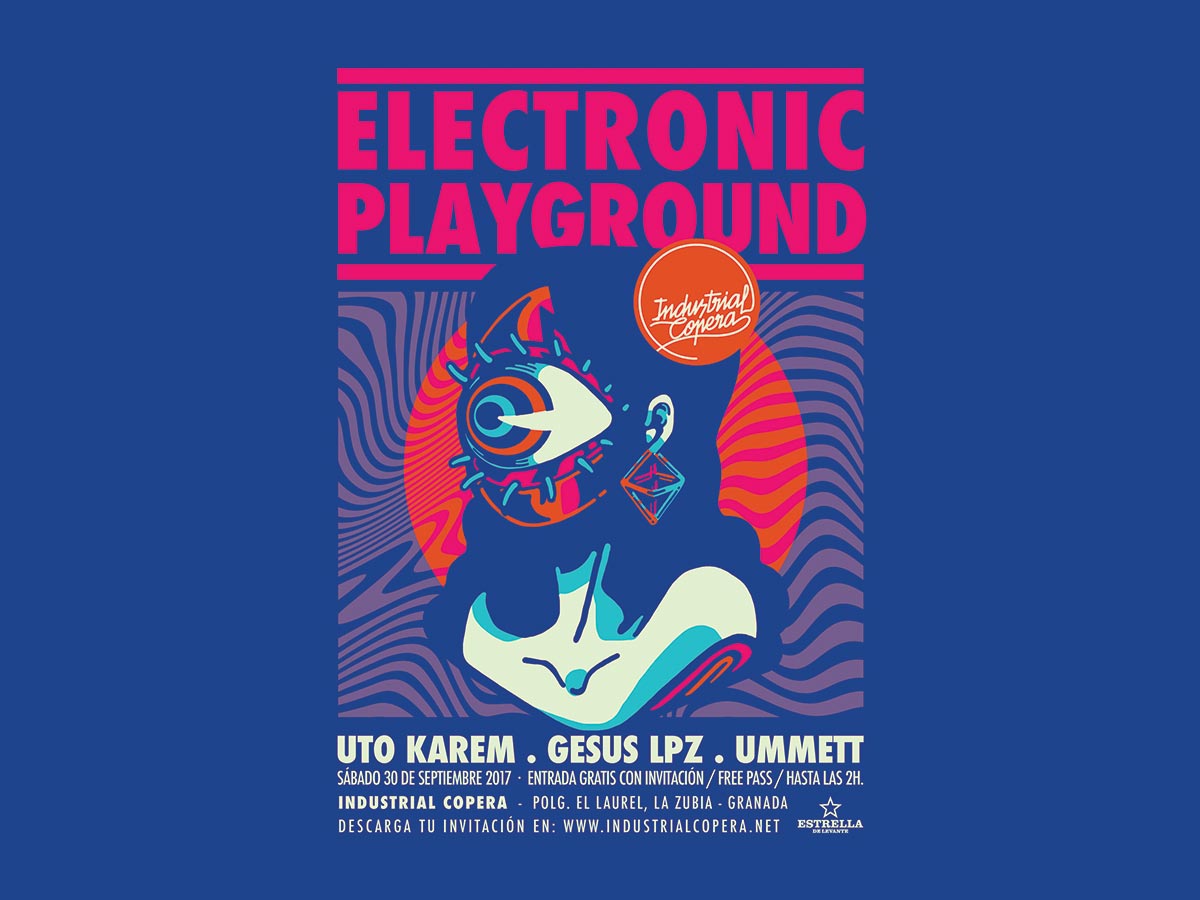
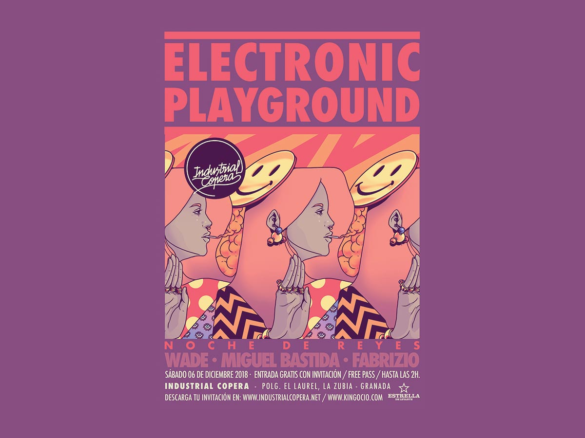
Industrial Copera is an Electronic Dance Music Club in Granada, Spain. Design agency POGO ® was tasked with creating a set of high-impact and creative posters for their events with custom illustrations. The result is a series of poster designs that not only look beautiful but also look unique and carry the brand message clearly. The hand-drawn illustrations look very retro – almost a steampunk feel – and include concepts such as a cyclops-like eye, a robotic face with face coming off and showing the inner electronics and so on. (Source)
ELECTRONIC PLAYGROUND POSTER COLLECTION
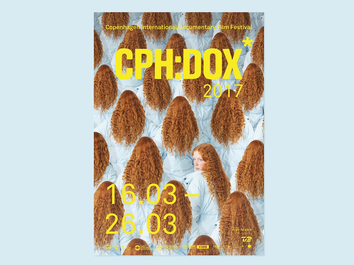
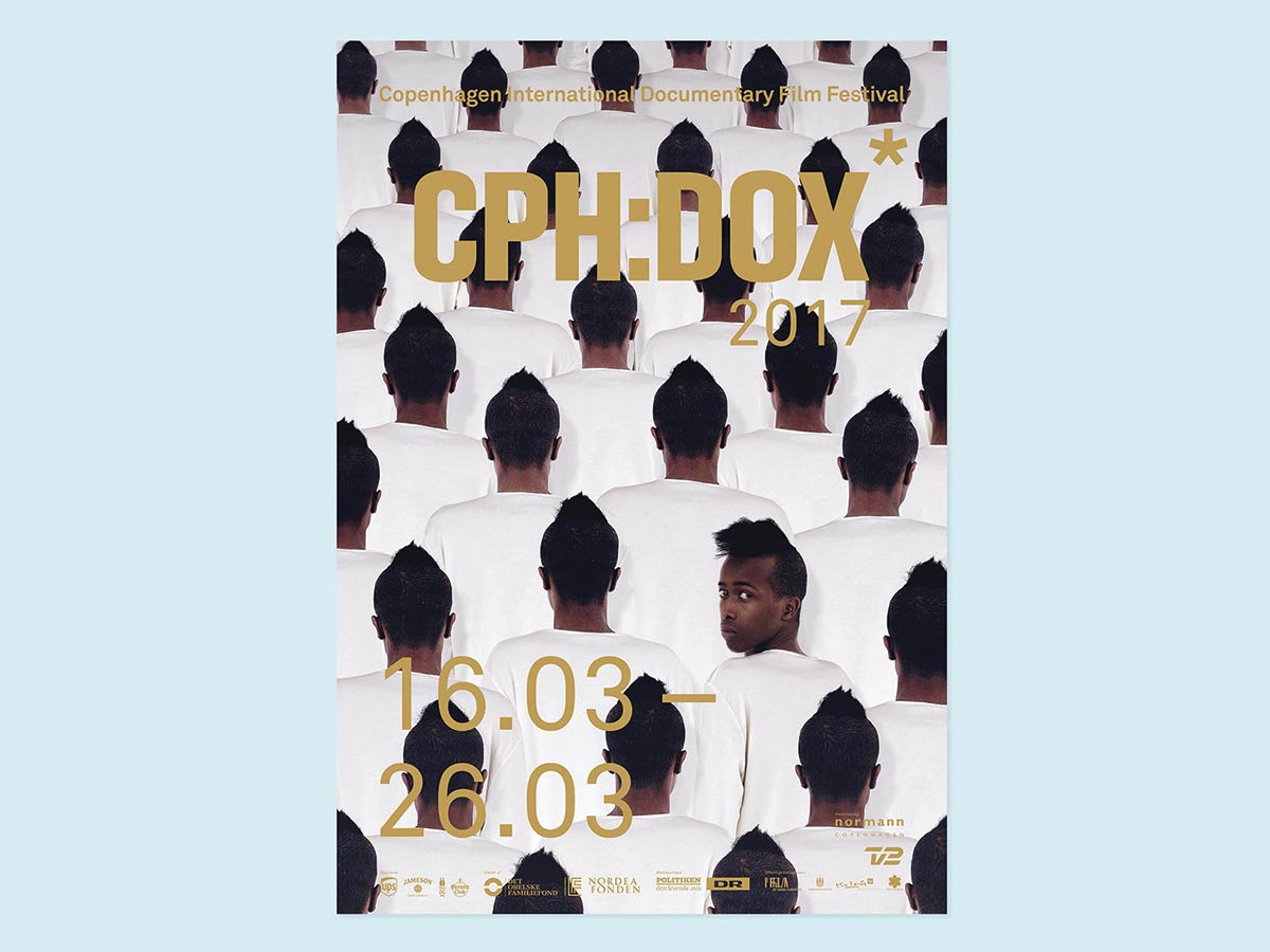
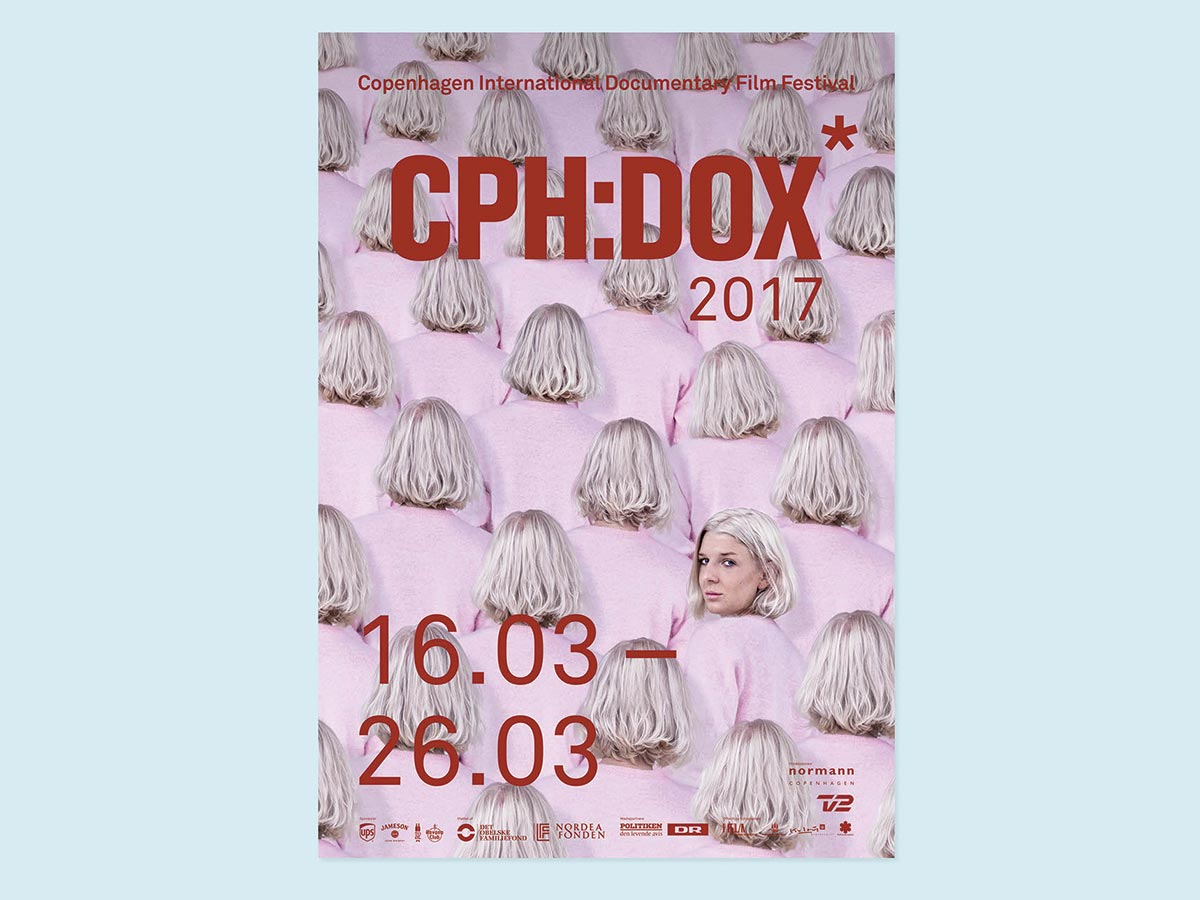
This series of interesting posters were created by Rune Elias for CPH:DOX – Copenhagen International Documentary Film Festival which is one of the largest documentary film festivals in the world. CPH:DOX was founded in 2003 and grew from 14,000 admissions in its first year to a record-breaking total of 97,500 admissions by 2017.
CPH:DOX showcases a program that encompasses the works of major international directors as well as new talent along with large-scale theatrical releases to film/video works in cinema and visual arts. To reflect this core mission the posters take on a very simple yet very direct and eye-catching design direction. Each poster has photos of a head facing away from the viewer which is repeated all through. Out of all the heads that fill the poster, one is shown facing the viewer and you can see the persons face! That creates a very whimsical impact and is sure to bring a smile to anyone’s face.
This series actually reminds me of the posters that you would see in the London National Gallery. (Source)
CAN DO IT POSTER SERIES DESIGN
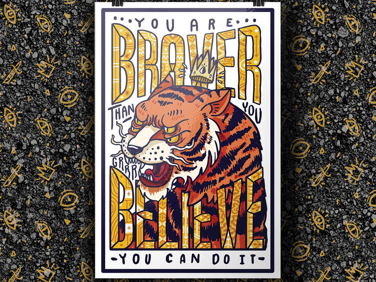
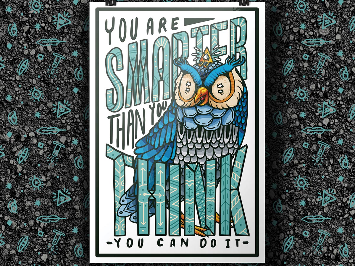
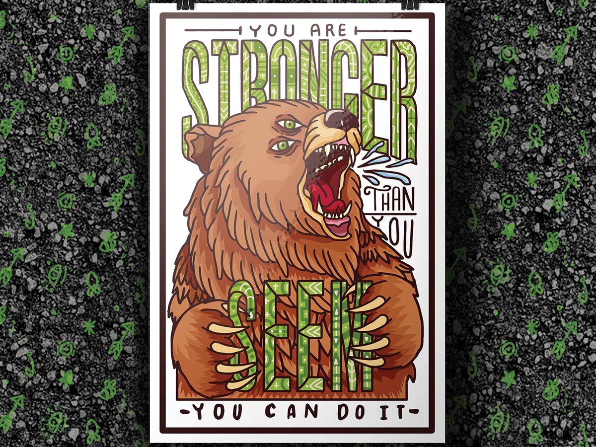
I like hand-drawn illustrations and especially when they buck the trend and are unique and quirky. This set of exciting posters created by Aura de Papel caught my attention because of the quirky-looking illustrations and layout.
Each poster showcases an illustration of an animal and a powerful slogan that is motivational. The first poster has an illustration of a tiger with the slogan “You are braver than you believe” and a subtext “You can do it”. The quirky thing about the illustration is that these animals have a double set of eyes. The next one is an illustration of an Owl with the tagline “You are smarter than you think” and followed by the same sub-text “You can do it”. Yet another poster shows a bear with the words “You are stronger than you seem” and again the words “You can do it”.
These are very motivational and high impact set of poster designs and the artist has done a great job. (Source)
NIKE BRANDING FOR JAPAN – BE LEGENDARY
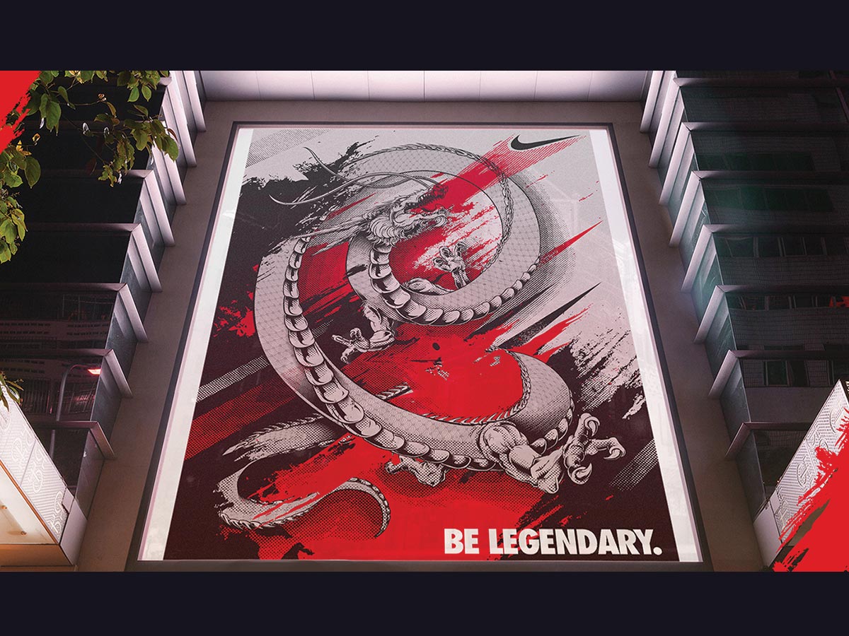
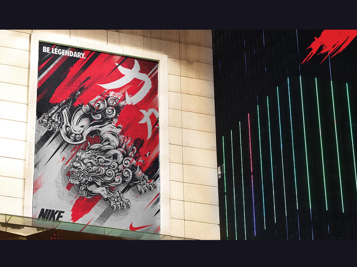
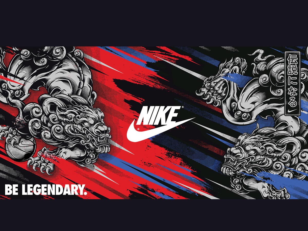
This is a wonderful set of posters with illustrations that are close to my heart. I love anything Japanese and in this set, we see beautiful illustrations of a Japanese dragon, a Food Dog, a Phoenix, and other legendary creatures that you may find in Japanese tattoos. I am a big fan of tattoos and these creatures and so it is an awesome combination.
This series of posters was created by Daniele Caruso for his University final project. Initially, Daniele included the Olympics logos and branding but was told to remove the references and in the end, this just became a branding exercise for Nike. I think Nike should buy this series and use them in their marketing campaigns. (Source)

MEXICO POSTERS COLLAGE
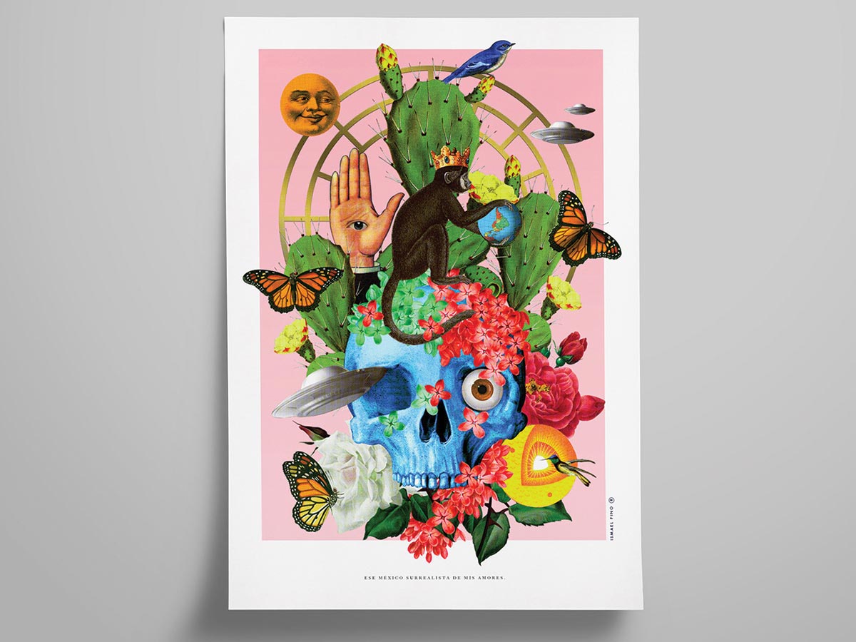
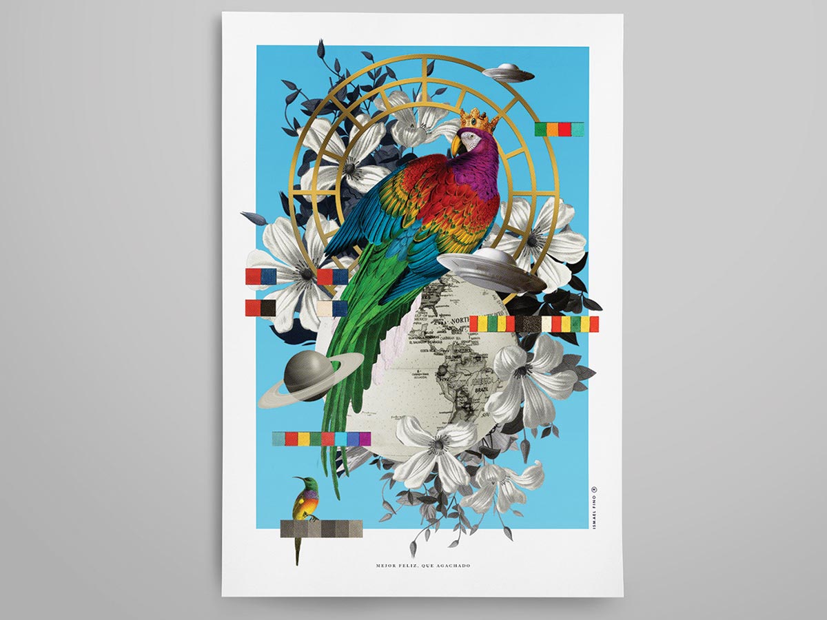
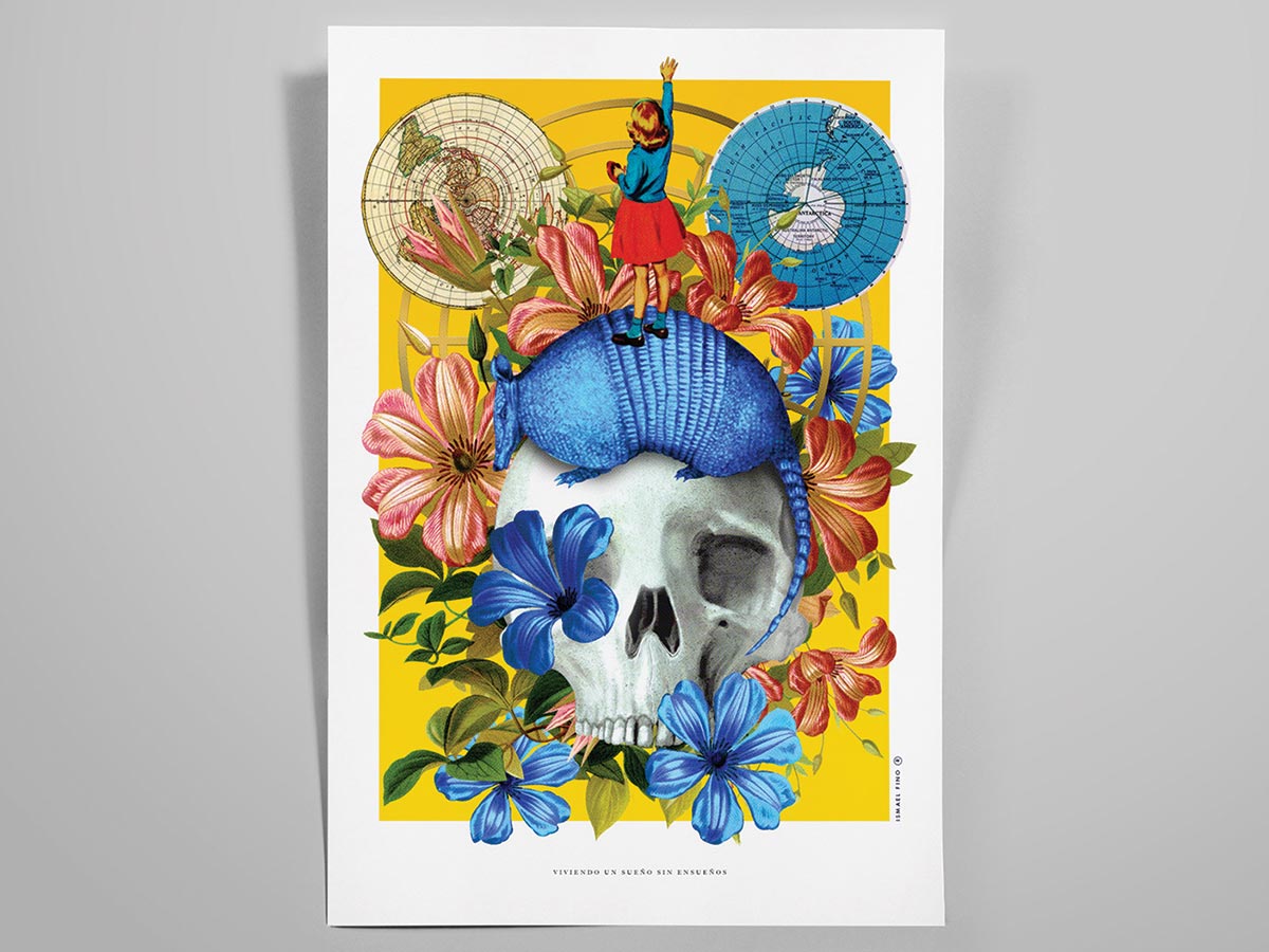
This series of posters were designed by Ismael Fino and incorporate illustrations, photographic elements, and graphic design that brings together all these disciplines into a cohesive artwork that create the right impact.
In the first poster, we see a huge skull as the centerpiece of the poster with flowers growing out of it. On top of the skull sits a blue armadillo and standing on it is a little girl reaching out her hand to the sky. The art style is very art deco and the illustration of the girl is reminiscent of early 30s comics.
In another poster we see the same skull as the centerpiece but this time with one eye and a flying saucer coming out of the other eye socket. There are butterflies, a hand with an eye in its palm and a monkey playing with a globe. Very strange set of illustration and frankly speaking is very hard to interpret the meaning of the various elements. (Source)


THE KILLING OF A SACRED DEER
The Killing Of A Sacred Deer is a very deep and complex movie that will leave you scratching your head by the end. It is a psychological horror-thriller film starring Colin Farrell, Nicole Kidman, Barry Keoghan, Raffey Cassidy, Sunny Suljic, Alicia Silverstone, and Bill Camp. I loved this film and the way it was directed. (Source)
Vasilis Marmatakis is credited with designing the original English posters for the film and as with his other poster work for films like The Lobster, Dogtooth, Acropod etc, the poster designs are clever and surreal. For the Korean market, Park Si Young created these posters derived from the originals. I love the way Park kept the original simplicity of the posters and added Korean translations. (Source)
