In the ongoing series on the power of funnels – both sales and lead generation, we started with talking about how funnels can help double or triple your sales and revenue. Then we looked at the assets needed to build a funnel that converts. And then we looked at how to optimize your funnel with a laser targeted call to action.
In this post, we’ll explore landing pages: why you need them, and how to build them. Without a doubt, one of the most important aspects of a funnel is its various landing pages. These pages serve as the final interface between your lead and some action you want them to take.
Having a strong landing page can mean the difference between getting a sale, or watching as your lead heads over to the competition.
But what is a landing page, and how do you build a good one? How does it differ from a funnel? Read on, you’re about to find out.

How the Funnel Relates to the Landing Page
You may be wondering, aren’t funnels and landing pages the same thing? Well, sort of, but not precisely. While they share similarities, there are fundamental differences between them. One thing to understand right off the bat is that they’re both tools used by professional marketers—and now by you, too. Here’s what you need to know:
A landing page is a single page with one CTA, or call to action. In our last post, we covered the CTA in detail. If you haven’t read that post, we recommend checking it out. But a funnel is made up of many web pages that direct—or, you guessed it, funnel—the prospect towards their final purchase decision. This can get fairly complex, so we’ll be looking at a few examples shortly.
Each page in a funnel is a destination, and it’s an opportunity to get the prospect to take a specific action. For instance, if you’re into inbound marketing, you may be trying to get leads at the top of the funnel to sign up for your newsletter so you can nurture them over time. To accomplish that, you would have to direct that traffic to a landing page made specifically for that task. That specific page would be a landing page.
There are many potential uses for a funnel, and the possibilities are endless. Let’s look at a more complex example.
Let’s say that Stella has a weight loss program. Stella’s ultimate goal is to get customers to sign up for her one-on-one weight loss coaching. But that’s not the only product Stella can sell, is it? Along the way, through her funnel, she might market other products, such as shakes, protein powders, etc. She may produce these on her own, or she may be an affiliate. The point is this: she uses her entire funnel to move the prospect along, from top, to middle, to end, with the ultimate goal of getting them to convert for her coaching program. But if they don’t, there’s a chance they will buy from her anyway, spending money on a less expensive product.
For each and every one of those lesser offerings, Stella will have to produce a separate landing page.
Let’s look at the steps the customer might take to get into her funnel:
- The customer clicks on an ad displayed by the Outbrain native advertising network—this leads to Stella’s top-of-the-funnel content, such as her blog
- Halfway down her blog post, Stella has placed a relevant CTA, and the customer clicks on that to find more information
- This leads the prospect to a landing page within her funnel
The landing page here might be for her coaching program, or it might be for a lesser product she sells. It may even be another company’s product, in which case she will receive a commission if she makes the sale.
Note that if she’s catering to top-of-funnel leads, and if she wants to sell them on coaching, her main goal will be to get them to sign up for her newsletter. Why? Because she needs to build a relationship with them. So, if the CTA in the middle of the blog post was a prompt to get them to sign up for her newsletter, she will need a specific landing page for that.
Recap
You can use a funnel to sell your main product, and you can use your funnel to sell lesser products—commonly known as ‘upsells.’ But each product you want to sell needs its own landing page and you should be careful not to have a badly designed website.
Why You Can’t Just Dump Everything onto One Page
Wouldn’t it be nice if you could just create one encyclopedic catalog page for all your products? While such a tactic might have worked in the early days of the Internet, it just simply isn’t done this way anymore. In fact, if a prospect lands on a page like this, they’re almost guaranteed to back out. Why? Information overload.
To use our weight loss example…if Stella created one massive page detailing all of the products she sells, including her coaching, and then funneled all traffic to that one page, she might get a few sales. But overall, she’ll be missing out because people would be leaving her site in droves. One look at her bounce rate would tell Stella that this isn’t a stellar strategy.
While it may be a lot of work to set up all of these landing pages, there are a few things you can do it to make it easier:
- Learn landing page best practices. We’ll explore the main elements of a good landing page later in this post, don’t worry. Once you’ve got them down, you won’t mind making multiple landing pages. It will be quite easy, in fact.
- Consider taking a copywriting course. The best courses aren’t free, of course, but they’re well worth it.
- Get your images done by a professional. Yes, this is another upfront cost. But today’s customers expect quality graphics. If person A has a superior product, but person B has better graphics, person B might make more sales. A visitor to your site judges it based on appearances, and it’s a snap judgment made in seconds.
The Most Important Element?
While the headline and copy are important, arguably the most crucial element of a product-focused landing page is the CTA. Your page should be simple enough that the visitor’s eyes latch onto the CTA right away. This cues the reader to expect to be pitched. You don’t want to be subtle here. If you have something to sell, don’t try to hide it. In fact, if you’re cluttering your landing page with a bunch of text in an attempt to camouflage the fact that you want them to buy something or give up their contact information, you’re doing it wrong.
If you’re trying to make a sale, the CTA should match that intent. Use either a button or a text link. If you’re trying to get them to download a freebie or sign up to a list, make sure the data submission form is highly visible.
Another Hypothetical
Before moving on to the elements that make a landing page a landing page, let’s look at just one more example.
Meet Bob. Bob is a professional painter. Bob would like to live off of his artwork, and he’s been moving toward that goal over the last decade. But Bob is a practical man, and he knows that his electric company doesn’t accept dogs playing poker as a form of payment. So Bob has set up shop as a house painter.
Fortunately for Bob, he’s had a painting blog for some time, giving practical DIY advice. Once Bob learned a bit about inbound marketing, it was easy for him to start getting leads. Bob has also produced several free how-to eBooks about painting, and he offers these design resources at various places on his website.
When Emily, an expectant mother looking for info on how to paint her new nursery, comes across Bob’s site, she’s immediately impressed by the quality of his blog posts. Even better for Bob, a CTA snags her attention: Bob is offering a free painting consultation. Well, she thinks, having a professional do it might be a better idea after all. She’s busy creating a life.
Emily clicks through. In contrast to the text-heavy blog post, the landing page she sees is sparse and to the point.
There, Bob highlights a few more benefits of the free consultation, and it looks good to Emily. She knows that in order get this deal, she will have to give Bob her contact information, but she’s okay with this because of the quality of his blog and the no BS landing page.
Emily submits her information and becomes a valuable lead indeed. Even better, Emily is motivated to speak to Bob about painting the nursery, and this lead cost Bob very little to obtain.
Summary
Most funnels need multiple landing pages. But it is possible to only need one landing page. For instance, if you sell only one product, such as a membership, you may only have one landing page, and that may even be your homepage. In this case, you may not be concerned with selling any other products. Since the majority of your site is locked behind a membership anyway, you can funnel all of your traffic to your homepage, which serves as your landing page, where you have your headline, sub headline, copy, and CTA.
But if your business is much more complex than this, you’ll need multiple landing pages, so it pays to know how to build them.

Don’t Be ‘That’ Company
Though landing pages can be brutally effective if done right, many novice entrepreneurs overlook their importance. Did you know that roughly half of clicks received by B2B companies go to their homepage and not to a specific landing page? What’s more, of the B2B companies who are using landing pages, around 60 percent of them use six or fewer landing pages in all.
The latter statistic is somewhat understandable. After all, many B2B companies have one core offering. However, if you’re a B2B company and you’re looking to get started with inbound marketing, you will need more landing pages than that.
Many small businesses avoid landing pages because they believe they’re hard to create, or that they belong to the mystical realm of the ‘marketing gurus.’
Nothing could be further from the truth. Later in this post, we’ll share some best practices for creating them so you can get started right away.
6 More Reasons Your Funnel Needs Landing Pages
For now, let’s continue our exploration of why landing pages are so essential to your online marketing efforts.
#1 You can Easily Generate Leads—If You Use Targeted Landing Pages
If there was one thing you could do right now to drastically increase the rate at which you acquire more leads, it would be to create more landing pages, and to make sure those landing pages were laser focused. Don’t send your email, social media, PPC or search traffic to your homepage—unless, as mentioned, you really are a small company selling just one product.
If you’re bigger than that—if you require a complex funnel so you can nurture leads, then you’re just throwing leads away if you send all that traffic to your homepage.
Landing pages give you an easy, reliable way to generate leads for your sales team. What’s more, you can easily segment and nurture these leads, which lets you know what approach to take when trying to get the sale.
Remember Bob? Bob created a CTA and landing page specifically to capture leads who were ready to convert. Bob created a CTA that was designed to appeal to people who needed to have their rooms painted right away. It would make no sense for that CTA to then lead to Bob’s homepage. Nor would it make sense for that CTA to lead to a plain email sign up page.
#2 You Can Give Each Offer Its Own Space
A dynamic business with lots of offerings needs to let each product or service shine. Don’t muddy the waters by mixing up your offers. For instance, if you create a landing page that promotes a paid webinar, don’t also mention your personal coaching service on that same page. Give each product or service its own space. This helps you take advantage of the various stages of the funnel by allowing you to segregate your offers. For instance, if you need to nurture leads, and are offering a free eBook to get sign ups, make sure the eBook offer is on its own landing page.
Don’t mention your other services on this page. Right now, all you want the prospect to do is join your email list.
#3 You Can Collect Demographic Information
Every time a prospect completes a conversion form on your website, your marketing team is gathering valuable information. Over time, this demographic data can give you insights into your target market, allowing you to fine-tune your more active advertising efforts. Additionally, as you learn which types of marketing personas are converting, you can create new content designed to appeal to them.
#4 Determine Who Is Most Engaged
Not only can you capture new leads with landing pages, you can also track reconversions. If someone converts once, there’s a good chance they’ll do so again. If they’ve purchased from you before, then you know your existing landing page worked. So if you’ve created a new product that compliments the existing one, you can use the first product’s landing page as a template.
You likely already have the contact information for these leads who have already converted, so it’s just a matter of letting them know about your new offer.
#6 Provide Insights into Your Marketing Efforts
You can track the metrics of every landing page you create. When you really hit the ball out of the park with a particular design, you’ll know it. You can then determine, through A/B testing, whether you should model future pages off of that first page. This is how you optimize your landing pages over time. Such optimization can help you obtain massive conversion rate gains.

The Key Components of a Landing Page
Now that you know what a landing page is, and why they’re important, let’s talk about landing page design. What throws most people is this: landing pages don’t need to be complex. In fact, the more complex they are, the worse they perform.
An effective landing page consists of just a few elements, but each element must be done right. Yes, this takes time and practice, but learning to build these pages on your own will save you a lot of money down the road.
Let’s look at these elements one by one.
#1 The Headline
The headline is the very first thing that the visitor will see when they land on your page. Therefore, it should be big and bold.
A good headline does two things:
- It sums up the offer in a concise way
- It answers the question, “What will the visitor receive if they convert?”
That’s it.
If you want to learn how to write effective headlines, review the landing pages of established businesses and keep the above tenants in mind. Break each headline down and pay attention to how the author summed up the offer and spelled out what the reader stands to gain when they convert.
Of course, there is more to it than that. Effective headlines utilize special words, such as emotional and power words. You can learn these words, but really, a good headline basically comes down to the two elements above. Use as few words as possible to convey the offer and the benefits of conversion.
Your job is to capture and hold the reader’s attention so they stay on the page and move on to your sub headline.
#2 The Sub-Headline
The sub-headline should elaborate on the benefits of the offer. That’s it. Again, look at the copy of any established business to get an idea of how it’s done.
Note: If you’re using PPC advertising, it’s crucial that both your headline and your sub-headline relate directly to your ad copy. If your landing page does not match the content of your ad, users will leave the page.
#3 Copywriting
Writing effective copy is the subject of entire books and is, sadly, beyond the scope of this post. But suffice to say that the text on the page should explain the value of the offer clearly and concisely. Focus on the benefits of your offer, and list each as a bullet point.
In addition, it’s a good idea to break up large blocks of text so you have plenty of white space on the page.
When writing copy, you are either highlighting benefits or listing features.
The most effective copy elaborates on both benefits and features, but generally, its benefits that will spur a lead to take action.
Think of a new type of grill.
What’s more interesting to you? What the various knobs do, or that this grill can cook a steak up to 50 percent faster without sacrificing flavor? Most people would be more interested in the latter.
#4 The Call To Action
Finally, a landing page must contain a call to action. As we discussed in our previous post, this is usually an image, like a button, but it can also be text.
A call to action consists of two parts:
- The first part tells the reader what you want them to do
- The second part tells them what they stand to gain if they take action right then
So, Buy now! isn’t a great CTA. But, Buy now to get 20% off! is.
That is the nuts and bolts of an effective landing page. You can add more elements, but remember: the most effective landing pages are clear, concise and to the point.
- Lead capture form. If you’re not trying to get the lead to buy something right then, then your landing page will need a lead capture form. This usually involves giving them access to a free resource in exchange for their email.
- Social sharing buttons. These buttons allow other people to easily share your landing page if they’re so inclined. It can’t hurt. Social sharing buttons become more important if you have an affiliate program.
- Images. Images of high quality can increase page engagement. Images of low quality can drive people away.
Small Changes, Big Results
Let’s look at a few examples of companies who improved their landing pages by making a few tweaks. It is amazing how one or two minor changes can increase conversion rates, and it underscores the importance of A/B testing.

#1 KIVA
Kiva is a non-profit that helps small businesses and individuals get loans. They found that their landing pages weren’t converting as well as they’d hoped, as documented in this case study.
To change things, they added more credibility to their landing pages, giving readers more information about who they were and why people could trust them.
After split testing, they found that their new landing page increased conversions by 11.5 percent.
#2 PAPERSTONE
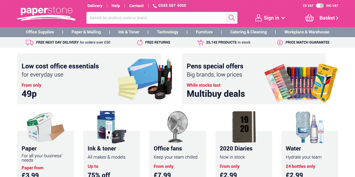
Paperstone is a UK-based office supply store in direct competition with larger chains like Staples. To increase their conversions, they added their competitor’s pricing directly below their own, as detailed in this case study.
If you’re confident that you can outperform your competitors price-wise, don’t be bashful.
For Paperstone, the move earned them a 10 percent conversion rate after split testing.

#3 VIADEO
Viadeo is a job recruitment service. The company helps businesses find talent. The problem? Their existing landing page wasn’t getting that across. So they added just two words to their landing page. The result? 30 percent more conversions.
Those words were: It’s free
Make sure that your landing pages are targeted to your target audience.
In this guide, we took a deep dive into landing pages: what they are, why you need them, and how you should build them. We hope you now have a stronger understanding of why the landing page is a crucial component of your funnel. Very few people build mega profitable landing pages in the first attempt. Building winning pages takes practice and a willingness to experiment. As noted, one of your biggest allies along the way is the A/B test, also known as split testing.
If you don’t experiment, you won’t be able to optimize.
Stick around for our next post in this series where we’ll give you concrete tips on overcoming the ad man’s nemesis: banner blindness. After all, having effective landing pages doesn’t mean much if people won’t click your ads—and if you can’t get people into your funnel, then you can’t sell to them.
