In this post we are going to some examples of innovative website designs that take UX very seriously. Of course, a list of innovative websites will date very quickly so we hope to update this as frequently as possible.
With the millions of creative websites on the Internet today, it’s getting harder and harder to stand out from the crowd. Any company that wishes to be exposed needs to have their very own website, and not just any website. It has to be creative and unique if it’s going to catch the attention of clients and the consumers. It also needs to represent the business and their brand well. That is why, companies spend a lot of time, effort and money into designing their own websites. The same applies to mobile app, page transitions and other user experiences on the internet.
Here is a list of 8 website designs that are innovative, creative and easy to navigate. From personal blogs to professional websites, they all breath a breathe of fresh air into the mundane and ordinary Internet landscape.
Lucia is a graphic designer and photographer who made a cute and fresh site to showcase her work. It’s a simple site that scrolls left and right with a few images of a cartoon version of Lucia. The site is great because the colors are relaxing to the eyes and the curves on the background images maintain a smooth transition from one section to the next. It’s a far cry from most personal sites that have a lot of graphics and a cluttered layout.
http://www.keystone-logistics.com/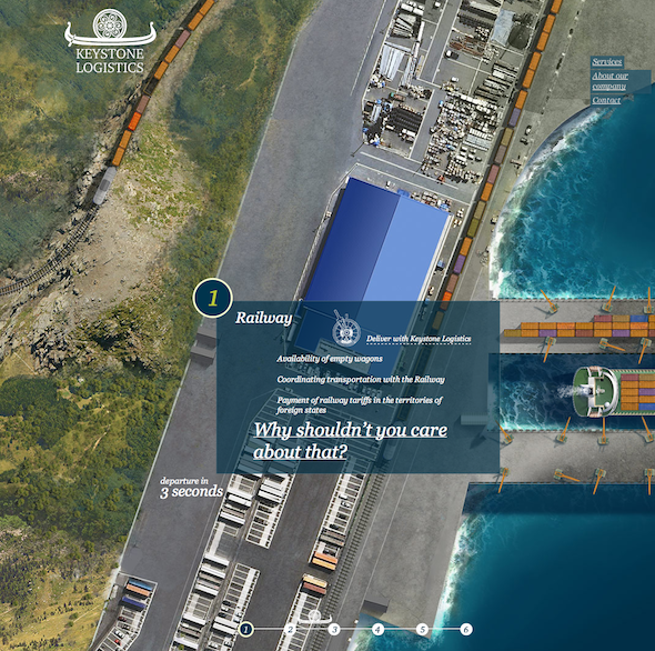
Keystone Logistics is a company that specializes in chartering, forwarding of cargo and other transportation services. The background seems to be a satellite image of roads and ships. It’s also very interactive, leading you from one image to the next as if you are moving through the water and the streets. The background changes from step 1 through 6, showing the visitor the different operations of the company. This gives their customers an overview of what their company can offer and how they can help them with their transportation needs.
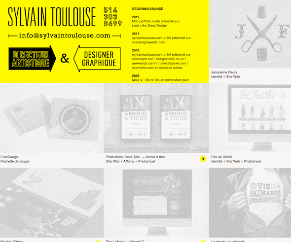
Sylvain Toulouse is a French graphic designer and art director. The website houses all his works. His portfolio is presented very neatly with each piece in a square area. They are arranged beside one another and are dimmed when the mouse isn’t hovering over it. It’s a clean and stylish way to present his work to potential clients. You can also toggle the language of the site from French to English with a click of a button.
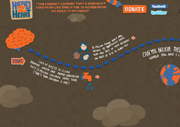
Head to Heart is a charitable website supporting the Gifts of Water and Street Grace causes. Again, you can scroll from left to right with navigational buttons on the bottom of the screen. All the information you would need about the website and the charities are all displayed. The website references a map to help the visitor go through all the sections of the website and learn all they need to about the various charities. The images are textured and look a lot like scrapbooks and collages.
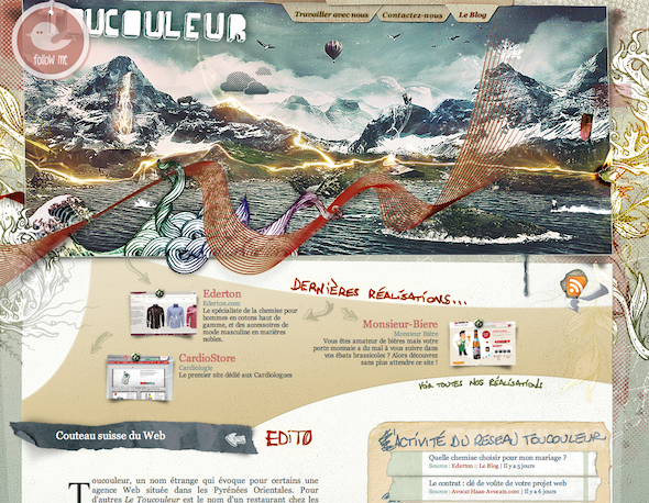
Toucouleur is a website that houses the portfolio of a French design company. Its most stunning feature is its amazing header image. The website itself is also very textured and uses earth tones to make it more appealing to the eye. Below the header is a textured layout using earth tones. There are elements of a traveler’s notebook that make the site more accessible to its visitors.
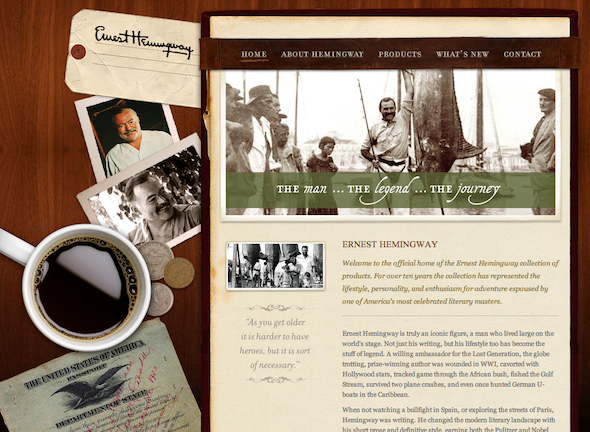
The Ernest Hemingway Collection website is the official home of the products inspired by the American writer. The site imitates what could have been the desk of the prolific novelist with a cup of coffee and some photos. The background is a rich wood photo that many desks have and lends to the overall aesthetic. You get to experience what it must have been like to be Ernest Hemingway and be a part of his life.
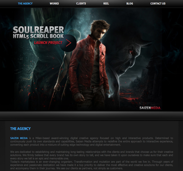
Saizen Media is a company that creates and develops websites for various clients. Their own site is very dark and futuristic. The Saizen Media site has an almost graphic novel feel to it. It’s very masculine, something that can be said about their clients as well. They make use of glossy images that help create the graphic novel feel. They proudly display their various works and clients by redirecting you to their websites.
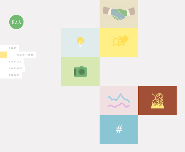
Bärnt & Ärnst is another design company that specializes in Photography, Social Media Marketing, Web Videos, etc. Their site is very minimalist, opting to use simple images as placeholders for their pages. A camera is used to redirect to their photography portfolio and a bird and book for a twitter application, for example. They use pastels and simple art to create a cool effect. They also have an interactive page where you can draw your own images.
« Putting the design puzzle together | The Allure Of Timeless Logos »
