When it comes to logo design, the value of typography can never be taken for granted. If the point of a logo is to communicate messages, there is no better way to do that than the use of letters and words. Since logos are all about aesthetics, it helps to choose the best lettering style for the design process.
There are many available options for the typography of a logo. But one needs to find the perfect logo design style for a brand when making a decision. Here are reasons a business can use as guidelines for choosing the best wordplay typography to create memorable logos:
Effective Branding
The choice of the right font must contribute positively to making a logo the visual representation of a business. It must be easily identifiable whether placed in huge billboards or small company souvenirs.
Communicating Messages
If it is true that a picture can paint a thousand words, then a logo is worth more. It embodies a business and therefore it will serve as the ambassador of its brand. The mere sight of a logo will send a message to people about the vision, mission, and ideals of a company. The right typography will help in this regard. A good choice of font will help avoid misinterpretation in people.
Adding Impact and Appeal
With so many competitors in an industry, a logo will help keep a business stand out among the rest. Apart from its function of representing a business, a logo will also help add visual impact and appeal to your brand. This helps as your edge in an otherwise crowded playing field. The right font can make a difference and initial-based logos.
The right typography will elevate the appeal and impact of any logo and not just text-based logos. It will help make its looks pleasing to the eyes. After all, no person will be attracted to a boring logo.
Unique Identification
The purpose of a brand is to make a business more noticeable among many. This is why a logo should always strive to be unique. The right choice of font will help make this possible. Distinct fonts will help a logo carve a niche in the eyes of people. This is crucial in building brand recognition.
Industry Affiliation
While a logo should strive to create separation from its rivals, it should not stray too far from the industry. Otherwise, people may be uncertain about what industry the business is pegged. The choice of typography from sans serif, cursive and decorative fonts will help tell the audience what kind of company the brand is all about.
Addressing the Target Audience
Branding is all about mixing and matching the right messages to attract the attention of the target audience. This is why an excellent logo must work to capture the fancy of its desired demographic. The right choice of typography is a significant factor in framing the perception of people about a logo.
Trust and Recognition
What it all boils down to in the creation of a logo is to gain the trust and recognition of people. When a logo is excellently designed with suitable typography, it will help establish the identity of a brand. When the company has started to make strides with its performance and quality of products and services, people will begin to trust and recognize its brand. The visual representation of this brand is the logo.
So design your logo right and work hard to make your business a success. Afterward, trust and recognition will easily follow. When your loyal customers see your logo, they know they are in good hands. This is particularly helpful because this will help spread the word about the quality of your brand.
Typography may seem like a trivial aspect of a logo. But it is pivotal in molding the impression about a brand. It is true that words in a logo can help create a good perception. But the way these words are written is equally important.
Case Study
What A Difference A Font Makes!
 The magazine industry is under attack. While magazines, newspapers, and other print periodicals were once a top means of entertainment in the United States, they have suffered massive losses as free entertainment on the internet has become the main way of passing time and getting information. Magazines all over the United States are responding by focusing on branding, developing new formats, and new logo designs for their publications.
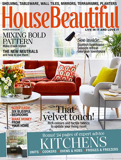
House Beautiful is the latest example of this trend. The magazine has traditionally used a rather simple logotype as a logo design. The type was tall and thin but rather plain, probably to prevent any stylistic clashes with the variety of homes and rooms published on the cover. The writing was published in colors that accented the cover to draw in reader interest at newsstands. This flexible color scheme will continue, but the font is changing as of this month’s issue. The writing has been pushed closer together and given curvy details that create a more distinctive feeling.
House Beautiful released a statement saying that the company feels its new logo is more youthful and feminine while also easier to read. However, I find it a little more difficult to read. Pushing the words together gives the text logo design a crowded feeling—like a cluttered room. The terminals definitely add interest and a youthful feeling, but they are almost girly. The fact that the terminals are placed only on certain letters keeps the logo from feeling too frilly, but it also makes them feel a little forced, especially in the word ‘House’. Putting the fancy detailing on the capital letters would probably resolve this issue.
One of the things that I really like about this logo design is that it has a general vintage feeling. However, it will still work well with a more modern cover because it has not gone full-on retro. It gives the magazine a more definite brand without limiting the editorial content. In short, while this logo definitely has a few issues, it is definitely an improvement and a much-needed update as well. The logo adds personality, while most magazine logo updates seem to be instead stripping it away.
The core problem in designing a magazine logo is that the magazine needs to appear to offer value. Americans are not afraid to pay for information, even if it is available for free, but the periodical needs to present a brand worth paying for. This logo design seems up to the task of building a House Beautiful brand among young homeowners.
With seven million readers, House Beautiful is one of the most successful American home décor magazines and also the longest continuously published name in its genre. However, even the most established business (or magazine) needs an occasional brand update. This new logo design adds character while maintaining simplicity and flexibility, which makes it a winner. It is a great design that is well-executed and will be instrumental in building a larger readership.
« Making Memorable Logos | Corporate vs Product Logo Design »

