From the time you get up in the morning and walk into your bathroom and till you switch off the TV and go to bed, you are constantly being exposed to and bombarded by hundreds of brands and logos. Increasingly the identity of a product or company is the only factor that distinguishes one from another in a sea of similar products or companies.
For example, if you walk into a supermarket and wanted to buy a bottled drink or mineral water. In the fluids section, you are likely to find at least 20 different brands of mineral water. I am talking about a medium to a large-sized supermarket. All of these brands of mineral water contain almost the same contents and mineral composition. Then why are they priced differently and why do you buy one particular brand and not another? Your decision to buy one particular brand among the 20 or so is largely based on which of the brands you perceive to be the better one. Now, ‘perceive’ is the keyword. 9 times out of 10 the price, taste or the bottle shape is a secondary consideration.
So companies, in a saturated market have to rely on their marketing campaigns to make people buy their products. And these marketing campaigns depend hugely on the image of their brand. The brand image starts with the company logo, the company colors and the effective marketing of these coupled with a catchy message determine the success of any marketing campaign. Of course, the budget and the product play a part too.
The Nike swoosh is not such a popular mark because of the millions that went into branding that mark into the general psyche.
Company brand mark – Why should you get one?
If you are a small company trying to establish yourself online or offline then the first thing that you introduce to potential customers is your logo. The effect your logo has on your potential customers or your website visitors will influence their buying decisions, to a certain extent. Of course, the quality of your service and customer service and reputation also have a major effect.
When meeting a prospective client, your business card speaks a lot about the type of company you are and the perceived quality of your service. A cheap looking card with a poorly done company logo might instantly create a feeling of distrust in the client. From then on it would be an uphill ride for you trying to sell them anything. For service-oriented businesses, it is more so important. You would not have any tangible products that you could promote to convince your customers. Your image is the only thing you could use to sway the buyer’s mood. Remember that a logo is not just a graphic!
A few years ago, it was sufficient to have your company name in text and you could go about your business. However now with an increasing number of players competing for the same target market, it is getting more difficult for companies to distinguish themselves. This is even more important for internet-based companies. Even brick and mortar companies have to pay attention when it comes to their logo. A homemade logo is not enough to compete against the bigger companies with a potentially unlimited marketing budget. The only way to succeed is to have a great pitch that would lead to conversions.
A good company mark should follow some basic guidelines.
When forming a company logo design it is important that all aspects remain consistent and are used widely. In-house graphic design and marketing departments should be supplied with a list of criteria that all designs are to follow. Corporations should ensure that the proper colors and fonts are used so that any promotional products that these businesses produce are achieved consistently. Many corporations are very strict with these guidelines and any variation in colors or fonts are taken very seriously. There have been in-house designers fired for using the wrong shade of blue on a project that represented the corporation. This is an example of how important it is to ensure consistency in your designs and products.
A company brand is often viewed in four different areas. These areas include corporate brand name, corporate designs, corporate communication, customer service, and corporate behavior. These areas are included in everything that a corporation is involved in. Corporate designs include uniforms and other supporting products that are produced by the corporation. Corporate communication includes commercials, print advertising, and public relations. These communication devices often involve the company logo in some way. The company logo may be used in the commercial or print advertising as a graphic or at the top of a press release letter. Corporate behavior includes the internal values and norms of the business. The company logo is often used on paper items that are produced by the business such as benefits information or orientation paperwork.
Basic Guidelines
Like other branches of creative art, logo designing at the basic level is the result of a creative vision. Even then all the arts from painting to sculpting follow certain guidelines and grammar. Logo designing is no exception.
An effective logo is the sum total of different images, shapes, typefaces, and colors. As a designer, you must know how to use all these elements in the right proportion to reflect the personality of a particular company. The logo is going to become a long-term asset for your company giving recognition to your brand and as such you have to follow the right process to get to the effectively communicate the message.
Here are a few standard rules to follow:
Industry-specific appearance
Since the logo is going to be the visual representation of your company, it needs to rightly reflect the type of industry that the company belongs to.
As for example, when you are designing a logo for a service sector company, the logo should typically come with a soft and smooth touch. They use rounded fonts to reflect the consumer-friendly orientation of the company.
The hi-tech logos, on the other hand, consist of straight lines and sharp and angular geometric shapes. This is meant to bring out the character of sharpness and innovation.
Consideration of the Usage
Whichever industries the logo may belong to, today’s logos are used in different places and for varied purposes. The purposes include building up the brand to ad campaigns to building up of a client base. As such, a good logo is one that is scalable and memorable. It must be visually attractive to a large spectrum of audience. With the growing importance of e-commerce, the logo must be savvy enough to fit perfectly in your e-commerce site. Thus you have to keep these usage criteria at the time of generating the logo.
Detailing in the designing
* The basic ingredients of all logos are more or less same; it is your power of detailing that gives distinction to a particular logo. While reviewing your logo before final deliverance, keep the following points in mind:
* Try to produce a simple graphical statement about the company’s positive attributes. The simple logos are not only memorable, but they are also easier to reproduce. This simple statement works best for earning recognition.
* Use the elements of logo such as color or typeface to convey your message. Make sure, the elements themselves don’t become so assertive that your message gets lost in them.
All through the design process, keep in mind that the logo is going to become a constant feature of the company for the next few decades. Use simple tools to interpret a strong message this is going to be the pillar of your success.
When companies are looking for someone to create logos and other graphic design projects, the first choice that presents itself is what type of graphic designer to hire. On one hand, there are many firms with long lists of credentials, employees, and satisfied clients. On the other hand are self-employed people who do freelancing from their home office. Both categories have a list of advantages and disadvantages when it comes to creating logos.
Advantages of Freelancers
Freelancers offer one key advantage, which is why this type of contractor has become more and more popular over the past few years. Freelancers have much lower overhead, which often translates into lower prices. Creating logos in one’s home is much cheaper than creating them in a professional logo studio that must be rented. When you choose a freelance worker, you may be getting the same product at a fraction of the price. Sometimes, however, the prices might be as much as or maybe more than a professional agency. This happens when you want to work with the top freelancers out there. They are quite talented and charge relative to that. An advantage paying a high premium to work with an A-class freelancer is that most of them work on one project at a time, so you get complete dedication and high quality of work that would be worth the investment.
Disadvantages of Freelancers
On the other hand, there are several disadvantages to freelancers. They usually come with fewer references and, often, less experience. This may mean lower quality. Also, they cannot usually handle extremely large projects because of the scale of their operations. It is very easy for a freelancer to become overloaded or have personal/family relates issues which might prevent them from sticking to deadlines. Because there is no one to pass work off to, the result may also be diminished quality. Also working with freelancers who do cannot communicate effectively in English could affect not only on the interpretation
A freelancer might also have no supervisor. This means no one checked their references and interviewed them for their position, no one is making sure they work in an ethical manner, and no one is checking the quality of their work. When creating logos, these disadvantages can have immense consequences for companies. This, however, does not apply to the A-class freelancers out there marking their mark.
Advantages of hiring professional firms
They have more employees than a freelancer, which means a broader skills set. It also means that there are likely to be experts on a variety of topics in the company. These firms can handle immense projects, and if a designer becomes sick or overloaded, there is always another pair of hands to take over creating logos for you. Most agencies have long lists of references as well as procedures for ensuring the quality of finished projects. Supervisors screen employees and help them maintain good working habits.
Disadvantages of hiring agencies
There are also disadvantages to agencies. They are often more expensive than freelancers because of the higher overhead. Some companies are less ethical than others, either not holding employees to very high standards of honesty and quality, or simply outsourcing their jobs to low-cost freelancers and pocketing the difference. However, it’s easy to tell which companies do this, because reputable agencies will have employees listed on their website as well as examples of high-quality work they have completed for other clients and most often than not would be registered with the local BBB or other such Authenticating organizations.
Custom Graphic Logo Designs
Web Design logos and graphic design logos offer flexibility to your website. They can be in a variety of formats including flash logos and other interactive medias. Anything that is interactive on a website will tend to draw your consumers back as people enjoy being able to interact with something on the Internet.
Your logo can move, flash, change colors and more. They are very unique and will add a new dimension to your website. Graphic design logos may also be a more affordable depending on how complicated you want them. A simple web design logo is easy for a graphic artist and you generally only need the design in one or two different file formats since the file is strictly for use on the Internet.
Professional graphic designers are also able to design web design logos that are friendly to Internet browsers. There is nothing worse than going to a website and waiting for the graphics to load. A graphic designer will help you to compress your graphic logos and other images so that they are browser friendly. Pictures that have large file sizes are not easy to load and can be a hassle for the web designer and user.
A web logo can also add a new element to your promotional products mix. If you are a business that functions outside of the Internet but you have a website you will benefit from the added functionality of your logo. You may have your existing sketch into a web design logo by a graphic artist. You will have the option of upgrading your Web logos and making it more attractive for use on the Internet.
Branding for a website should always incorporate the “dot com” part of the website name. If you are a business that is only online it is important that you stress the fact that you are an online only business. A business that exists outside of the Internet may use the “dot com” to emphasise that your services are available online and in real life. Most logos will incorporate this factor and it can be used very creatively.

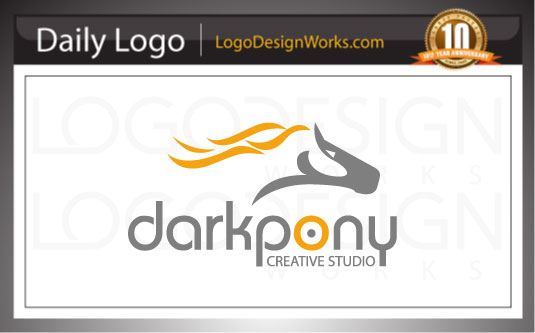
Client Name: Darkpony Creative Studio
Logo Category: Graphic Design Logos
Logo Type: Iconic Logos
Project Summary:
Innovative Web Solutions (Web Development, E-commerce, SEO, Web Applications etc.)
Target Market:
Industry (small to very large companies), Higher Education, Individuals and Public Sector.
Design Review:
As the name suggests, the client wanted an abstract looking, iconic and free flowing symbol of a pony, and that is what we provided him with. The icon is very brandable, and can standalone and still be recognised. We had to be careful not to create an association to equestrienne related services. To that end we made a free flowing icon of the pony with a hint of fire in it’s mane to indicate creativity and passion. The elements of the icon can then be used for various branding aspects such as on the website design, as watermark on the stationery design, on the brochure designs and other marketing materials.
The design also incorporates a bulls eye icon in the “O” of Pony to indicate that this company hits the mark when it comes to delivering design solutions to their customers. The client also suggested that the inspiration of the company name came from the “Dark Horse” phrase, which means “Someone who emerges to prominence; being previously little known”.
Creating animal and pets based logos is always challenging. Especially when the logo designer tries to create some thing unique and focused on the target market. Our logo designers take inspiration from reference photos and other context sensitive marketing information available online.

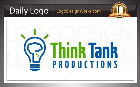
Client Name: Think Tank Productions
Client Location: Palm harbor, Florida 34683
Project Summary:
The client is involved in multiple disciplines of multimedia. The client gave us the creative freedom on this project, but did not want us to use “tanks”. The idea we came up with, depicts the idea bulb with the glowing filament made up of a thinking cloud. Creative thinking is at the core of the brightest ideas.
Target Market:
They work with small businesses who need graphic design, web design and SEO services.
Design Review:
The client wanted a simple yet powerful idea to represent what they do and their core skill set. The client was all about ideas. Ideas for their customers and the implementation of those ideas in terms of design.
We created a number of logo concepts for this client which included clouds, thought bubbles, rays and more. The client liked the light bulb and cloud concept.

