Are you starting a new medical practice or pharmaceutical company?
Are you thinking about making a logo or having a logo design created by a professional? Did you know that many medical logos contain derivative, over-used design elements? Worse, these design elements are so common that today’s consumers simply ignore them. To the average consumer, one medical practice looks much like any other.
But competition in the health care space is rising, and if you want to stand out, you’ll need to create a strong brand. Part of building a brand that will stand the test of time is creating a logo that consumers will remember.
To do that, you’ll need to know what these cliched design elements are so you can avoid them at all costs—or else use them with intention, putting meaningful spins on them.
It’s time to create something new. Read on.

Why Differentiation is Key
Consumers have a choice, and because they do, branding is important in the medical field, even vital. Branding is the process of differentiating your medical practice from all others in your area. Branding includes your logo but also involves the look and feel of your physical office, your staff, your tools and any other detail that speaks about who you are and what you stand for.
Think about it: why should a consumer pick you over the competition?
After all, virtually all practices retain the services of board-certified physicians. Virtually all practices follow the oft-touted ‘best practices’ of medical care. The majority of physicians working at clinics are, at the very least, competent.
Whoopty do.
Though the benefit of competition in health care is debated, there’s no denying that such competition is on the rise. Reliance on referrals from other medical professionals may be akin to resting on your laurels. But proactive brand-building can provide you with a safeguard your competitors may disregard.
There are several ways to differentiate yourself from your competitors, which we will cover momentarily, but one of the most important may be to create a high-quality, original logo, as this is the cornerstone of your branding efforts.
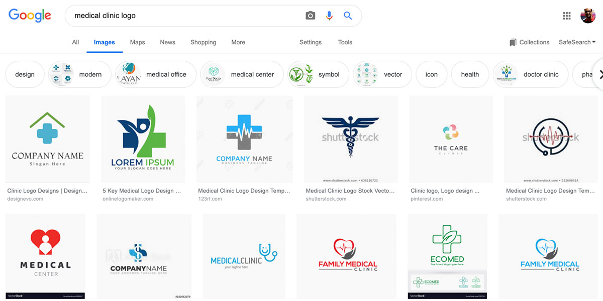
If you do a Google image search right now for ‘medical clinic logo,’ you will be presented with dozens of medical logos that look more or less the same. If establishing a strong brand is important to you, you’ll need to do better than these examples.

How to Differentiate Your Medical Brand
Before we move on to how to medical logo tropes to avoid, let’s look at several ways you can further differentiate your medical practice once you have that stellar logo.
#1 Embrace Modern Technology
More and more consumers are comfortable with communication and scheduling online. For instance, if you’re running late, use all the means at your disposal to let the patient know. Do they have email? Contact them via phone and email. They might miss your call, but they may see your email show up on their desktop PC or smartphone.
Contact patients via email about specials and other issues if they’ve indicated that they’re comfortable with this form of information. You could also create a portal on your own website with which patients can check and confirm appointments. Rigorously train front desk staff on how to use these tools.
#2 Focus on Customer Service
In a world where doctors are pressured to see a different patient every fifteen minutes or so, customer service is more important than ever. While you can’t avoid coming off as a bit distant all the time, you can ensure that your front desk staff is well trained in customer service.
Desk staff should appear courteous at all times—they must be capable of dealing with hot-headed patients without folding under the pressure.
#3 Work with Patients, Not Just on Them
In the medical field, there is a tendency to view patients as malfunctioning machines that must be fixed as quickly and as efficiently as possible. Certainly, patients must be seen to in an efficient manner, but it’s the practice that doesn’t lose sight of the human element that wins loyalty.
By embracing these three tenets of a strong medical practice from the get-go, you’ll find it much easier to build your brand.

So, What’s in a Logo?
Think of any company or brand you care about. You can recognize that the company by its logo, even if the company’s name isn’t present, right? Or maybe you can guess the type of business a company is just from its logo. This is the power of symbols. They’re a succinct way of communicating information about a company.
Your medical logo is especially useful for crafting intentional public perception. Without a doubt, your logo is one of the most important branding investments you can make. Here are a few examples.
Here’s why it matters:
- It’s the ‘face’ of your company. Often, it’s the first thing a potential customer sees. Remember: consumers form an impression about your business within the first few seconds. A well-designed logo conveys the notion that you’re professional, qualified and trustworthy.
- It’s more than an image. Your logo serves as the foundation for all of your branding efforts. Everything else, from letterhead, fonts and even your website take cues from your logo.
Other Factors to Consider
As you work on brand strategy for your medical practice, there are a few things you should keep in mind:
- A stellar logo is a balancing act: it should be simple enough to look good in multiple media formats, but at the same time, it should be distinctive enough so that people recognize it instantly.
- It should stay away from the cliched, stereotypical, or over-used design elements of its industry—more on that in a bit.
- A good logo is memorable.
- Your logo should convey your values.
Consider the McDonald’s logo. It’s simple and memorable, yet distinctive. Once you see it, you forever associate it with the McDonald’s chain of fast food restaurants. Nike is another good example. Their mark is simple yet distinctive.
Value
Many medical practices attempt to convey values of trustworthiness, gentle care, and understanding. But they do so by using the same symbols that everyone else in the space is using, namely the caduceus and the staff of Asclepius. There are a few problems with this approach:
- Because consumers have been exposed to these symbols so often, these symbols have lost a great deal of meaning.
- Therefore, using them in your logo or branding materials only tells consumers that you’re in the medical field, it doesn’t tell them anything about you. It doesn’t differentiate you at all from everyone else in the space.
- By featuring these elements heavily in your branding, you lose the opportunity to create something impactful.

A Deeper Look: The Caduceus & The Staff of Asclepius
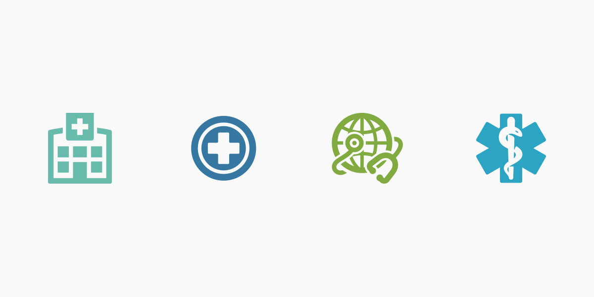
The image of serpents wrapped around a staff is instantly recognizable to anyone in the medical field. But it’s instantly recognizable to patients, as well. You can find this symbol incorporated into the branding of pharmaceutical manufacturers, hospitals and clinics.
The winged version of this ubiquitous symbol is known as a caduceus. In the caduceus, twin snakes wrapped around a winged staff. This staff is representative of the staff carried by the Olympian god Hermes, who was the primary messenger between the gods and mortals in Greek mythology—hence the wings, to indicate speed.
According to mythology, the staff was given to him by Apollo, the god of healing. The legend goes on to say that Hermes used the staff to separate two mighty fighting serpents. The snakes then coiled around his staff and remained there, in balance.
Incidentally, Hermes was also the patron of travelers. In ancient times, when the fastest mode of travel available was a swift horse or pony—but a donkey-drawn cart was more likely—the world seemed much larger. Doctors, in particular, felt this effect as they traveled from town to town.
An even earlier version of the caduceus is the staff of Asclepius. The emblem has no wings and only one snake, but the general idea is retained: we see a serpent coiled around a staff. Some have theorized that the use of the snake coiled around a staff represents man’s dominance over nature, and, by extension, over disease.
Originally, Apothecaries and early doctors used these symbols so that folks who couldn’t read could find them. But today, these emblems are extremely common in medical logos and branding, and, consequently, consumers have grown blind to them.
The bottom line: by using them as the primary iconography in your branding, you’ll be instantly recognizable as a medical practice, but that’s about it. You won’t stand out in any other meaningful way. Of course, you can use these symbols if you wish. Just know that you may find it harder to differentiate yourself from your competition.

The Scourge of Generic Logos
Have you ever seen a logo and felt sure you’d seen it somewhere else? You’ve probably just encountered a generic logo. Some of these cookie-cutter logos come from logo contest sites, where freelancers compete for a cash prize. Others are the result of clipart packages. Whatever the case, generic logos contain tired design elements, and consumers ignore them.
Like the stereotypical medical logo design elements mentioned above, you’ll either want to steer clear of these or else put a fresh spin on them. An unoriginal logo may lead consumers to the conclusion that your brand is also unoriginal. If you’re like everyone else in the space, why should they come to you?
A compelling logo design is the first step toward standing out from the competition in an increasingly competitive marketplace.
Examples of Over-Used Design Elements to Avoid
Not all of these are common in medical logos, but they’re still helpful to know about. They’ll give you a better idea of the types of generic elements you’ll want to avoid overall.
#1 A Globe
The globe represents worldliness and conveys a sense of travel and adventure. Unfortunately, it’s used to death.
#2 The V-Man
The V-Man is a gender-neutral humanoid that shows up in logos across all industries. It’s a generic mark meant to convey inclusiveness. Often, the V-Man has his ‘arms’ held up high in excitement. The problem with the V-Man is that he’s wholly unoriginal and appears in thousands, if not hundreds of thousands, of logos.
#3 The Graph
The simple line that graph that goes up and to the right is meant to convey growth and ongoing success. Unfortunately, it’s so common that people just tune it out. It doesn’t mean anything.
#4 The Meaningless Wordmark
A wordmark, letter mark or another symbol can be a succinct, elegant way to brand yourself, but it should mean something. A wordmark in a common, generic font won’t set you apart from your competition.
Generic Logo Elements in Other Industries
Let’s briefly examine over-used design elements in other industries.
#1 Accounting
Fintech industry logos tend to feature the company’s initials coupled with a geometric shape of some sort. These logos are simple but are often forgettable. They rarely speak to any value other than money accumulation, and consequently, they often feature gold and silver as main color elements.
#2 Real Estate
As you might expect, the real estate industry is replete with logos that feature houses, skyscrapers, and other building elements. Again, the issue here is that all these logos get muddied in the customer’s mind, rendering them fairly useless.
#3 Internet Technology
Technology companies tend to use images that convey connectivity, such as globes, wires, towers, etc. The irony is that many of these companies own amazing, unique technologies, yet their logos all look so similar.
#4 Retail
Logos for retail, whether brick and mortar or online, typically feature dollar signs, price tags or carts.
#5 Automotive
Generic automotive logos tend to feature a ‘check engine light’ icon, abstract car shapes or icons to indicate speed, such as wings or lightning bolts.
#Dental
Generic dental logos, unsurprisingly, tend to contain clipart of teeth. You may also see generic dental logos featuring two V-Men forming the rough shape of a tooth by standing back to back and linking arms.

Google Broke the Mold
It would have been tempting for Google—which started life as BackRub if you can believe it—to fall into this trope. At the time, Google was the most advanced search engine on Earth, blowing anything else out of the water, by far. Its innovative backlink technology gave users better results than did other search engines.
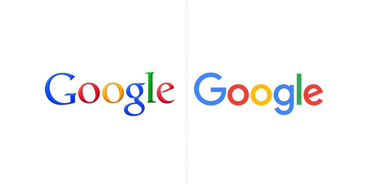
Using a globe as the centerpiece of their logo, symbolizing connectivity around the world, may have seemed an intuitive choice. Instead, founders Larry Page and Sergey Brin wanted something more playful and original. The result is the original Google logo by Ruth Kedar, which features the custom typeface, Catull.
What’s more, according to designer Ruth Kedar, she chose to make the “L” in the Google logo green because “Google doesn’t follow the rules.”
You see, the first color in the logo is blue, followed by red, yellow and blue again. So the eye expects the “L” to be red. Instead, Kedar subverted expectations by making it green.
This is a stellar example of a logo conveying the company’s values, even if subtly.

Before Having a Logo Made: Examine These 5 Points
When you go to create your logo, you’ll want to keep the five elements of brand strategy in mind. These are:
- Target audience
- Brand promise
- Brand perception
- Brand voice
- Brand Values
Examining these points will help you home in on what truly matters to you, and that will, in turn, show up in your logo. Let’s look at them one at a time.
#1 Target Audience
In a B2C operation, your target audience is the people who are most likely to buy your product. While people historically haven’t had much choice when it comes to a health care provider, there is pressure worldwide to change this. Increasing competition in the health care space may indicate the need to target specific demographics.
For instance, earlier in this post, we mentioned ways that a new medical practice could stand out. One of them was to stay on top of communications technology. Doing so could be a great way to target millennials.
Knowing who you want to serve is the first step in creating a strong brand.
#2 Brand Promise
When you tell your target audience, through advertising, website copy or other materials, what you have to offer them, you’re making your brand promise. It’s part of what differentiates you from the pack, and it’s why they would choose you over someone else.
#3 Brand Perception
Brand perception is, simply, how people see you right now. One way to gather this information is to survey your current customers at some point after they’ve engaged with you or your team. Some patients are happy to provide feedback, but you may want to offer a small incentive to encourage as much engagement as possible.
Once you have this information, compare the reality with your ideal brand perception.
#4 Brand Voice
Brand voice encompasses all marketing and PR materials. It is your personality. Are you serious, or do you strike a lighter tone? Your answer will depend in part on your target audience, of course. Whatever the answer, you want to be consistent over time.
#5 Brand Values
Finally, what do you stand for? What guides your company decision-making? What brand core values do you seek to embody?
With these elements of the brand in mind, you’ll be in a much better position to commission a logo that can serve you well for decades to come. Now, you can more easily communicate with the designer about who you are and what you stand for.
Final Considerations
There are a few other over-used medical design elements you’ll want to steer clear of unless you’re confident that you or your designer can put a new spin on them. These are:
- Pills or pill boxes
- Microscopes
- A stethoscope
- The cross
- The Heart symbol, either as stand-alone, supported by two hands or interlocked with a second heart symbol
- An EKG chart
- Mortar and pestle
However, there are two aspects of logo design where you may want to stick with what’s come before: fonts and colors. Unlike graphics, which can become stale over time, fonts and colors have more subtle effects on psychology that consumers don’t seem to grow resistant to.
The Use of Fonts
The font you choose says a lot about you. Here, it may be wise to color within the lines, so to speak. No one can argue that a medical logo featuring Comic Sans is going to win the confidence of many potential customers, so it may be best to stick with a tried-and-true font like:
- Helvetica
- Verdana
- Geneva
- Calibri
The font you choose should be easily legible and appealing to the eye.
Colors
Your logo should contain ideally 2-3 colors. If you use any more, and you risk muddying your message. However, it’s important to note that color has a profound psychological impact on most people. Imagine, if you will, if the McDonald’s golden arches were, say, blue. Or green. Not exactly very stimulating, is it? But the brand’s primary colors are actually red and yellow. Have you ever thought of why that is?
The color red is stimulating.
It is said to stimulate appetite, and it attracts attention. Meanwhile, yellow triggers feelings of happiness.
Burger King also uses red and yellow in the center of their logo, but they outline this with a blue line. The blue line is neutral and encourages the eye to the center, where the words, ‘Burger King,’ are featured prominently.
In the medical field, the most common colors used for logos are blue, red and green.
#1 Blue
Blue is said to represent faith, trust, heaven, and loyalty. Being a darker color, it is soothing to the eye.
#2 Green
Green is representative of nature, rejuvenation, energy, and growth.
#3 Red
Red represents love, passion, desire, courage, confidence, and determination.
Varying from these colors may be a bit risky. Yellow is overstimulating. Orange, even more so. Purple conveys a sense of wealth, but it’s also associated with gagging, lack of oxygen, etc.
I hope this concise guide has helped on your branding journey. Have you seen any generic medical logos lately? Let me know in the comments section below!

