Successful logos endure the test of time. So, how to keep your logo young? The best logos have been used by big businesses to represent their brands for decades and counting. The secret is not akin to rocket science at all. It all amounts to an appreciation of aesthetics, common sense, and even a touch of simplicity. There should also be enough foresight to see how a logo will evolve a few years down the road. Here is a study of 597 logos conducted by the Harvard Business Review that shows the most effective logos.
When a logo design is not working out as planned, here are a few factors to consider to keep your logo young.
Case Study: Check out this wedding photography logo design we created for one of our clients which takes into account the target audience and how they would perceive the brand. We also created a slick new website for this client which enhanced the visual identity even more. This resulted in the client presenting their brand as a premium service.
Pay Attention to the Target Market
An excellent logo design should be engaging and entertaining especially for its intended audience. It is best for a logo to avoid showing a literal brand meaning in order to tickle the imagination of people. On the other hand, abstraction should be kept under control. The meaning of a logo should still be understandable and identifiable to the target audience.
Often, especially these days, communicating the right message via the logo is taking a back seat to aesthetics and “coolness”. The target audience is often ignored when it comes to logos created by non-professionals.
Pay attention to the target audience and the message you want to communicate. However, do not try and overload the logo with too many layers of meaning and message. Try and keep it to a maximum of two messages or meanings.
To achieve this, start with storylines instead of simple graphic or visual ideas. Let the stories lead the way to visuals.
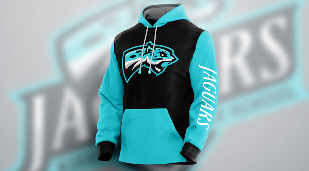
Case Study: Check out this high school mascot logo that we created for one of our clients. The power of this mascot logo comes in the application of this logo on different touchpoints. The logo has to be crisp and clean everywhere and this can only happen if your logo was created in vector format rather than a raster format like Photoshop of such software.
Use Vectors Instead of Raster Graphics
There are many technologies that can be used on logos now such as complex 3D rendering and various illustrations. However, for longevity, a vector-based logo design will provide better flexibility and balance. Vectors give logos the benefit of consistent resolutions no matter the size range. More importantly, complex treatments such as 3D effects can still be achieved using the canter effect of vectors.
Again, non-professionals tend to create logos in Photoshop or in other words a raster format. This may not seem to have a huge impact in the beginning to the brand owner but down the line issues would crop up when files are requested by the sign maker, the embroidery company, or other such vendors.
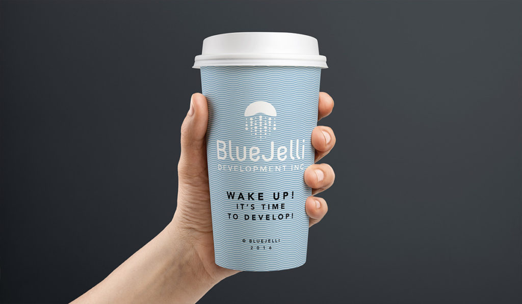
Case Study: Check out this mobile app development logo design that we created for one of our clients and you can see the kind of flexibility this design has. The icon can be used independently as well as part of an official brand pattern. The brand name text can also be used by itself and it is still recognizable.
Adaptability and Flexibility
Wise men have noted that the only permanent thing today is change. A logo should be open for redesigns after a few years. Market trends change and may give rise to opportunities to tinker with a logo design. Thus it is important that a logo has enough flexibility to adapt to any situation. It must not be literal or specific so that it can be easily adjusted in the future.
Icons are the preferred choice for logos of small businesses and even for advocacy groups. An iconic logo can stand alone in many situations without the need for an accompanying tagline.
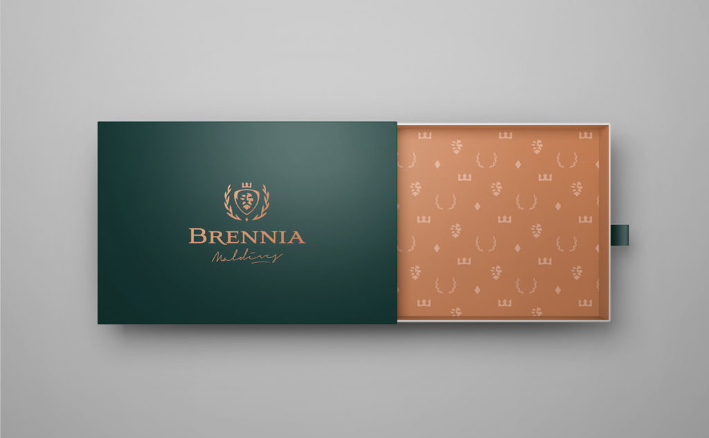
Case Study: Check out this super memorable logo design we created for our client, a Maldives resort brand identity project that was derived from a robust brand strategy that we started with and positioned the client to literally go into the Blue Ocean! This logo is unique and creates a superb brand recall.
Making it Memorable and Unique
For a logo to last for years, it has to be memorable. Even if you have to refresh your brand, it needs to appeal to the undependable memories of people so that it can be recalled easily. Typically, recognizable shapes and design elements can contribute to the appeal of a logo design.
If a logo is memorable and identifiable, it can easily stand out in an industry where the competition is tough. Before you finalize a logo design, make sure to research the industry and other competitors to make sure the logo design is unique. Apart from aesthetic considerations, this also avoids copyright infringement problems down the road.
In fact, I would recommend that you invest in trademarking your logo and brand name. In my many years at the agency, I have seen countless stories of grief from clients who approach us to create a new brand name and logo because they were in trademark litigation resulting in paying for and using logos that infringe on other trademarks.
A logo should not only be memorable; it must be effective as well. People must think about the products or services offered by the business logo upon first glance. The logo should be related and relevant.
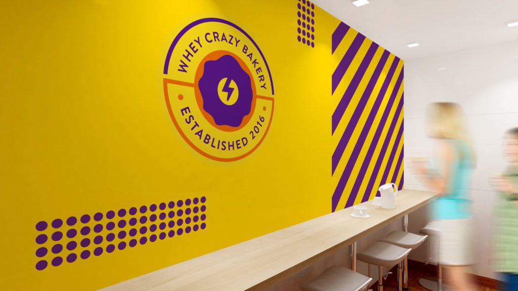
Case Study: Check out this superb protein bakery brand identity we created for one of our clients where we used color to effectively communicate the message of uniqueness and power to the target audience.
The Effect of Colors
Colors can affect a logo more than just adding style and appeal to its design. Psychologists have noted that colors can inspire feelings and perceptions in people. While the interpretations of colors vary depending on age, gender, and even culture, the value of colors should be an important consideration for the longevity of a logo.
The rule of thumb is to choose a single color or to pair it with only two to three complementary colors. This is to maintain a level of coherence for a logo. Google is the exception because the motif of their logo is a rainbow. Too many colors can be expensive when it comes to reproducing the logo. Read this comprehensive branding color theory article.
Coherence in Design
A logo is meant to establish familiarity and identification for a business or advocacy. It is important for a logo to maintain a consistent image wherever it is used. For longevity, a logo must have a balance between simplicity and innovation. It must also work well in all mediums especially in black and white and in small prints. Coherence in logo design will go a long way in establishing an identity for a brand.

