What is creative user interaction design?
User Interaction design is the practice of designing interactive digital products, environments, systems, and services that create meaningful relationships between people and the products and services that they use.
Interaction design is often abbreviated as iXD or iXD design.
There could be some confusion between the definitions of user experience design (UX) and interaction design (iXD). The primary difference is that user experience design can include all interfaces that users face in a given system while ID deals with specific interactions between users and a screen.
So while user experience design might look at a button on a website and design it for best visibility and ease of use, ID goes beyond that and figure out the behavior of the user and what happens to that behavior when they interact with the button or even before.
Interaction design specialists should consider the following questions when designing interactions on websites, applications, or other touchpoints:
- Define How Users Can Interact with the Interface – this includes things such as what users can do with direct actions such as with a mouse, finger, or stylus as well as indirect commands such as keyboard shortcuts.
- Give Users Clues about Behavior before Actions are Taken – utilizing colors, labels, layout, and other tools, give users clues about what is expected of them or what will happen once they take action. If this fails users hesitate and will not take action. This is a common issue with low conversion rates on many websites.
- Anticipate and Mitigate Errors – anticipating errors and putting constraints in place to prevent such user errors is critical to maximizing user experience. Mitigating errors through helpful and clear messages leads to successful interactions.
- Consider System Feedback and Response Time – what happens when a user takes action? How does the system let the user know what it is doing and what is going to happen next? And how long does the response take? You can consider response times at four levels: immediate (less than 0.1 seconds), stammer (0.1-1 second), interruption (1-10 seconds), and disruption (more than 10 seconds)
- Strategically Think about Each Element – consider how each element reacts to interaction. Are the buttons the right size? Are the menus placed in the most intuitive way? Are you following standards and only departing from them if it makes sense?
- Simplify for Learnability – one of the most common pitfalls of user experience on websites or applications is that users are left to untangle the complexity of the system. Simplify the system to an extent where user interaction is seamless.
Read more about these questions here.
Here are a few examples of effective interaction design strategies.
Emotional storytelling
Interaction design is a great place to tell your brand story. You can use the interaction with your website or application as a portal into creating an emotional connection with your audience and help them fall in love with your brand.
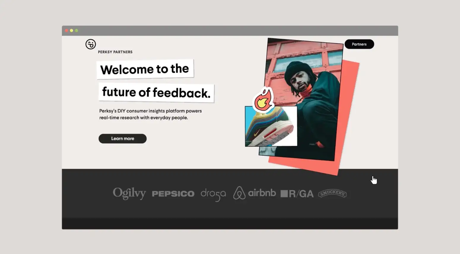
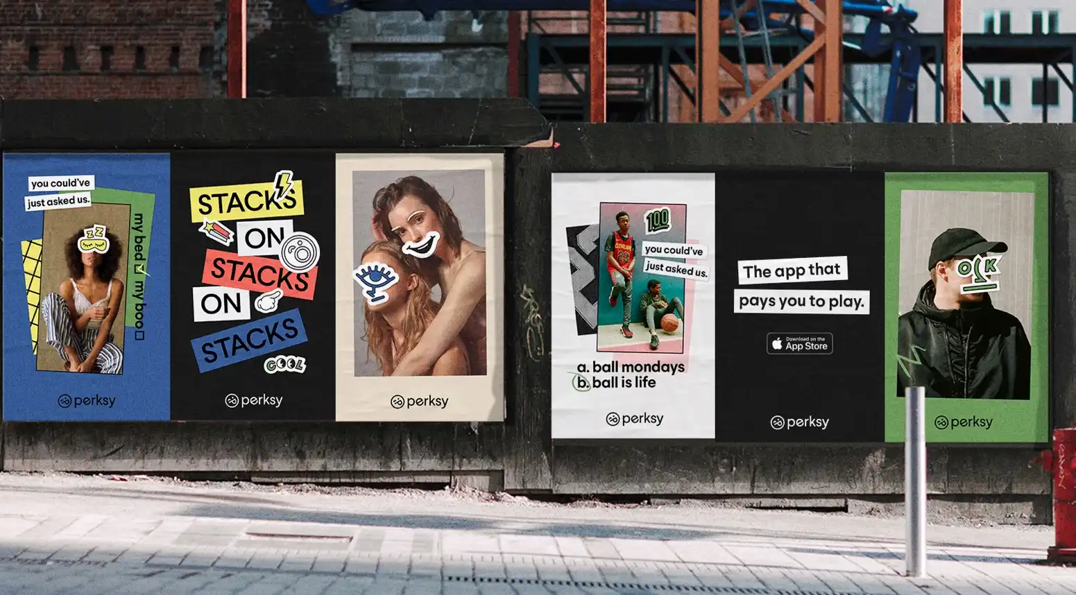
In the example below, Persky created a goal-driven design that extended the emotional icon of their primary identity into a system where every visual element can be stacked to create digital and physical moments that tell the unique stories behind every user. The result is a set of stickers that are both physical as well as digital and work well as unique touchpoints into their application.
Persky is a next-generation consumer insights platform powers real-time research with everyday people through contextual, in-the-moment mobile research.

In-flight Interaction Redesigned
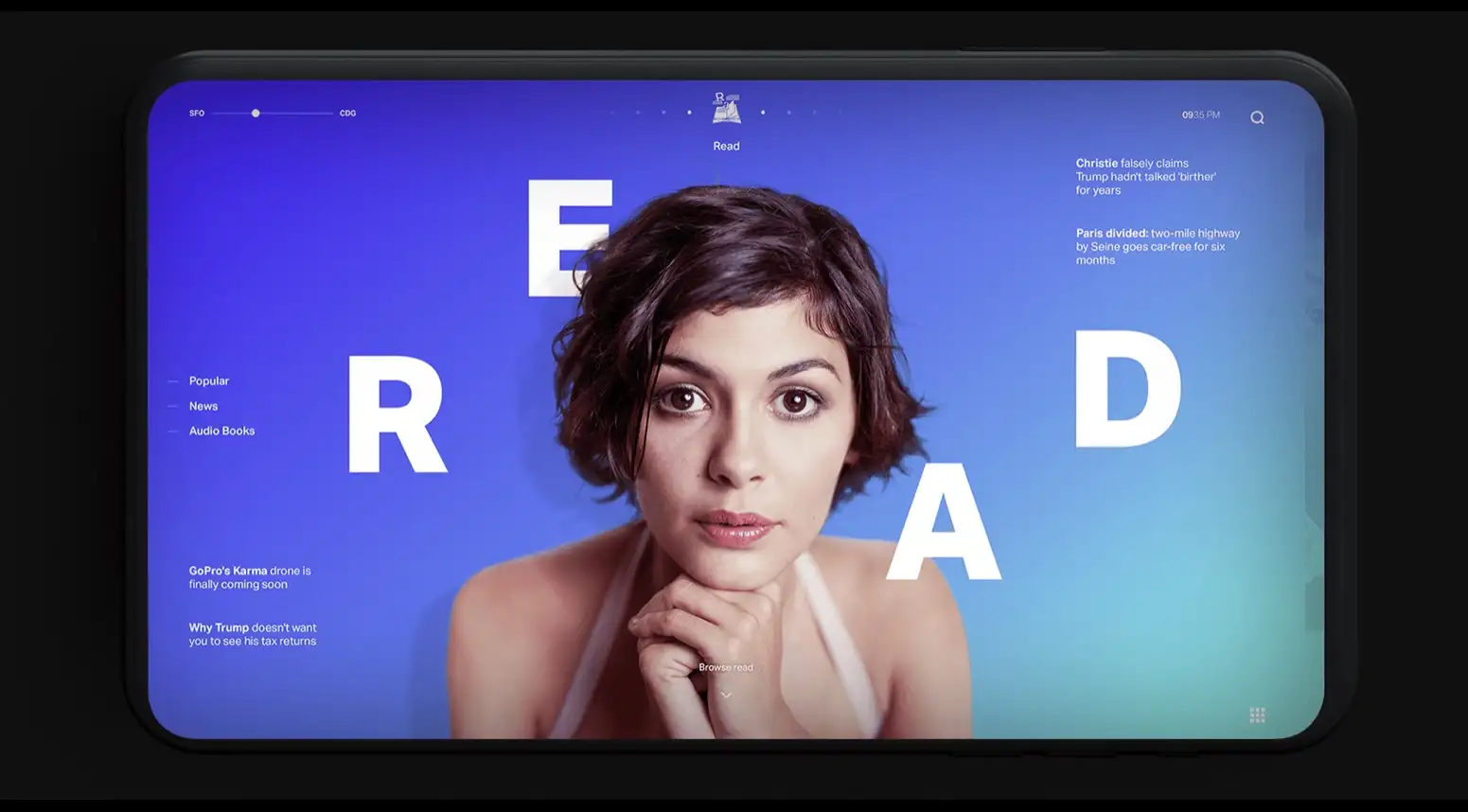
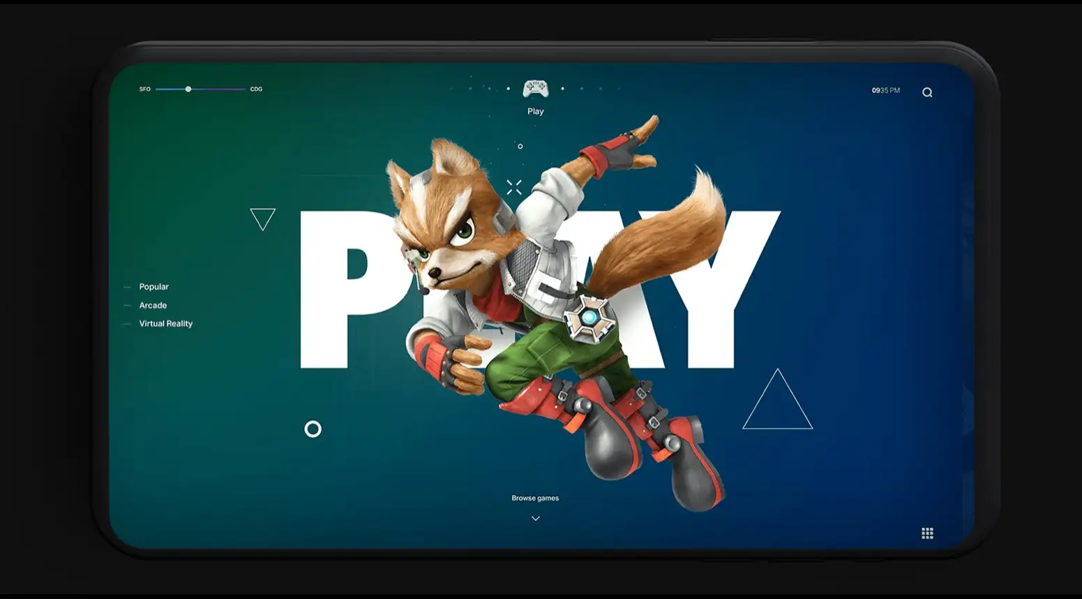
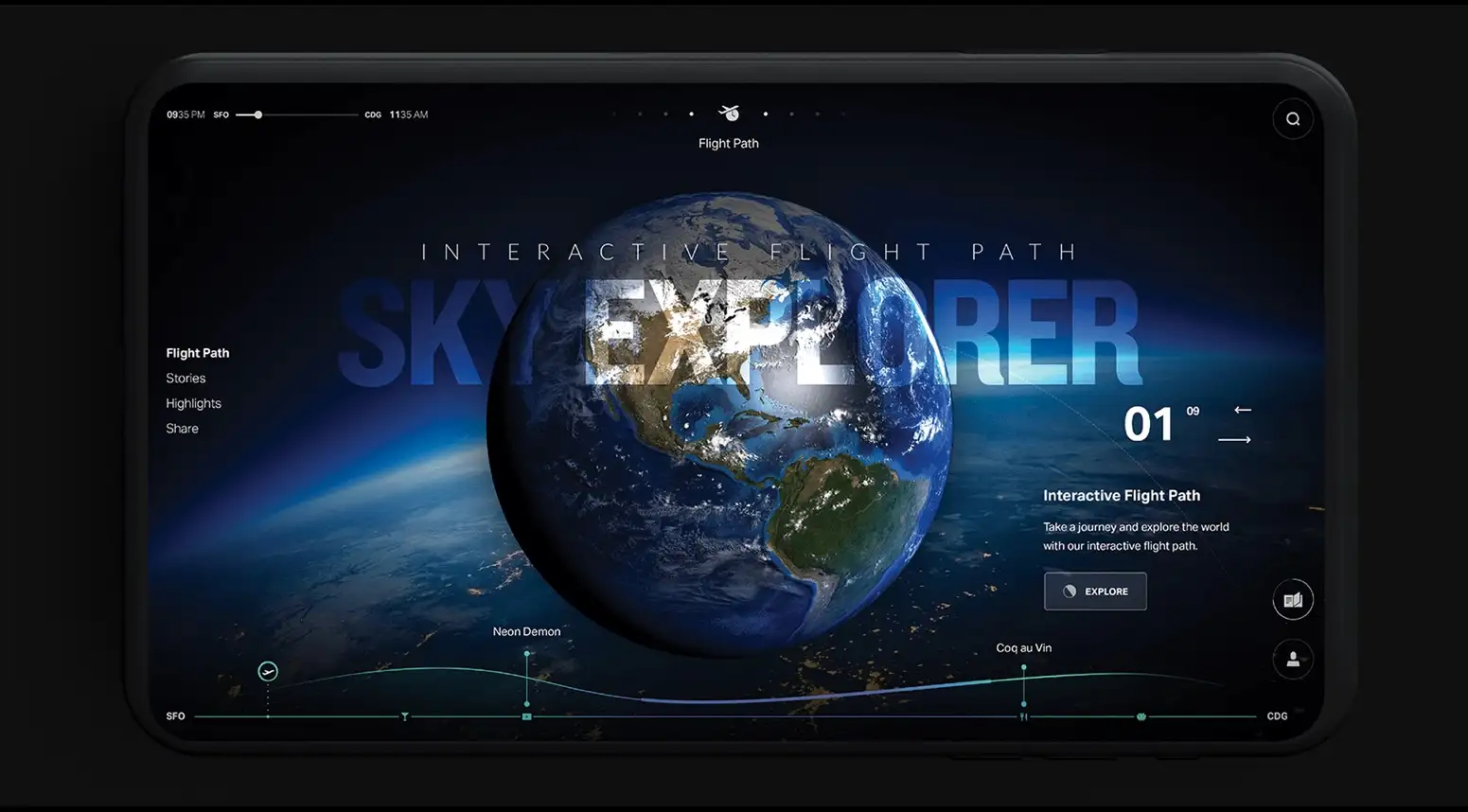
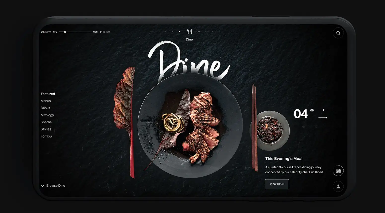
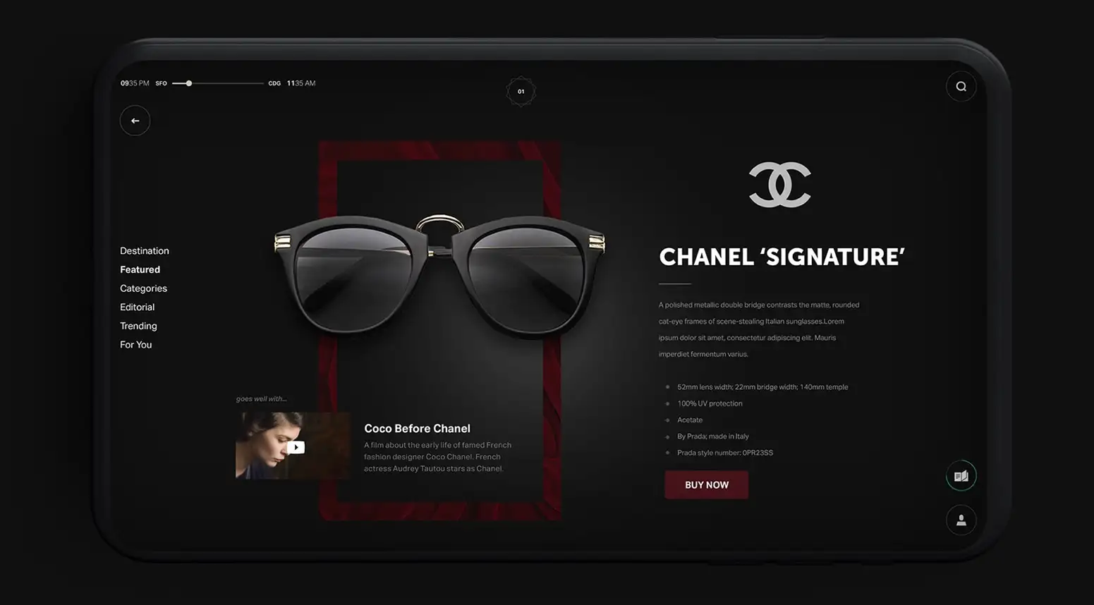
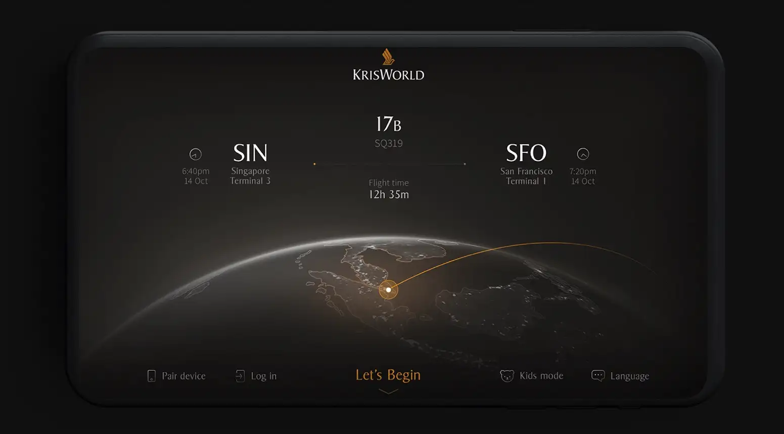
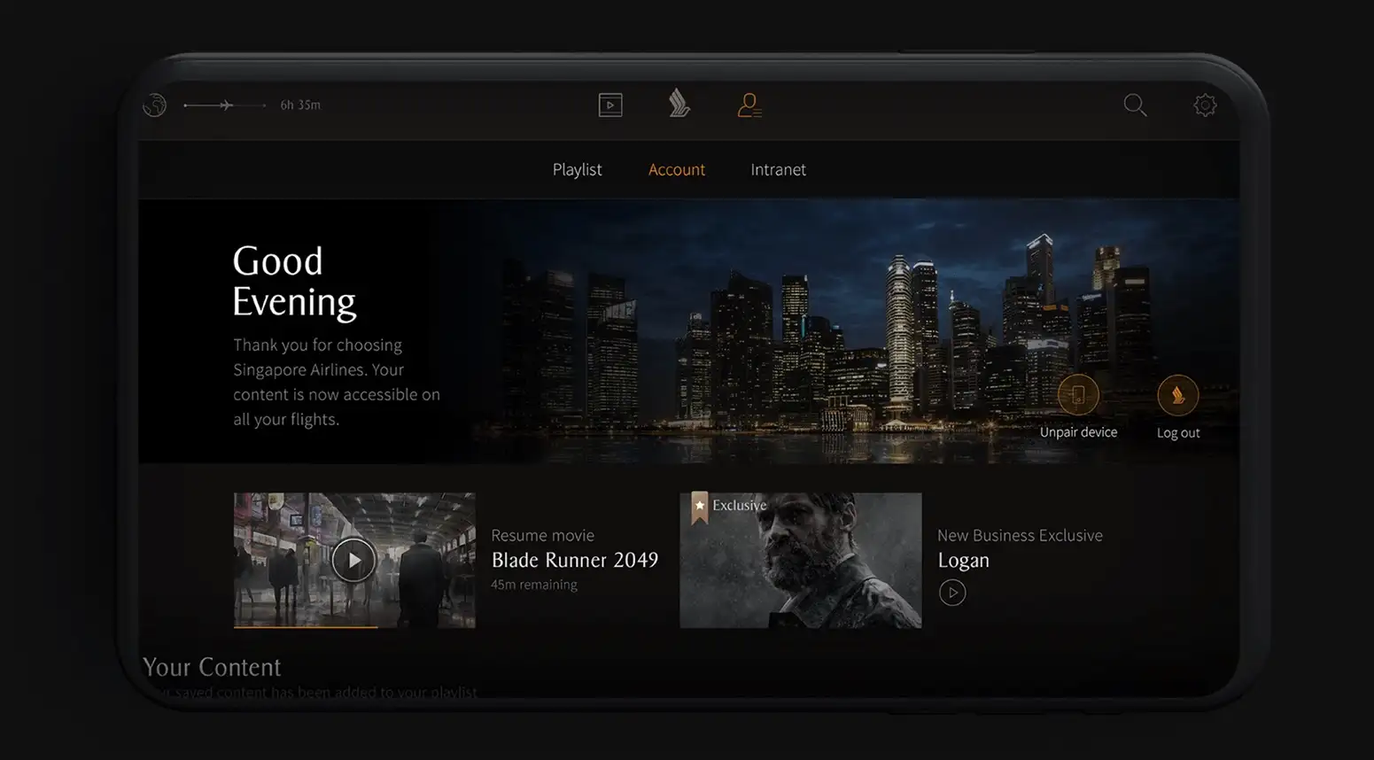
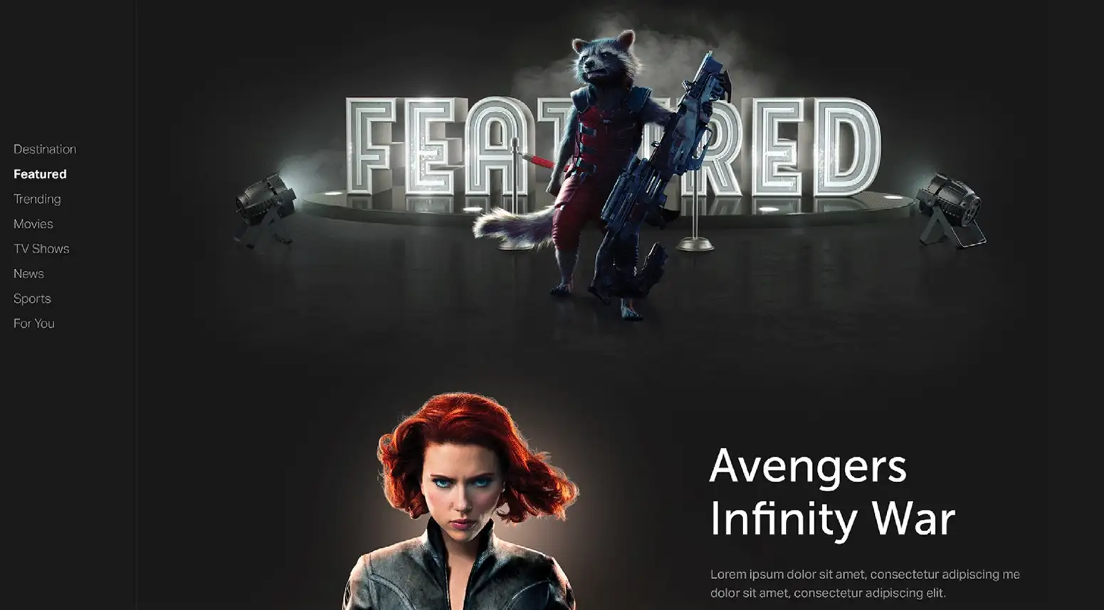
One of my pet peeves is the horrendous design of the in-flight entertainment screen. Everything about the in-flight experience of entertainment and the screen is wrong. From the aged and blurry screens to the 1990s-looking screen interface, the lag time of on-screen interactions with the navigation controller and in-flight entertainment interaction is due for a major re-design, and here it is.
Below you see some re-designed screens and visual language created for in-flight entertainment that brings flying into the realm of Tesla user experience. This is a lovely project, from the stunning graphics to the beautiful interaction design of the dining menu to the flight path screen!
Website Like Mobile App Interaction Design
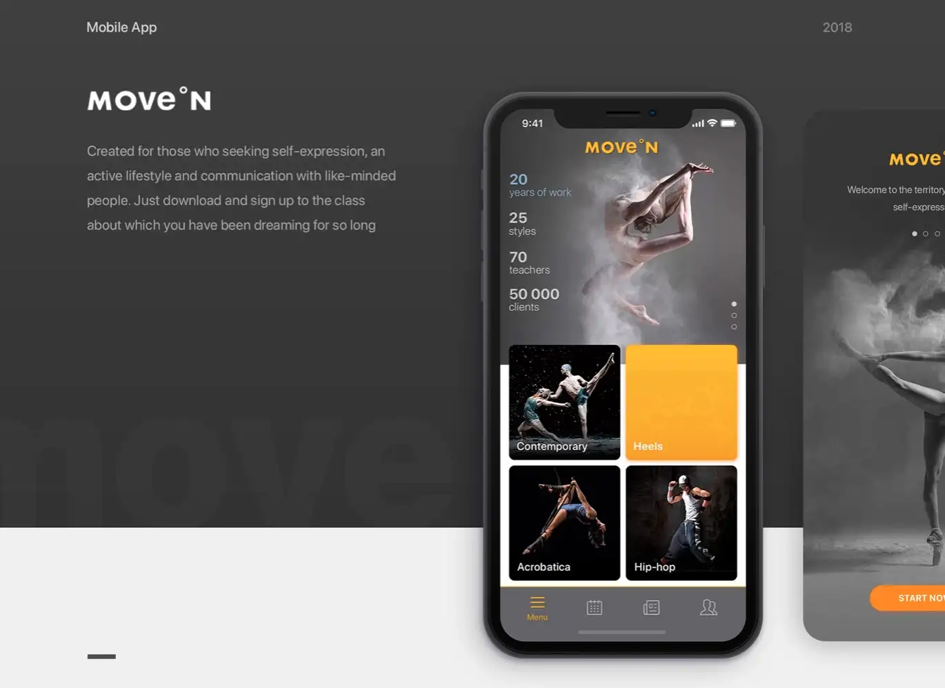
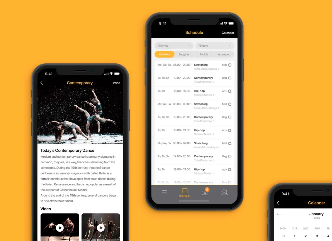
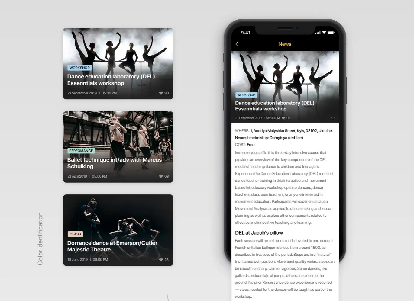
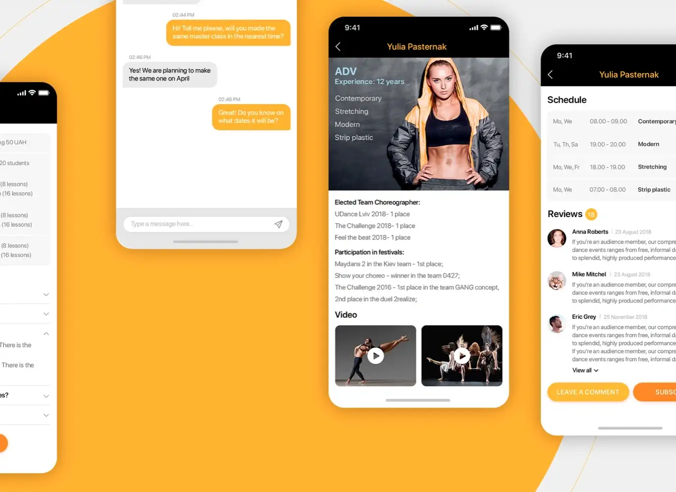
There are hundreds of awesome examples of awesome app interaction design and this field is getting better by the minute as more and more apps are coming out with well-thought-out interaction design elements. However, for the sake of this article, I chose a dance app that has a much better interaction flow than other apps in the same category.
As seen in the example below, one style that really works in conveying fun and friendliness is to style the interaction of the web almost like a web page. This dance app’s navigation and flow of content and layouts all look very similar to a web page although this is a native app.
Mobile App Like Website Interaction Design
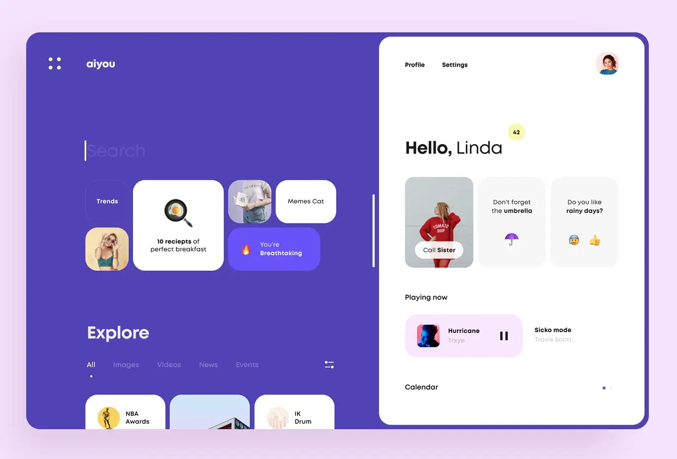
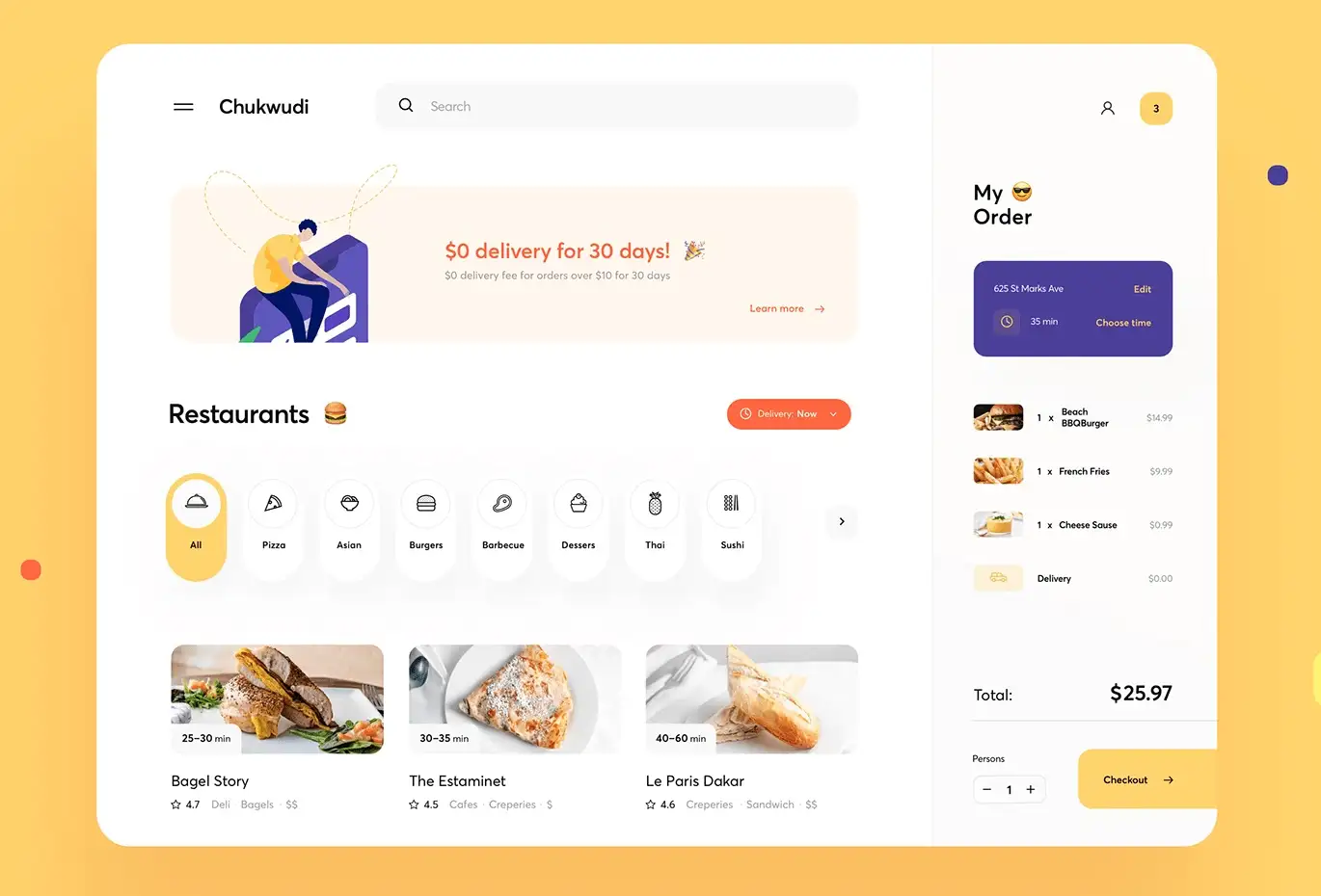
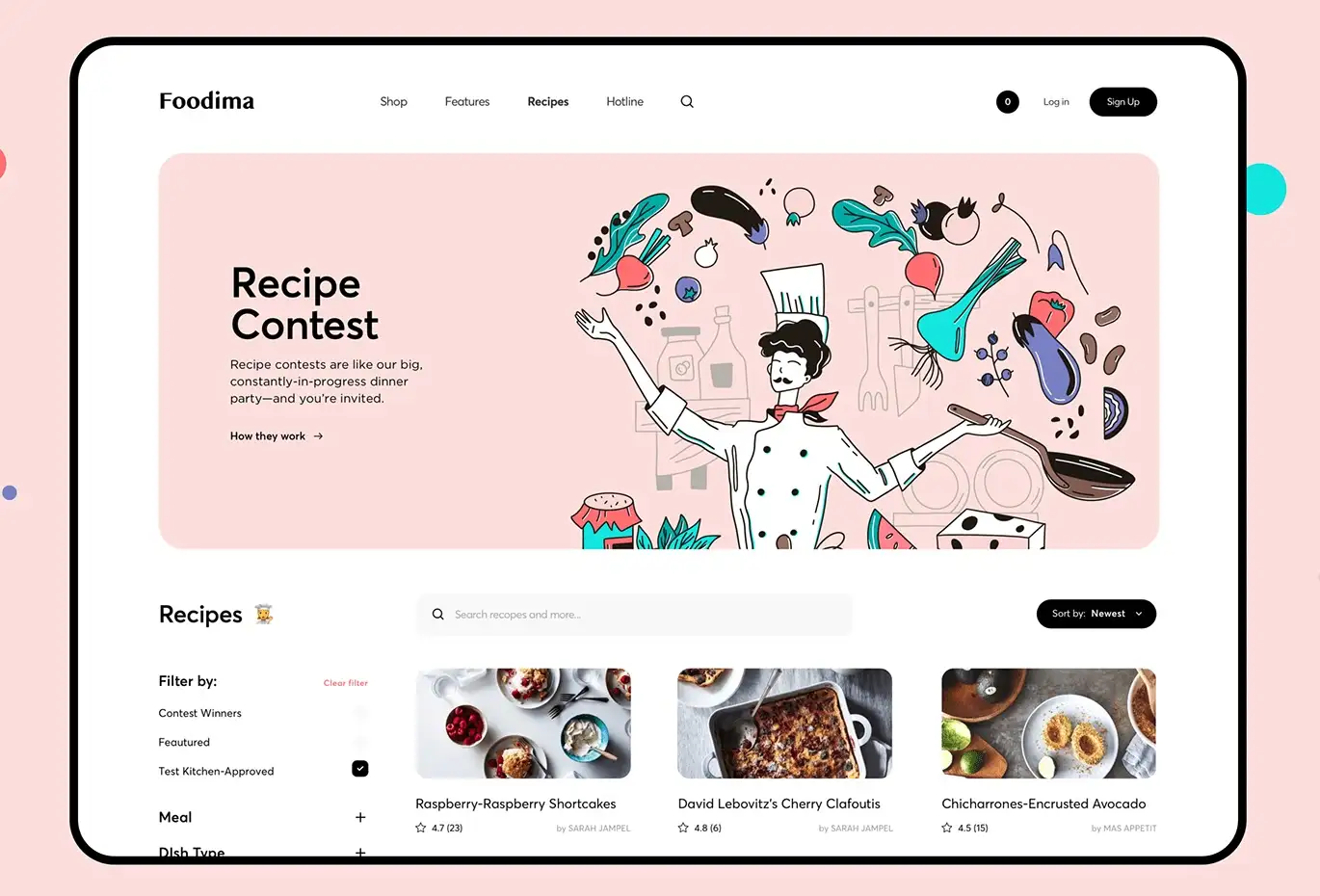
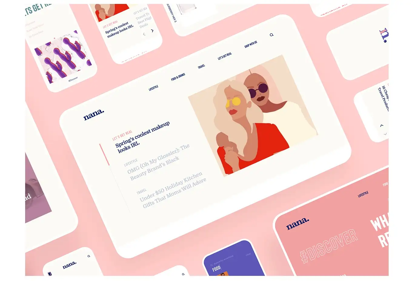
On the flip side, compared to the above strategy, we look at websites interaction design that looks like mobile apps and this works really well in lifting the brand perception to the next level. As you can see in the examples below, each of these websites looks like an app with card designs, rounded corners, and app-like controls.
More and more users are coming to expect app-like user interfaces on websites and the ones that invest in this kind of design style would reap the benefits from the emotional connection with the audience.
Electric Vehicles Control Panel Design
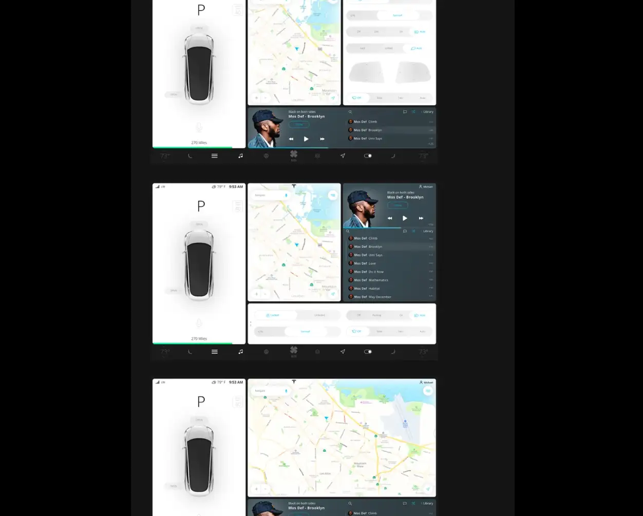
The next frontier of interaction design would be in the EV cockpit dashboard design space. Tesla has set the benchmark for how a EV cockpit dashboard should be and you can see design aesthetics that would bring a smile to your face.
There are some EV dashboards that are diabolic – like for instance the Toyota Prius Prime dashboard. To prevent bad UX with any new EV that would be launched, the key is to follow minimalism design principles and to resist the temptation to over engineer.
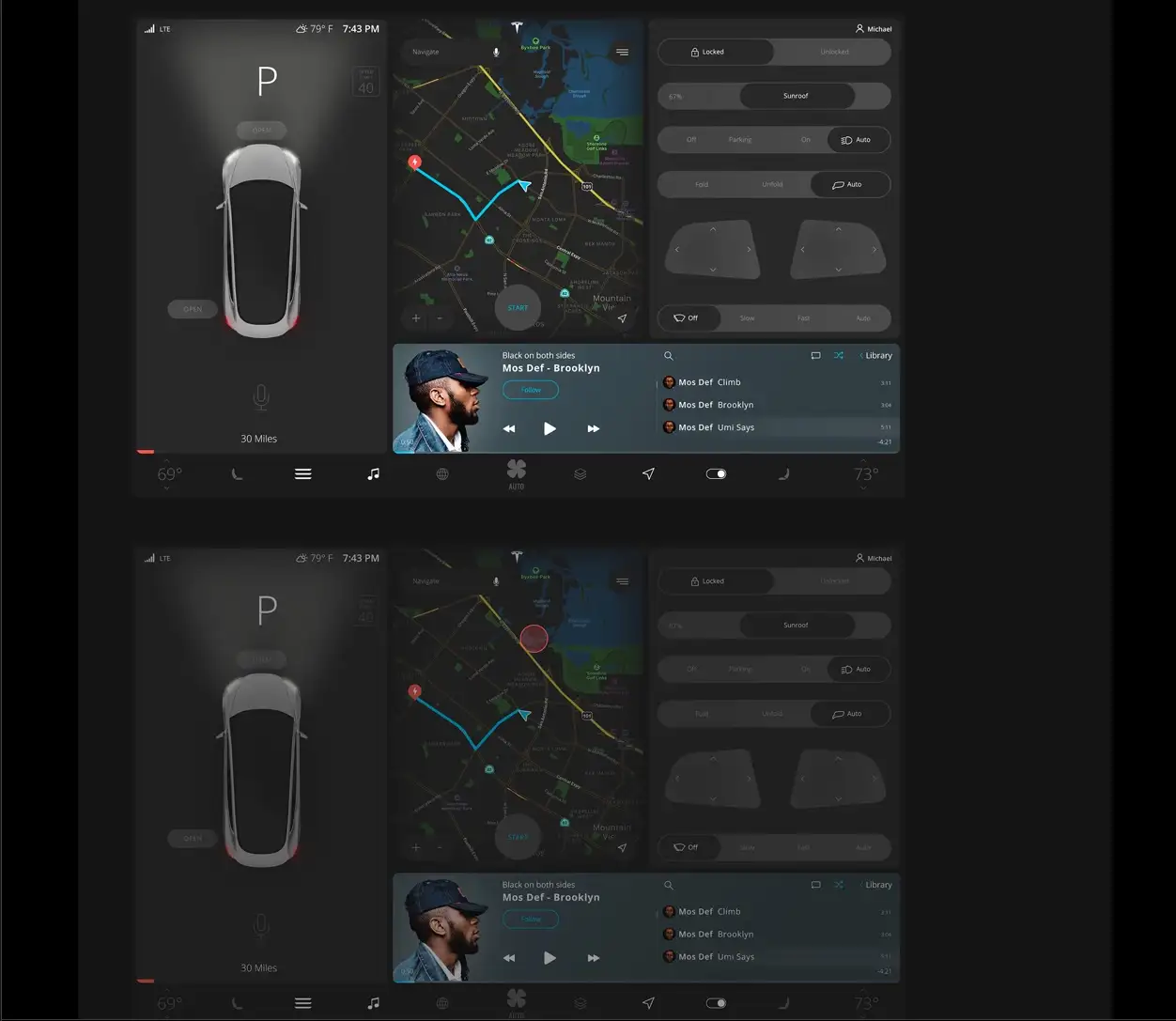
To create a robust interaction design it is important for visual designers to keep elements a reasonable size. Start with design research and always think of the user experience. Hope this inspires to think outside the box when tackling any iXD projects!
References & Credits
Photo Credit: Perksy by Justin Au
Photo Credit: In-Flight Entertainment by Thomas Moeller
Photo Credit: Mobile App for dance center by Olga Sh
Photo Credit: User interaction and web interfaces design by Cuberto
Photo Credit: Tesla Model 3 | User Interface by Michael Cherkashin

