« Your Friend the Brand Manager | 5 Steps To Optimizing Your Facebook Ad Campaigns »
Landing Page Design Tips: Landing pages are the web pages you send campaign traffic to. That traffic could be PPC visitors, email visitors or any type of traffic that begins from an ad.
The primary goal of a landing page is to convert the visitor right away (either into a lead or customer). While your main website helps inform visitors about your company, product, and services over the course of a few pages, your landing page will do it on one page.
Because your landing page must pack a very powerful punch, it plays by its own set of rules. If you’re just getting started with landing page design, or you’re looking to get more conversions out of your landing pages, follow these six tips:
1. Get rid of your navigation.
While your regular website is a great place for visitors to explore and learn, your landing page is meant to do one thing: convert.
When you include full navigation on your landing page, you provide a lot of opportunity for “leakiness.” Leakiness occurs when visitors start clicking around to different pages on your site and lose their focus on converting. However, this does not apply to a logo design firm like ours.
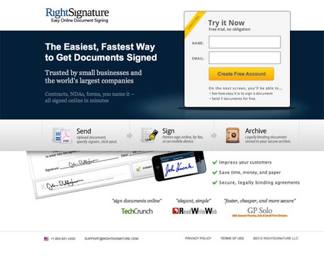
In the case of PPC campaigns, you’ve paid good money to get a click and you’ll want to do everything it takes to get that person to convert. Part of doing what it takes is keeping the visitor focused and not allowing them to wander off and get lost in other parts of your site.
2. Use Directional Cues.
Creative directional cues help grab the attention of your landing page visitor. They include things like the eye direction of the person in your images, arrows and body language.
You’ll want to make sure your directional cues guide the eye of the visitor towards your call to action or other very important aspects of your landing page design. I would suggest bringing in your brand manager during this phase to ensure these cues align with your brand.
For example using arrows to point to a lead gen form guides the visitor’s eye to the form and makes them more likely to fill it out.
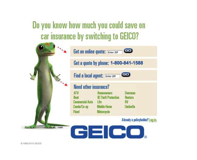
Another example would be the eye direction and body language of a person in a picture used on your landing page. If the person in the image is looking at or pointing to your form or product for purchase, you’ll be more likely to get the conversion.
3. Write short, scannable copy.
Web visitors don’t like to read long paragraphs. They scan copy looking for the most important parts. To ensure your landing page visitors read your most compelling copy be sure to use bullet points and short paragraphs.
In general, you can expect the first two bullet points in a list to be read. Make sure those two points are the ones most likely to help you convert the visitor into a customer or lead.
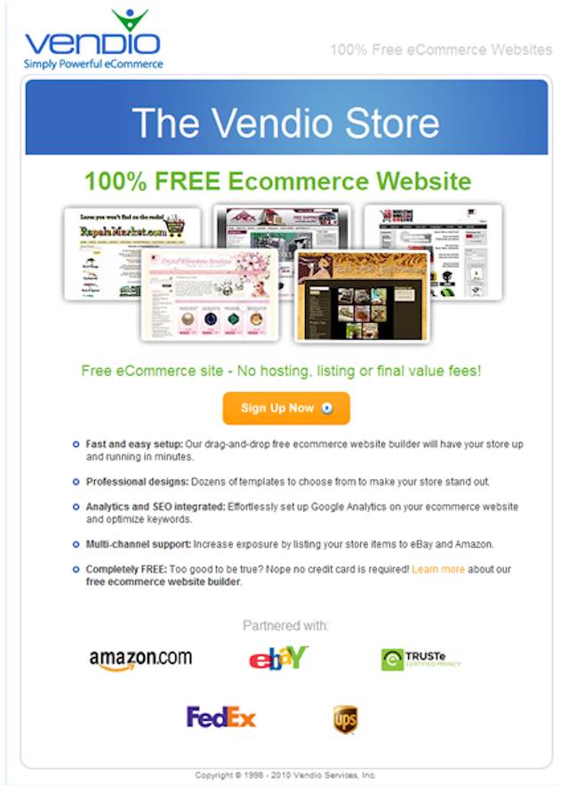
Additionally, online readers tend to scan the first and last sentences of a paragraph, so put compelling information in those areas.
And finally, online readers will often skip paragraphs that are longer than five lines (not five sentences, but lines). Be sure to keep your own paragraphs short and punchy.
4. Keep the call-to-action above the fold.
The call-to-action (buy now, get started, learn more, etc.) on your landing page design is arguably the most important element. It is the thing that encourages your visitor to convert.
When it comes to online behavior, we know a lot of visitors will only scan what they see when a page first loads and if that information isn’t compelling they may not scroll down seeking additional information.
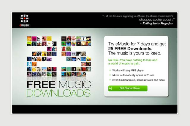
This means you need to keep your call-to-action high enough on the page that it is seen without a visitor needing to scroll down (aka above the fold). Putting it below the fold drastically decreases your chance for conversion.
5. Incorporate testimonials and trust badges.
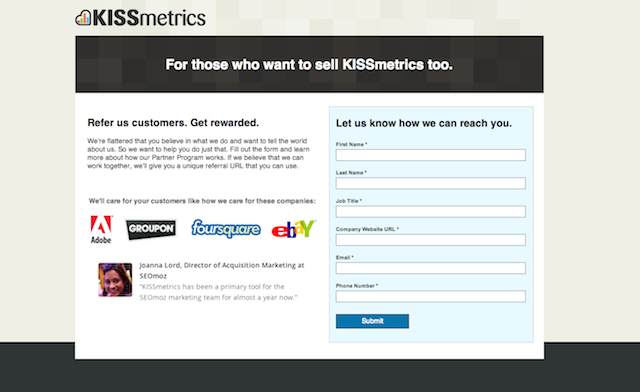
Testimonials and trust badges act as social proof and highly encourage conversion. Social proof is anything that says to the visitor “people like me are using this product/service and find it valuable.”
Testimonials are a really strong form of social proof; however, if you don’t have any customers that want to be featured on your landing pages, you could also use trust badges. If you’re selling a product directly on the landing page a trust badge could simply be something like a “TRUSTe” badge that says you take privacy and security seriously.
However, trust badges could also come in the form of logos of your other customers. No need to get a full testimonial when you can simply say “you’ll be in good company – look who else is using our product/service!” Of course, this works best when the company logos you’ll be using highly recognizable ones like Groupon and eBay, although just the presence of badges tends to provide some level of comfort.
6. Never stop testing your design.
When it comes to landing pages your goal is getting the most number of conversions possible. This is why it is so important to have a sophisticated testing strategy in place.
Most small businesses will want to start with a/b testing or testing one landing page against another. Elements you can test include different: headlines, subheads, body copy, form lengths, images, videos and so on.
Use testing software like Unbounce or Visual Website Optimizer to split traffic between the two pages and see which one converts better. Once you have a winner begin testing another element and so on until you’re sure you have truly optimized the landing page design.
You will be surprised at what simple changes can make. For example, when CityCliq decided to test their headline the result a huge increase in conversions:
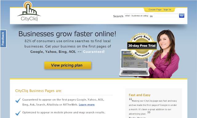
Version A of the landing page which converted at 25.3%
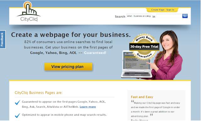
Version B of the landing page which converted at 47.8%
You see the only difference between the two versions of the landing page is the headline. The Version B headline included a very clear description of what CityCliq could help small business owners do – and really pumped up their conversion rates.
Image what a/b testing can do for your own landing pages!
When it comes to your landing pages a specific set of design rules apply. Follow these six tips for better results in your own online campaigns.
How to Properly Design High Converting Landing Pages
A landing page is technically any web page that a visitor lands on after clicking a link or ad. In terms of online marketing, it means a very specific and controlled page you choose to land a visitor on after he clicks on an ad.
Many website owners running online advertisements through Google Adwords, Facebook Ads or other ad networks simply link visitors to their homepage or a page within their existing site. Unfortunately, because ads often mention very specific things to garner a click, this tends to lead to poor conversion rates.
The Importance of Dedicated Landing Pages
For example, you may have created two ads in Google Adwords. One that mentions “Limited Time Free Shipping” while the other mentions “20% off all orders over $50.”
Landing visitors on a page within your existing website that doesn’t explicitly include the specific offer mentioned will not convert as well as a page that does showcase the specific offer.
That means in this scenario you should have two different dedicated landing pages created – one for each ad variation. And on each of those two landing pages, the headline should mention the specific offer (free shipping or 20% off).
Additionally, because people who click an ad are being compelled by a specific offer usually for a specific item, it is considered a good practice to create a landing page that sits on its own subdomain instead of linking to a page within a large website.
When you link to an external website page within your website the navigation lends itself to “leakiness” or the ability for the visitor to click away from the offer that originally compelled him to click your ad. Since you paid for that ad click you want to do your best to get him to convert right away.
So what should the landing page on your subdomain look like if it’s not supposed to be a part of your regular website? Great question!
Blueprint for a Standard Landing Page
Here’s is a blueprint for a standard landing page design layout:
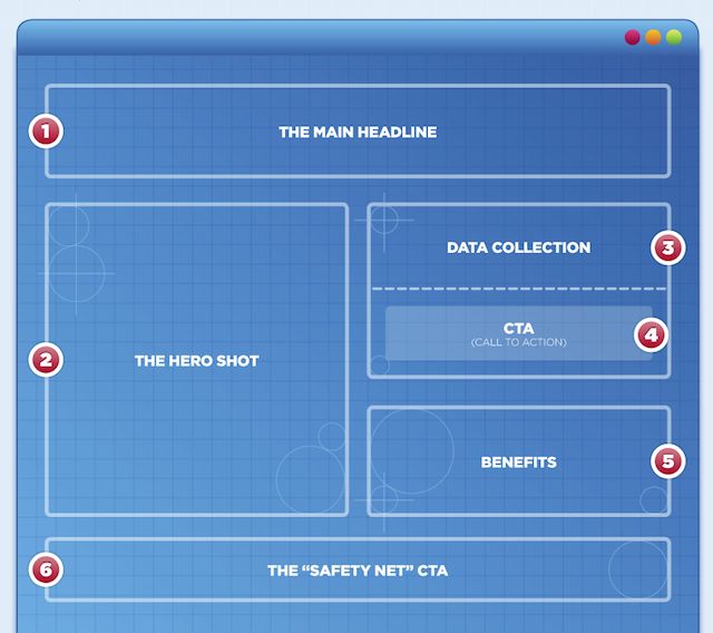
The actual brand design (colors, logo, fonts, etc.) of the page should follow the same standards as your normal website.
Breaking Down the Landing Page Layout
Alright, so it’s great to have a blueprint for your landing page layout, but even better for just a little more guidance, right? Let’s analyze each element.
The Main Headline – The main headline of your landing page should be an attention-grabber and very clearly relate to the offer used in the ad that sent the click. Going back to the Limited Time Free Shipping example, your headline should be related to Limited Time Free Shipping not 20% off, 50% off, BOGO or anything else.
The Hero Shot – The hero shot is the main image on your landing page. It’s best not to use stock photography if you can help it because that comes across as very impersonal. Instead use actual images of your product, pictures of your staff or a specially created graphics specific for this ad campaign. The hero shot is generally the first thing a person looks at when your landing page loads, so make sure it is really compelling.
Data Collection – If your landing page is being used for lead generation or a sale, this is the area that you want to include your form fields in to increase registrations on your website. If your landing page is not for lead gen, but rather retail, you can include a brief summary description of the product here.
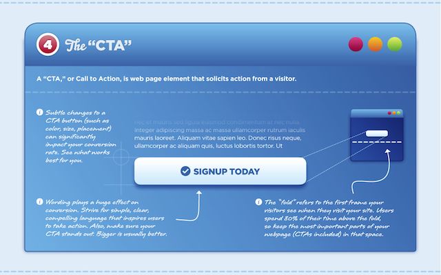
CTA (Call to Action) – This is arguably the most important element on the landing page. The Call to Action is what says to the visitor “Buy Now,” “Add to Cart,” “Join Newsletter” or whatever else the desired action is. It should be short, clear and very easy to understand.
Benefits – The benefits section is where you add maybe a small paragraph and a bulleted list of the reasons why your product or service is the best. Don’t include a long or cumbersome copy here. Keep things easy to read by making the features scannable through short paragraphs, bulleted lists and bolded key terms.
The “Safety Net” CTA – The “Safety Net” CTA is where you place your secondary call to action. It sits at the bottom of the page because you don’t really want people to take action on it – you want them to respond to your main CTA above (“Buy Now,” “Add to Cart,” etc.). Your “Safety New” CTA might be a link to your main website or social media buttons like the Facebook Like button or the Tweet button. Some marketers might say not to include this element at all since it can distract people from your main CTA – and they wouldn’t be wrong. This is something you will want to a/b test.
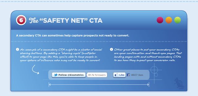
In general, I tend to advise clients to put the secondary CTA on the Thank You page. It is a great way to keep customers or leads engaged after they have already responded to your main CTA.
Follow the tips mentioned in this article and you will be on your way to improving your online ad campaigns and generating more revenue!
The images used in this post are part of a Landing Page Blueprint infographic created by Kissmetrics.
Landing Page Boot Camp
Your eCommerce website landing page is your first impression, and it is important that it be top notch in every way. However, many website administrators are confused about what makes a landing page work best. Here are a few tips for creating a landing page that inspires your visitors to become customers – welcome to the landing page boot camp.
-
Use several different landing pages.
Many websites use their homepage as an all-purpose landing hub, but this practice forces visitors to wade through a lot of information before finding what they need. This also makes it difficult to target one particular group at a time. Customers who have to go through multiple steps are more likely to bounce, so give them a targeted landing page with just the information they seek.
-
Place important information carefully.
Many users will not scroll down or click on a link unless they already see the information they want. This means that your main message must be placed at the top left of the page. This will ensure that your visitors are always seeing your marketing message. You should also place important links, such as those to your sales page, at the top as well.
-
Get to the point.
Make your call to action as early as possible and place it right next to a link to your sales page. This will enable customers who know exactly what they want to quickly complete the process. Similarly, use as few words as possible in all areas. Anything else will create clutter and make it hard to find and identify the most important information.
-
Tie into an advertisement.
If you have different landing pages for different advertisements, make sure to tie into the advertisement in question as much as possible. You already have a rough idea of what your visitors want—they clicked on the ad, after all. Give them the exact same marketing message with more relevant details. In many cases, using the exact same text as an opener is the most effective strategy.
-
Keep it simple.
Visual clutter turns people off and muddies your message. Don’t confuse or annoy your visitors; it is too easy for them to click ‘Back’ and lose the inclination to buy. If you have multiple landing pages, it should be easy to identify a core message for each one and stick to that message. Keep your landing pages simple, brief, and targeted.
-
Use visual aids to separate lists and other information.
At some point, you have to include details or lists in order to give discerning buyers the information they seek. Use bullets, boxes, or other visual aids to separate this information so it is easy to scan. Place important pieces of information in large, bold letters to set it apart from less important details. People are usually looking for one key piece of information, and they shouldn’t have to read a novel to get to it.
A well-designed e-commerce landing page will increase your sales by helping your customers see why your business is the best choice. A crowded, cluttered, or disorganized landing page will have just the opposite effect. You can’t afford to lose customers to poor design, so make your landing pages the best they can be.
