Logo Design Trends for 2022
As a business owner, you probably realized that logo design style trends change all the time. What’s been popular a few years back may not be as popular now. And if you want your brand to become successful, you must make sure that the logo is recognizable.
It needs to be physically appealing – something that you know for a fact will positively attract people your way. For that purpose, here are some logo design trends that will bring you success in the year to come.
Tall Logos
Before, we were accustomed to horizontal logo shapes. These logos are still going strong – but there are also people that prefer tall logos. These are unconventional, attracting people just for the fact that they are different.
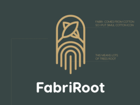
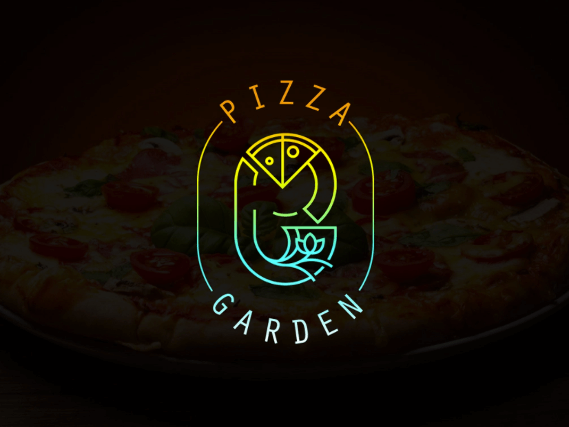
Look at FabriRoot, for example, or the new logo for Pizza Garden. They stand tall, and they stand confident. Sure, some people might love them, others might prefer the “old ways.” There will always be someone who has something to say against them, but trends show that tall logos will likely take up the stage.
Blurred Logo
We know what you’re thinking: you’re supposed to be able to read logos, right? Well, yes – and at the same time, not always. Blurring the text, or at least a part of it, doesn’t mean you won’t be able to read what’s written there. It just means that it’ll look like it’s behind some sort of transparent veil.
In 2022, people won’t focus only on readability, but also on movement and fluidity – something that blurred effects often imply. Clearwater played with this type of logo, to suggest the moving water.

Bright Colors
The 90s are back, and they want bright, daring colors. This type of logo design is a good option for playful brands that like to experiment. They also attract a lot of attention, which means that people will remember the brand once they see your logo.
A good example here would be Trolli, with its bright color and bold font design. This suggests the playfulness of the brand, something that the buyers would expect, considering what the company sells. It is a type of brand that will attract attention, bringing in the right crowd.

Serif Font Logos
The Serif and Sans-Serif debate is still going strong these days, and it’s been safe to assume for a while that these fonts would only grow in popularity. A lot of brands now changed their logo into featuring the serif font, as it offers beauty, formality, elegance, minimalism, and modernity in the same design.
Look at the Zara font, for example. The logo’s elegance and class suggest the products that they are trying to sell. The revamp was indeed controversial at first, as people were used to the old logo – but it still grew a lot in terms of popularity.

Lowercase Letters
Nowadays, more and more brands are playing with lowercase logos. Amazon was at the starting point, but since then, more people began taking a fancy to it. These types of logos are less imposing and appear friendly and approachable as opposed to the uppercase logos that suggest power and authority.
Friendliness is what people are looking for today. Even MasterCard switched to a lowercase design so that they seem more approachable to the masses. The trick is to mix it with some kind of picture or design (like Amazon’s arrow or MasterCard’s filled circles). Otherwise, the logo will just appear plain.

Art Deco Logo Design
Art deco is back, and it is making its way through the branding world as well. People are looking for that streamlined, sleek look that suggests geometry and symmetry – the aesthetics of the Great Gatsby. It looks classy and elegant, while remaining resilient and modern.
The advantage of art deco logos is that they can be adapted to any design, regardless of the brand image. Jewelry, pastry, perfume, clothing – whatever you may sell, art deco should work for you. A logo model for Euro Precision Automotive even made the design work for cars, so you can see why this logo design will be so popular in 2022. It works for any type of industry.
Overlapping Elements
More and more brands are going for overlapping elements in their brand logos. The MasterCard logo comes to mind here as well, with their overlapping circles. It’s bold and intriguing and definitely makes people think – something that will make them more likely to turn to your brand.
These overlapping elements may be applied to pretty much anything, from colors and letters to symbols, shapes, and patterns. By overlapping the elements, the brand logo will look more voluminous as well. Ensemble Studio did a fairly good job with this trick, and they serve as a great example.
Laconic Logo Designs
Nowadays, less is more. While some brands will benefit from bright, playful colors, not all of them can take advantage of that type of design in 2022. Brands are looking towards being taken seriously, which is why the laconic design has grown so much in popularity.
This type of logo is stylish, clear, and overall timeless looking. Despite the fonts and geometric designs from a laconic logo, each element has its own purpose. This way, you should be able to show off the essence of your brand. Hungry Harvest has a logo that is a good example in this case.
Geometric Shapes
Geometric shapes and designs have been here for a while, and they will follow into 2022 as well. They are neat, simple, and not to mention discreet. They position your brand as an image of efficiency and elegance, without making the logo stand out like a sore thumb.
Look at how Renault recently revamped their logo, for instance. Its essence is still there, but the focus is now more on geometry and a streamlined look. The strength of this logo simply lies in its creativity and simplicity.
Character Tricks
In 2022, people will be looking for unusual, but also for readability. A new trend among brands involves swapping certain letters from the logo with a symbol. This way, the logo will look unusual and informal, while maintaining a relatively laconic look. It brings the best of both worlds.
Look at Future Noodles, for example. They changed the two o’s into an infinity sign, which somehow looks like infinite noodles. It’s fun, representative, and definitely gives off the essence of the brand. It is a great character trick that looks professional and playful at the same time and attracts users.
Gradient Design
Gradient designs have been growing in popularity over the last couple of years, and you may expect to see them a lot in the following year as well. They are interesting, volumetric, and highly recognizable. They add dynamics and depth to the logo, capturing the attention of anyone glancing at the design.
Look at the brand logo for PartyMania, for instance. It mixes gradient with lowercase font, making the logo seem not only friendly and approachable but also recognizable. You don’t necessarily have to gradient the whole logo; just a small section of it will be enough to catch users’ attention.
Optical Illusions
Have you ever looked at the picture of an optical illusion, only to blink twice after looking at it again? These kinds of images are so interesting that they will likely have you thinking about them and their logic for a while.
For instance, you can take a look at the NatWest logo, with its squares forming a weird yet intriguing kind of optical illusion. It is the kind of logo that attracts attention, making it seem vivid, dynamic, and offbeat. The three-dimensional effect will increase brand awareness, something that will certainly help you get your brand out there.
Cartoon Logos
We live in a time when people no longer want to see just serious stuff. They want to see cute and funny things as well – something that will put a smile on their faces. Cartoons touch a piece of childhood, especially when you mix them with a bit of animation here and there. For this reason, they have become more popular than ever.
Look at the Monster Pony logo, for example. It works great in its static form, but the brand also chose to animate it. It is dynamic and engaging, which attracts customers and increases brand awareness. Plus, an advantage of this kind of logo is that it works for various types of industries – not just the ones oriented towards the younger audience. You just need to design it right.
The Bottom Line
The year 2022 is right here, waiting around the corner to greet us. So, from a business point of view, you must be prepared for everything that it brings. Whether you are starting a small business or you want to rebrand, there are multiple logo design options that you can go for. Flashy, simple, bold, or minimalist – you just need to let your creativity loose.
LogoLounge, one of the Internet’s most comprehensive logo databases and reference sites, has released its 10th annual LogoLounge Trends Report, which features logo design trends from the past year. LogoLounge’s report samples designs from all over the world in order to identify trends.
I’ve shared a few of the most notable trends below by picking out logos that we have created in the past that fall with in these logo trends. By sharing this, I aim to:
- Expose you to some of the more popular logo design trends
- Expand your design sensibilities
- Help you identify which creative direction you’d like your brand’s logo to take
Transparent links
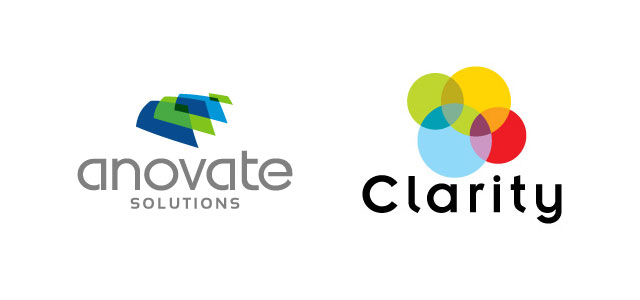
Logos that contain multiple shapes and images in different colors are sometimes placed in overlapping positions. These overlapping areas are then made transparent/translucent. This is meant to signify diversity, as well connection, which can be further emphasized by arranging the shapes into a single unbroken circle.
Peel
“Peel” gives the impression of a sticker with poor adhesion. This is a graphical device that has been in use for a long time, but is now being used in conjunction with other graphical elements such as dropped shadows, textures, and background imagery. Some logos use this to reveal something underneath and imply a sort of hidden value.
Sphere Carving
Many people already associate the sphere with the concepts of “global” and “self-contained”, but carving out elements from within the sphere lets the brand individualize the shape and gives another level of meaning, which can be helped even further by judicious application of color.
Tessellation
Tessellation involves a repeating pattern of geometric shapes, which may or may not result in a larger mosaic image. Color can be used to provide striking variations in the patterns and emphasize certain elements of the pattern—perhaps signifying diversity and cooperation between groups. The geometric patterns can also imply a link to science or mathematics.
Leaf Amalgams
In this trend, leaves are used as building blocks to form an entirely different object. The larger image may either be completely or partially made of leaves, but it will use them as a prominent element. The use of leaves implies a strong tie to nature and natural processes, which can be used for environmental companies, organic, or holistic products.
Twixt
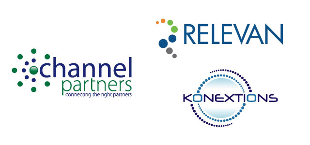
“Twixts” are tiny collections of dots that represent connectivity. These can be arranged in lines, radiate outward from a central image, or be assembled into a single pattern. It can be associated with modern concepts such as technology and interactivity.
To view the full report from LogoLounge, click here.
UK Logo Design Trends
The UK is known for timeless designs that transcend fashion, but this does not mean that there are not always new trends sweeping the nation. Logo design is a very style-oriented field, especially for people who are in fields where keeping a modern image is important. Here are a few trends that seem to be gathering momentum right now. If you are not already seeing a lot of these motifs and themes, you probably will be seeing them soon!
Minimalism. Minimalism has been popular in UK design for the better part of a century, but it remains very much in style. It can be just perfect for giving a modern and professional feeling to a logo design. However, these logos are much more difficult to design than many other types, so be sure you talk to a logo designer about this.
Signature logos. This type of logo design is rather common in the UK, but it seems to be getting more so. This is especially true in companies that are named after the business owner. If you think about it, your signature is a logo of sorts, so using it in an actual logo makes sense. This motif is also common in design oriented fields; a signature logo is sleek, modern and appealing without being complicated or dated.
Three Dimensional logos. Three dimensional logo deigns have been available for years, but it is only recently that they have been such high quality and low cost. Three dimensional logos can represent technological superiority, but they also can suggest other emotions depending on the exact design. They are especially appropriate for modern, techy, even geeky brands.
Punctuation Inspiration. We use punctuation every day in writing, but it has been absent in the UK logo design world until very recently. However, we are beginning to see it pop up in logos around us, and it is easy to see why. Punctuation helps us set the tone for sentences and allows us to be very clear; why would this principle be any different in logo design? Punctuation logo design can feel clever and be very expressive.
Text-Only logos. One way to be simple and timeless in design is to use text only. This gives your logo design a professional and sophisticated feeling, while ensuring that you will be able to use the logo through a variety of times and fads. However, one drawback is that these can seem cold and less friendly than logos which bright and pretty images. Also, if not handled correctly, these can be less memorable for the customer base.
Whether to follow a trend or to choose a more timeless design is a completely personal decision. The type that will be most effective for your company and your consumer base depends on the unique aspects of your brand and your market. If you have any questions about the type of logo that will work best for your company, talk to a professional UK logo designer.”
US Logo Design Trend Alert
US Logo Design Trend Alert: Designers Get Double Vision
As we prepare for one year to end and another to start, many people begin to look back at the preceding months. However, we at SpellBrand are all about looking forward, especially at the trends, styles, and happenings that will define graphic design in the year to come. Here is one trend that seems to be building momentum in the United States: double vision.
We have noted several times that the use of transparent, overlapping shapes is a common theme in modern logo design, but it has taken on a new twist in many of the latest designs we have seen. We are seeing the use of very limited color palettes and uncomplicated shapes that yield a simple and elegant design with both style and staying power. As examples of this trend, here are a few of our faves.
This design shows us one of the benefits of the double vision style: it can de-fuse images with negative associations. Most of us have absolutely no good associations with mosquitos; depending on the part of the world you are from, they remind you either of blood borne pathogens or a swollen itch lump covered with calamine cream. This logo design has a recognizable shape with less baggage than a less layered image would carry. The soft colors and rounded wings contribute to this effect as well.
One time when double vision logos are especially relevant s when your name or another part of your brand suggests multiple layers. Here we see an event planning company with a name that practically begs for an offset logo. The way the letters are formed from the overlap between the magenta and cyan is clever and memorable, giving the logo design a witty feeling that hints at the company brand.
The overall style suggests several different elements coming together into a single, attractive whole. The Castle Print logo design shows this well. Traditionally, printing used three base colors to make all of the hues we know and love. This was accomplished by expert blending of shades. You can see these hues coming together quite literally in this image, hinting at the history of this company’s industry. The three color bubbles come together into a castle, tying into the name as well. The suggestion is that this is a company that pulls different elements together, and that it is a problem solver. Further, this image will look great in print, which is important for a company in this industry.
One benefit to this trend is that it is easy to animate. If you want a logo design that can look good on paper while also being the basis of a simple, recognizable animation on your website or a television advertisement, this motif is definitely one to talk to your logo designer about. It won’t work for every business out there, but sometimes a double vision logo design is the perfect addition to a brand.
Top 10 Logo Design Trends of 2009
If you are looking for logo that uses the best of modern logo design concepts, the first step is to know exactly what ‘modern’ is this year. From eighties retro to layers, the logo trends of 2009 are as diverse as can be. Here are the ten top trends in logo design this year along with why they are so perfect for our time.
1. Waves
2. Layered Transparent Shapes
3. Leaves
4. 80’s Retro
5. Mosaic
6. Circles
7. 3-D Shapes
8. Hidden images
9. Wordplay
10. Origami
If the logo is the face of a company, these logo design concepts are the celebrities of the logo world. Although these are all extremely trendy logos, don’t be afraid to use them. These logos may be en vogue, but they are far from overused. An experienced logo design artist can make these trendy elements both new and classic for your company.
Logo Trends of the Recent Past: A Retrospection
In any field, the study and analysis of recent trends is important because it helps you to stay abreast of your competitors and helps you set your own style.
From an international perspective, logo designing is becoming increasingly competitive where new technologies seem to arrive every alternate day to make the designers more and more experimental with their jobs.
As a result, on the one hand we come to see some really original works of art; on the other hand the internet has become crowded with copies and copies of the copies and so on.
Even then, taking a glimpse of recent logo designing trends is helpful because it brush up your ideas about latest technologies and their uses. More importantly, by analyzing the trends, a serious designer can get the idea about the route to success on the one hand and the hints of the ways to avoid on the other.
Here are the major logo design trends from the recent past giving you an idea about the thinking patterns of the others.
The use of punctuations, smilies etc
With world becoming more and more connected through the worSpellBrandide web, the way people communicate with each other has been changed significantly. In this age of e-mails and instant messages, you can express with a whole new range of vocabulary. Thus the logos using punctuation logos marks have become quite common, just at the days of dotcom boom, the sign @ became the most predictable feature of the logos.
Wire styled logo
The extremely creative logo designers are using this style a la Picasso to create some really outstading logos. These logos created with few frugal and subtle strokes are expected to stay on for a few more years.
Reflections
This has been the most conspicuous trend in the logo designing in the recent past. In the world of logo designing this new style has acquired the name, the new drop shadow. This style has been widely adopted to give the hint of a greater world that apparently exists on the other side of the mirror.
Hot dog signs
These signs have been used in a number of logos to give expression to the motion or sound or any emotions. Just the same way, transmission beams have taken places in the logos of wireless systems to give expression to the sharing and spreading of information.
The presence of green
The color of green has found a strong presence in the logos of recent past. This is due mainly to the spread of organic products, boom in the spa business and like. Environment becoming the hottest issue these days, this trend is expected to stay.
You can collect the necessary spices from these trendy logos to cook up your own recipe. So take cues from the past to become the trend setter of the present.
