Today’s article is all about how to promote your brand right from the comfort of your own website. Now, I know what you might be thinking: “Wait, I already have my site up and running. What more should I be doing with it?”. Well, I’m here to tell you that there’s so much more than you can do to promote your brand via your online site.
Your website is one of your only mediums to interact with potential customers and visitors. And when you make your brand prominent and visible, then you are helping to build up familiarity with your brand in the eyes of visitors. They will be more likely to recognize your brand in the future and understand what you’re all about. Plus, you’re going to be able to differentiate yourself from your competition when your branding is easy to see all over your site.
Let’s take a look below at some of the top strategies you should be employing to show off your brand onsite.
Your logo should be clearly visible at all times.
You should already know that your brand is way more than just your logo. However, that doesn’t mean that your logo isn’t one of the most important pieces of your brand! In fact, your logo is one of the parts of your marketing strategy that sets you apart from your competitors the most. When someone can easily remember your brand from your logo, it’s much easier for you to keep those customers around.
When you are designing your website, you should ensure that your logo is visible at all times, while visitors are going through the site. This is easy to achieve when you keep the logo at the top right or left of your site. Make sure that on each page, the customer can easily click on the logo to go back to your homepage.
Now you might think that this isn’t going to do much for your brand’s visibility. However, imagine other websites that you’ve visited lately. Which do you remember more? The brand that had their logo splattered all over their site or the one where you couldn’t see any logo?
Remember that your logo is the visual representation of your brand and what you stand for.
Choose your theme, fonts, and colors super carefully.
Everything about your site should remind visitors about your brand. Now, these are things that are indeed superficial. But when you use them correctly, you can bring your visitors back to your brand at every touchpoint on your site. Think about the colors that are used in your current logo, the fonts that are most prevalent, and what style really fits your brand’s aesthetic.
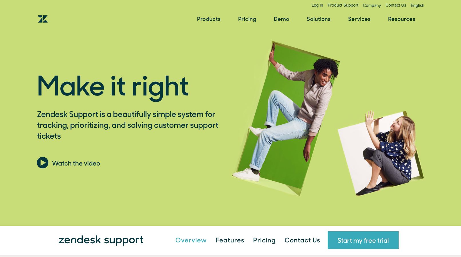
When you get the answers to those questions, you’ll be able to design that site that fits exactly with the style of your brand. For an example of what I’m talking about, head over the website of Zendesk. Their entire site fits into the scheme of Zendesk as a relaxed and contemporary brand. All of the colors and the entire layout of the site fits into the brand’s identity. You can do the same for your brand!
Use your 404 sites to your advantage.
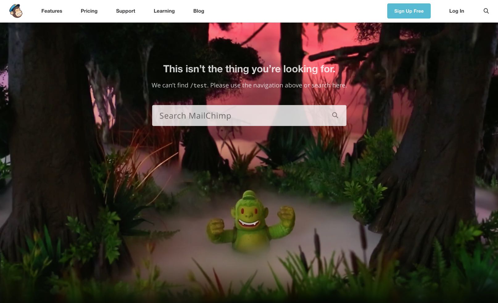
Imagine those annoying times when you’re trying to find a specific page on a website, but rather end up facing a 404 page. There’s no reason why you can’t use these 404 pages (no matter how annoying they may be) to your advantage when pushing your brand’s image onsite!
There are some pretty unique ways that you can do this. For example, when a visitor tries to visit a page that doesn’t exist, you can have a fun and quirky page pop up that highlights some fun part of your brand. Or you could even have a fun video appear that directs the visitor to some other page of the site. Or you could even just list down some potential pages that the visitor might find interesting.
When you take a look at your site, look at these little quirks that you can add in to promote your brand’s image. 404 sites aren’t normally something that sites think about utilizing. How many other parts of your site are you not taking advantage of?
Use your brand’s unique tone for your site’s copy.
No matter whether you’re writing a blog post entry for your brand’s blog or just writing some copy about your pricing structures, you’ve got to be consistent with your brand’s unique voice and tone. If you don’t, then you just risk ending up sounding just like your competitors. And I know that you definitely don’t want that!
Let’s take Slack for example. Slack is a company that has a pretty relaxed and conversational tone whenever they’re writing copy for their site. This is something that sets them apart from other similar services online. When visitors are reading their web copy, then they can more easily connect with what’s being written. On top of that, this tone reminds them of what Slack stands for and what kind of company that they are.
Spend some time in the upcoming weeks to determine exactly what your brand’s tone is or should be. If you’re more of a professional no-nonsense brand, then that’s what your tone should sound like. If you want to strike more of a conversational and laid-back tone, then you should write all copy with that in mind. When your visitors stop by, they’ll connect the dots with your brand’s identity system.
Is it time for a revamp of your site?
If you’ve read through the above points and you feel like you’re not doing a good enough job in promoting your brand via your website, then it’s time for some changes. When you promote your brand’s logo and message throughout your site, visitors are going to take notice. They’ll be more familiar with your brand and will be much more likely to buy into what you’re trying to sell to them. Trust me when I say that this is one of the easiest and best things you can do for your brand.


