Spellbrand Blog
Top 10 FinTech Startup Brands

The fastest growing startups and the ones with the most impact on the business world are a new breed of financial technology startups, also called FinTech Startups. These startups use software to provide financial services and have disrupted the traditional financial services models and landscapes. Here is a brief look at the top 10 fintech startups along with reviews of their logo designs. I have also written a report on blockchain brand identity that you may find interesting.
MONZO
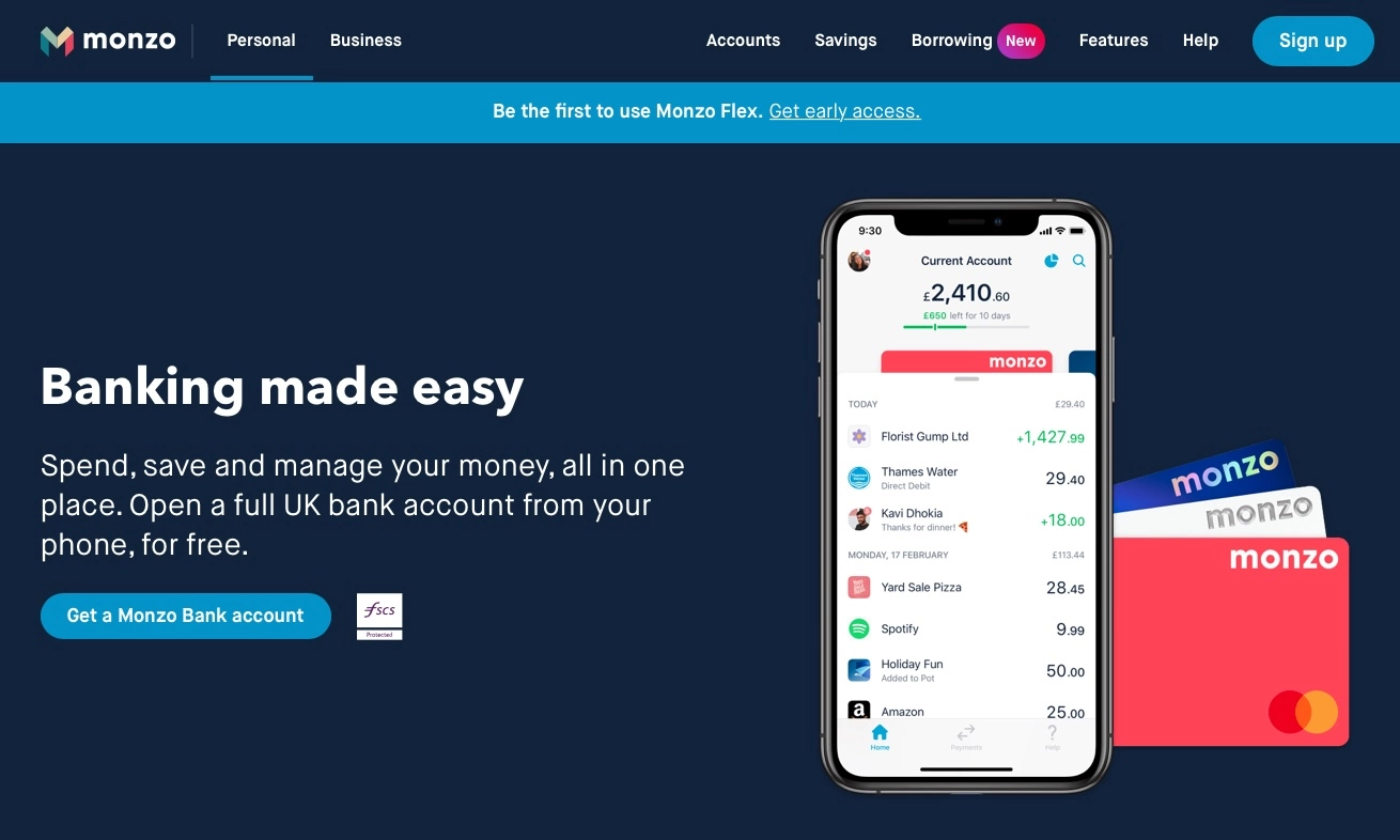
More than 5.73M people use Monzo to manage their money and spend it around the world. The app UX, UI, and model are so awesome that Monzo is gaining rapid popularity.
Vision: We’re building a bank, together
Mission: By solving your problems, treating you fairly, and being totally transparent, we believe we can make banking better.
Tag line: We believe in an alternative to the banking of the past
BRAND IDENTITY
The primary logo is the letter M in an origami style. Monzo uses bright pastel colors that may look a little chaotic on the face of it but careful inspections or a little use of the service shows that colors are not random and have been carefully selected to target several tiers of audience archetypes.
Although the primary icon is not that exciting, the overall visual language of the brand is cohesive and does create diffrentiation. Since this is a fintech brand and has user touch points on multiple platforms and devices, we can understand the need for the simplistic icon-based primary logo.
STARLING BANK
BRAND ESSENCE
Starling Bank is an award-winning, fully licensed, and regulated bank built to give people a fairer, smarter, and more human alternative to the banks of the past.
Vision: Give people a fairer, smarter, and more human alternative to the banks of the past.
Mission: Branchless, paperless and run on renewable energy
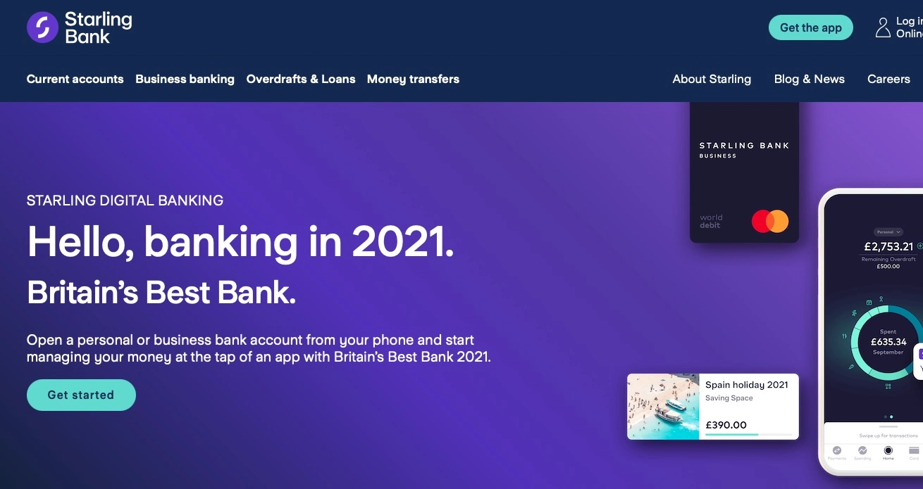
Tag line: Hello, banking in 2021.Britain’s Best Bank.
Brand Name Explanation: The Starling bird is sociable, adaptable, friendly, and supportive – all qualities Starling Bank wanted from their new bank. It also works as part of a team to make something as complex as a murmuration feel beautifully simple.
BRAND IDENTITY
The primary logo is the letter S formed out of two abstract shapes enclosed in a blue circle. The icons themselves are not too strong but do create recall because of the shape of the letter S. It could also be assumed that the two shapes forming the letter S are in fact abstract hands coming together in a protective manner hinting at the service.
The overall brand identity and colors are quite muted and seem stuffy – almost like the very banks and institutions that Starling is trying to fight off and displace. A brighter identity that was more modern and used vibrant colors would perhaps align with the brand message. The website UI is also quite stiff and dates.
TANDEM
BRAND ESSENCE
Nothing to say really since amazingly Tandem does NOT have any information about the brand, its sense, vision, mission, etc. The reason I included it in this list is just to show you how NOT to brand your startup.
Vision: –
Mission: –
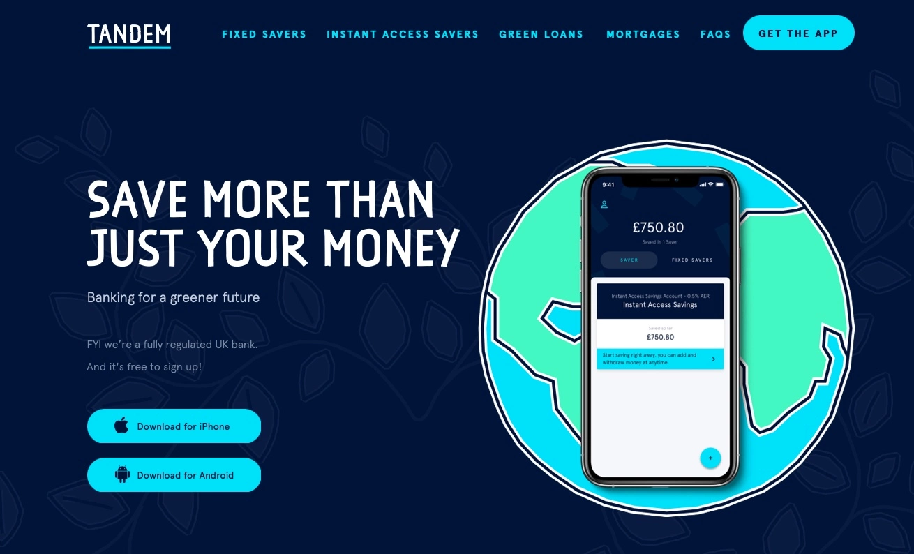
Tag line: Save more than just your money
Brand Name Explanation: –
The logo design for Tandem is as bad as its overall brand identity, its lack of brand essence messaging on its website, and any personality whatsoever. In fact, the various images or illustrations you see on the website look random and clipart-like. Not sure what the message is with the almost hand-drawn-looking illustrations randomly thrown around the website.
TIDE
BRAND ESSENCE
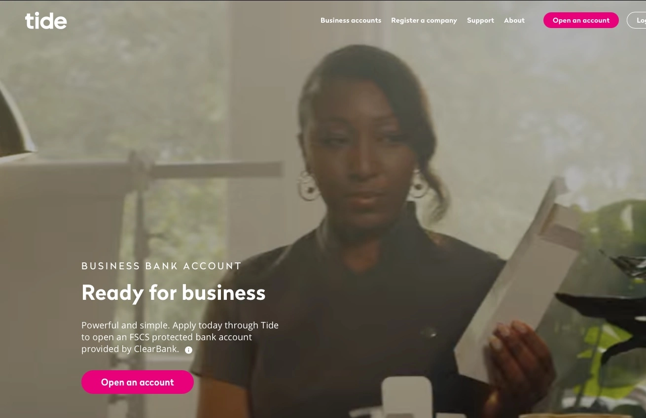
Tide is a business financial platform and the leading provider of digital business banking services in the UK and are regulated by the Financial Conduct Authority (FCA) and offer e-money accounts, provided by PrePay Solutions (PPS), as well as business bank accounts, provided by ClearBank.
Vision: We believe the world would be a better place if more people gave it a shot.
Mission: Tide is about doing what you love
Tag line: Ready for business
Brand Name Explanation: –
The primary logo is very simple – the word in simple typography does not look like any customization was done to it. Blue and crimson pink seem to be the corporate colors but I do find that it lacks an overall storytelling aspect to the brand identity. Perhaps it is due to the simple logotype or perhaps even the name itself which reminds me of the Tide washing liquid that is ubiquitous.
The website looks quite barebones and not much effort is put into the user experience. However, compared to Tandem, at least they have a decent about us page.
ALLY
BRAND ESSENCE
Nothing to say really since amazingly Tandem does NOT have any information about the brand, its sense, vision, mission, etc. The reason I included it in this list is just to show you how NOT to brand your startup.
Vision: Be a relentless ally for your financial well-being
Mission: A leader in digital financial services
Tag line: Committed Beyond Banking
Brand Name Explanation: The word ally means “combine or unite a resource or commodity with (another) for mutual benefit” and proposes that this brand is an ally to people looking for better financial services.
Look Externally – We’re focused on innovation and strive to meet the needs of our customers by anticipating changes and responding quickly.
Execute with Excellence – Good enough is never enough. We continually look for ways to improve and do things better.
Act with Professionalism – We operate with integrity, hold each other accountable, treat others with respect, and embrace diversity.
Deliver Results – We’re driven to win for our customers. We measure our performance not only by our success but by how we achieve it.
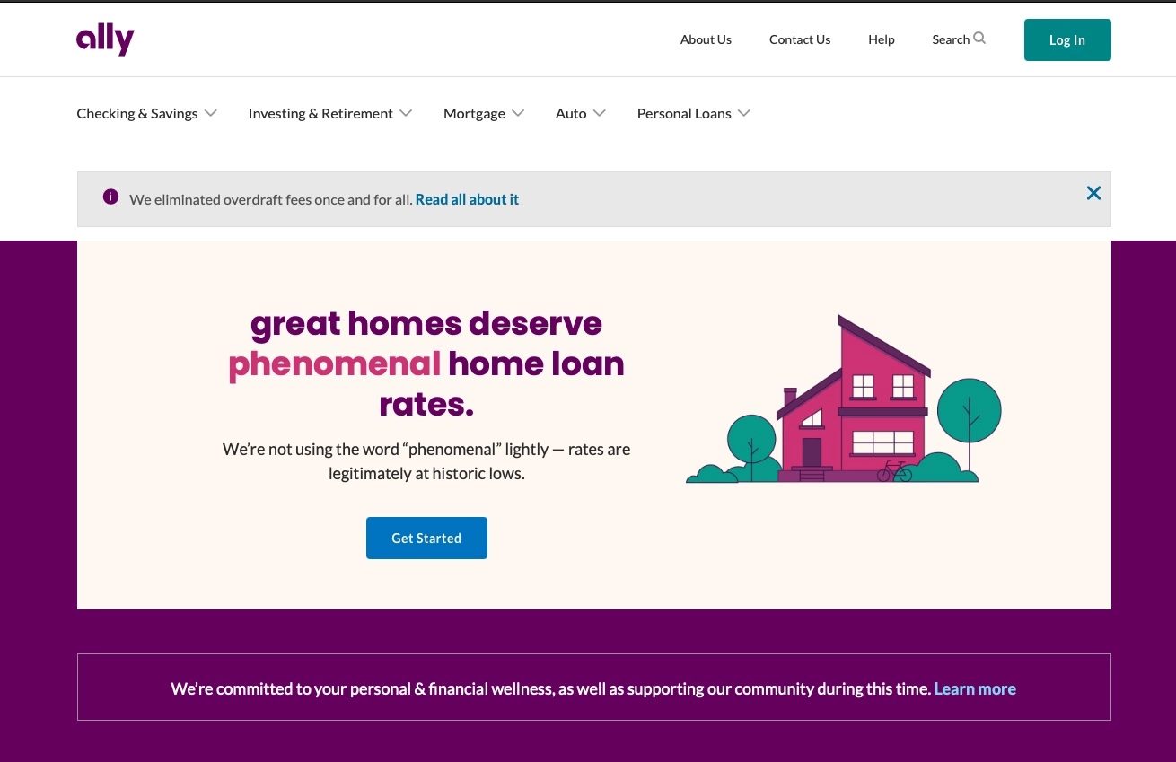
Although the brand essence of Ally is much more advanced than the other brands on this list, the brand identity is perhaps a little lacking. The primary logo design is a simple typographic treatment of the word “ally” with the letter “a” custom drawn. Dark purple is the brand’s corporate color. However, there is no other visual language storytelling on the website which itself looks sparse and boring.
ATOM
BRAND ESSENCE
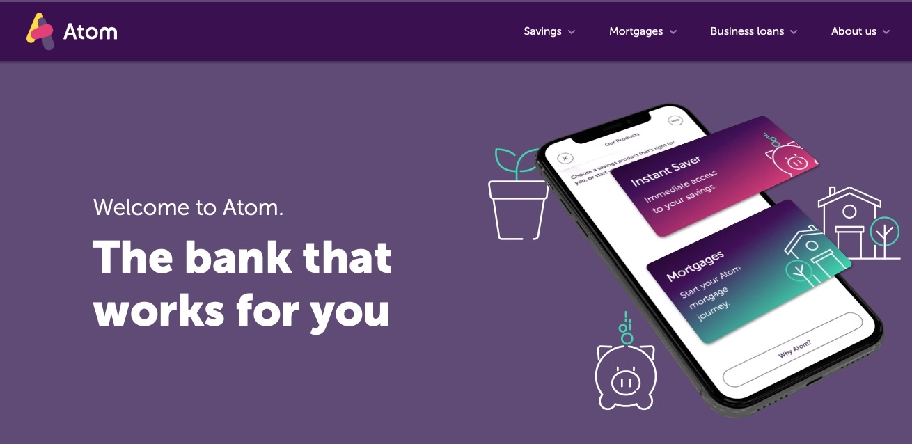
A digital bank that you can only access through an app on your smartphone or tablet.
Vision: To change banking for good. For the better. For everyone.
Mission: We help people who want to own their own homes and build their own businesses.
Tag line: The bank that works for you
Brand Name Explanation: –
The primary logo design and brand identity are slightly better for Atom. The logo icon is the letter A made out of abstract colorful shapes. Dark purple and crimson pink seem to be the corporate colors but these are not unique and look like the corporate colors of Ally or a few other financial institutions. The website is much better than others on this list and some care was taken to be consistent in their branding as well as storytelling. The website has a lot of information including annual reports which communicate the message that this is trying to be authentic and transparent.
VENMO
BRAND ESSENCE
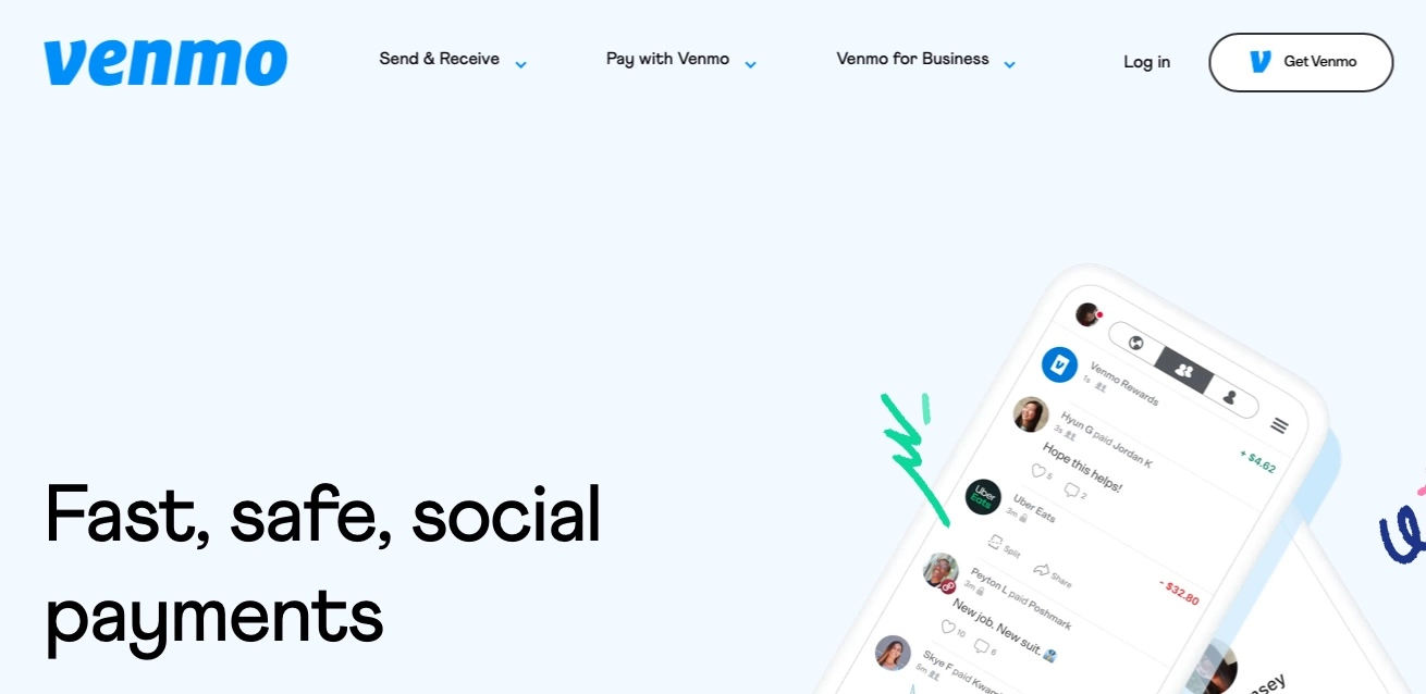
Since 2009, Venmo has been the app for fast, safe, social payments between friends. It’s the app where settling up feels like catching up, and where money enhances friendships rather than complicating them.
Vision: Bringing people together
Mission: Venmo is so much more than peer-to-peer payments. It’s a mobile hub for handling your money, so you can focus on the moments.
Tag line: Fast, safe, social payments
Brand Name Explanation: The name Venmo comes from vendere, Latin for “to sell,” and “mo” for mobile. Kortina says that picking a name wasn’t a huge deal for the fledgling company. They just wanted something that was short, could be used as a verb, could be spelled intuitively (no startup cliches like switching c’s and k’s), and could be purchased on GoDaddy for cheap. (source)
Yet another primary logo design is a simple typographic treatment with one letter slightly customized. The strategy with one letter being custom is that it can then be used as an icon – social media avatars, app icons, and more. The pale color and the website design give off “Web 2.0” vibes of the 4-5 years ago. The layout and information flow is quite decent on the website.
WORLDREMIT
BRAND ESSENCE
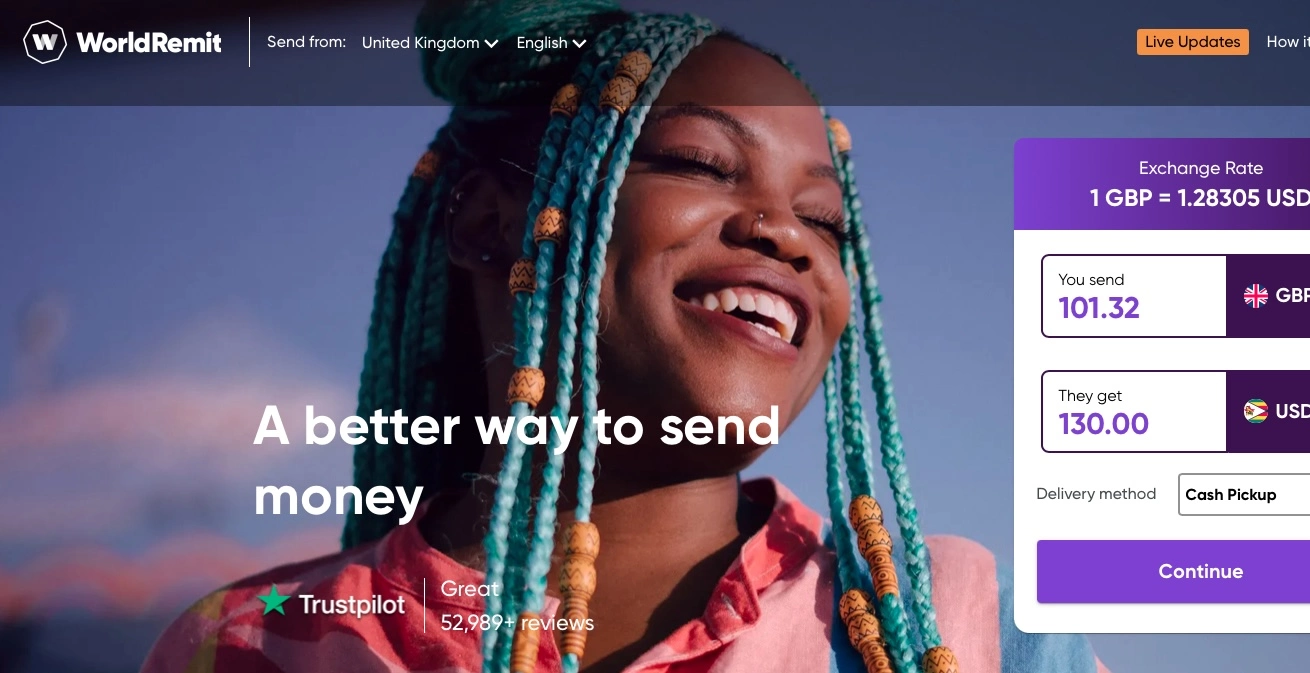
WorldRemit is an innovative, forward-thinking company that goes from one success to another. Over the last ten years, the business has grown to serve 5.7 million customers, using 70 different currencies, across 130 countries worldwide.
Vision: –
Mission: –
Tag line: A better way to send money
Brand Name Explanation: –
Although Worldremit’s brand essence is poorly communicated on their website – i.e I could not find their vision and mission, I do like their brand identity. The primary logo design is the letter W enclosed in a polygon. I like the website design and the layout of information, typography, colors and imagery.
AZIMO
BRAND ESSENCE
Azimo B.V. is an online remittance service headquartered in Amsterdam, Netherlands. It also has offices in Kraków, Poland.
Vision: The money transfer service for hard-working people
Mission: To make it faster, cheaper, and easier for people to support their loved ones back home.
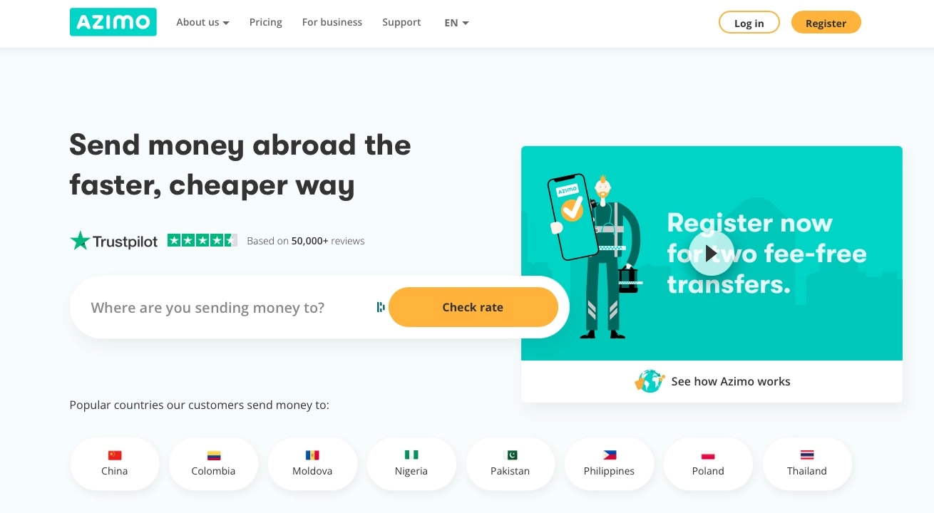
Tag line: Send money abroad the faster, cheaper way
Brand Name Explanation: –
I like the Azimo brand identity including the primary logo design and the teal color palette. The use of flat and modern illustrations is very consistent throughout the website.
ZETTLE
BRAND ESSENCE
Zettle makes modern point-of-sale (POS) products designed to simplify every workday. Take payments and track every sale, all in one place.
Vision: –
Mission: To help small businesses succeed in a world of giants
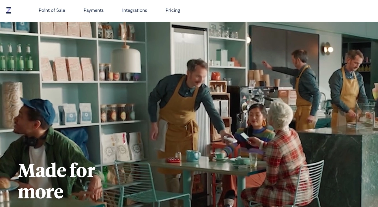
Tag line: Made for more
Brand Name Explanation: –
The brand identity of Zettle is quite sparse. The primary logo design is the letter Z but without any design element or customization. However, I do like the website and the use of custom illustrations. It is clean, slick and quite easy to navigate.

Mash Bonigala
Creative Director & Brand Strategist
With 25+ years of building brands all around the world, Mash brings a keen insight and strategic thought process to the science of brand building. He has created brand strategies and competitive positioning stories that translate into powerful and stunning visual identities for all sizes of companies.
Featured Work
See Our Work in Action
Real brands, real results. Explore how we've helped businesses transform their identity.
Client Love
What Our Clients Say
Don't just take our word for it. Hear from the brands we've worked with.
Tom McGee
PD Campus
"We tried several designers to design our logo and could not find the one that fit our company. After a few years of searching for a good branding company, I found Spellbrand through a random search. Spellbrand was sensational! They took the time to listen to our story and created a few designs that spoke to our team and what we do. We've never had a designer do that. We not only received a great logo, but we now have a brand we are all proud to wear! Thank you!"
Josh Amburn
Lakefront Docks and Lifts
"I came into this project expecting to get the best logo for our brand. That’s exactly what I received. The team at SpellBrand used the descriptions of what we do along with a color palette of our site to design three amazing concepts. Once we decided on what worked best for our needs, they worked diligently to perfect the design. Their use of their project management software makes the collaboration painless. Great work team! We’ll see you on the next project! Josh"
Related Services You Might Love
Based on what you just read, here are services that can help you achieve similar results for your brand.
Free Download
Brand Consistency Checklist
A 27-point checklist to audit your brand across every touchpoint. Used by our team on real client projects.
Success! Check your email for the download link.
Instant PDF download. We'll also send branding tips -- unsubscribe anytime.
Keep Reading
Related Articles
Mar 27, 2026
Your Brand Name Doesn't Matter (As Much As You Think)
A brand naming agency telling you the name isn't everything? Yes. After naming 250+ brands since 1998, here's the uncomfortable truth about what actually drives brand success.
Read More
Mar 26, 2026
Brand Culture: How to Build an Internal Culture That Amplifies Your External Brand
Your brand is only as strong as the people who deliver it. Learn how to align internal culture with your external brand promise so that every employee interaction reinforces what your marketing communicates.
Read MoreMar 26, 2026
Brand Name Ideas: 50 Examples by Industry with Expert Analysis
Explore 50 real brand name examples across 10 industries with expert analysis on why they work. Get naming inspiration and learn what makes a brand name memorable.
Read More
