Spellbrand Blog
Top 10 Star Logos (Updated Edition)

Everyone wants to be a star nowadays, which may be why star logos are all around us. This shape denotes excellence, quality, and, at times, alternative culture. The following ten-star logos represent ten very different brands and different logo styles, but the star shape is well used in all of them.
UPDATE: This post has been so popular that we have decided to update the logos.
!all star finance logo design
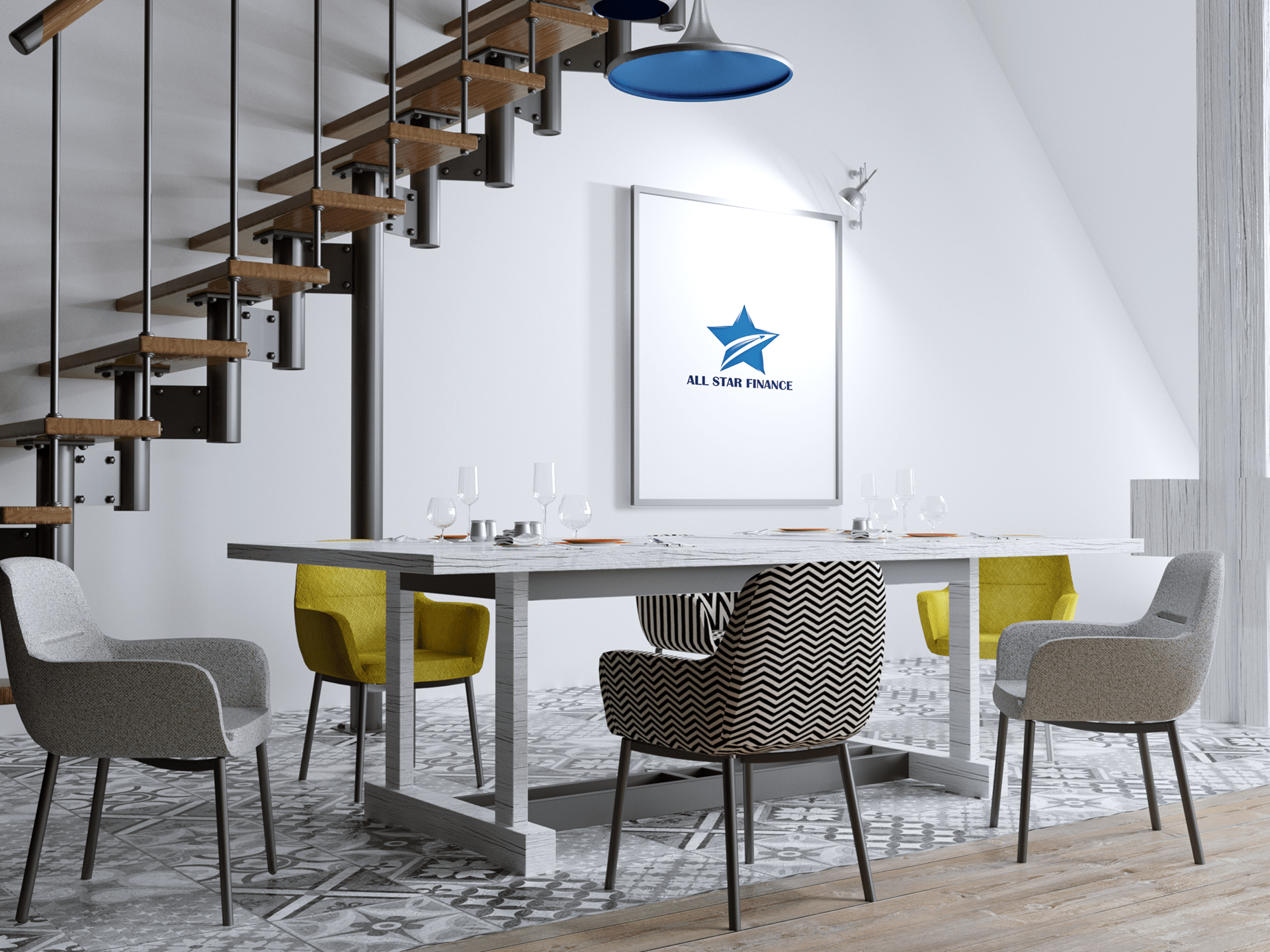
All Star Finance Logo Design
An interesting-looking logo design with a bold star and a single color. Although the shape of the star is traditional, the designer added a little bit of gradient to arms and streaks to break up the monotony. In the middle of the star is a rocket with a jet stream. Although I must admit, the rocket is perhaps a little too cliche to represent “business taking off” perhaps.
!star travel logo design
Israel Travel Star Logo Design
Although this is a concept logo and not really a brand logo, we decided to include it here for it’s sheer creativity and fun rendering of a star. The star is made up of a David’s star and a paper flying plane to bring the message of Israel and travel into one visual.
!m star logo design
M Star Logo Design
Another concept logo that we particularly liked for it’s unique design that still ends up looking regular and memorable. The star with integrated M look stylish and versatile, although it is debatable it would have the same effect if it is rendered flat.

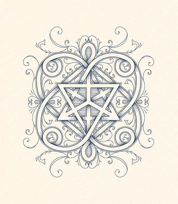
Araminta Barbour star emblem
A superb example of an ornate emblematic vintage illustration with a star in the middle enclosed by refined ornamental design elements. The design is a non-traditional logo design and would work really well if the positioning and target audience are well aligned.
!superum star logo design
Superum star logo
Another example of a simple star logo with a rocket inside it. However, in this case, it makes sense. The designer chose a star and a rocket to hint at the core value of the brand which is ambition. Because the rocket was subtly integrated and creates a clean negative space, it really works well in this logo design.
!stark logo design
Stark star logo
A beautiful example of a fun and cool-looking star logo made up of a star, spark and the letter S. The cool gradients add a lot of punch to the logo and is sure to make it pop. Logos like this work well for app or platform-based startups.
!matchstick alliance logo design
Matchstick Alliance logo
Matchstick Alliance is a group of highly talented individuals from different industry perspectives to help entrepreneurs reach their goals.
“Your entrepreneurial idea is a matchstick. It contains the potential to set the world on fire. Yet, without the right conditions, it could also quickly flame out, or never ignite at all.”
I really like this logo. The glow of the matchstick really shows through and the simplicity of the star shape and the stick end making up one of the arms of the star really catches your attention.
Image Source
!p star logo design
P Star logo
Letter-based logos are always interesting and it is hard to find clever interpretations of such logos. In this case, the P Star logo looks stunning and makes sense. The incorporation of the star does not look forced and fits nicely into the overall flow of the design.

Star Kids logo
Another simple yet impactful logo with a star and the negative space creates the image of a kid. The various stars around the main star create that fun and bright organization vibe and this is a technique that works really well for non-profit or charity organizations.

A3 Laboratory logo
I find this logo very interesting. It takes a non-traditional approach to a star logo design and creates a star from parts of the Jaguar to form the whole. At least, I think it is a Jaguar. It could be a cat too. But the speed of the Jaguar comes across on the dynamic angle of the design.
A Star Logo Design
Branding and logo design is becoming common among schools in the UK. There was a time when marketing was absent in educational organisations such as schools, but more and more are seeing the community and student pride that comes from having a brand that you can be proud of. As more and more schools begin to access professional design services, the bar is being raised all around the UK. Schools with plain or old fashioned signage now feel out of date.
The National Star College and its sister organization the National Star Foundation recently introduced two separate but linked identities. The college educates students who have some very real challenges, mainly young adults with physical disabilities that can make it difficult to attend a traditional university or to get trained for a productive future. The National Star Foundation is a charitable foundation that helps to provide new opportunities for students of the school.
The college and foundation need a more professional brand and UK logo design not just for pride, but because the organisation is approaching a period of growth. They want to develop a wider range of services and also to make their cause better known in the UK. Having a great logo design created can help the National Star College and Foundation to begin achieving these goals. As the college stated in their release announcing the new logo design, they are not really known outside the disability sector, which will be a challenge in any expansion.
The new logo design features the name of the company in bold white letters against a coloured background. The S is shaped so that it has a shooting star hidden within. The National Star College uses the shortened ‘NSC’ on a leafy green background, while the foundation logo design uses merely the S (the same one as in the other logo) against a rich purple. Both organisations have developed straplines that express their purposes for people who are not familiar with them, which will help to build awareness for the growing brands.
There were a few challenges in developing this brand, which were identified by the organisation. First, the organisation wanted to make it clear that they serve adults, not children. Second, the brands for the college and the foundation needed to be distinct and yet work well together. Last, the logo design had to be versatile enough to be used in a variety of contexts, including uniforms, vehicles, marketing, stationary and more. In addition, the star image clearly ties into the name.
One of the key challenges for this brand in the future will be its reliance on colour. It is easy to see the logo designs losing recognition power if rendered in black and white formats, which will probably be necessary at some point. While the colours are modern and eye-catching, they are possible the most stylish and attention-getting parts of each logo design. When the colour is removed, a lot of the brand will go with it. However, it is a great logo design and a very effective brand for two related organisations that are doing a lot of good in UK communities.
Brand Building Tip: Know Your Niche
A common mistake when starting a business is to try to be all things to all people. This will get you nowhere fast because competition is stronger than ever. Consumers don’t have time to read multiple marketing materials—in fact, they tune out faster than ever before.
If you want to make your mark, you’ll need to stand out. Paradoxically, this means digging your heels in.
You see, if you don’t define your niche early on, people will have a hard time defining you. They won’t be able to recommend you to friends because they can’t articulate exactly what it is you do.
Think of Honda.
When Honda hit the scene, Americans were scrambling to get their hands on affordable automobiles. After all, much of America in the 1960s was rural. One of the things that made Honda so successful in the U.S. in the following decades was that American consumers could quickly and easily relate the company’s core offerings to one another.
Honda consistently offered reliable automobiles and motorbikes at affordable prices.
So, what’s your niche? How is your product different from what’s already out there?
When reading your value proposition, you should find some reference to what your niche is within it. If you don’t, then your niche may not be adequately defined.
In the case study, Developing Sustainable Value Propositions in Industrial Markets, the authors explore this concept in great depth.
As you can see, the image of a star can be used in many different ways, to imply several different meanings. Unlike more basic shapes, such as the circle and square, the meaning of a star depends heavily on culture and even on the age of the viewer. A good logo designer knows how your target audience will view this and other shapes, and how to create a logo design that will draw them in.
* Unless otherwise stated all copyrights to the top 10 logos shown above belong to their respective owners. SpellBrand has not designed any of these designs unless explicitly mentioned in the review itself
Brand Building Tip: Be Helpful
Today’s consumers don’t like being sold to. They’re bombarded by advertisements night and day, and they have largely become blind and deaf to them. To reach consumers, then, you need a broader approach. Programs like Energy Star—which is run by the U.S. government—don’t need to worry too much about brand recognition. They simply…exist. You don’t have the same luxury.
To get consumer attention in today’s crowded marketplace you need to provide value.
Fortunately, there are several ways to show your customers you care—and, ultimately, that’s what they want. They want to know that you’re more than a cold, calculating corporate entity.
One of the best ways to ensure you remain relevant is to become a Sage archetype in your space. For a how-to on this, look no further than John Deere. The company went out of its way to become a thought leader in the agriculture space, informing consumers of all things farming-related. In fact, the company was very early to the content marketing game. In 1895, John Deere launched what is considered the first branded media, their magazine, The Furrow. Today, the publication exists primarily online, where it still helps to cement the company’s reputation as a leader in lawn care and agriculture.
For more on how to do content marketing right—like the folks at John Deere—see the case study, Content Marketing Insights from IAB’s Town Hall.
Another way to grab and hold customer attention is to humanize your brand. The goal here is to think of your brand as a real person, only bigger and bolder. Thinking of your brand as a person forces you to be specific. One problem with the concept of brand is that it’s nebulous. Thinking of your brand in broad terms will result in vague marketing materials that won’t have any impact on consumers.

Mash Bonigala
Creative Director & Brand Strategist
With 25+ years of building brands all around the world, Mash brings a keen insight and strategic thought process to the science of brand building. He has created brand strategies and competitive positioning stories that translate into powerful and stunning visual identities for all sizes of companies.
Featured Work
See Our Work in Action
Real brands, real results. Explore how we've helped businesses transform their identity.
Client Love
What Our Clients Say
Don't just take our word for it. Hear from the brands we've worked with.
Liana Alexander Raye
Harlequin Starr International Styles
"Working with the Spellbrand team has been incredibly easy. Mash has a team of experts who are extremely visionary and pioneering, pulling together ideas and initial thoughts into an actual brand giving you options that you feel best align with your thought process. I have no idea how they created my brand based on the vague brief I gave them, but they have worked wonders and magic. Their design, attention to detail, willingness to ensure the final product is exceptional all counts towards a company who has the client at the forefront of mind at every step of the way. Spellbrand is my Number 1 go to for all branding, website and design concepts moving forward. I look at them as an extension to our marketing arm. Just brilliant."
Ernest Bannister
M.O.R.E
"My experience with the Spell brand team has been nothing short of excellent. From the beginning Mash and team made me feel very comfortable with the design process. I am extremely happy with the results of my design and look forward to working with Spellbrand; exclusively! I have told many family, friends and peers about the great work the Spellbrand team has done in creating my design. Thanks again for all your patience and professionalism; I look forward to working with you in the future."
Related Services You Might Love
Based on what you just read, here are services that can help you achieve similar results for your brand.
Free Download
Brand Consistency Checklist
A 27-point checklist to audit your brand across every touchpoint. Used by our team on real client projects.
Success! Check your email for the download link.
Instant PDF download. We'll also send branding tips -- unsubscribe anytime.
Keep Reading
Related Articles
Apr 3, 2026
When to Kill Your Brand Name (And How to Rename Without Losing Everything)
Your brand name might be holding you back. After renaming dozens of established businesses, here are the 6 signs it's time to let go, the real cost of renaming, and the process that protects the equity you've already built.
Read MoreApr 2, 2026
We've Named 250+ Brands. These Are the 7 Naming Strategies That Actually Work.
After 26 years and 250+ brand names, here are the seven naming strategies we use repeatedly because they produce names that survive trademark screening, resonate with audiences, and compound in value over time.
Read MoreApr 1, 2026
The $100K Brand vs. the $5K Brand: What You're Actually Paying For
A line-by-line breakdown of what separates a $5K brand from a $100K brand. After 26 years of pricing branding projects, here's the honest truth about where the money goes and whether it's worth it.
Read More

