Spellbrand Blog
Top 10 Global Logos
Looking for a custom logo?
Get a professional, one-of-a-kind logo designed by our award-winning team.
Looking for a custom logo design?
Our professional designers create unique, memorable logos tailored to your brand.
See Our Logo Design Services →International Appeal: The Top Five Lessons Your Can Learn from Global Logos
Have you ever wondered how a company grows from a small business to an international giant? The logo is at least one piece of these success stories. Here are ten companies that are dominating their markets on a global scale and what we can learn from their logo design about how to build a logo that speaks in a language everyone can understand.
Use Shape to Convey Your Meaning. Two good examples of this are the Olympic logo and the OPEC logo.
Olympics Logo Design
While every Olympics has its own logo, designed by the country in which the games are occurring that year, the Olympics itself has a logo that is recognizable around the world. The lesson here is that to build a logo that will be universally recognized, you must use shapes that have universal meanings. In this case, the circle is an inclusive shape. Intertwining the circles emphasizes the point that these are global events, including people from many countries. Read more about the top 10 Olympics logos.
OPEC Logo Design
OPEC is another example of how to use shape to build a logo with international appeal. The Organization of Petroleum Exporting Companies is an international conglomerate that has perhaps the most control over the global economy of any organization or even any country. Their logo uses modified circles to express inclusiveness, and is remarkable in its ability to carve four very different letters from this one simple shape.
Use Color to Your Advantage. Google and the Red Cross are both companies that use color successfully in both their logo and their branding.
Google Logo Design

Google has changed their logo slightly throughout the years, but one thing that has never changed is the primary color scheme that has become part of the company’s brand. Because this company has tried to be different, easier, and more fun than their competitor’s, this elementary school palette is very appropriate. Google is a good example of how to use to color to build a logo that portrays a certain image.
Red Cross Logo Design
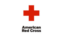
The Red Cross has built an image as a worldwide humanitarian organization, and their choice of color is especially significant. Red is not just the color of blood; it is also a color that gets attention. Because the Red Cross needs to be recognizable from a long way away and to be easily distinguished from military organizations, this is an especially appropriate choice of color. If you need to build a logo that gets instant notice, using a bold color such as red may be one way to get the job done. Read more about the top 10 charity organization logos.
Be Consistent. Two companies that have built a global brand through consistently using the same image are Coca-Cola and IBM.
Coca-Cola Logo Design
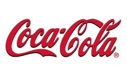
The Red Cross has built an image as a worldwide humanitarian organization, and their choice of color is especially significant. Red is not just the color of blood; it is also a color that gets attention. Because the Red Cross needs to be recognizable from a long way away and to be easily distinguished from military organizations, this is an especially appropriate choice of color. If you need to build a logo that gets instant notice, using a bold color such as red may be one way to get the job done. Read about the top 10 beverage logos.
IBM Logo Design
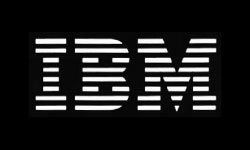
IBM does not use its original logo, but the current logo has a high recognition factor because it has been used for several consecutive decades with very few changes. The logo uses simple letters with lines going through them. The lines both add recognition and are representative of the lines of coding that are seen in many IBM products. However, there is nothing trendy or dated about this logo; it is a good example of how to build a logo that can withstand the test of time. Read about the top 10 hardware logos.
Stay As Simple As Possible. The BBC and Walmart are two very different organizations that nonetheless are both clear winners when it comes to creating recognition through keeping it sweet and simple.
BBC Logo Design
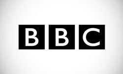
From the BBC, we can see that one way to build a logo with impact that crosses cultures is to keep it simple. This logo’s black and white color scheme shows that they are all business, an impression driven home by the use of business-like squares and a bold but basic font without serifs. As a result, people all over the planet recognize the BBC logo and understand the purpose of the company it represents. Any frills or additional details would only detract from this well recognized international logo. Read about the top 10 media logos.
Walmart Logo Design
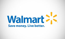
Walmart is another global giant that has a simple logo. The lettering is simple and bold. The color blue is known to be calming, while the sun-like image beside the lettering suggests that the letters represent a blue sky. The new tagline, ‘Save money. Live better’, is prominently written under logo. A lot of information about the company is conveyed in this simple logo, making it another good example of how to build a logo that works.
Be Industry Specific. McDonald’s and Playboy International are both experts in conveying a message about their products with logo design.
McDonald’s Logo Design
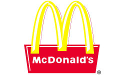
Children all over the world recognize the golden arches of the McDonald’s logo, and part of this is due to the fact that the logo is unusually expressive of its industry. McDonalds has a lot to teach about how to build a logo that immediately communicates the corporate industry. First, it uses colors that are strikingly similar to ketchup and mustard, the two condiments you will see the most of at this fast food restaurant. Second, the ‘M’ appears to be made out of French fries, the product for which McDonald’s is perhaps best known. Read about the top 10 restaurant logos.
Playboy Logo Design

Playboy is a controversial but nonetheless successful company that has used its logo to build an international brand. It’s no coincidence that this logo is highly industry specific. The rabbit refers to the Playboy ‘bunnies’ for which this company is known, while the formal necktie is an allusion to the gentleman image that the company has tried to cultivate. Playboy’s success is no secret, making this another good example of how to build an international logo that is both industry specific and generally recognized by a worldwide audience.

Mash Bonigala
Creative Director & Brand Strategist
With 25+ years of building brands all around the world, Mash brings a keen insight and strategic thought process to the science of brand building. He has created brand strategies and competitive positioning stories that translate into powerful and stunning visual identities for all sizes of companies.
Featured Work
See Our Work in Action
Real brands, real results. Explore how we've helped businesses transform their identity.
Client Love
What Our Clients Say
Don't just take our word for it. Hear from the brands we've worked with.
Josh Amburn
Lakefront Docks and Lifts
"I came into this project expecting to get the best logo for our brand. That’s exactly what I received. The team at SpellBrand used the descriptions of what we do along with a color palette of our site to design three amazing concepts. Once we decided on what worked best for our needs, they worked diligently to perfect the design. Their use of their project management software makes the collaboration painless. Great work team! We’ll see you on the next project! Josh"
Raymond Chen
RLC Global Archicom, Singapore
"SpellBrand was very accommodating from the beginning of the design process even when we had distinct design ideas, being architect designers ourselves. Jeff responded with many preliminary style options based on our initial sketchy ideas, enabling us to zoom in on the specific feel we were looking for. From that point on, it was just refinement and the final logo was in our hands in a matter of days. We have used SpellBrand on other logos for my clients projects."
Related Services You Might Love
Based on what you just read, here are services that can help you achieve similar results for your brand.
Free Download
Brand Consistency Checklist
A 27-point checklist to audit your brand across every touchpoint. Used by our team on real client projects.
Success! Check your email for the download link.
Instant PDF download. We'll also send branding tips -- unsubscribe anytime.
Keep Reading
Related Articles
Nov 17, 2025
Top 10 Simple Logos (Yet Effective Logos)
Discover the top 10 simple logos (yet effective logos) logos. Expert analysis of iconic logo designs, their history, and what makes them memorable.
Read MoreNov 17, 2025
Top 10 American University & College Logos
Discover the top 10 american university & college logos logos. Expert analysis of iconic logo designs, their history, and what makes them memorable.
Read MoreNov 17, 2025
Top 10 Car Company Logos
Discover the top 10 car company logos logos. Expert analysis of iconic logo designs, their history, and what makes them memorable.
Read More
