Spellbrand Blog
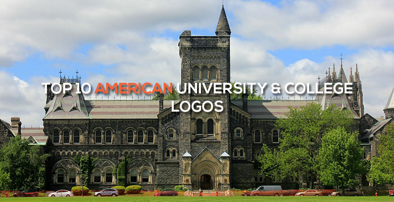
Top 10 American University & College Logos
Looking for a custom logo?
Get a professional, one-of-a-kind logo designed by our award-winning team.
Looking for a custom logo design?
Our professional designers create unique, memorable logos tailored to your brand.
See Our Logo Design Services →Education as a Brand: Top Ten American College Logos
Although few people think of their university as a brand, that is in fact what many have become. Colleges can make big money by selling apparel bearing their professional education logo designs as well as becoming well known enough to have games and other functions shown on national television. Having a recognizable brand also rallies student spirit while encouraging more people to apply at the school in question. Here are the top ten American university logos and why they are so powerful among students and the community.
Yale University Logo Design
Like many older and more established universities, Yale has a crest for a logo. The colors are the school colors, but the lettering is perhaps the most significant aspect of the logo. The Hebrew lettering is especially significant to the university, as Hebrew was a required subject in the college’s early days. The words are Urim v’Thummim, which roughly translate as Light and Truth. The same words are repeated in Latin at in a scroll at the bottom of the crest. It’s obvious from the professional logo designs that this university values knowledge and integrity, which is exactly the image that they are trying to portray.
Washington State University Logo Design
Washington State University, known as ‘Wazzu’ to students and alumni, has a modern logo that is nonetheless striking and appropriate. The letters WSU are blended into a cougar, which is the school mascot. The font and the school colors are a distinctive part of the WSU brand, making this a not just an example of great professional logo designs, but a great brand as well.
Princeton University Logo Design
Princeton was originally a theological seminary, and their logo recalls these religious roots. It uses a crest, which is significant because the founders were Yale graduates, another university using a crest logo. Like most universities, the school colors are featured prominently. The wording reads ‘Dei sub numine viget’, which means ‘Under God’s power she flourishes’, while the open book is an obvious reference to the Bible. While Princeton is no longer solely a religious school, its professional logo designs recall an earlier and important time in the school’s history.
Howard University Logo Design
This historically black college was established shortly after the Civil War and shows its patriotic roots both in its professional logo designs and in its red, white, and blue school colors. However, the distinctively American flair doesn’t end there; the seal is striking similar to many used by the federal government. This school is service oriented, which can be seen in the motto ‘Veritas and Utilitas’, meaning ‘Truth and Service’ in Latin. In a small book central to the logo, the Latin words for ‘God and Country’ remind students and community of what is truly important to Howard.
City University of New York (CUNY) Logo Design
This is not one college, but rather an entire system of them. Because its organization is very different from many other universities, it is only appropriate that CUNY’s professional logo designs also be different. Rather than rely on a crest or drawing on mascots for inspiration, this logo has a contemporary edge, with a solid color-filled square and the school initials placed off center for an effect reminiscent of modern art. Everyone who sees this logo can guess that CUNY is a little different, so the logo is effective and appropriate.
Arizona State University Logo Design
This college has a seal, but the logo that is used in apparel and literature most often is the recognizable ASU logo. The logo features the three letters in block print, in the recognizable maroon that is one of the school colors. The other color, gold, is shown in a sun that is behind the middle letter. Because the school mascot is the Sun Devil, the sun of these professional logo designs is appropriate for both the university and the sunny state in which it is located.
Penn State University Logo Design
Short for Pennsylvania State University, Penn State’s shortened nickname is recognizable enough that it is featured on the school’s professional logo designs. The logo, which is colored in the university’s distinctive blue, features a ‘Nittany Lion’, which is a type of mountain lion that was once found commonly in the area as well as the school mascot. The graphic is shaped like a shield and features the year that the school was founded, 1855, both of which lend an air of establishment and tradition.
Indiana University Logo Design
Because the school mascot, the Hoosiers, does not lend itself well to simple professional logo designs, Indiana University has chosen a text-only logo that is both attractive and recognizable. The graphic features an overlapping U and I, centered to appear balanced. The font is bold with serifs, creating a formidable image. The image is in one of the school colors, crimson. This logo is recognizable, appropriate, and simple enough to last the test of time.
University of Central Florida Logo Design
This university logo is different because it uses the circle, a shape which traditionally makes people feel included. The mascot is the Knights, but the professional logo designs feature a horse, which is traditionally associated with knights and chivalry. The horse has wings, giving it a sense of freedom and movement that many college students can appreciate. A star is strategically placed above the horse’s head, which ties in to the school motto: Reach for the stars.
Dartmouth College Logo Design
Dartmouth’s shield logo is a winner because it manages to incorporate a lot of information about the school while making Dartmouth seem different from other Ivy League colleges. The shield shape lends a touch of tradition, while the motto, ‘Vox Clamantis in Deserto’ shows the school’s uniqueness because it means ‘The voice of one crying in the wilderness’. The shield features a schoolhouse in an obviously rural area, which refers to the very rural area in which Dartmouth is located, one factor which makes the Dartmouth experience different from that at other well-known colleges.
Because branding is so important, many schools have entire departments of staff assigned to the cause. However, you can get the same results for a far more reasonable sum by hiring a logo designer or branding consultant. While colleges have much to teach about, they offer one lesson that every business owner can learn from: the power of a brand.

Mash Bonigala
Creative Director & Brand Strategist
With 25+ years of building brands all around the world, Mash brings a keen insight and strategic thought process to the science of brand building. He has created brand strategies and competitive positioning stories that translate into powerful and stunning visual identities for all sizes of companies.
Featured Work
See Our Work in Action
Real brands, real results. Explore how we've helped businesses transform their identity.

Client Love
What Our Clients Say
Don't just take our word for it. Hear from the brands we've worked with.

Gracienne Myers
Banana Vital
"If you are looking for a company to design your company’s identity or even rebrand your current brand, Spellbrand is the company that you would choose, they designed my company, Banana Vital’s logo, and provided me with 6 design to choose from which made it hard to choose because they were all very good. Just recently I hired them to rebrand Mechanical Bull Sales and again every logo was great and well thought out. I am very pleased with the work that Spellbrand has provided and I am looking for to continue working with them."

Liana Alexander Raye
Harlequin Starr International Styles
"Working with the Spellbrand team has been incredibly easy. Mash has a team of experts who are extremely visionary and pioneering, pulling together ideas and initial thoughts into an actual brand giving you options that you feel best align with your thought process. I have no idea how they created my brand based on the vague brief I gave them, but they have worked wonders and magic. Their design, attention to detail, willingness to ensure the final product is exceptional all counts towards a company who has the client at the forefront of mind at every step of the way. Spellbrand is my Number 1 go to for all branding, website and design concepts moving forward. I look at them as an extension to our marketing arm. Just brilliant."
Related Services You Might Love
Based on what you just read, here are services that can help you achieve similar results for your brand.
Free Download
Brand Consistency Checklist
A 27-point checklist to audit your brand across every touchpoint. Used by our team on real client projects.
Success! Check your email for the download link.
Instant PDF download. We'll also send branding tips -- unsubscribe anytime.
Keep Reading
Related Articles
Nov 17, 2025
Top 10 Simple Logos (Yet Effective Logos)
Discover the top 10 simple logos (yet effective logos) logos. Expert analysis of iconic logo designs, their history, and what makes them memorable.
Read MoreNov 17, 2025
Top 10 Car Company Logos
Discover the top 10 car company logos logos. Expert analysis of iconic logo designs, their history, and what makes them memorable.
Read MoreNov 17, 2025
Top 10 Clothing and Fashion Brands
Discover the top 10 clothing and fashion brands logos. Expert analysis of iconic logo designs, their history, and what makes them memorable.
Read More