Linden Foods: German Simplicity in Hyderabad
Situation: Rebranding Food Packaging Company in Competitive Market
Linden Foods is a food packaging and restaurant holding company located in Hyderabad, India. With a rich history of servicing the packaged food industry, the client wanted to rebrand to a fresh new look that would be in line with modern branding initiatives that client had planned for the next couple of years.
The Hyderabad food packaging industry is highly competitive and to stand out from the competition, Spellbrand proposed a bold brand strategy– to create a “German” like logo design with simplicity and elegance. During our market analysis we noticed that competitive brands had quite chaotic and cluttered branding and visual language.
The food packaging market in Hyderabad is competitive, with numerous brands competing for shelf space. Most competitors had chaotic and cluttered branding, creating an opportunity for a brand that stands out through simplicity and elegance.
![]()
Task: Create Brand Identity That Stands Out
The challenge required:
- Market differentiation: Brand identity that stands out from chaotic competitors
- Modern rebrand: Fresh new look aligned with modern branding initiatives
- Simplicity: German-inspired design with simplicity and elegance
- Packaging design: Simple and bold packaging that stands out on shelves
![]()
![]()
![]()
![]()
Action: Strategic Brand Development
Logo Design: German-Inspired Simplicity
The Hyderabad food packaging industry is highly competitive and to stand out from the competition, Spellbrand proposed a bold brand strategy– to create a “German” like logo design with simplicity and elegance. During our market analysis we noticed that competitive brands had quite chaotic and cluttered branding and visual language. A simplistic logo and color palette would then help the client stand out from the crowd.
This design approach:
- Creates German aesthetic: Simplicity and elegance stand out from chaos
- Ensures clean design: Minimal visual language differentiates from competitors
- Uses simple palette: Simple color palette creates visual distinction
- Positions boldly: Bold strategy sets brand apart
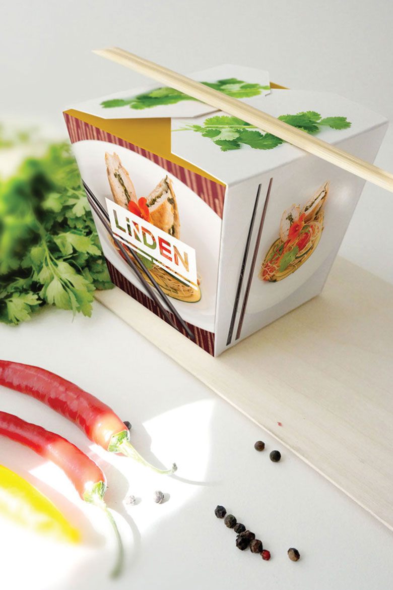
Packaging Design: Simple and Bold
We also helped the client with designing some of the packaging for their new line of Asian Instant Food packages. This included using simple and bold photos of the food on the packaging with ample white space and very simple branding. The instant food packages on the shelves by their competitors were so overloaded with images, design and text that they all looked the same. By removing all unnecessary details and text from the food box packaging, these packages stand a chance to stand out on the shelves of super markets.
This packaging approach:
- Uses simple bold photos: High-quality food photos with white space
- Minimizes branding: Very simple branding reduces clutter
- Differentiates on shelf: Stands out from overloaded competitor packages
- Removes clutter: Clean design removes unnecessary details and text
Food Packaging Design Principles
If you are thinking of getting your food package design created, perhaps these principles can help you:
- Keep the packaging design simple and clean
- Use high-quality images of the food
- Remove all unnecessary embellishments and design elements from the packaging
- Reduce the amount of text – as long as they are within the government guidelines
- Make sure your packaging is completely different from your competition – this is critical
Result: Brand Identity That Stands Out
The brand identity we created for Linden Foods successfully positions them as a food packaging company that stands out from the competitive Hyderabad market. The comprehensive brand transformation delivers:
Strategic Outcomes
- Market differentiation: Brand identity successfully stands out from chaotic competitors
- Modern rebrand: Fresh new look aligned with modern branding initiatives
- Simplicity: German-inspired design with simplicity and elegance achieved
- Packaging design: Simple and bold packaging that stands out on shelves
- Complete brand system: German-inspired logo, simple color palette, and clean packaging create unified experience
Implementation Success
Today, Linden Foods uses this comprehensive brand identity to attract customers who want modern, clean food packaging. The simple logo design and clean packaging with ample white space create a distinctive visual identity that differentiates them from competitors with chaotic and cluttered branding. The brand successfully positions Linden Foods as a food packaging and restaurant holding company that combines simplicity and elegance with high-quality food photography, creating packaging that stands out on supermarket shelves through clean, minimal design.
Brand Name Strategy: Creating “Linden Foods”
The name “Linden Foods” was developed through Spellbrand’s strategic brand naming process. Our team researched the competitive landscape, target audience, and brand positioning to create a name that would resonate in the market and support long-term brand growth.
The naming process included linguistic analysis, trademark screening, domain availability verification, and brand storytelling to ensure “Linden Foods” would be distinctive, memorable, and legally protectable. Learn more about our brand naming service or explore our full naming portfolio.