Lohrenz Farms: 50 Years of Agricultural Excellence
Situation: Rebranding 50-Year-Old Corporate Farming Operation
Lohrenz Farms are a corporate farming operation. They have been in business for over 50 years and have established a respectable name.
Lohrenz Farms custom farm, or manage farmland for farmers that no longer wish to do the labor themselves, or are owners that wish to benefit from the profits of farming, but are not equipped to do the work. They also farm a significant amount of land themselves. Their main crops are corn and soybeans. They utilize the latest technology in the field to provide the highest level of efficiency for their customers and the best profit margins possible.
After 50 years they decided to rebrand and came to Spellbrand for this important task. The agricultural industry requires brands that communicate both heritage and modern technological capabilities. Lohrenz Farms needed a brand identity that would honor their 50-year legacy while positioning them as a modern, technology-driven farming operation.
Task: Rebrand While Preserving Heritage
The challenge required:
- Heritage preservation: Maintain 50 years of respect and recognition
- Modern appeal: Hint at technological advancements
- Versatile design: Works across vehicles, newsletters, websites, business cards
- Industry relevance: Incorporate agricultural themes (corn, soybeans, farming)
Action: Strategic Brand Development
Brand Strategy: Heritage Meets Modernity
The client let us know that they were looking at color, imagery, and of course name recognition – all in one for their logo development. They also wanted a symbol incorporated in the logo, either an ear of corn, or a tractor, or an agricultural theme that would fit their industry and the services they provide (corn and soybeans, farming operations).
The primary goal of this project was to create a logo that would stand out from our competition and since the logo will potentially be displayed on their vehicles, their newsletters, correspondence, their future website, business cards, etc., we had to create something that would translate well onto different media.
We wanted to create a brand that stayed true to it’s roots, heritage and tradition. At the same time, we also wanted to hint at modernity because of the technological advancements they have made in their farming practices.
This strategic approach:
- Preserves heritage: Stays true to 50 years of roots and tradition
- Hints at modernity: Reflects technological advancements in farming
- Ensures versatility: Works across vehicles, newsletters, websites, business cards
- Incorporates industry: Incorporates agricultural themes (corn, soybeans)
Brand Solution: Emblem with Corn Rising Like the Sun
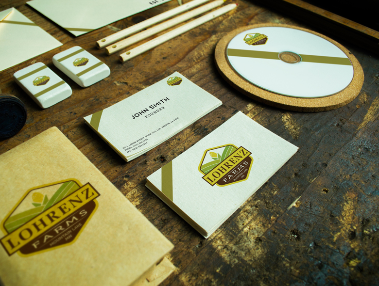
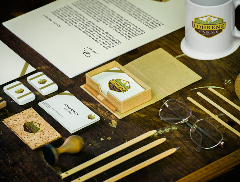
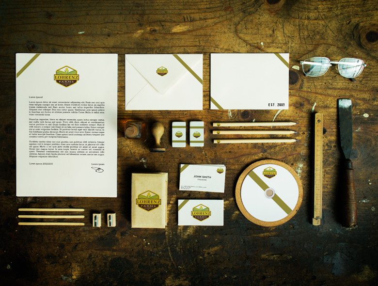
The team at Spellbrand set to work on this project and came up with 10 different ideas incorporating the imagery that the client specifically wanted to see. Since we have worked with countless companies related to the food and drink industry, we were able to come up with some really stunning design ideas. When we presented the designs to the client, they were quite thrilled. They got back to us a couple of days later and selected the final design. They wanted to see a few tweaks and wrapped up the project in a few days to move on to creating matching stationery design.
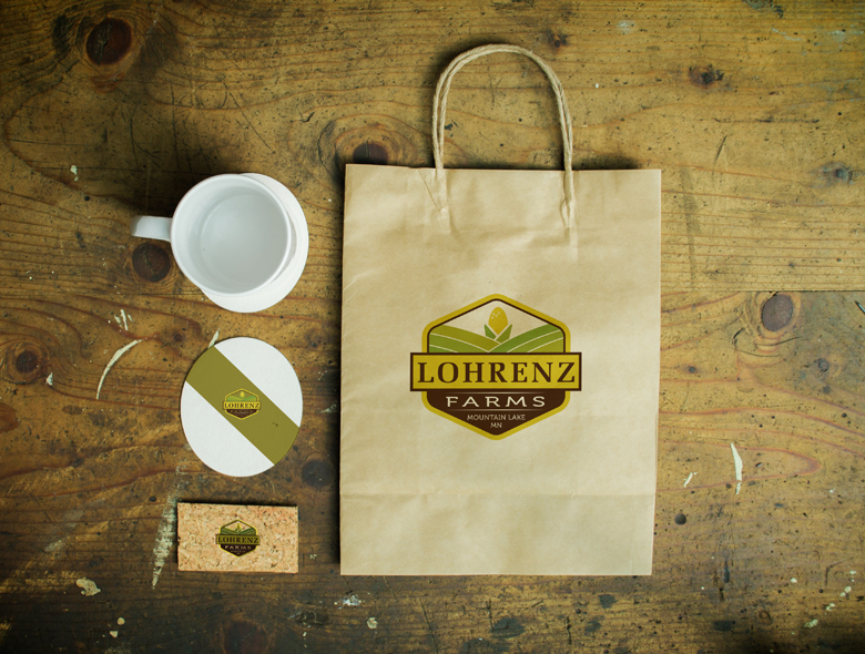
We came up with an emblem like shape for the logo design since that would not only lend itself well to reproduction across different media, but also look traditional. We then created an abstract illustration of rolling hills farm with an ear of corn rising above the horizon like the Sun. This indicates that Lohrenz Farms is a beacon of hope and light for their clients.
We used a traditional and conservative font for the main part of the name and a more modern and soft font for the sub text. The legibility factor was quite important and hence we framed the lettering with flat Earthy colors.
This design approach works because:
- Emblem shape: Traditional look that reproduces well across media
- Rolling hills: Represents farmland and agricultural landscape
- Corn rising like sun: Symbolizes beacon of hope and light for clients
- Dual typography: Traditional font for name, modern font for subtext
- Earthy colors: Flat colors improve legibility and frame lettering
Complete Brand Identity System
We also created stunning matching stationery design items including rustic looking business cards, letterhead, envelope design as well as paper bags, coffee mugs, erasers, CD cases and more.
Result: Brand Identity That Honors Heritage
The brand identity we created for Lohrenz Farms successfully balances heritage and tradition with modern appeal. The comprehensive brand transformation delivers:
Strategic Outcomes
- Heritage preserved: Brand successfully maintains 50 years of respect and recognition
- Modern appeal: Brand hints at technological advancements
- Versatile design: Logo works across vehicles, newsletters, websites, business cards
- Industry relevance: Brand incorporates agricultural themes (corn, soybeans, farming)
- Complete brand system: Emblem logo, stationery design, and marketing materials create unified experience
Implementation Success
Today, Lohrenz Farms uses this comprehensive brand identity to attract customers who need custom farming or farmland management services. The emblem logo design with its rolling hills and corn rising like the sun creates a powerful visual representation of a beacon of hope and light for their clients, while the versatile design works across all media from vehicles to websites. The brand successfully positions Lohrenz Farms as a 50-year-old corporate farming operation that utilizes the latest technology while staying true to its roots, providing the highest level of efficiency and best profit margins possible through technological advancements while honoring their 50-year heritage and tradition.
Brand Name Strategy: Creating “Lohrenz Farms”
The name “Lohrenz Farms” was developed through Spellbrand’s strategic brand naming process. Our team researched the competitive landscape, target audience, and brand positioning to create a name that would resonate in the market and support long-term brand growth.
The naming process included linguistic analysis, trademark screening, domain availability verification, and brand storytelling to ensure “Lohrenz Farms” would be distinctive, memorable, and legally protectable. Learn more about our brand naming service or explore our full naming portfolio.