La Fame: Beauty as an Abstract Idea
Situation: Launching London Cosmetics Brand in Asian Market
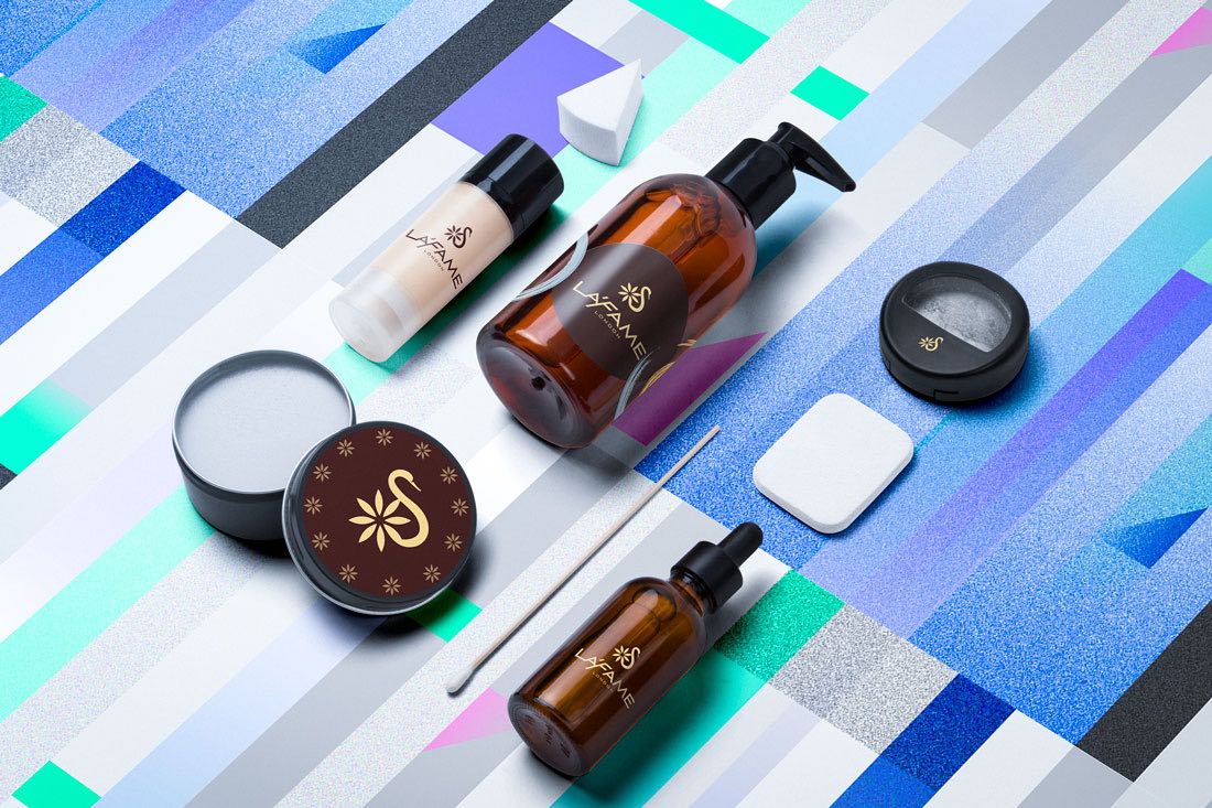
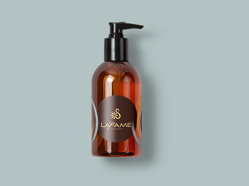
La Fame is a cosmetics brand based in Europe’s financial capital London but will be launched in the Asian market to start off as an imported brand and to compete with regional top local brands. The products to start off will be beauty cream, beauty soap, face wash, etc.
The Asian cosmetics market is highly competitive, with numerous local and international brands competing for attention. La Fame needed a brand identity that would work in both European and Asian markets while positioning as premium yet accessible—a challenging balance that requires sophisticated brand strategy.
Task: Create Brand Identity for Dual Market Launch
The challenge required:
- Dual market appeal: Brand identity that works in both European and Asian markets
- Premium positioning: Sophisticated enough for premium brand positioning
- Accessible appeal: Affordable enough for daily use
- Elegant design: Visual identity that suits both markets’ aesthetic preferences
Action: Strategic Brand Development
Brand Strategy: Beauty as an Abstract Idea
After much research and brainstorming we came up with the strategy to approach beauty as an abstract idea.
This strategic approach:
- Transcends boundaries: Abstract concept of beauty transcends cultural boundaries
- Creates universal appeal: Works in both European and Asian markets
- Appeals to premium segment: Sophisticated approach appeals to premium market
- Allows flexible positioning: Enables premium yet accessible pricing strategy
Logo Design: Abstract Swan with Flower
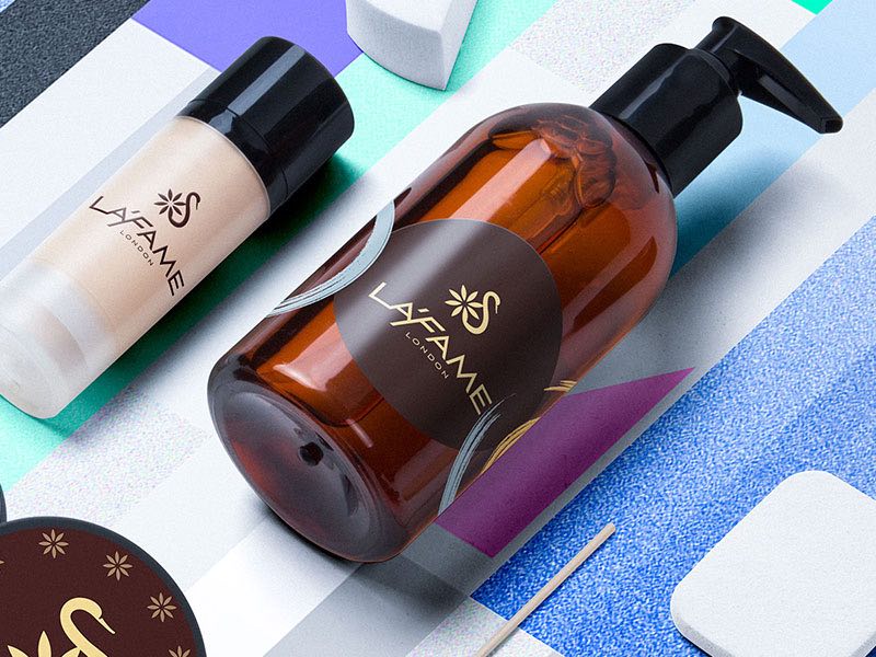
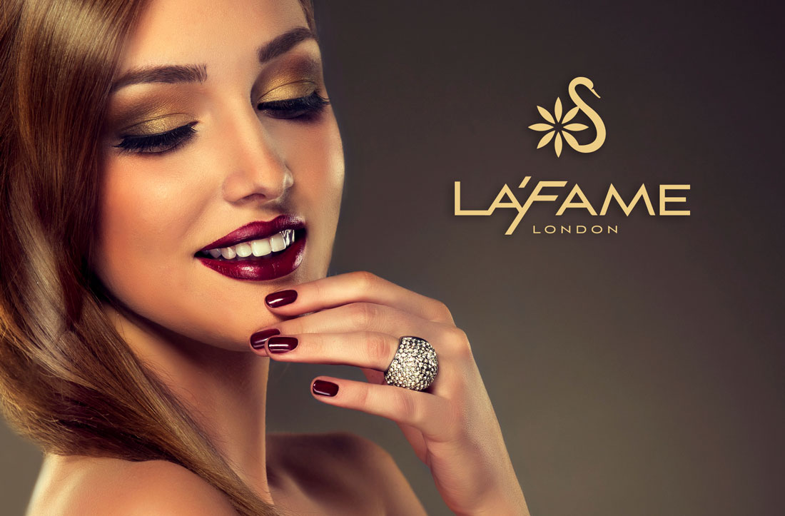
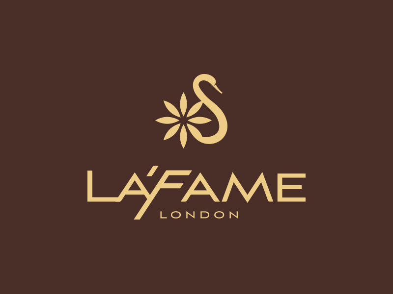
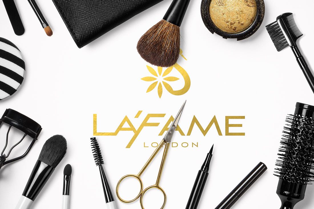
We created an abstract and minimalistic swan icon with a flower incorporated into the design to add flair and make the swan design unique. For the typography we chose a hard edged yet elegant font and customised it to create a truly exceptional and catchy brand identity.
This design approach:
- Represents elegance: Swan symbol communicates elegance and grace
- Appeals to modern aesthetic: Abstract minimalism resonates with contemporary consumers
- Adds uniqueness: Flower element adds flair and distinctiveness
- Balances elegance and modernity: Hard-edged typography is elegant yet modern
- Creates exceptional identity: Customized design ensures brand distinctiveness
Brand Positioning: Premium Yet Accessible
The brand identity had to be sophisticated enough to position the brand as a premium brand but at the same time accessible enough to be considered affordable and for daily use. This presents a problem in terms of brand strategy since this requirement feels like the brand is straddling two opposing positioning angles.
But at the heart of the brand, we recognised core values that aligned perfectly with the target audience and this enabled Spellbrand to create a simple, elegant and understated identity development that connects with customers and creates a loyal following.
This positioning works because:
- Core values alignment: Connects with target audience values
- Simple elegance: Understated design appeals to both markets
- Premium perception: Sophisticated enough for premium positioning
- Accessible appeal: Affordable enough for daily use
- Customer connection: Creates loyal following
Result: Brand Identity That Bridges Two Markets
The brand identity we created for La Fame successfully positions them as a cosmetics brand that works in both European and Asian markets. The comprehensive brand transformation delivers:
Strategic Outcomes
- Dual market success: Brand identity successfully works in both European and Asian markets
- Premium positioning: Sophisticated brand identity competes with top local brands in Asia
- Accessible appeal: Remains accessible enough for daily use
- Abstract beauty concept: Approach to beauty as abstract idea transcends cultural boundaries
- Customer connection: Simple, elegant, and understated identity creates loyal following
Implementation Success
Today, La Fame uses this comprehensive brand identity to launch in the Asian market as an imported brand. The abstract swan logo design with its minimalistic aesthetic and elegant typography creates a sophisticated brand identity that is premium enough to compete with top local brands in Asia while remaining accessible enough for daily use. The brand successfully positions La Fame as a London-based cosmetics brand that approaches beauty as an abstract idea, creating a simple, elegant, and understated identity that connects with customers and creates a loyal following in both European and Asian markets.
Brand Name Strategy: Creating “La Fame”
The name “La Fame” was developed through Spellbrand’s strategic brand naming process. Our team researched the competitive landscape, target audience, and brand positioning to create a name that would resonate in the market and support long-term brand growth.
The naming process included linguistic analysis, trademark screening, domain availability verification, and brand storytelling to ensure “La Fame” would be distinctive, memorable, and legally protectable. Learn more about our brand naming service or explore our full naming portfolio.