Pinnacle: Disrupting Accounting Through Digital Innovation
Situation: Creating Brand Identity for Digital Accounting Platform
Pinnacle’s mission is ambitious: disrupt the accounting sector by bringing easy-to-use accountant services through digital platforms. In an industry known for complexity and traditional methods, they needed a brand identity that would communicate innovation, trust, and accessibility.
The accounting industry has been slow to embrace digital transformation. Most firms still operate with traditional methods that create friction for clients. Pinnacle saw an opportunity to change this by making accounting services as accessible and user-friendly as modern software platforms.
The digital accounting market requires brands that communicate innovation, trust, and accessibility. Pinnacle needed a brand identity that would differentiate them from traditional accounting firms while building trust in a financial services context.

Task: Create Complete Brand Strategy and Visual Identity System
When Pinnacle approached Spellbrand, they were building a new digital accounting services platform from the ground up. The challenge required:
- Brand strategy: Complete brand strategy positioning for digital disruption
- Brand naming: Brand name that communicates excellence and achievement
- Visual identity: Logo design and brand identity system
- Digital differentiation: Brand that differentiates from traditional accounting firms
- Trust building: Brand that builds trust in financial services context

Action: Strategic Brand Development
Brand Strategy: Positioning for Digital Disruption
Our brand strategy positioned Pinnacle as:
- Innovative: Leveraging technology to simplify accounting
- Accessible: Making professional accounting services available to businesses of all sizes
- Trustworthy: Maintaining the reliability expected in financial services
- Modern: Appealing to forward-thinking entrepreneurs and businesses
Brand Naming: “Pinnacle” - Reaching the Peak
The name “Pinnacle” was chosen to communicate excellence and achievement—qualities that businesses want in their accounting partner. It suggests reaching the highest point, which aligns perfectly with helping businesses achieve their financial goals.
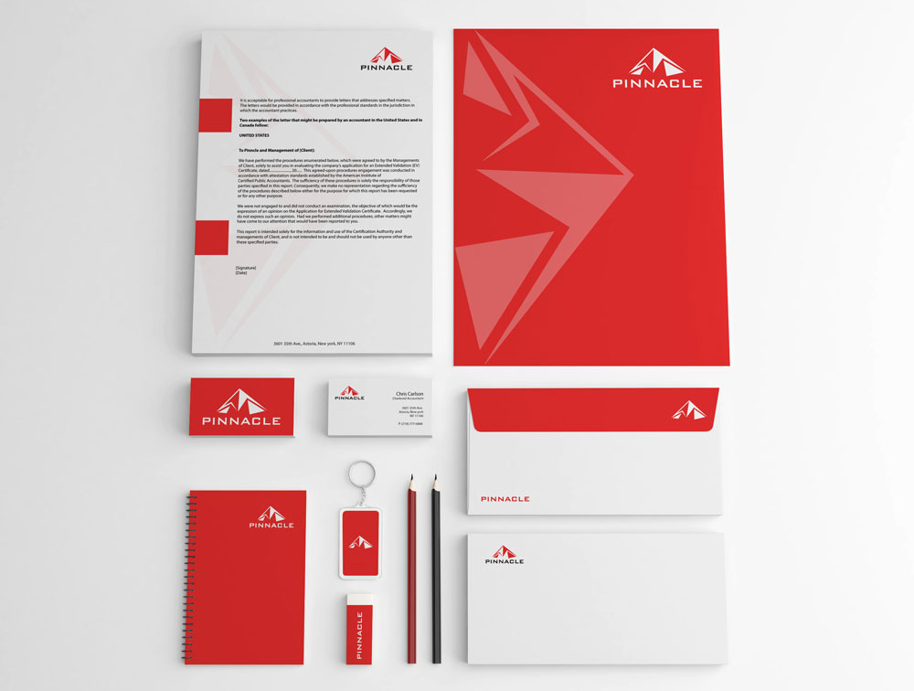
Logo Design: Modern and Professional
The logo design needed to balance modern digital aesthetics with the trust and professionalism required in financial services. We created a mark that feels contemporary yet reliable, innovative yet stable.
Key design elements include:
- Clean, geometric forms: Suggest precision and accuracy
- Modern typography: Feels digital-native
- Professional color palette: Builds trust
- Versatile applications: Works across digital and print
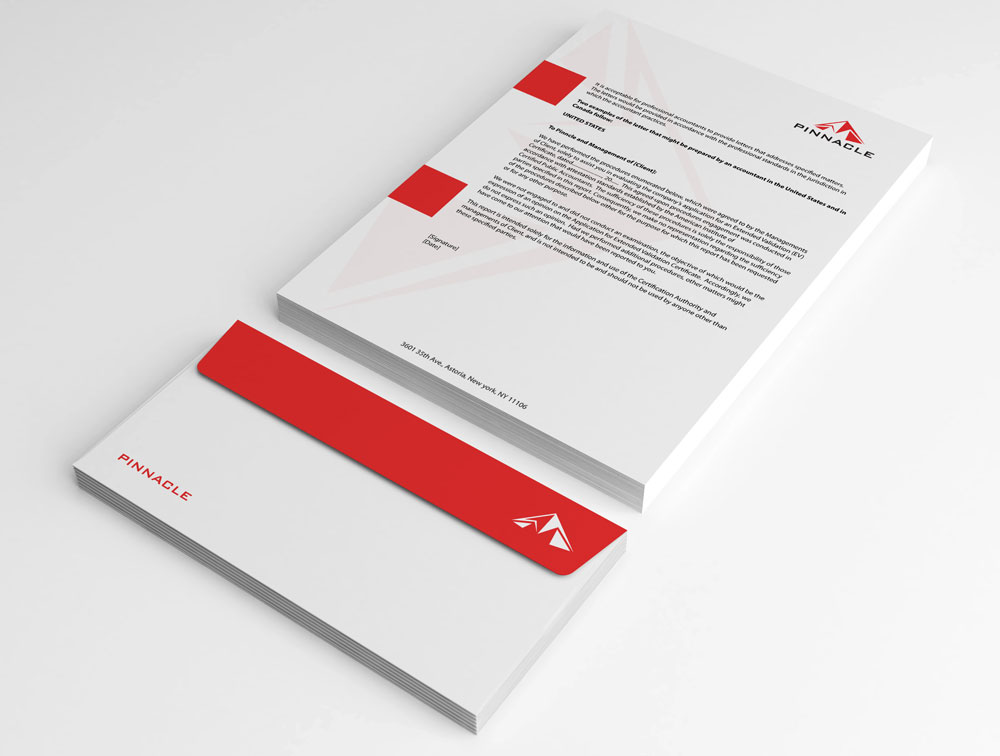
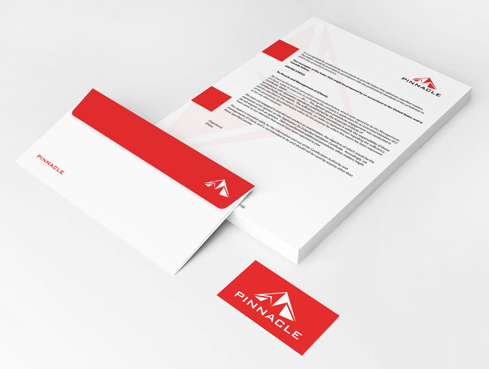
Visual Identity System: Cohesive and Scalable
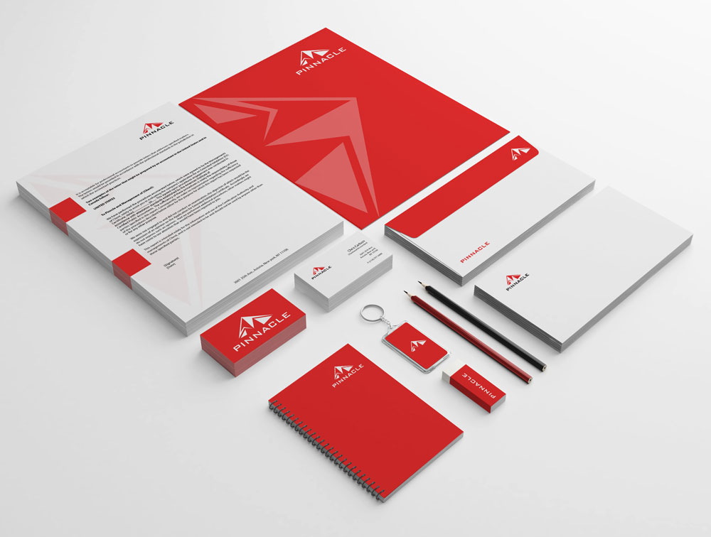
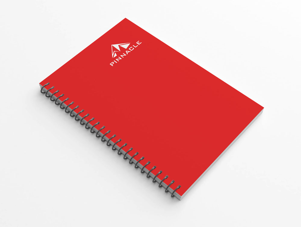
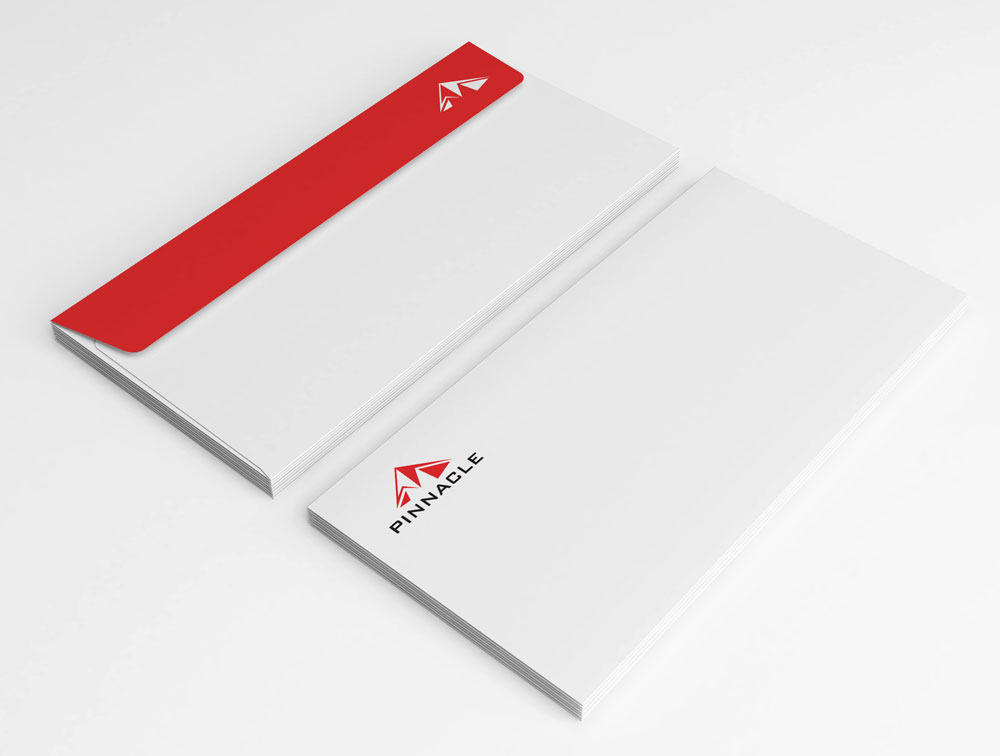
The complete brand identity system extends beyond the logo to create a cohesive visual language that works across all touchpoints—from the digital platform interface to marketing materials to client communications.
Result: Brand Identity Ready for Digital Disruption
The brand identity we created gives Pinnacle the visual foundation to compete in the digital accounting space. The comprehensive brand transformation delivers:
Strategic Outcomes
- Brand strategy: Brand strategy successfully positions for digital disruption
- Brand naming: Brand name successfully communicates excellence and achievement
- Visual identity: Logo design and brand identity system successfully created
- Digital differentiation: Brand successfully differentiates from traditional accounting firms
- Trust building: Brand successfully builds trust in financial services context
- Complete brand system: Logo, brand identity system, and visual language create unified experience
Implementation Success
Today, Pinnacle uses this comprehensive brand identity to attract modern businesses looking for streamlined, digital-first accounting solutions. The logo and brand system communicate innovation while maintaining the trust and professionalism that businesses require when choosing an accounting partner. The brand successfully positions Pinnacle as an innovative, accessible, trustworthy, and modern accounting platform that breaks free from traditional industry constraints, leveraging technology to simplify accounting and making professional accounting services available to businesses of all sizes.
