Spellbrand Blog
Use of Color in Creating Logo Designs
Color is one of the most powerful tools in logo design. It is often the first thing people notice about your brand, and it communicates personality before a single word is read. The colors you choose for your logo will influence how customers perceive your brand, remember your business, and feel about your products. Get it right, and color becomes a strategic asset. Get it wrong, and you send the wrong message entirely.
The science of color perception
Color is not decoration. It is a fundamental part of how humans process visual information. Our brains are hardwired to respond to color, often before we consciously register what we are seeing. This happens in milliseconds, making color one of the fastest channels for communicating with your audience.
The human eye can distinguish thousands of different colors, shades, hues, and tints. Most people have three types of color receptors (cones) that allow us to see color. Some people, particularly women, have four types, giving them enhanced color perception. This variation means your logo colors will be perceived slightly differently by different viewers, but the overall psychological responses tend to be consistent.
Context matters too. The same color looks different depending on what surrounds it, what material it is printed on, and what lighting conditions it is viewed under. Professional logo designers test colors across multiple applications and contexts for this reason.
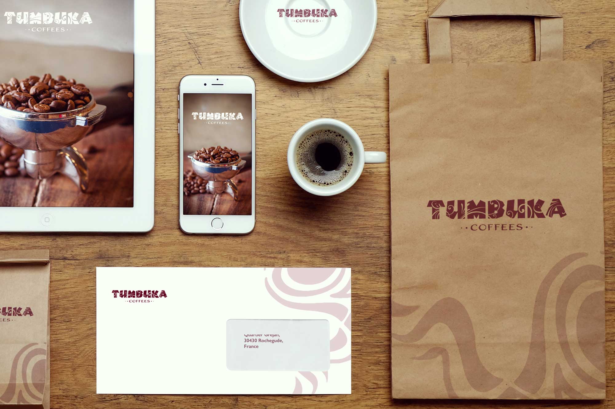
What colors communicate
Red
Red grabs attention faster than any other color. It is energizing and passionate, making it a natural fit for brands that want to convey excitement, urgency, or appetite. Food brands lean heavily on red because it has been shown to stimulate hunger. Coca-Cola, McDonald’s, and KFC all built their visual identities around it. Red also communicates power and confidence, which is why it appears in sports and entertainment branding. The risk is that red can also read as aggressive or alarming, so it needs careful handling in industries where calm and trust matter more than energy.
Blue
Blue is the most commonly used color in corporate logos, and the reasons are psychological rather than aesthetic. It conveys trust, reliability, stability, and professionalism. Blue is calming and reassuring, which makes it the default for financial institutions, technology companies, and healthcare brands. Facebook, IBM, Samsung, and American Express all rely on blue to signal dependability. The danger is that blue can feel cold or sterile if used without warmth from other elements. Brands in creative industries sometimes avoid blue precisely because it reads as too corporate.
Green
Green connects instantly to nature, growth, health, and freshness. It is calming and balanced, which makes it ideal for environmental brands, health and wellness companies, and organic products. Green also carries associations with prosperity, which is why many financial brands use it alongside blue. Whole Foods, Starbucks, and John Deere all use green to different effect. The challenge is that green occupies a wide spectrum from lime to forest, and each shade carries a different feeling. A bright lime green feels energetic and modern; a deep forest green feels established and premium.
Yellow
Yellow is the most visible color in the spectrum and the most difficult for the eye to process. It radiates optimism, cheerfulness, and warmth. Brands targeting creativity, happiness, or youthful energy gravitate toward yellow. McDonald’s golden arches, Snapchat, and IKEA all use yellow to feel welcoming and energetic. The tradeoff is that yellow can feel overwhelming in large doses and cheap in the wrong context. Most designers use it as an accent rather than a dominant color, pairing it with darker tones that ground the design.
Orange
Orange sits between red’s energy and yellow’s cheerfulness, producing a color that feels friendly, enthusiastic, and approachable. It works well for brands that want to feel accessible and fun without the intensity of pure red. Fanta, Nickelodeon, and Home Depot use orange to feel inviting and a little playful. Orange suits technology startups, creative agencies, and brands targeting younger demographics. The risk is that orange can read as unserious, which makes it a tough sell for luxury or financial brands.
Purple
Purple has carried associations with royalty and luxury for centuries, dating to a time when purple dye was so expensive only monarchs could afford it. In logo design, purple communicates sophistication, creativity, wisdom, and a certain mystique. Cadbury, Hallmark, and Yahoo all built identities around purple. It is less common in logos than blue or red, which actually works in its favor: a purple logo stands out in most competitive sets simply because fewer brands use it. Purple suits luxury brands, beauty companies, and creative industries particularly well.
Black
Black is power, sophistication, and timelessness distilled into a single value. It is the color of luxury brands and high-end products: Chanel, Nike, Prada, and Apple all use black as a primary identity color. Black conveys strength and elegance with minimal effort, and it pairs with virtually any accent color. The versatility is unmatched. A black logo works on light backgrounds, dark backgrounds, printed on packaging, embossed on leather, or displayed on a screen. For brands positioning as premium or authoritative, black is often the strongest starting point.
White
White represents simplicity, cleanliness, purity, and minimalism. In logo design, white is most often used as negative space or as part of a minimalist composition. It creates breathing room, lets other elements stand out, and communicates a kind of confident restraint. Apple’s use of white space around its logo is iconic. White is essential for creating contrast and balance, and it ensures that the overall brand identity feels clean rather than cluttered.
Gray
Gray is the diplomat of the color spectrum. It is neutral, balanced, and professional without demanding attention. Technology and corporate brands use gray to convey seriousness and sophistication: Apple’s product lineup, Wikipedia, and Lexus all incorporate gray prominently. Gray works as both a primary color for brands wanting to appear restrained and professional, and as a supporting color that adds sophistication to brighter palettes without competing with them.
Color combinations and harmony
Choosing individual colors is just the beginning. How colors work together determines whether your logo feels cohesive or chaotic.
Complementary colors sit opposite each other on the color wheel: red and green, blue and orange, yellow and purple. These pairings create high contrast and energy, making them effective when you want a logo that grabs attention and feels dynamic.
Analogous colors sit next to each other on the wheel: blue and green, red and orange, yellow and green. These pairings create harmony and cohesion, producing logos that feel calm and unified.
Monochromatic schemes use variations of a single color, creating sophistication and unity through shades and tints rather than contrasting hues. This approach works well for brands that want to communicate simplicity and elegance.
Triadic schemes use three colors evenly spaced on the color wheel, creating balance and vibrancy. This is harder to execute well but produces distinctive, memorable palettes when done right.
Practical considerations
Versatility across applications
Your logo will appear on websites, business cards, product packaging, signage, social media, and dozens of other surfaces. The colors you choose need to work across all of them.
Colors look different on screen versus in print. Screens use RGB (red, green, blue) light, while print uses CMYK (cyan, magenta, yellow, black) inks. Professional designers account for these differences and ensure colors translate well between mediums. Your logo also needs to work in a single color, whether black, white, or a brand color, for applications like embossing, engraving, or single-color printing. A logo that only works in full color limits your options. And it must hold up against light backgrounds, dark backgrounds, and colored backgrounds, which sometimes requires creating variations with sufficient contrast.
Accessibility
Approximately 8 percent of men and 0.5 percent of women have some form of color vision deficiency. Your logo should be recognizable and effective even for people who cannot distinguish certain colors. Sufficient contrast between logo elements, especially between text and backgrounds, ensures readability regardless of color perception. And if your logo uses color to convey meaning, that meaning should also be communicated through shape, typography, or other design elements.
Cultural context
While many color associations are universal, some vary significantly by culture. White represents purity and weddings in Western cultures but mourning in parts of East Asia. Red signals luck and prosperity in Chinese culture but danger or warning in Western contexts. If your brand operates internationally, research how your colors are perceived in each target market before finalizing.
Timelessness versus trends
Color trends come and go, but your logo should last for years or decades. Blue for trust, red for energy, and black for sophistication have remained popular for generations because they tap into responses that do not change with fashion.
Trendy colors can make a logo feel current, but they date quickly. The millennial pink of the 2010s and the Gen Z neon of the 2020s both felt fresh in their moment and tired shortly after. If you use trend-influenced colors, use them as accents rather than primary identity colors, or be prepared to update your logo more frequently. The strongest approach is usually timeless primary colors with trend-aware accents: stability and relevance working together.
Color in digital contexts
Modern logo design must account for digital applications that did not exist when many classic logos were created. Your colors need to work across websites, mobile apps, social media platforms, and digital advertising.
Different screens display colors differently. While you cannot control every display, you can ensure your colors perform well across the most common types by testing on multiple devices. Dark mode, now standard on most platforms, adds another layer: your logo must read clearly in both light and dark interfaces, which may require creating a light-on-dark variation. And as digital logos increasingly animate and interact, consider how your colors work in motion. Some colors translate beautifully into animation; others lose their impact.
Choosing with purpose
Color selection for your logo is a strategic decision, not a personal preference exercise. Start by understanding what you want your brand to communicate. Then consider your target audience, your industry, and your competitive landscape. Use color psychology as a guide, but do not be afraid to break conventions when it serves your brand strategy.
Color is one element of effective logo design, working in combination with typography, shape, and composition to create your complete brand identity system. The most successful logos use color strategically, not decoratively. Your logo colors will become synonymous with your brand. Choose them carefully, test them thoroughly, and use them consistently. When done well, color becomes one of your brand’s most recognizable and valuable assets.
If you need help choosing colors that work for your brand, let’s talk about your project.

Mash Bonigala
Creative Director & Brand Strategist
With 25+ years of building brands all around the world, Mash brings a keen insight and strategic thought process to the science of brand building. He has created brand strategies and competitive positioning stories that translate into powerful and stunning visual identities for all sizes of companies.
Featured Work
See Our Work in Action
Real brands, real results. Explore how we've helped businesses transform their identity.
Client Love
What Our Clients Say
Don't just take our word for it. Hear from the brands we've worked with.

Christian Nocera
Dapper Yankee
"Delighted to have used Spellbrand for our last project. The work was thorough and results excellent. For me it was such a pleasure to work with Mash who was able to keep up with all my last minute requests for small changes. Nothing was too much of a problem and I would have to say that its great to work with people who do actually put the customer needs first! One thing saying it, its another thing doing it – Thanks Mash!"

Joe Russell
VALENSOR
"Mash and his team were amazing. They were able to take our vision and produce a truly creative and unique branding package. What struck me most was their desire to make our company happy alongside ensuring our company has good branding. Mash was always willing to answer our questions and help us arrive at a decision. Overall, SpellBrand is not just creating company names and logos, they are creating character and soul for their clients' companies. I would recommend them to anyone looking to stand-out among their competitors. SpellBrand services are most definitely worth their weight in gold."
Related Services You Might Love
Based on what you just read, here are services that can help you achieve similar results for your brand.
Free Download
Brand Consistency Checklist
A 27-point checklist to audit your brand across every touchpoint. Used by our team on real client projects.
Success! Check your email for the download link.
Instant PDF download. We'll also send branding tips -- unsubscribe anytime.
Keep Reading
Related Articles
Jan 15, 2025
Real Estate Logo Design and Branding: What Actually Works
After designing brand identities for hundreds of real estate professionals, developers, and agencies, here is what separates the agents who get remembered from the ones who get scrolled past.
Read MoreNov 19, 2024
Healthcare & Medical Facilities: Awful Logo Practices
Why some healthcare facilities compromise on logo design and how it harms their reputation. The real cost of cheap branding in the medical industry.
Read MoreNov 19, 2024
Why Crowdsourcing Your Brand's Logo is a Bad Idea
Crowdsourcing logo design seems cheap and easy. But it creates problems that cost far more than professional design in the long run.
Read More