Spellbrand Blog
Developing a Jewelry Logo

Looking for a custom logo?
Get a professional, one-of-a-kind logo designed by our award-winning team.
Looking for a custom logo design?
Our professional designers create unique, memorable logos tailored to your brand.
See Our Logo Design Services →Creating a jewelry logo requires a delicate balance. You need to convey luxury and sophistication while remaining memorable and versatile. Whether you’re launching a fine jewelry line, a contemporary accessories brand, or a custom jewelry studio, your logo sets the tone for how customers perceive your craftsmanship and quality.
The jewelry industry is built on trust, emotion, and aspiration. Your logo needs to reflect these values while standing out in a competitive market. Let’s explore what makes an effective jewelry logo and how to develop one that truly represents your brand.
Understanding the Jewelry Brand Landscape
Before diving into design specifics, it’s important to understand what makes jewelry branding unique. Unlike many industries, jewelry brands often need to appeal to emotion first, logic second. Customers aren’t just buying a product—they’re buying a symbol, a memory, a piece of their identity.
This emotional connection means your logo needs to work harder. It’s not just identifying your business; it’s representing the feelings customers associate with your pieces. A wedding ring brand needs to convey romance and commitment. A fashion jewelry line needs to express style and trendiness. A fine jewelry brand needs to communicate luxury and timelessness.
Key Design Elements for Jewelry Logos
Symbolism and Imagery
Beyond the Obvious
Many jewelry brands make the mistake of using obvious symbols—a diamond, a ring, a necklace. While these elements clearly communicate what you sell, they don’t differentiate you from competitors. Consider more abstract or unique symbols that relate to your brand story or values.
Geometric Elegance
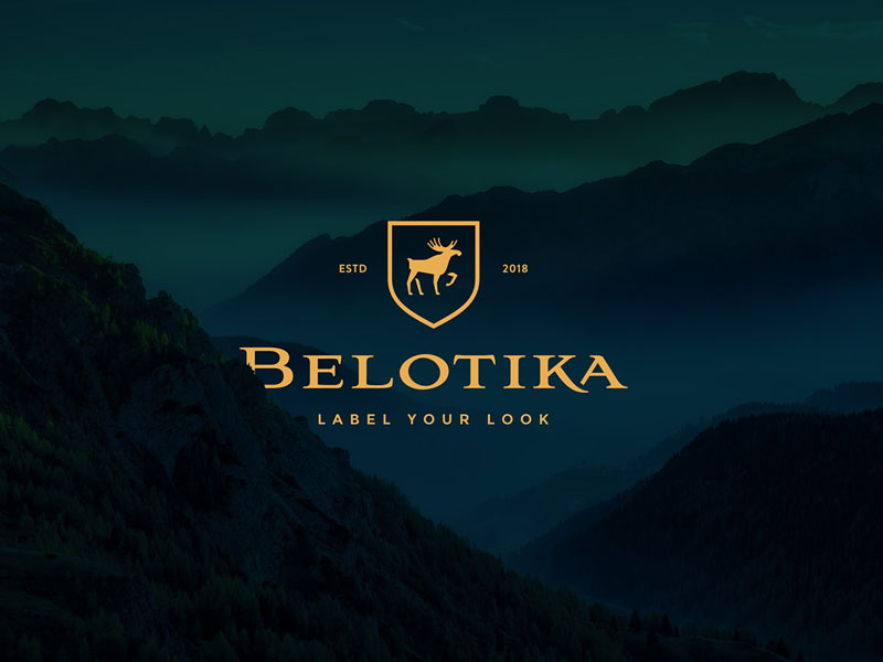
Geometric shapes work beautifully for jewelry logos. Circles suggest completeness and unity—perfect for wedding jewelry. Triangles can represent aspiration and achievement. Hexagons suggest precision and craftsmanship. These shapes feel modern while maintaining sophistication.
Nature-Inspired Elements
Many successful jewelry brands use nature-inspired elements: leaves, flowers, waves, or abstract organic shapes. These connect to the natural materials used in jewelry (metals, gemstones) while creating a more unique visual identity.
Monogram Approaches
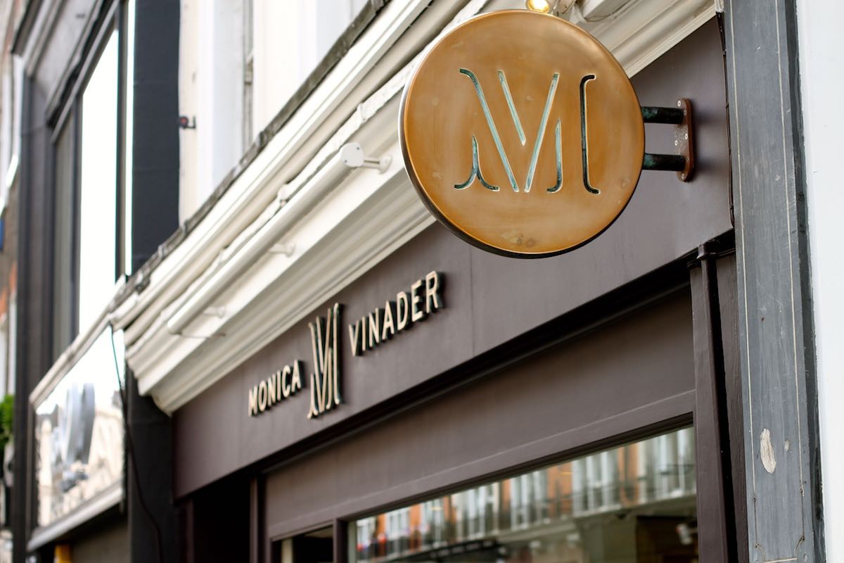
For established brands or those with strong founder names, monogram logos can be highly effective. They feel personal, luxurious, and timeless. Think Tiffany & Co.’s elegant script or Cartier’s refined lettering.
Typography Choices
Script and Serif Fonts
Traditional jewelry brands often use script or serif fonts to convey elegance and heritage. These fonts feel luxurious and timeless. However, they need to be highly legible—especially at smaller sizes on tags, boxes, or digital applications.
Modern Sans-Serif
Contemporary jewelry brands are increasingly using clean sans-serif fonts. These feel fresh, modern, and approachable while still maintaining sophistication. They work particularly well for brands targeting younger customers or those positioning themselves as accessible luxury.
Custom Lettering
Many luxury jewelry brands use custom lettering that’s unique to them. This creates instant recognition and prevents competitors from using similar typography. Custom lettering can be expensive, but for established brands, it’s often worth the investment.
Font Pairing
Many jewelry logos combine two fonts: one for the brand name and one for taglines or descriptors. The key is ensuring these fonts complement each other without competing. Usually, pairing a script with a sans-serif or a serif with a sans-serif works well.
Color Psychology in Jewelry Branding
Metallic Colors
Gold, silver, and rose gold are natural choices for jewelry logos. They directly connect to the materials used in jewelry while conveying luxury. However, these colors need careful handling—they can look cheap if not executed well.
Black and White
Many luxury jewelry brands use black and white exclusively. This creates a timeless, sophisticated look that works across all applications. Black and white logos are also highly versatile and print beautifully on everything from business cards to packaging.
Accent Colors
When jewelry brands do use color, they typically use it sparingly as an accent. A single color can add personality while maintaining elegance. Deep blues suggest trust and reliability. Rich purples convey luxury and creativity. Soft pinks suggest femininity and romance.
Color Considerations
Remember that your logo will appear on various materials: white boxes, black velvet, silver tags, digital screens. Choose colors that work across all these contexts. A logo that only looks good on white backgrounds limits your marketing options.
Design Process: From Concept to Final Logo
Research and Discovery
Start by researching successful jewelry brands in your category. What design elements do they use? What makes them effective? More importantly, what gaps exist that you could fill? Don’t copy—instead, understand the visual language of your category and find ways to speak it uniquely.
Ready to Transform Your Brand?
Let’s create something magical together. Explore our services and see how we can help you build a brand that stands out.
Consider your target customer. A logo for a high-end fine jewelry brand targeting affluent customers will look very different from one targeting fashion-forward millennials. Your logo should appeal to your specific audience while remaining true to your brand values.
Concept Development
Develop multiple concepts before settling on a direction. Explore different approaches: wordmark-only, symbol-only, combination marks. Each has different strengths. Wordmarks work well for brands with distinctive names. Symbols create visual recognition. Combination marks offer flexibility.
Sketch freely at this stage. Don’t worry about perfection—focus on exploring ideas. Some of the best logo concepts come from unexpected directions. A concept that seems too simple or too abstract might be exactly what your brand needs.
Refinement and Testing
Once you have a direction, refine it carefully. Every line, curve, and spacing decision matters. Test your logo at various sizes: large (for storefronts), medium (for business cards), and small (for social media profiles). It should work beautifully at every size.
Test your logo in different contexts: on white backgrounds, dark backgrounds, colored backgrounds. Test it in color and in black and white. A versatile logo gives you more marketing options and ensures your brand looks professional everywhere it appears.
Application Considerations
Think about where your logo will appear: jewelry boxes, tags, storefronts, websites, social media, advertisements. Each application has different requirements. A logo that works well on a large storefront sign might not work on a small jewelry tag.
Consider creating logo variations: a full logo for larger applications, a simplified version for small spaces, a horizontal version for wide spaces, a vertical version for tall spaces. These variations ensure your logo always looks its best.
Common Mistakes to Avoid
Overcomplicating the Design
Jewelry logos need to be elegant, not complex. Too many elements create visual clutter and reduce memorability. Simplicity is sophistication in jewelry branding.
Using Generic Symbols
Avoid obvious symbols that every jewelry brand uses. A generic diamond or ring won’t differentiate you. Find symbols that are unique to your brand story or values.
Ignoring Scalability
Jewelry logos often need to work at very small sizes—on tags, inside rings, on small packaging. If your logo relies on fine details, it will disappear at small sizes. Design for the smallest application first.
Following Trends Too Closely
Trendy logos date quickly. Jewelry is often an investment purchase, and customers want brands that feel timeless. While it’s okay to feel modern, avoid designs that will look dated in a few years.
Neglecting Versatility
A logo that only works in color or only on white backgrounds limits your marketing options. Design for versatility from the start.
Case Studies: What Makes Jewelry Logos Effective
Tiffany & Co.
The iconic blue box and elegant script logo create instant recognition. The color is trademarked, making it uniquely theirs. The script font conveys luxury and heritage while remaining highly legible.
Cartier
Cartier’s logo uses refined serif typography that feels both classic and modern. The logo works beautifully in various applications, from storefronts to product engravings. It’s simple, memorable, and unmistakably luxurious.
Pandora
Pandora uses a modern sans-serif wordmark that feels approachable while maintaining sophistication. The logo works well across digital and physical applications, appealing to their target market of fashion-conscious consumers.
David Yurman
David Yurman combines custom lettering with a distinctive symbol, creating a logo that’s both unique and versatile. The logo conveys craftsmanship and artistry while remaining clean and modern.
Bringing It All Together
Developing an effective jewelry logo requires understanding your brand, your customers, and your market position. It’s not just about creating something beautiful—it’s about creating something that communicates your brand values, appeals to your target audience, and stands out in a competitive market.
Remember that your logo is just the beginning. It sets the foundation for your entire brand identity. How you use it, where you place it, and what you pair it with all contribute to how customers perceive your brand.
Take time with this process. A well-developed logo can serve your jewelry brand for years, building recognition and trust with every customer interaction. Rushing this process often leads to logos that need redesigning sooner, costing you time and money while potentially confusing your customers.
Your jewelry logo should feel like your best piece—carefully crafted, thoughtfully designed, and built to last.

Mash Bonigala
Creative Director & Brand Strategist
With 25+ years of building brands all around the world, Mash brings a keen insight and strategic thought process to the science of brand building. He has created brand strategies and competitive positioning stories that translate into powerful and stunning visual identities for all sizes of companies.
Featured Work
See Our Work in Action
Real brands, real results. Explore how we've helped businesses transform their identity.
Client Love
What Our Clients Say
Don't just take our word for it. Hear from the brands we've worked with.
Tom McGee
PD Campus
"We tried several designers to design our logo and could not find the one that fit our company. After a few years of searching for a good branding company, I found Spellbrand through a random search. Spellbrand was sensational! They took the time to listen to our story and created a few designs that spoke to our team and what we do. We've never had a designer do that. We not only received a great logo, but we now have a brand we are all proud to wear! Thank you!"
Sue Politte
Success In Focus
"Love it! My brand identity and logo helps quickly communicate what I do. I coach very busy business leaders who want to take their organization to the next level and are tired of all the things that are slowing things down or blocking progress. My brand identity needed to grab visual attention and communicate quickly that I help my clients get focus so they gain and build success. My new brand will help my potential clients identify with me. Thank you!!!!"
Related Services You Might Love
Based on what you just read, here are services that can help you achieve similar results for your brand.
Free Download
Brand Consistency Checklist
A 27-point checklist to audit your brand across every touchpoint. Used by our team on real client projects.
Success! Check your email for the download link.
Instant PDF download. We'll also send branding tips -- unsubscribe anytime.
Keep Reading
Related Articles
Nov 17, 2025
Do It Yourself Logo Design
Understand the pros and cons of DIY logo design. Learn when it makes sense to design your own logo and when professional design is worth the investment.
Read MoreNov 17, 2025
5 Rules for a Winning Business Card Design
Master the art of business card design with these five essential rules. Discover expert strategies and insights to help your business succeed.
Read MoreNov 17, 2025
Benefits of Co-branding
Discover how strategic co-branding partnerships can expand your reach, build credibility, and drive growth. Learn expert strategies for successful brand collaborations.
Read More

