Spellbrand Blog
5 Rules for a Winning Business Card Design

Looking for a custom logo?
Get a professional, one-of-a-kind logo designed by our award-winning team.
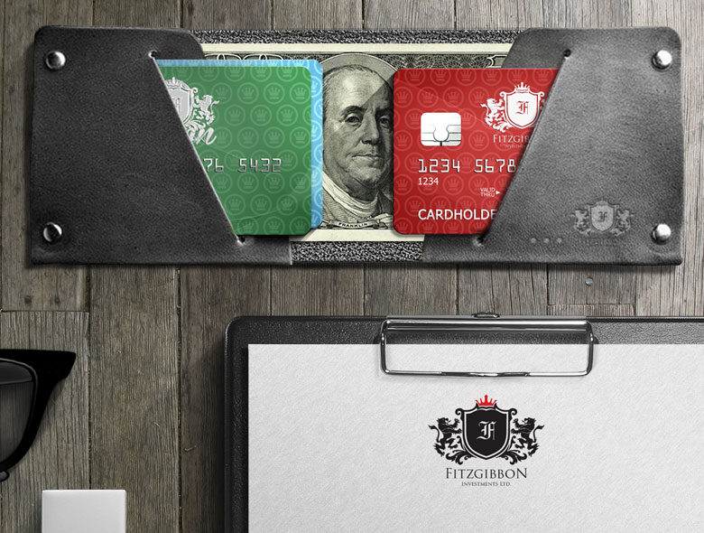
Your business card is more than contact information—it is a tangible piece of your brand that people can hold, keep, and remember. In an increasingly digital world, the physical business card has become even more powerful precisely because it is rare. A well-designed business card creates a memorable impression and reinforces your brand identity every time someone looks at it.
But most business cards fail to make an impact. They are cluttered, poorly designed, or forgettable. Follow these five essential rules to create business cards that work for your brand instead of against it.
Rule 1: Work with a Professional Designer
While DIY business card services and templates are readily available, professional design makes all the difference. A professionally designed business card communicates that you value quality and attention to detail—qualities that reflect well on your business.
Why Professional Design Matters
Professional designers understand how to balance information with white space, how to create visual hierarchy, and how to ensure your card works across different printing methods. They also understand how your business card fits into your complete brand identity system.
The Cost of Cheap Design
Cheap, template-based business cards are easy to spot. They look generic, unprofessional, and forgettable. When someone receives a poorly designed card, it reflects poorly on your business before they have even interacted with you. The money you save on design is often lost in missed opportunities and damaged first impressions.
Finding the Right Designer
Ideally, work with the same designer who created your logo and other brand materials. This ensures consistency across all your brand touchpoints. Your business card should feel like part of a cohesive brand system, not a standalone piece.
If you are working with a new designer, look for someone with experience in print design specifically. Digital design skills do not always translate to print, and business cards have unique requirements that digital designers might not understand.
Rule 2: Choose Information Strategically
Every element on your business card should serve a purpose. Too much information creates clutter and reduces impact. Too little information makes the card less useful. Finding the right balance is crucial.
Essential Information
At minimum, your business card should include:
- Your name
- Your title or role
- Company name
- Phone number
- Email address
- Website URL
Optional Information
Consider including these only if they are relevant to how people will use your card:
- Physical address (if clients visit your location)
- Social media handles (if you are active and want connections)
- QR code (for digital contact sharing or portfolio access)
- Tagline (if it adds value and is not cliché)
What to Exclude
Avoid including:
- Too many contact methods (pick the ones you actually use)
- Unnecessary decorative elements
- Information that will become outdated quickly
- Personal social media accounts (unless relevant to business)
- Multiple phone numbers unless each serves a distinct purpose
Information Hierarchy
The most important information should be most prominent. Usually, this means your name and company name are largest, followed by contact information. Your title can be smaller but still readable. Everything else should be smaller still.
Rule 3: Master White Space
White space—the empty areas on your card—is not wasted space. It is a crucial design element that makes your card readable, professional, and impactful.
Why White Space Matters
White space gives your card breathing room. It makes information easier to read and digest. It also creates a sense of sophistication and professionalism. Cards with too little white space feel cluttered and cheap, even if the design itself is good.
How to Use White Space Effectively
- Leave margins around all edges
- Space out text elements generously
- Group related information together
- Use white space to create visual hierarchy
- Do not feel like you need to fill every inch
The Psychology of White Space
White space does not just look better—it actually helps people process information more effectively. When information is spaced well, people can focus on individual elements without being overwhelmed. This makes your card more memorable and your information more likely to be retained.
Rule 4: Keep It Simple and Readable
Simplicity is sophistication in business card design. A simple, clean design is more memorable, more professional, and more versatile than a complex one.
Typography Choices
Choose fonts that are highly readable at small sizes. Script fonts might look elegant, but they are often difficult to read when printed small. Sans-serif fonts are usually the safest choice for business cards, though some serif fonts work well too.
Limit yourself to two fonts maximum—one for your name/company, one for contact information. Using more fonts creates visual chaos and reduces professionalism.
Size and Readability
Ensure all text is large enough to read comfortably. Phone numbers and email addresses should be at least 8pt, preferably larger. Your name can be larger, but do not go overboard—balance is key.
Color Considerations
If you use color, use it strategically. Your brand colors should appear, but do not let color overwhelm the design. Remember that your card might be printed in black and white, so ensure it works without color too.
Standard Dimensions
Stick to standard business card dimensions (3.5” x 2” in the US, 85mm x 55mm internationally) unless you have a compelling reason to deviate. Non-standard sizes do not fit in card holders, get damaged more easily, and can seem gimmicky rather than professional.
Avoid Gimmicks
Unusual shapes, die-cuts, and other gimmicks might seem creative, but they often backfire. They make cards harder to store, more expensive to print, and can come across as trying too hard. Simple, well-executed design is always more effective than gimmicks.
Rule 5: Invest in Quality Printing
Your business card design is only as good as its execution. Even the best design looks cheap when printed poorly. Invest in quality printing on quality cardstock to ensure your cards make the right impression.
Cardstock Quality
The weight and finish of your cardstock significantly impact how your card feels and is perceived. Standard cardstock is 14pt or 16pt. Heavier cardstock (18pt or higher) feels more premium but costs more. Choose based on your brand positioning and budget.
Finish Options
- Matte: Professional, understated, reduces fingerprints
- Glossy: Eye-catching, vibrant colors, but shows fingerprints
- Uncoated: Natural feel, great for textured designs, more sustainable
- Soft-touch: Premium feel, stands out, more expensive
Print Quality
Ensure your printer uses high-resolution printing. Low-quality printing makes even good designs look unprofessional. If you are printing in-house, invest in a quality printer and premium paper. For professional results, use a professional printer.
Special Finishes
Consider special finishes if they fit your brand:
- Embossing: Raised text or logo for tactile interest
- Foil stamping: Metallic accents for luxury feel
- Spot UV: Glossy accents on matte cards
- Die-cutting: Custom shapes (use sparingly)
These finishes cost more but can significantly elevate your card’s perceived value.
Beyond the Basics: Making Your Card Memorable
While following these five rules will create a solid business card, going beyond the basics can make yours truly memorable.
Consistency with Brand
Your business card should feel like part of your complete brand identity. Use your brand colors, fonts, and visual style consistently. Someone should be able to look at your card and immediately connect it to your website, your office, and your other materials.
The Back of the Card
While many cards leave the back blank, using it strategically can add value. Consider:
- A QR code linking to your portfolio or contact form
- A calendar for scheduling
- Additional contact methods
- A brief value proposition
- Your logo in a larger format
Just ensure the back does not feel cluttered or overwhelming.
Digital Integration
Modern business cards often include QR codes that link to digital contact information, portfolios, or LinkedIn profiles. This bridges the physical and digital worlds, making it easier for people to connect with you online.
Sustainability Considerations
Many businesses now consider environmental impact when printing business cards. Recycled paper, soy-based inks, and minimal printing can reduce environmental impact while still creating effective cards.
Common Mistakes to Avoid
Overdesigning
Trying to include too many design elements, colors, or effects creates clutter. Simple, clean design is always more effective.
Underdesigning
Going too minimal can make your card forgettable. Find the balance between simplicity and impact.
Ignoring Brand Consistency
Your business card should feel like part of your brand, not a separate piece. Ensure it uses your brand colors, fonts, and style consistently.
Poor Quality Printing
Even the best design looks cheap when printed poorly. Invest in quality printing to match your quality design.
Outdated Information
Ensure all information is current. Nothing looks more unprofessional than outdated contact information or a website that no longer works.
The Business Impact
A well-designed business card does more than share contact information—it:
- Creates memorable first impressions
- Reinforces your brand identity
- Demonstrates professionalism and attention to detail
- Makes you more likely to be remembered and contacted
- Serves as a tangible reminder of your meeting
In a world where most interactions are digital, a physical business card stands out. Make yours count by following these five rules and investing in quality design and printing. Your business card is often the first piece of your brand someone encounters—make sure it represents you well.

Mash Bonigala
Creative Director & Brand Strategist
With 25+ years of building brands all around the world, Mash brings a keen insight and strategic thought process to the science of brand building. He has created brand strategies and competitive positioning stories that translate into powerful and stunning visual identities for all sizes of companies.
Featured Work
See Our Work in Action
Real brands, real results. Explore how we've helped businesses transform their identity.

Client Love
What Our Clients Say
Don't just take our word for it. Hear from the brands we've worked with.

Josh Amburn
Lakefront Docks and Lifts
"I came into this project expecting to get the best logo for our brand. That’s exactly what I received. The team at SpellBrand used the descriptions of what we do along with a color palette of our site to design three amazing concepts. Once we decided on what worked best for our needs, they worked diligently to perfect the design. Their use of their project management software makes the collaboration painless. Great work team! We’ll see you on the next project! Josh"

Liana Alexander Raye
Harlequin Starr International Styles
"Working with the Spellbrand team has been incredibly easy. Mash has a team of experts who are extremely visionary and pioneering, pulling together ideas and initial thoughts into an actual brand giving you options that you feel best align with your thought process. I have no idea how they created my brand based on the vague brief I gave them, but they have worked wonders and magic. Their design, attention to detail, willingness to ensure the final product is exceptional all counts towards a company who has the client at the forefront of mind at every step of the way. Spellbrand is my Number 1 go to for all branding, website and design concepts moving forward. I look at them as an extension to our marketing arm. Just brilliant."
Related Services You Might Love
Based on what you just read, here are services that can help you achieve similar results for your brand.
Free Download
Brand Consistency Checklist
A 27-point checklist to audit your brand across every touchpoint. Used by our team on real client projects.
Success! Check your email for the download link.
Instant PDF download. We'll also send branding tips -- unsubscribe anytime.
Keep Reading
Related Articles

Mar 21, 2026
Brand Identity System: The Complete Guide to Building a Memorable Brand
How to build a brand identity system from strategy through logo, color palette, typography, and brand guidelines. The framework we use with every client at Spellbrand.
Read MoreMar 19, 2026
Brand Identity Design: The Strategic Process Behind Visual Identities That Command Markets
Brand identity design is more than logos and color palettes. The complete process for building a visual identity system that differentiates, builds trust, and scales.
Read More
Feb 19, 2026
How to Conduct a Brand Perception Audit: Measure the Gap Between Identity and Reality
How to conduct a brand perception audit that reveals the gap between how you see your brand and how customers actually experience it. Methodology with survey templates, analysis frameworks, and next steps.
Read More