Cacao Nature: Authentic Swiss Chocolate from Origin to Craft
Situation: Creating Brand Identity for Authentic Swiss Chocolate Company
Cacao Nature is a chocolate company that creates healthy dark chocolate products by sourcing the highest grade cacao.
Cacao Nature ensures the highest quality right from the moment the Cacao bean is carefully planted and cultivated, right up to the moment it is crafted into the delicious chocolates that it sells wholesale and to retail.
The Swiss chocolate market is competitive, with numerous brands competing for shelf space. Cacao Nature needed a brand identity that would communicate their unique positioning: sourcing highest grade ingredients from origin, ensuring quality from planting to crafting.
Task: Create Brand Identity Communicating Authenticity and Quality
To help the company brand itself successfully and to match its product promise, Cacao Nature approached Spellbrand. The challenge required:
- Simple logo: Simple logo that works on various packaging
- Right message: Brand identity that communicates right kind of message
- Authenticity: Visual identity that reflects authentic nature of company
- Origin sourcing: Brand that highlights sourcing highest grade ingredients from origin
- Vintage modern: Design that is vintage and modern at the same time

Action: Strategic Brand Development
Brand Strategy: Vintage and Modern Emblem
By sourcing the ingredients from the origin, Cacao Nature creates a unique blend of authenticity and taste that rivals the best in the world. The brief was simple and succinct. We had to create a simple logo that not only worked well on the various packaging but also communicated the right kind of message.
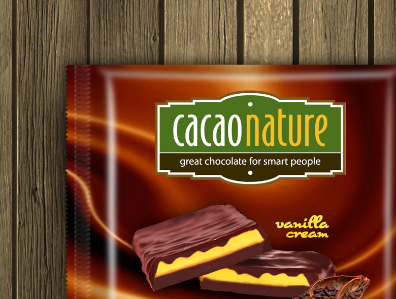
We considered the authentic nature of the company along with the fact they source the highest grade ingredients from the origin and decided to go for an emblem like logo design that looked vintage and modern at the same time. We tried out several different layout options and font treatments and finally settled on the chocolate bar style of emblem with a modern font.
The emblem itself, without any embellishments was the design. Although some of the initial design concepts had images of the cacao beans and hints of chocolate, we realized that the brand did not need any such cliched imagery to carry it across. A simple and elegant design emphasizing the medley of vintage and modern was the key.
This brand strategy:
- Emphasizes origin sourcing: Sourcing ingredients from origin creates authenticity
- Ensures simplicity: Simple logo that works on various packaging
- Communicates message: Communicates right kind of message
- Combines vintage modern: Emblem design that looks vintage and modern
- Uses chocolate bar style: Chocolate bar style of emblem
- Applies modern font: Modern font treatment
- Maintains elegance: Simple and elegant without cliched imagery
Package Design: Standing Out in Swiss Supermarkets
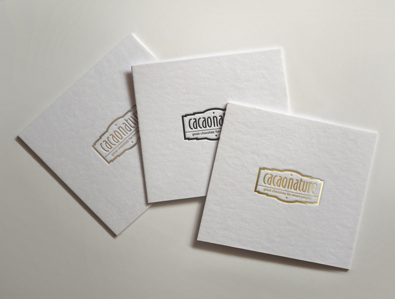
Here is the logo letter pressed on hand out cards that the client includes in the packaging that is sent out to customers who order online from their website.
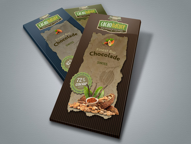
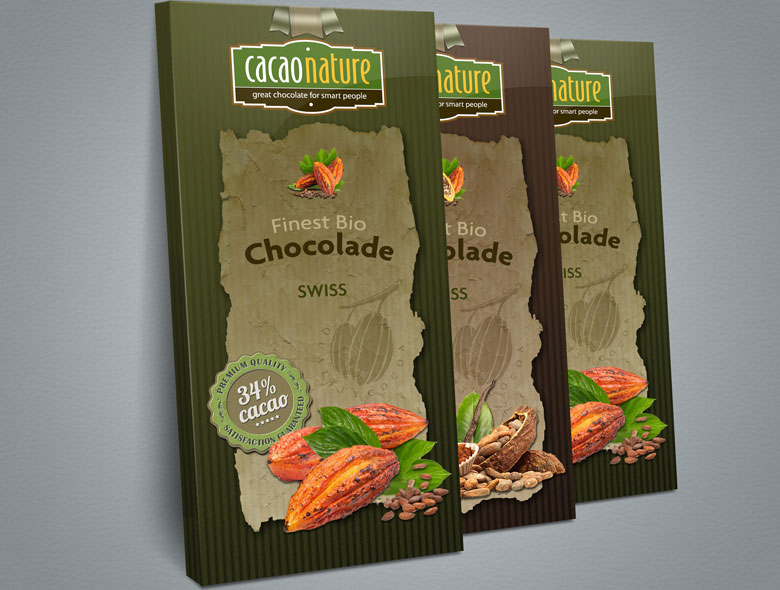
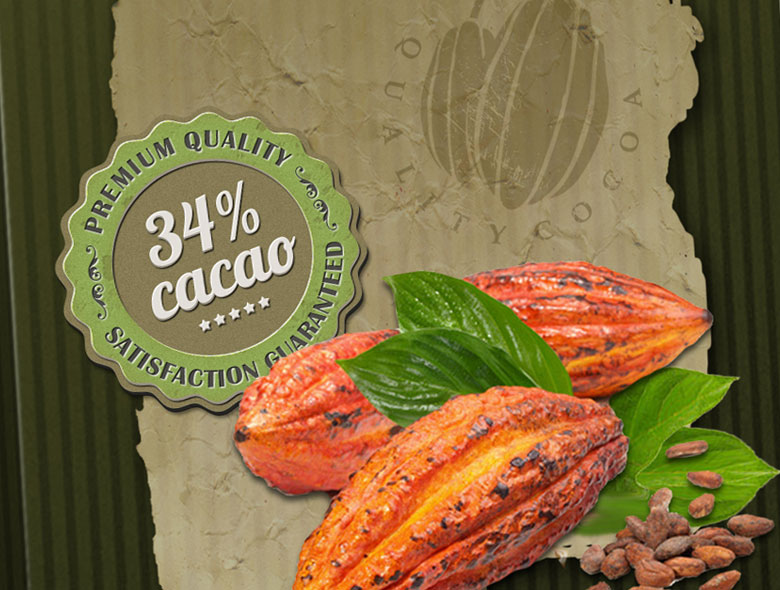
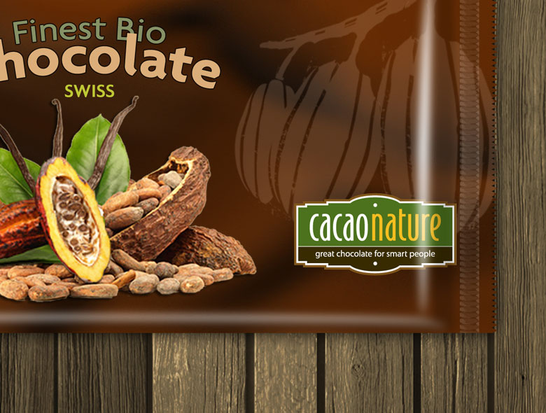
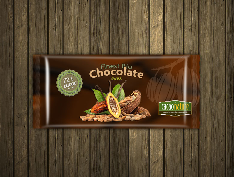
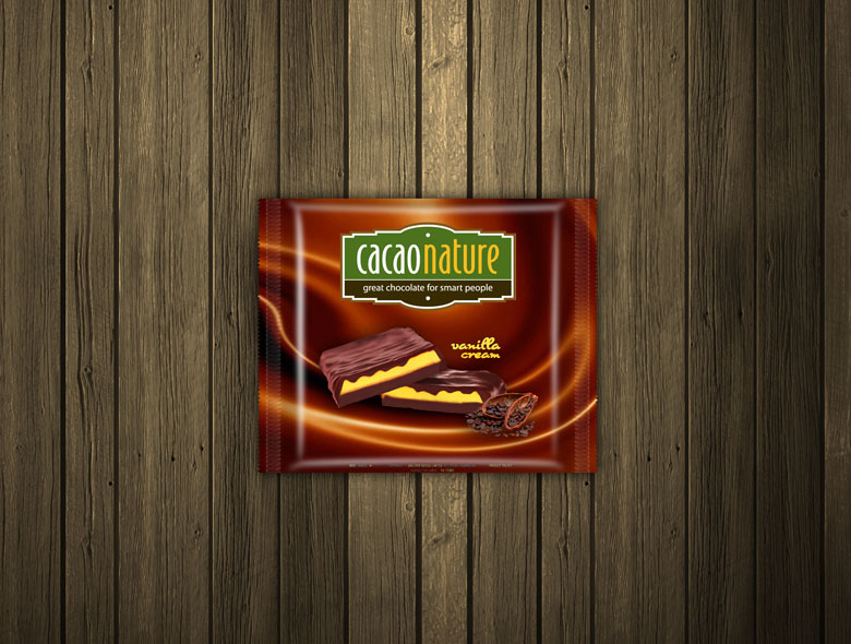
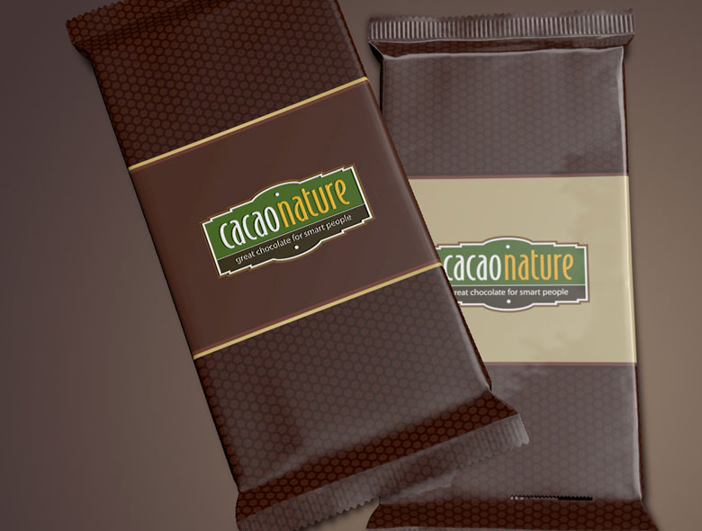
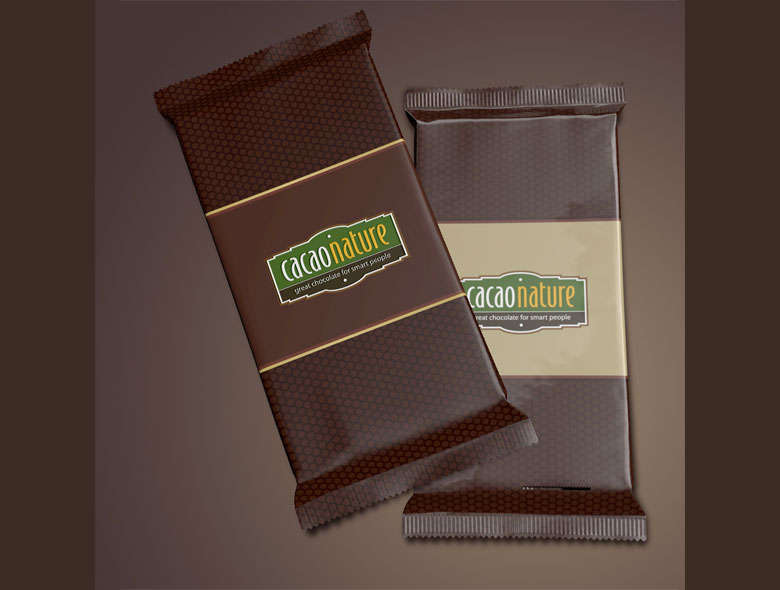
Here are some mock up packaging that we created for the client for the Swiss Chocolate market. The Earthy color palette and the grungy design was deliberate to enable the client’s chocolates stand out from the competition in the Swiss supermarket shelves. These chocolate bars looked stunning and really created a great impact on display.
This package design:
- Uses earthy colors: Earthy color palette
- Creates grungy design: Grungy design stands out from competition
- Targets Swiss market: Designed for Swiss Chocolate market
- Maximizes impact: Creates great impact on display
- Ensures stunning appearance: Chocolate bars looked stunning
Result: Brand Identity That Communicates Authenticity
The brand identity and package design we created for Cacao Nature successfully communicates authenticity and quality. The comprehensive brand transformation delivers:
Strategic Outcomes
- Simple logo: Simple logo successfully works on various packaging
- Right message: Brand identity successfully communicates right kind of message
- Authenticity: Visual identity successfully reflects authentic nature of company
- Origin sourcing: Brand successfully highlights sourcing highest grade ingredients from origin
- Vintage modern: Design successfully combines vintage and modern
- Complete brand system: Emblem logo, earthy color palette, and grungy package design create unified experience
Implementation Success
Today, Cacao Nature uses this comprehensive brand identity and package design to attract customers seeking healthy dark chocolate products. The vintage and modern emblem design with chocolate bar style and modern font, combined with earthy color palette and grungy package design, creates a brand that stands out from competition in Swiss supermarket shelves while reflecting the authentic nature of sourcing highest grade ingredients from origin. The brand successfully positions Cacao Nature as a chocolate company that ensures highest quality from the moment cacao bean is carefully planted and cultivated right up to the moment it is crafted into delicious chocolates, with a brand identity that emphasizes the medley of vintage and modern through simple and elegant design.

