Ahura Builders: Rebranding 30 Years of Excellence
Situation: Rebranding 30-Year-Old Real Estate Building Company
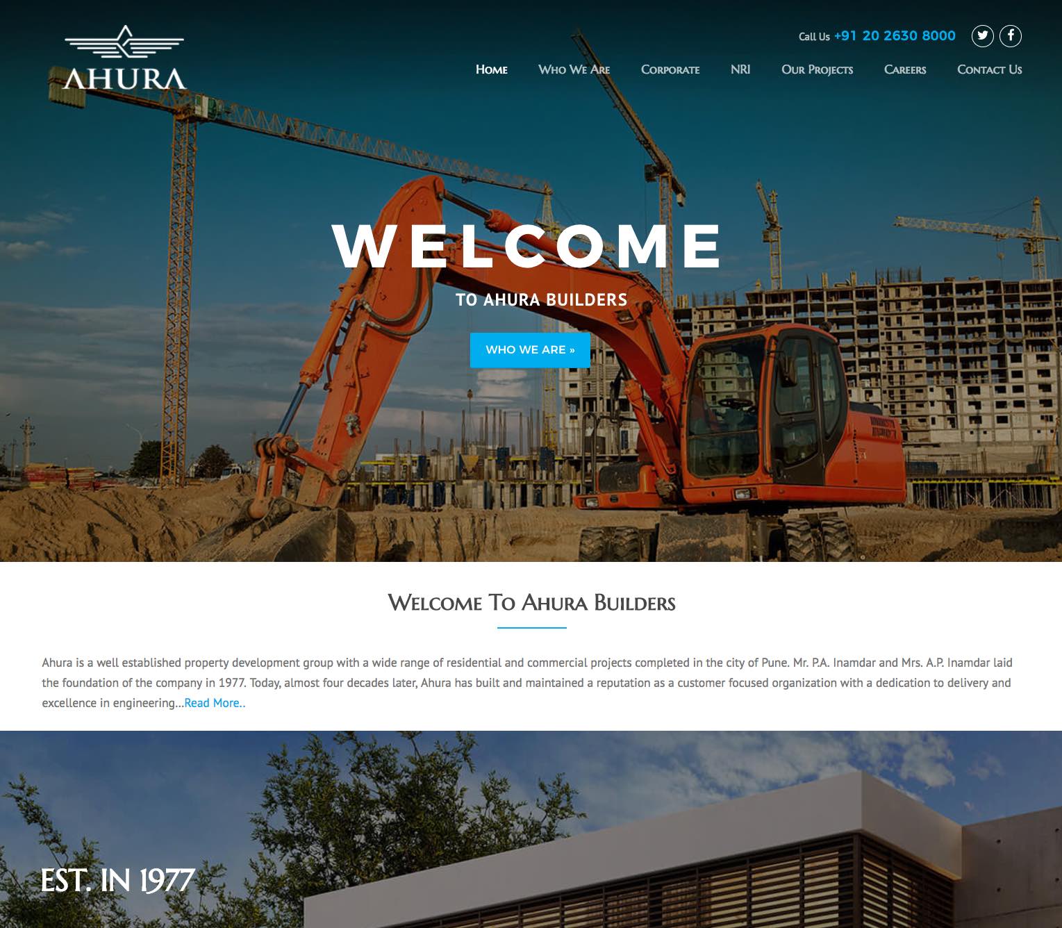
Ahura Builders located in Pune, India are a leading Real Estate Building company with a name that is synonymous with quality and meticulous planning.
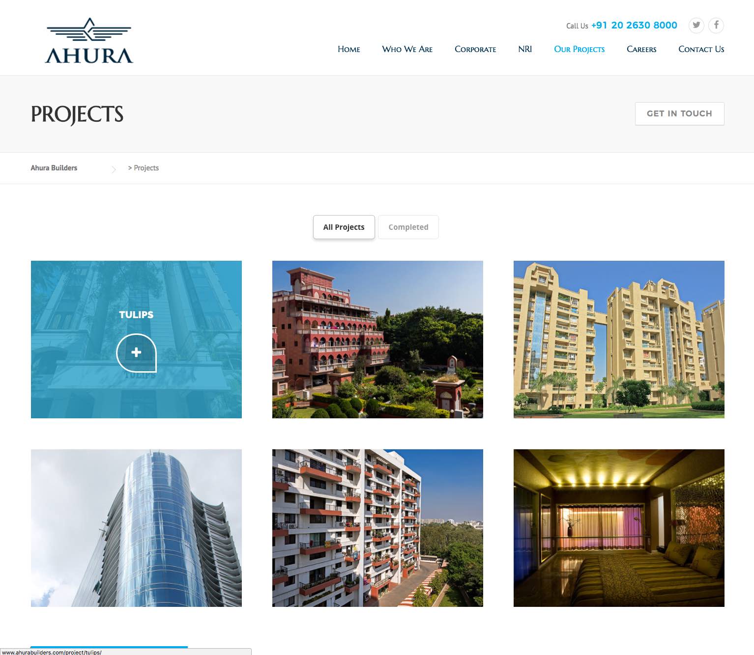
With projects such as the Latitude near NIBM, Pune, Pearl Tower near Magarpatta City – a magnificent 11-storeyed, a four-tower residential project with a rich collection of luxurious homes and more, Ahura Builders has carved a reputation for affordable prices coupled with the best-planned facilities for optimum utility. Within a span of 30 years, they had managed to change the landscape in every location they had a project in.
The real estate building market requires brands that communicate quality, sophistication, and international standards. Ahura Builders needed a brand identity that would signal the next phase of their brand evolution while honoring their 30-year legacy.
Task: Create Rebrand Signaling Next Phase
After 30 years Ahura Builders wanted to rebrand. The challenge required:
- Rebranding: Brand identity that signals next phase of brand evolution
- 30-year legacy: Visual identity that honors 30 years of brand heritage
- Modern refresh: Logo design that refreshes dated, complex, tired logo
- International stage: Brand that brings Ahura Builders to international stage
- Core elements: Brand that retains core design elements of old logo

The Old Logo: Dated, Complex, and Tired
The old logo that Ahura Builders had was created 30 years ago and would have been a great logo back then and for a good number of years following their inception. However, now it looks quite dated, complex, and tired. The old logo shows an eagle alighting on a shield that encloses the company name.
Action: Strategic Brand Development
Brand Solution: Abstract Eagle with Architectural Sophistication
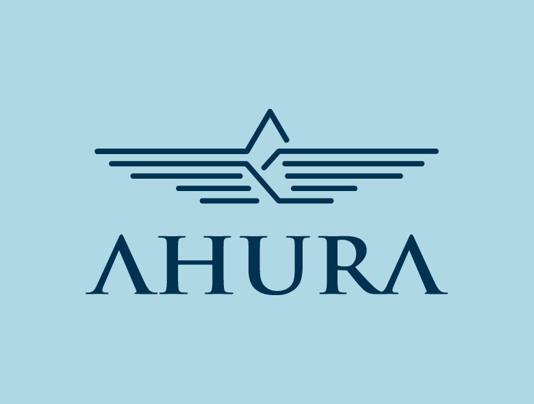
We wanted to retain the core design elements of the old logo while refreshing it to suit the modern world and the new direction which Ahura Builders is taking. So we stripped down the eagle image down to its core and created an abstract image that hints at the architectural sophistication that Ahura Builders is poised to give the world. Below the icon, the name of the company is an elegant but very robust-looking font type. The new logo looks stunning and brings Ahura Builders to the international stage.
Result: Rebrand That Signals Next Phase
The brand identity we created for Ahura Builders successfully signals the next phase of their brand evolution. The comprehensive brand transformation delivers:
Strategic Outcomes
- Rebranding: Brand identity successfully signals next phase of brand evolution
- 30-year legacy: Visual identity successfully honors 30 years of brand heritage
- Modern refresh: Logo design successfully refreshes dated, complex, tired logo
- International stage: Brand successfully brings Ahura Builders to international stage
- Core elements: Brand successfully retains core design elements of old logo
- Complete brand system: Abstract eagle logo, elegant robust typography, brand identity system, and visual language create unified experience
Implementation Success
Today, Ahura Builders uses this comprehensive brand identity to attract customers and signal their next phase of growth. The abstract eagle logo design that hints at architectural sophistication, combined with elegant but robust typography, creates a stunning logo that brings Ahura Builders to the international stage, refreshing their dated, complex, and tired logo while retaining core design elements. The brand successfully positions Ahura Builders as a leading Pune real estate building company with a name synonymous with quality and meticulous planning, with projects like Latitude and Pearl Tower that have carved a reputation for affordable prices coupled with best-planned facilities, changing the landscape in every location they have a project in over 30 years, with brand identity that signals the next phase of their brand evolution while honoring their 30-year legacy.
Brand Name Strategy: Creating “AHURA Builders”
The name “AHURA Builders” was developed through Spellbrand’s strategic brand naming process. Our team researched the competitive landscape, target audience, and brand positioning to create a name that would resonate in the market and support long-term brand growth.
The naming process included linguistic analysis, trademark screening, domain availability verification, and brand storytelling to ensure “AHURA Builders” would be distinctive, memorable, and legally protectable. Learn more about our brand naming service or explore our full naming portfolio.

