Spellbrand Blog
Top 10 Beach Resort Logos
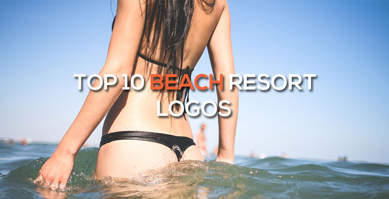
‘Tis the season to dream of warm weather and sandy beaches. While the rest of us are bundled up like Eskimos, there are places in the world where a bikini is the perfect December fashion statement. Beach resort logos must play on the very human desire for warm weather and leisure, inspiring people from all over the world to spend an astounding amount of money to get away from the ice and chill. These ten Beach Resort Logos will make you wish you were lying in the sun rather than slogging through rain and snow. Also, check out the top 10 spa salon logos list.
Sandals Logo Design
This resort offers a Caribbean vacation without worries. The Beach Resort Logo Design shows this, with serene blue water and white sand in the background. The name of the resort appears to have been hand-painted for a casual touch, with bold lettering in a sunny yellow. The wording below describes the resorts and locations. Everything from the name to the logo implies casual fun in the sun, which is an attractive message to people looking for a warm getaway.
Maui Prince Logo Design
The Maui Prince is one of the best known resorts in this famously tropical state, and the beauty salon logo suggests this eminence while inviting the average person to have a part of it. The wording is black and traditional, with serifs. However, the image is in the shape of an inclusive circle, with a whale tail to refer to the nearby ocean. The pink color is feminine enough to suggest a soft, pampering experience.
Atlantis Paradise Island Logo Design
Atlantis Paradise Island has a logo that ties into their name. The writing is old fashioned and purposely drawn to appear aged, referring to the ancient empire for which the resort is named. The A and the S both branch out and connect below into a wave like shape, referring to the ocean that is the main reason for most trips to the Bahamas. Wording below describes the exact location.
Club Med Logo Design
This logo promises a relaxing, no-worries vacation in a variety of ways. First, the main color is a relaxing blue. The lettering is rounded, lacking hard edges and serifs. The image to the left has a roughly round shape, which is inviting and inclusive. Trident’s spear is a prominent part of this image, but this well known nautical image is made friendly by drawing the sharp ends so that they are bent over and safe. A small yellow diamond implies wealth while the color adds an attention-getting detail to the logo.
5. Aqua Bamboo & Spa Logo Design

Mash Bonigala
Creative Director & Brand Strategist
With 25+ years of building brands all around the world, Mash brings a keen insight and strategic thought process to the science of brand building. He has created brand strategies and competitive positioning stories that translate into powerful and stunning visual identities for all sizes of companies.
Featured Work
See Our Work in Action
Real brands, real results. Explore how we've helped businesses transform their identity.
Client Love
What Our Clients Say
Don't just take our word for it. Hear from the brands we've worked with.

Tom McGee
PD Campus
"We tried several designers to design our logo and could not find the one that fit our company. After a few years of searching for a good branding company, I found Spellbrand through a random search. Spellbrand was sensational! They took the time to listen to our story and created a few designs that spoke to our team and what we do. We've never had a designer do that. We not only received a great logo, but we now have a brand we are all proud to wear! Thank you!"

Ernest Bannister
M.O.R.E
"My experience with the Spell brand team has been nothing short of excellent. From the beginning Mash and team made me feel very comfortable with the design process. I am extremely happy with the results of my design and look forward to working with Spellbrand; exclusively! I have told many family, friends and peers about the great work the Spellbrand team has done in creating my design. Thanks again for all your patience and professionalism; I look forward to working with you in the future."
Related Services You Might Love
Based on what you just read, here are services that can help you achieve similar results for your brand.
Keep Reading
Related Articles
Nov 17, 2025
Top 10 Simple Logos (Yet Effective Logos)
Discover the top 10 simple logos (yet effective logos) logos. Expert analysis of iconic logo designs, their history, and what makes them memorable.
Read MoreNov 17, 2025
Top 10 American University & College Logos
Discover the top 10 american university & college logos logos. Expert analysis of iconic logo designs, their history, and what makes them memorable.
Read MoreNov 17, 2025
Top 10 Media Company Logos
Discover the top 10 media company logos logos. Expert analysis of iconic logo designs, their history, and what makes them memorable.
Read More