Spellbrand Blog
Top 10 Breakfast Cereal Logos
Looking for a custom logo?
Get a professional, one-of-a-kind logo designed by our award-winning team.
Looking for a custom logo design?
Our professional designers create unique, memorable logos tailored to your brand.
See Our Logo Design Services →Tasty Design: The Top Ten Breakfast Cereal Logos
Why study cereal logos? When it comes to food and drink logo branding, breakfast cereals are pulling out all the stops. From bright colors to endorsements from popular characters to constantly new and approved flavors, breakfast cereals must be on top of their game to survive in a market flooded with choices. As you can imagine, the brand logo of a major cereal has to be a masterpiece of good design and subconscious influence. These ten breakfast cereals may not all be the healthiest choice, but when it comes to their logo they are doing everything right.
Cheerios Logo Design
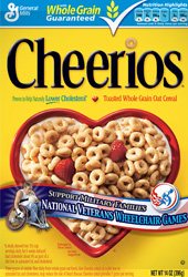
Cheerios may not have the most original brand logo, but it is a very appropriate one for this straightforward cereal with multigenerational appeal. The name is displayed in black letters in a simple black font, with a Cheerio dotting the ‘I’, in case you don’t know what this iconic cereal looks like. From this logo alone, it’s easy to see that Cheerios is not one of the bright, sugary cereals that is targeting children, but rather a healthier choice.
Honey Smacks Logo Design
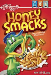
Honey Smacks is about as different from Cheerios as one can get, and the brand logo expresses this beautifully. The name is in a bold, golden hue that is reminiscent of honey, while the letters of the word ‘honey’ drip viscously at the bottom. The font is a happy medium, neither a serious one with serifs nor a friendly, rounded one. This cereal logo portrays the flavor it is known for while maintaining a straightforwardness that appeals to parents.
Life Logo Design
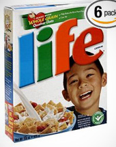
Life is a healthy cereal option that is nonetheless sweet and crunchy enough to appeal to children (like the top 10 children logos), who are the main target of most breakfast cereals. The brand logo expresses this perfectly in bright, primary colors reminiscent of primary school along with a font that has sharp corners to maintain a little seriousness. The diagonal placement of the logo on the box gives the sense of a headline, adding an air of importance.
Froot Loops Logo Design
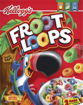
This sweet and sassy cereal knows that young people are its main audience, and it really pulls out the stops in making this brand logo appealing to them. The colors are bright and attractive, while pieces of the equally brightly colored cereal make up the ‘O’s’ in the name. The other letters are white, which stands out against a red and yellow background. Red and yellow are both colors that make people feel hungrier, so this color palette is common in the cereal industry and the food industry in general.
Kix Logo Design
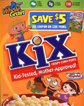
Kix is another cereal that has managed to balance a reasonable amount of healthy ingredients that appeal to mothers along with the sweetness and crunch that children want. The brand logo uses a classic, bright blue and bold letters with newsy serifs to show its serious side. A red rectangle below the cereal name holds the cereal tagline: Kid-Tested, Mother Approved. The ‘I’ is dotted with a round cereal piece to tie this healthier, more parent-friendly image in with the product itself. Pleasing both kids and parents is a difficult task, but this logo is a success because it manages to appeal to both groups.
Frooty Pebbles Logo Design
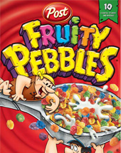
Frooty Pebbles are a cereal that many adults will remember from their childhood. The cereal has long used the once-popular cartoon characters from the Flintstones as spokespeople, and the brand logo ties these prehistoric favorites in as well. The letters appear to be carved from rock, which is significant for the Stone Age cartoon. However, it is brightly colored rock that catches the eyes of our youngest consumers. This cereal doesn’t even try to appear healthy, which may be appropriate considering the many sweeteners and artificial colorings that give it its distinctive appearance and taste.
Cinnamon Toast Crunch Logo Design
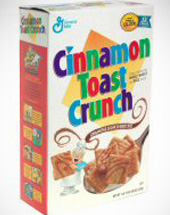
Cinnamon Toast Crunch can be recognized easily even without the box because it has a very different shape from most children’s cereal: a square. A square is a very serious, adult shape, so the brand logo of this cereal needs the lightening up that the primary colors lend. A golden square is in the background, reminding consumers of the element that makes this cereal a little different from its many competitors.
Apple Jacks Logo Design
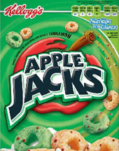
Apple Jacks don’t even taste like apples, but they manage to tie their name into their cereal with a brand logo that relates to both. Instead of the bright colors that dominate the industry, the wording is bold and black with an angle that makes the letters appear to be coming out at the viewer. In the background is a stylized apple as well as a cinnamon stick that communicates the main flavor of this enigmatically named cereal.
Cookie Crisp Logo Design
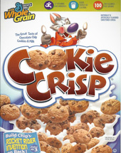
A cereal that looks and tastes like a chocolate chip cookie? Clearly, Cookie Crisp is very different in flavoring and appearance from other cereals. The brand logo does a great job of expressing this difference. Shades of brown express the main ingredient—chocolate chips—while pieces of the cereal itself are used as letters. No attempts are made at a healthy image—and none are needed. The appeal of eating cookies for breakfast is portrayed well enough.
Honey Bunches of Oats Logo Design
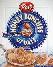
This cereal has a winning brand logo because it shows exactly how this cereal is different from most others. An inclusive circular shape in a healthy blue holds the cereal name in blocky white letters. The circle is serrated to look like a blue ribbon, the symbol of first place. Almonds and honey are in the middle of the circle, showing the two main ingredients in a straightforward way that appeals to adults.
As you can see, even major brands have to use the best principles of branding to tell consumers in a glance about their product. This need is not limited to breakfast cereals, however; every business can benefit from a solid brand image and a logo that compliments it.

Mash Bonigala
Creative Director & Brand Strategist
With 25+ years of building brands all around the world, Mash brings a keen insight and strategic thought process to the science of brand building. He has created brand strategies and competitive positioning stories that translate into powerful and stunning visual identities for all sizes of companies.
Featured Work
See Our Work in Action
Real brands, real results. Explore how we've helped businesses transform their identity.
Client Love
What Our Clients Say
Don't just take our word for it. Hear from the brands we've worked with.
Steve Turner
Turn2Coaching
"Delighted to have used Spellbrand for our last project. The work was thorough and results excellent. For me it was such a pleasure to work with Mash who was able to keep up with all my last minute requests for small changes. Nothing was too much of a problem and I would have to say that its great to work with people who do actually put the customer needs first! One thing saying it, its another thing doing it – Thanks Mash!"
Sue Politte
Success In Focus
"Love it! My brand identity and logo helps quickly communicate what I do. I coach very busy business leaders who want to take their organization to the next level and are tired of all the things that are slowing things down or blocking progress. My brand identity needed to grab visual attention and communicate quickly that I help my clients get focus so they gain and build success. My new brand will help my potential clients identify with me. Thank you!!!!"
Related Services You Might Love
Based on what you just read, here are services that can help you achieve similar results for your brand.
Free Download
Brand Consistency Checklist
A 27-point checklist to audit your brand across every touchpoint. Used by our team on real client projects.
Success! Check your email for the download link.
Instant PDF download. We'll also send branding tips -- unsubscribe anytime.
Keep Reading
Related Articles
Nov 17, 2025
Top 10 Simple Logos (Yet Effective Logos)
Discover the top 10 simple logos (yet effective logos) logos. Expert analysis of iconic logo designs, their history, and what makes them memorable.
Read MoreNov 17, 2025
Top 10 American University & College Logos
Discover the top 10 american university & college logos logos. Expert analysis of iconic logo designs, their history, and what makes them memorable.
Read MoreNov 17, 2025
Top 10 Car Company Logos
Discover the top 10 car company logos logos. Expert analysis of iconic logo designs, their history, and what makes them memorable.
Read More
