Spellbrand Blog
Top 10 Charity Logos
Looking for a custom logo?
Get a professional, one-of-a-kind logo designed by our award-winning team.
Looking for a custom logo design?
Our professional designers create unique, memorable logos tailored to your brand.
See Our Logo Design Services →Why would a charity need a logo? In modern times, successful non-profits are run with the same shrewdness and professionalism as the most successful Fortune 500 company. They take their dedication to their cause with the same seriousness that a CEO gives to their profit margin. As such, even charities need public relations and an image, complete with a logo. Here are some clear winners when it comes to creative logo design for charities.
INTERNATIONAL RED CROSS
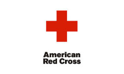
The International Red Cross is a humanitarian non-profit that focuses on providing emergency care to victims of war and disaster. With a logo that is recognized around the world, this organization has become synonymous with mercy and charity. What makes this creative logo design? First, the Red Cross logo is a color and a shape that are easy to recognize even from far away. Second, it is simple enough that it hasn’t had to be modified in the century and a half since Clara Barton created the organization during the American Civil War. The high recognition of this logo is crucial to this company’s ability to help others.
THE NATURE CONSERVANCY
This environmental organization’s motto says it all: ‘Protecting nature. Preserving life’. With a special concern for native plants and animals of dying habitats, The Nature Conservancy aims to save the globe one habitat at a time. Its creative logo design states this without words. The sphere is green, suggesting both ‘Mother Earth’ and the green movement. The leaves on the sphere make people think of nature, while the round shape suggests inclusiveness. The message? That we are all included in this organization’s mission to protect nature.
WWF

The World Wide Fund for Nature, formerly the World Wildlife Fund, is another conservation-oriented charity. However, its logo couldn’t be more different. It features, simply, a stylized and easily recognizable panda. Because pandas are nearly extinct animal that has been rescued by the WWF and other concerned organizations, there could be no better mascot for this creative logo design.
THE UNITED NATIONS CHILDREN’S FUND
Also known as UNICEF, this organization was created to provide emergency supplies such as food and water to children who are affected by war and natural disasters. It is only appropriate that this logo design features the United Nations logo with an adult holding up a small child. Because this is a United Nations program in which adults support children through difficult situations, the logo is more than appropriate. It is recognized around the world and will continue to be a force in children’s rights in the foreseeable future.
SUSAN G. KOMEN FOR THE CURE
The looped pink ribbon of this organization has become an international symbol of breast cancer research and survival. This impactful logo incorporated the American habit of wearing different colored ribbons to show support for different causes. Many people wear the pink ribbon or buy apparel with this graphic to show their support for breast cancer. Susan G. Komen for the Cure is the largest breast cancer charity on the globe, and with this publically supported logo, it’s easy to see why.
SAVE THE CHILDREN
This international children’s charity focuses on improving the lives of children worldwide through a variety of means, including by providing education and healthcare to many young people who otherwise would have no access. The red color is attention-getting and urgent, while the round shape makes people feel included. The small child shape in the center of the circle holds out its arms, reaching out to prospective donors. The message of this creative logo design is that these children need help immediately and that you can be included in the effort.
GRANTSCAPE
This British non-profit focuses on funneling grants to individuals and organizations that can use them to perform social good, such as by protecting the United Kingdom’s fragile environment. Grantscape’s logo perfectly expresses this goal. The logo features a plant opening, a reference to the conservation programs supported by this non-profit company. The bloom is a round shape that could also be seen as a sun. Through Grantscape, the light of charity is blooming, and this creative logo design expresses that perfectly.
HABITAT FOR HUMANITY INTERNATIONAL
Habitat for Humanity International is a religious non-profit that rallies communities to build homes for people who need them. With donated materials and time, this is actually done for a very reasonable price, allowing every dollar given to this charity to be stretched unimaginably far. The blue and green of the logo are both calming colors, but they are also associated with our planet. As a global charity, this is appropriate. The house-like shape of this creative logo design shelters three people of various sizes, expressing what this company does best: giving families a place to call home.
BOYS & GIRLS CLUBS OF AMERICA
Boys & Girls Clubs of America aims to help poor urban youth by providing after-school activities and other programs designed to enrich their lives. The goal is to raise well-rounded adults and create stronger communities. The top 10 children’s logo design expresses this mission succinctly. The image is of two clasped hands. The hands roughly form the shape of a triangle, which implies strength. The message is that together we are strong, which is precisely what the Boys & Girls Clubs want to communicate.
BARNARDO’S
This British children’s charity began as a chain of orphanages, but later became a foster care and adoption charity. The logo shows two adults holding a child’s hands. Their hands are raised up and they appear to be skipping, giving the logo a joyful feeling. This creative logo design does a great job of communicating the key mission of Barnardo’s: to create happy families and nurture children.
From children’s rights to environmental advocacy, these non-profit organizations have a variety of causes. However, they all have two key things in common: they all are extremely successful as businesses, and they all have a creative logo design that enables them to express their mission in a pictorial form. Would these organizations be able to help so many without their well-recognized and well-respected logos? Luckily, we’ll never have to find out!

Mash Bonigala
Creative Director & Brand Strategist
With 25+ years of building brands all around the world, Mash brings a keen insight and strategic thought process to the science of brand building. He has created brand strategies and competitive positioning stories that translate into powerful and stunning visual identities for all sizes of companies.
Featured Work
See Our Work in Action
Real brands, real results. Explore how we've helped businesses transform their identity.
Client Love
What Our Clients Say
Don't just take our word for it. Hear from the brands we've worked with.
Josh Amburn
Lakefront Docks and Lifts
"I came into this project expecting to get the best logo for our brand. That’s exactly what I received. The team at SpellBrand used the descriptions of what we do along with a color palette of our site to design three amazing concepts. Once we decided on what worked best for our needs, they worked diligently to perfect the design. Their use of their project management software makes the collaboration painless. Great work team! We’ll see you on the next project! Josh"
Jenny Richard
Woods Of Fairfax
"Working with the team at Spellbrand has been fantastic! I spent time researching companies that would help me build brands for each asset that are all in different locations and more specifically build a brand that could help tell each of their unique stories. Spellbrand did just that. The process was easy. To provide them with my initial thoughts through a nicely-outlined input form they sent to me and they took that information and created a number of awesome designs. I was able to incorporate "the story" easily with a design we selected. I'm excited to get it into action and see what's in store for the next project. Also, each person I worked with has been super responsive, knowledgeable, and awesome to work with! Kudos to Mash, Mike, and Eva! I really enjoy working with you!"
Related Services You Might Love
Based on what you just read, here are services that can help you achieve similar results for your brand.
Free Download
Brand Consistency Checklist
A 27-point checklist to audit your brand across every touchpoint. Used by our team on real client projects.
Success! Check your email for the download link.
Instant PDF download. We'll also send branding tips -- unsubscribe anytime.
Keep Reading
Related Articles
Nov 17, 2025
Top 10 Simple Logos (Yet Effective Logos)
Discover the top 10 simple logos (yet effective logos) logos. Expert analysis of iconic logo designs, their history, and what makes them memorable.
Read MoreNov 17, 2025
Top 10 American University & College Logos
Discover the top 10 american university & college logos logos. Expert analysis of iconic logo designs, their history, and what makes them memorable.
Read MoreNov 17, 2025
Top 10 Car Company Logos
Discover the top 10 car company logos logos. Expert analysis of iconic logo designs, their history, and what makes them memorable.
Read More
