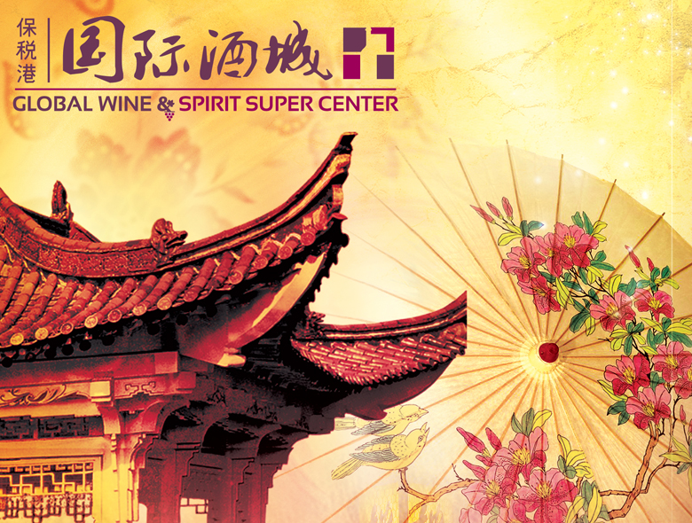
GWSSC: Bilingual Brand Identity for Chinese Wine Market
Situation: Creating Bilingual Brand Identity for Chinese Wine Importer
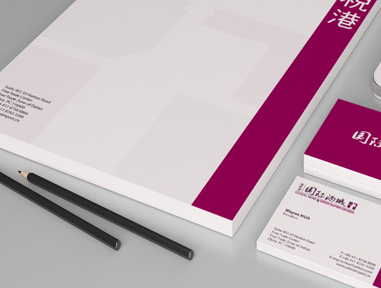
GWSSC is located in the Free Trade Zone of Dalian, China. They import great wines from all over the world (France, Italy, U.S.A.,and Australia etc.), and supply to whole sellers in China.
They have a tax-free bounded warehouse, show room and exchange hall in the Free Trade Zone, and they are a unique sea port distributor in their region. As an extension of their core business, GWSSC was also launching a few events centered around culture, food and drink to build brand awareness in China.
The Chinese wine import market requires brands that work in both Western and Chinese contexts. GWSSC needed a brand identity that would communicate their international wine importing business while appealing to Chinese wholesalers.
Task: Create Bilingual Brand Identity Working in Both Worlds
The challenge required:
- Bilingual design: Logo design with both English and Chinese characters
- Both worlds: Brand identity that works in both Western and Chinese contexts
- Traditional approach: More traditional approach with rectangular layout
- Text emphasis: Emphasis on text with supporting icon
- Grape icon: Sub icon of grapes as requested
Action: Strategic Brand Development
Brand Strategy: Traditional Approach for Both Worlds
Over the years we have worked with a lot of Chinese companies and helped them with their branding and website design needs. In this case study we talk about one such company.
Because of the international nature of their business, rather than hiring a Chinese design agency, the client decided to hire someone from the west to create a brand identity that would work in both worlds.
Since the client wanted a logo design that included both English and Chinese characters, after some in depth research and analysis, we decided to go for a more traditional approach with the design which would follow a regular rectangular layout, emphasis on text and supported by a small icon that can then used by itself.
This strategic approach:
- Addresses international nature: Brand identity works for international business
- Uses western design: Western designer creates brand for both worlds
- Accommodates bilingual: Logo design includes both English and Chinese characters
- Follows traditional approach: Traditional approach with rectangular layout
- Emphasizes text: Emphasis on text with supporting icon
- Enables flexibility: Small icon can be used by itself
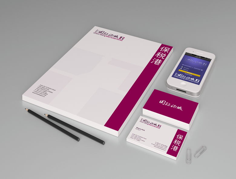
Brand Solution: Horizontal Layout Accommodating Multiple Elements
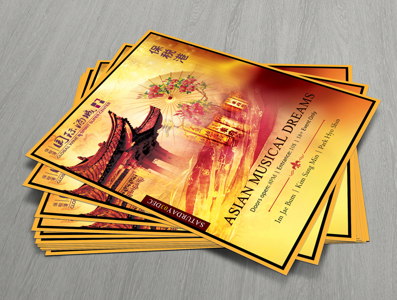
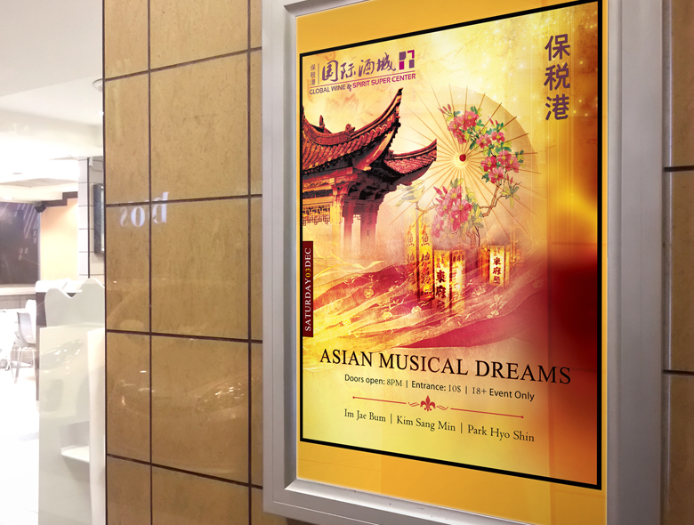
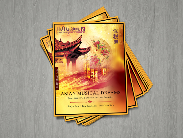
The main challenge was the sheer number of English and Chinese text characters that needed to be accommodated into the logo along with an icon and at the request of the client a sub icon of grapes. After much sketching and doodling, we came up with a horizontal layout that the client liked and we as design professionals felt would work well on different media. We also helped create an event launch poster for the client which included design and print. Other items that we created for the client included a paper back branded with some Chinese characters, a t-shirt design and a cap design with the logo.
This brand solution works because:
- Horizontal layout: Horizontal layout accommodates multiple elements
- Multiple characters: Accommodates English and Chinese text characters
- Grape sub icon: Sub icon of grapes as requested
- Media versatility: Works well on different media
- Event materials: Event launch poster with design and print
- Branded items: Paper back, t-shirt design, cap design with logo
Result: Brand Identity That Works in Both Worlds
The brand identity we created for GWSSC successfully works in both worlds. The comprehensive brand transformation delivers:
Strategic Outcomes
- Bilingual design: Logo design successfully includes both English and Chinese characters
- Both worlds: Brand identity works in both Western and Chinese contexts
- Traditional approach: Traditional approach with rectangular layout appeals to both markets
- Text emphasis: Emphasis on text with supporting icon creates balanced design
- Complete brand system: Horizontal layout, grape sub icon, and event materials create unified experience
Implementation Success
Today, GWSSC uses this comprehensive brand identity to attract wholesalers in China. The bilingual logo design with both English and Chinese characters follows a traditional approach with rectangular layout, text emphasis, and supporting icon. The horizontal layout accommodates the sheer number of text characters along with icon and grape sub icon, creating a brand identity that works well on different media and helps build brand awareness in China through events centered around culture, food and drink. The brand successfully positions GWSSC as a unique sea port distributor in Dalian Free Trade Zone with tax-free bounded warehouse, show room and exchange hall, importing great wines from all over the world and supplying to wholesalers, with a brand identity that works in both worlds through bilingual design and traditional approach.