Groep Caenen: Modernizing Belgium’s Trusted Real Estate Brand
Situation: A 58-Year Legacy Brand Losing Relevance
Groep Caenen, established in 1966, approached Spellbrand with a critical challenge: how to modernize a 58-year-old real estate brand to appeal to the new generation while maintaining the trust and credibility built over decades. The company needed to shed its dated visual identity and position itself as a fresh, powerful, global corporation—without falling into the trap of cliché house designs that make real estate brands look cheap and unprofessional.
As a full-service real estate group handling mediation and listings for apartments, villas, houses, and garages across Belgium, Groep Caenen’s strengths were clear: full-service capabilities, honesty, long-term market presence, high standards, fast selling and renting, and an extensive network. But their visual identity didn’t reflect these strengths—it looked like every other real estate company.
The market had changed dramatically. Younger property buyers and sellers expected modern, tech-forward brands that felt professional and trustworthy—not traditional, conservative imagery. Meanwhile, the Belgian real estate market was saturated with generic house icons, keys, and roof silhouettes that all looked identical, making differentiation nearly impossible.
Task: Modernize Without Losing Trust
The challenge required:
- Modernize visual identity to appeal to new generation while maintaining trust
- Differentiate from competitors without using cliché real estate imagery
- Create versatile brand system that works across digital and physical touchpoints
- Position as global corporation while maintaining local credibility
Stop Blending In With Your Competitors
Like Groep Caenen, your real estate brand deserves to stand out. Get a free brand audit to discover how your visual identity compares to competitors—and what it’s costing you in listings and credibility.
Action: Strategic Brand Transformation
Research and Market Analysis
We began by analyzing the Belgian real estate market, studying competitors, and understanding the expectations of both property owners and buyers. The research revealed several key insights:
- Generational shift: Younger property buyers and sellers want modern, tech-forward brands that feel professional and trustworthy—not traditional, conservative imagery
- Visual fatigue: The market is saturated with house icons, keys, and roof silhouettes that all look the same
- Trust through design: Professional, sophisticated branding signals competence and reliability more effectively than generic real estate symbols
- Digital-first expectations: Modern audiences encounter brands primarily through digital channels, requiring versatile visual systems
Strategic Brandmark Development
Rather than creating another logo with a house or key, we developed a sophisticated brandmark system built on geometric principles that communicate:
- Forward movement: The arrow-like forms suggest progress, momentum, and forward-thinking service
- Connection: The interlocking shapes represent the connection between buyers, sellers, and the company
- Trust and stability: The solid geometric foundation conveys reliability and professionalism
- Modern sophistication: The abstract, non-literal approach positions Groep Caenen as a contemporary, global corporation
The tagline “je vastgoedpartner” (your real estate partner) reinforces the partnership approach, while the visual identity elevates the brand above typical real estate aesthetics.
Logo Design: Geometric Sophistication
The Primary Brandmark
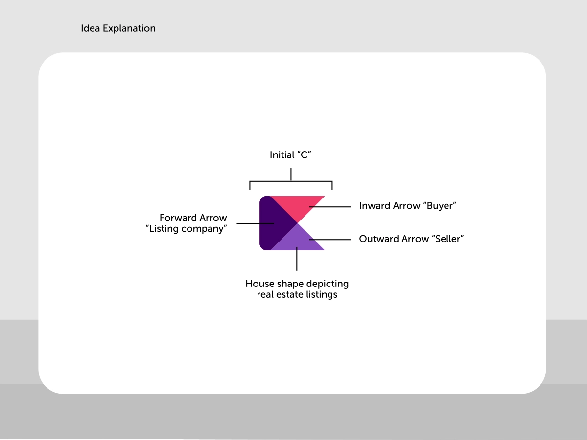
The logo consists of three distinct geometric elements that form a cohesive, memorable mark:
- The Initial ‘C’: A rounded rectangular form that suggests the company name while maintaining geometric clarity
- Forward Arrow (Listing Company): A vibrant pink/magenta triangle pointing right, representing the company’s forward momentum and active listing services
- Inward Arrow (Buyer): A darker purple triangle pointing inward, symbolizing buyers coming to the company
- Outward Arrow (Seller): A lighter purple triangle pointing outward, representing sellers listing their properties
Together, these elements create a house-like shape that subtly references real estate without being literal—a sophisticated nod to the industry that maintains modern, corporate appeal.
Color Strategy
The color palette was carefully chosen to convey specific brand attributes:
- Deep Purple: Represents trust, professionalism, and stability—core values for a real estate company
- Vibrant Pink/Magenta: Adds energy, modernity, and approachability—signaling the brand’s appeal to the new generation
- Light Purple/Lavender: Provides balance and sophistication, creating visual harmony
This palette stands out in the real estate market while maintaining professional credibility.
Visual Identity System: Comprehensive Brand Language
Typography and Voice
The typography system balances friendliness with professionalism. Clean, modern sans-serif fonts ensure readability across all applications while maintaining a contemporary feel. The brand voice guidelines emphasize clarity, honesty, and partnership—reflecting Groep Caenen’s core values.
Graphic Elements
Beyond the logo, we developed a comprehensive system of graphic elements:
- Geometric patterns: Abstract triangular compositions that extend the brand language across applications
- Photography direction: Real, authentic imagery of properties and people—avoiding stock photography clichés
- Icon system: Custom icons for services, property types, and digital interfaces
Real-World Applications: Making the Brand Visible
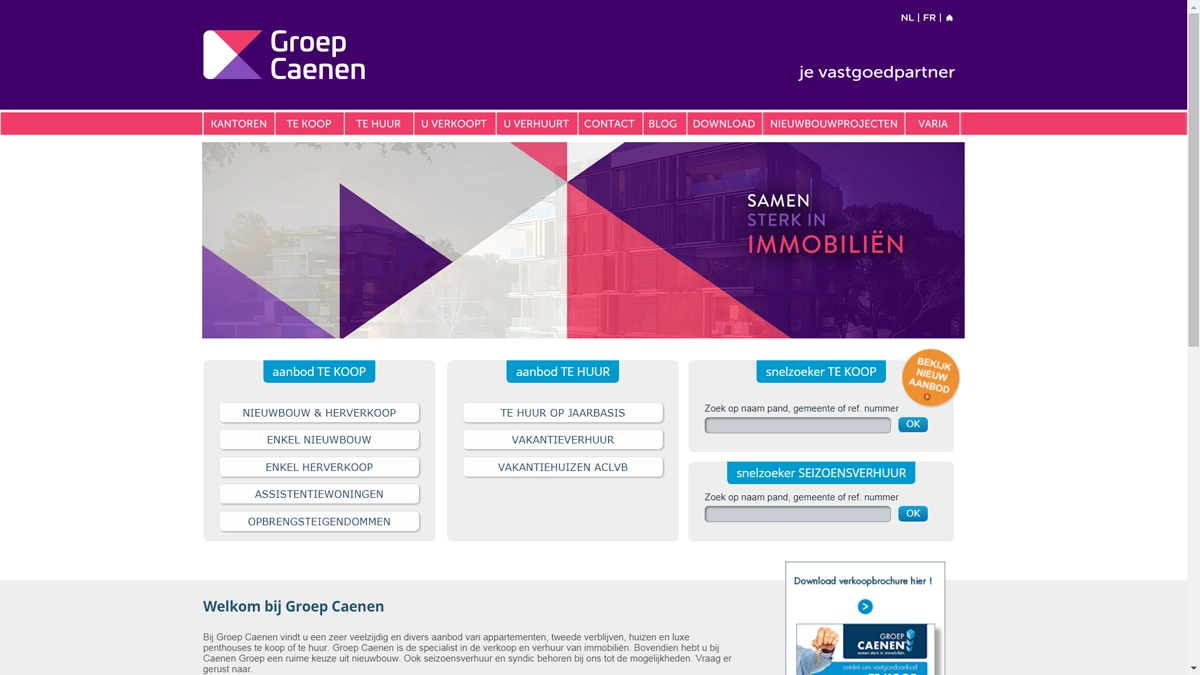
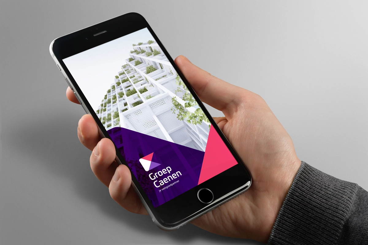
Digital Presence
The website redesign transformed Groep Caenen’s online presence into a modern, user-friendly platform. The homepage features the new brandmark prominently, with clear navigation and property search functionality. The geometric patterns and color palette create visual consistency across all digital touchpoints.
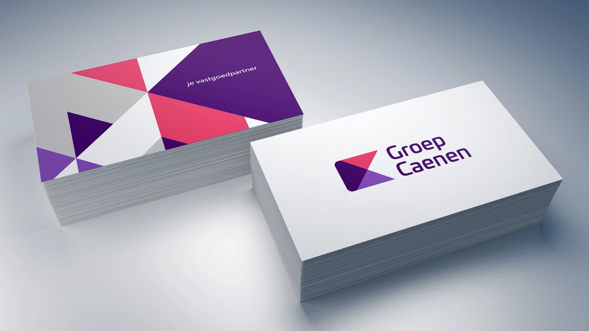
Corporate Materials
Business cards, letterhead, and email signatures were redesigned to reflect the new brand identity. The business cards feature the geometric pattern on the reverse side, creating a memorable tactile experience that reinforces brand recognition.

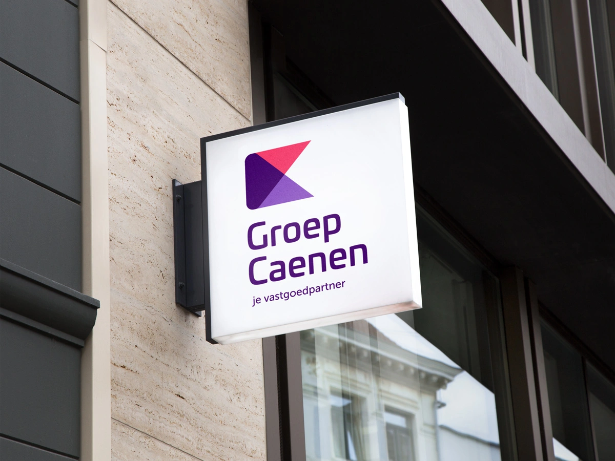
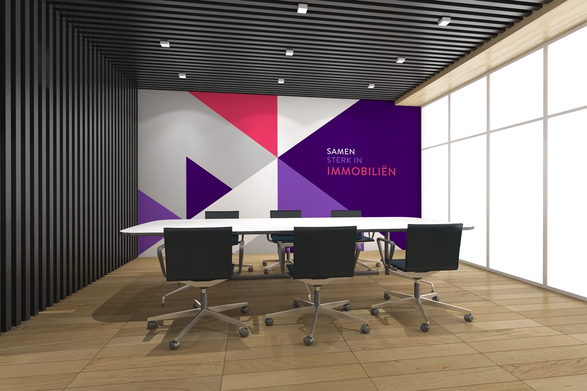
Environmental Branding
The brand identity extends into physical spaces, creating immersive brand experiences:
- Office signage: Building signage featuring the new logo creates strong street-level presence
- Conference rooms: Branded interior spaces reinforce the corporate identity for client meetings
- Promotional materials: Brochures, flyers, and marketing collateral maintain visual consistency
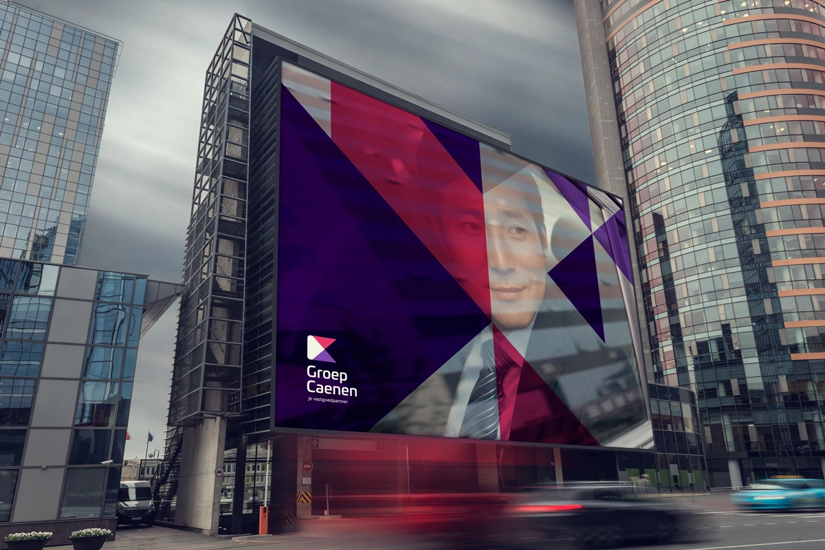
Outdoor Advertising: Maximum Visibility
Billboards and Digital Displays
Large-format billboards showcase the brand identity at scale, ensuring maximum visibility in high-traffic areas. The geometric patterns and bold colors create eye-catching displays that stand out from typical real estate advertising.

Vehicle Branding
Company vehicles wrapped with the new brand identity serve as mobile billboards, extending brand visibility throughout Belgium. The geometric patterns create dynamic, modern vehicle wraps that reinforce brand recognition wherever the vehicles travel.

Promotional Flags and Banners
Event banners and promotional flags feature the brandmark prominently, ensuring consistent brand presence at property viewings, open houses, and real estate events.
Brand Applications: Comprehensive Touchpoint System
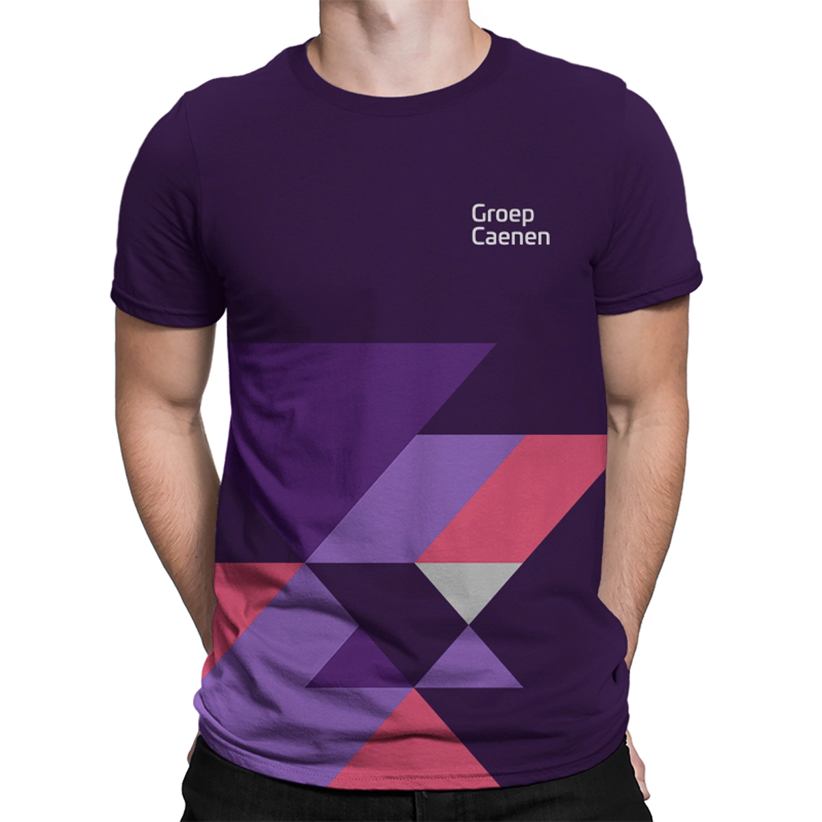
Apparel and Merchandise
Corporate apparel, including t-shirts and branded clothing, extends the brand identity into everyday touchpoints. Team members wearing branded apparel become brand ambassadors, reinforcing brand recognition in client interactions.
Presentation Materials
Sales presentations, investor decks, and client proposals feature the new brand identity, ensuring professional, consistent communication across all business interactions.
Result: Successfully Modernized Brand That Bridges Legacy and Future
The rebranding of Groep Caenen successfully bridges the company’s 58-year legacy with modern appeal. The new visual identity delivers:
Strategic Outcomes
- Modern positioning achieved: Groep Caenen now positions as a modern, global corporation while maintaining the trust and credibility built over 58 years
- Clear differentiation: Sophisticated, non-literal design avoids cliché real estate imagery, standing out from competitors
- New generation appeal: Appeals to younger property buyers and sellers who value professional, contemporary branding
- Consistent brand recognition: Creates unified brand experience across all touchpoints—from digital platforms to billboards to vehicle wraps
- Flexible growth system: Provides adaptable brand system that can evolve and expand as the company grows
Implementation Success
The comprehensive brand application system ensures that every interaction with Groep Caenen reinforces the brand identity:
- Digital presence: Modern website and online platforms communicate professionalism
- Physical touchpoints: Billboards, vehicle wraps, and signage create strong street-level presence
- Corporate materials: Business cards, letterhead, and presentations maintain brand consistency
- Environmental branding: Office signage and interior spaces reinforce corporate identity
The brand transformation successfully modernizes Groep Caenen’s visual identity while preserving the trust and credibility that comes with 58 years of market presence, positioning them as Belgium’s forward-thinking real estate partner for the new generation.
The Future: Expanding the Brand System
With the core brand identity established, Groep Caenen is positioned to expand into additional marketing materials, including:
- Brochure design: Property brochures that showcase listings while maintaining brand consistency
- Flyer design: Marketing flyers for new listings, open houses, and promotional events
- Additional digital applications: Social media templates, email campaigns, and digital advertising
- Environmental graphics: Wayfinding systems, property signage, and exhibition displays
The flexible brand system accommodates future growth while maintaining visual consistency and brand recognition.
This case study demonstrates Spellbrand’s expertise in real estate branding, combining strategic thinking with sophisticated design to create brands that stand out in competitive markets. For businesses looking to modernize their brand identity or create a new visual language, Spellbrand offers comprehensive brand strategy and design services tailored to your industry and target audience.