

TUMBUKU: Artisanal Coffee from the Heart of Africa
Situation: Creating Brand Identity for Specialty Coffee Micro Roaster
The client is located in France operating a micro coffee roaster. With an emphasis on organic and fair-trade coffee and operating for the last five years, the client had been building up French clientele to drinking specialty coffee, lighter roasts with more flavor.
TUMBUKU is evolving out of Atelier du Café (name of roastery), which means “to blossom or grow out of” in Shona, which is the language of Zimbabwe (Africa) where this whole coffee passion thing was born. This connection to African coffee culture is central to the brand’s identity and story.
The specialty coffee market requires brands that communicate artisanal quality, sustainability, and unique origin stories. TUMBUKU needed a brand identity that would connect the French micro-roaster to its African coffee origins while communicating artisanal excellence.
Task: Create Brand Identity Building Specialty Coffee Brand
The challenge required:
- African connection: Brand identity that connects to African coffee origins
- Artisanal excellence: Visual identity that communicates artisanal scientific approach
- Sustainability: Brand that communicates natural, organic, sustainability values
- Custom typography: Logo design based on custom typography with design element
Brand Strategy: Artisanal Excellence
Emphasis is on the artisanal way of working, very pure, scientific approach to roasting coffee. TUMBUKU’s core values for their coffees are: natural, organic, flavor, nurturing, sustainability, and only using recycled packaging.
The client aims to focus on a small palette of delicious, gourmet Organic and Fair Trade coffees, hand-roasted with a lot of care in order to create a more original experience for their customers. To reflect this vision, we decided to create a logo based on custom typography that would integrate a design element that spoke true to what the brand stood for.
Action: Strategic Brand Development
Logo Design: Connecting to African Roots
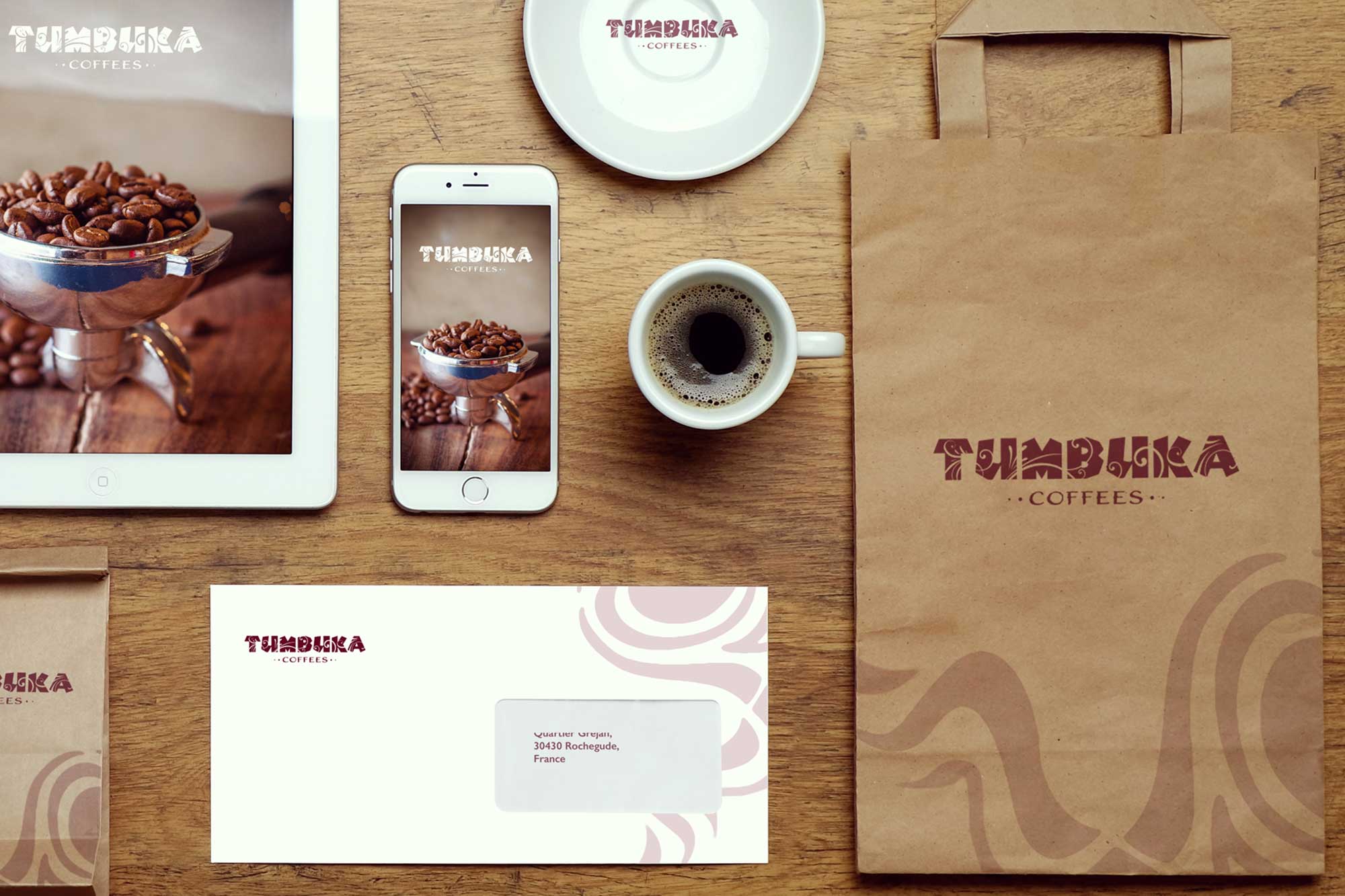
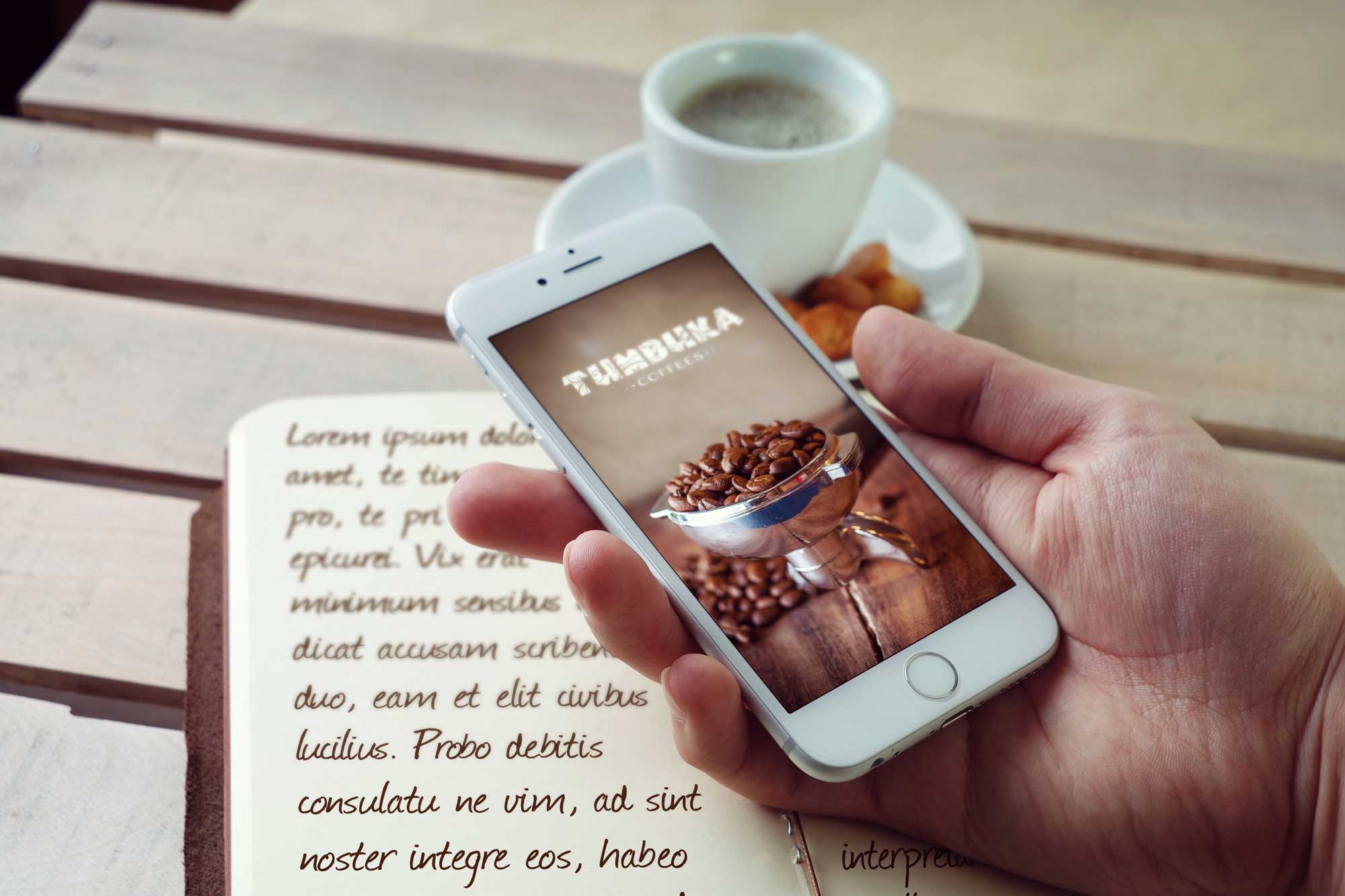
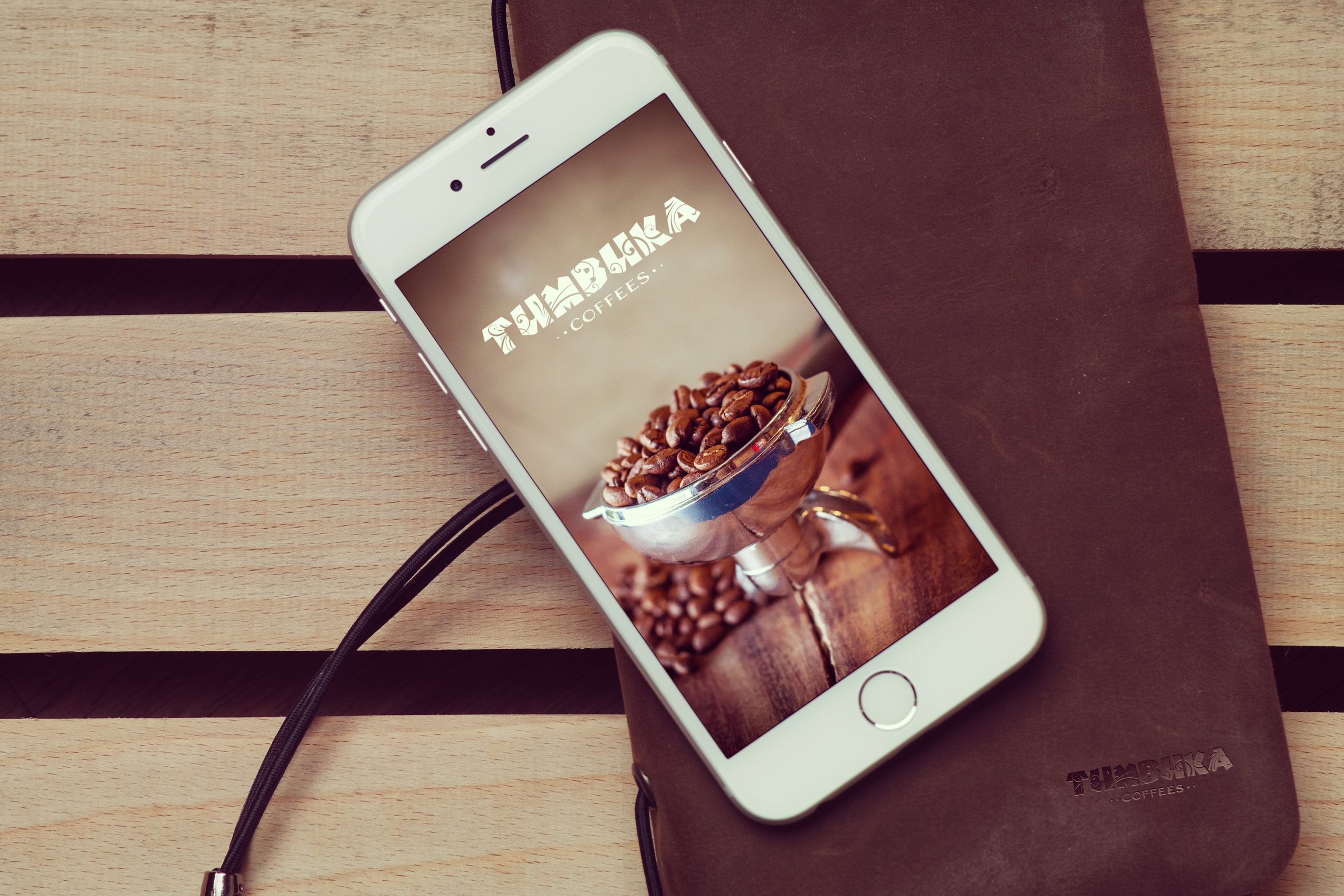
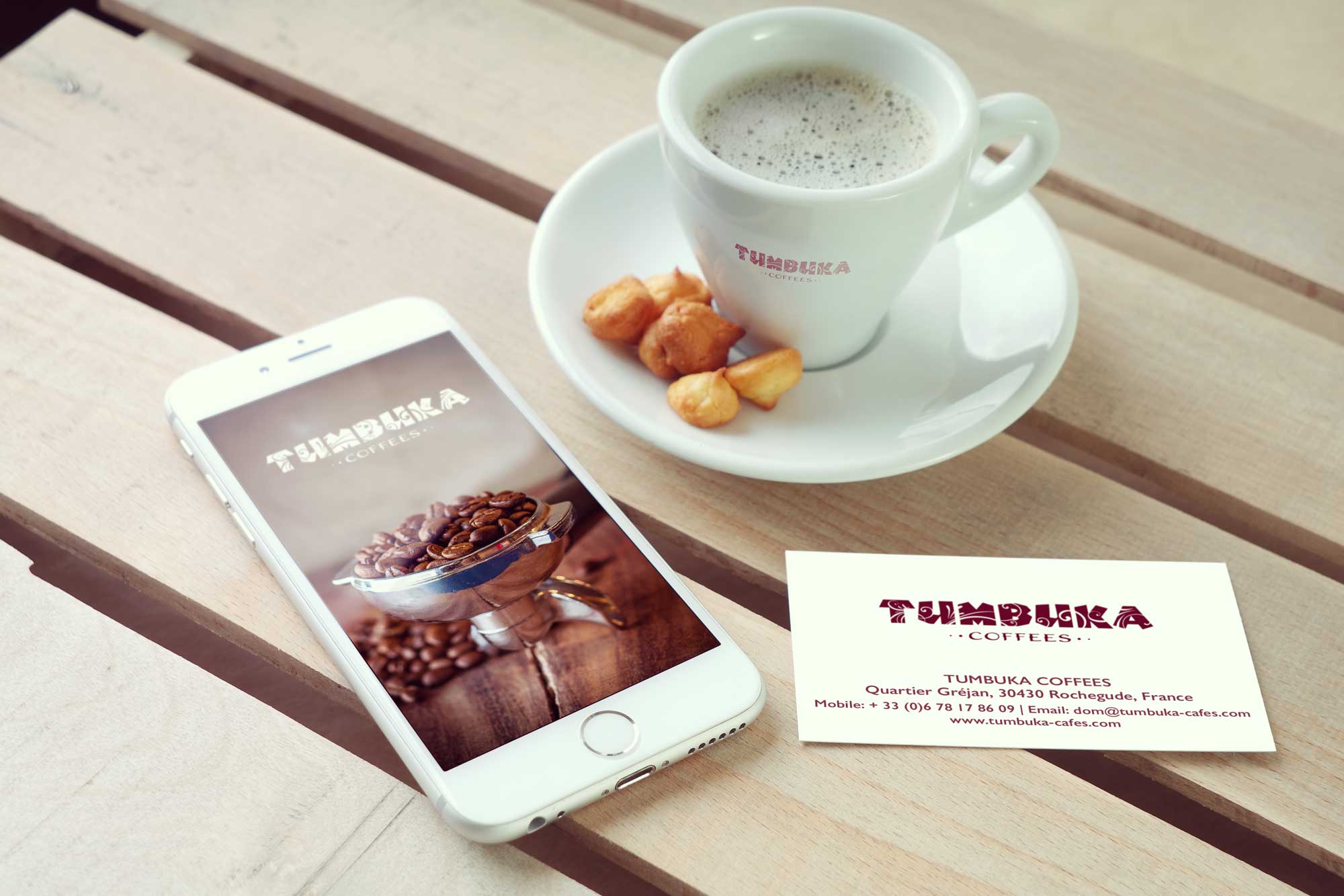
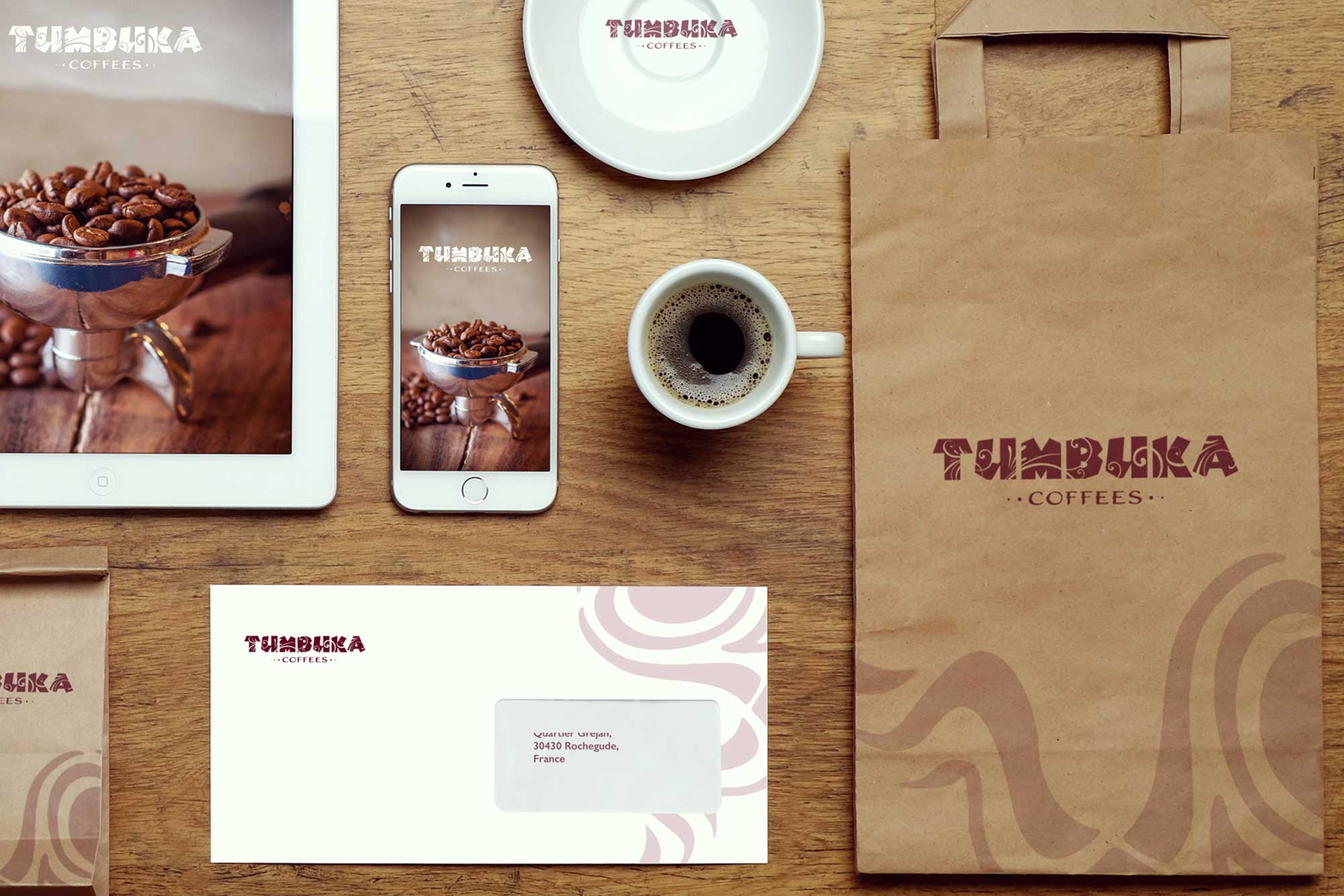
Since the client started a startup that caters to a niche market segment of coffee lovers, we wanted to keep the whole visual language of the brand earthy and rustic. The dark coffee color of the logo reflects the color of rich coffee beans. The typography we created brings to mind the vast Savannah grasslands where wild lions, rhinos, and elephants roam free—connecting the brand to its African coffee origins while maintaining the artisanal, scientific approach to roasting.
Package Design: Artisan Craftsmanship
We also created matching stationery design and package design that reflects the artisan and craftsmanship of the coffee that the client roasts and provides to their customers. The coffee carry bags are simple and functional with a simple design focusing on maximizing the brand logo mark front and foremost. The pattern design is also subtle and elegant without being too complex and confusing, ensuring that the packaging communicates quality and sustainability while remaining practical for everyday use.
Result: Brand Identity That Honors Origins
The brand identity we created for TUMBUKU successfully connects the French micro-roaster to its African coffee origins. The comprehensive brand transformation delivers:
Strategic Outcomes
- African connection: Brand identity successfully connects to African coffee origins
- Artisanal excellence: Visual identity successfully communicates artisanal scientific approach
- Sustainability: Brand successfully communicates natural, organic, sustainability values
- Custom typography: Logo design successfully based on custom typography with design element
- Complete brand system: Custom typography logo, earthy rustic visual language, and packaging design create unified experience
Implementation Success
Today, TUMBUKU uses this comprehensive brand identity to attract French clientele who want to experience specialty coffee with lighter roasts and more flavor. The earthy, rustic visual language appeals to coffee lovers who appreciate organic, fair-trade coffee, while the custom typography and packaging design reflect the craftsmanship and care that goes into every roast. The brand successfully builds on their five years of experience to create a brand that honors both the African origins of coffee and the artisanal French approach to roasting, connecting the French micro-roaster to its African coffee origins while communicating the artisanal, scientific approach to roasting specialty coffee.