

Highlands Development Group: Honoring Heritage While Building the Future
Situation: Refreshing Brand for International Real Estate Agency
Highlands Development Group is an international real estate agency with offices in New York, London, Hong Kong, Dubai and Lisbon.
With a rich heritage of over 60 years, the company decided they needed to fresh their brand identity to be more in line with their global operations and their premium clientele. So they came to Spellbrand to help them rebrand them and at the same time also help them brand their office interiors.
The international real estate market requires brands that communicate heritage, professionalism, and luxury. Highlands Development Group needed a brand identity that would honor their 60-year heritage while positioning them for global operations and premium clientele.
Task: Create Brand Identity Refreshing Brand for Global Operations
The challenge required:
- 60-year heritage: Brand identity that honors rich heritage of over 60 years
- Global operations: Visual identity that aligns with global operations
- Premium clientele: Brand that appeals to premium clientele
- Stay true to heritage: Brand that stays true to heritage and humble beginnings
- Office interiors: Brand identity that extends to office interiors
Action: Strategic Brand Development
Logo Design Solution: Embodying the Goodness of the Highlands
Although the company is global and the projects it now deals with are all huge multi-million dollar ventures, they always stayed true to their heritage and humble beginnings in the Highlands of England. When we identified this core of the company, we decided to build the brand story from there.
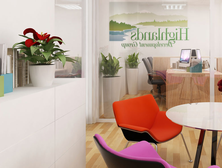
We created a stunning-looking logo design that embodies all the goodness of the highlands – the meadows, the creeks, the mountain peaks the totality of nature. We chose a very regal font to compliment the almost Japanese watercolors looking design.
This logo design:
- Builds from heritage: Builds brand story from heritage and humble beginnings
- Embodies highlands: Embodies all goodness of highlands
- Includes nature elements: Meadows, creeks, mountain peaks, totality of nature
- Uses regal font: Very regal font to compliment design
- Creates watercolor look: Almost Japanese watercolors looking design
- Ensures stunning appearance: Stunning-looking logo design
Office Interior Branding: From Logo to Environment
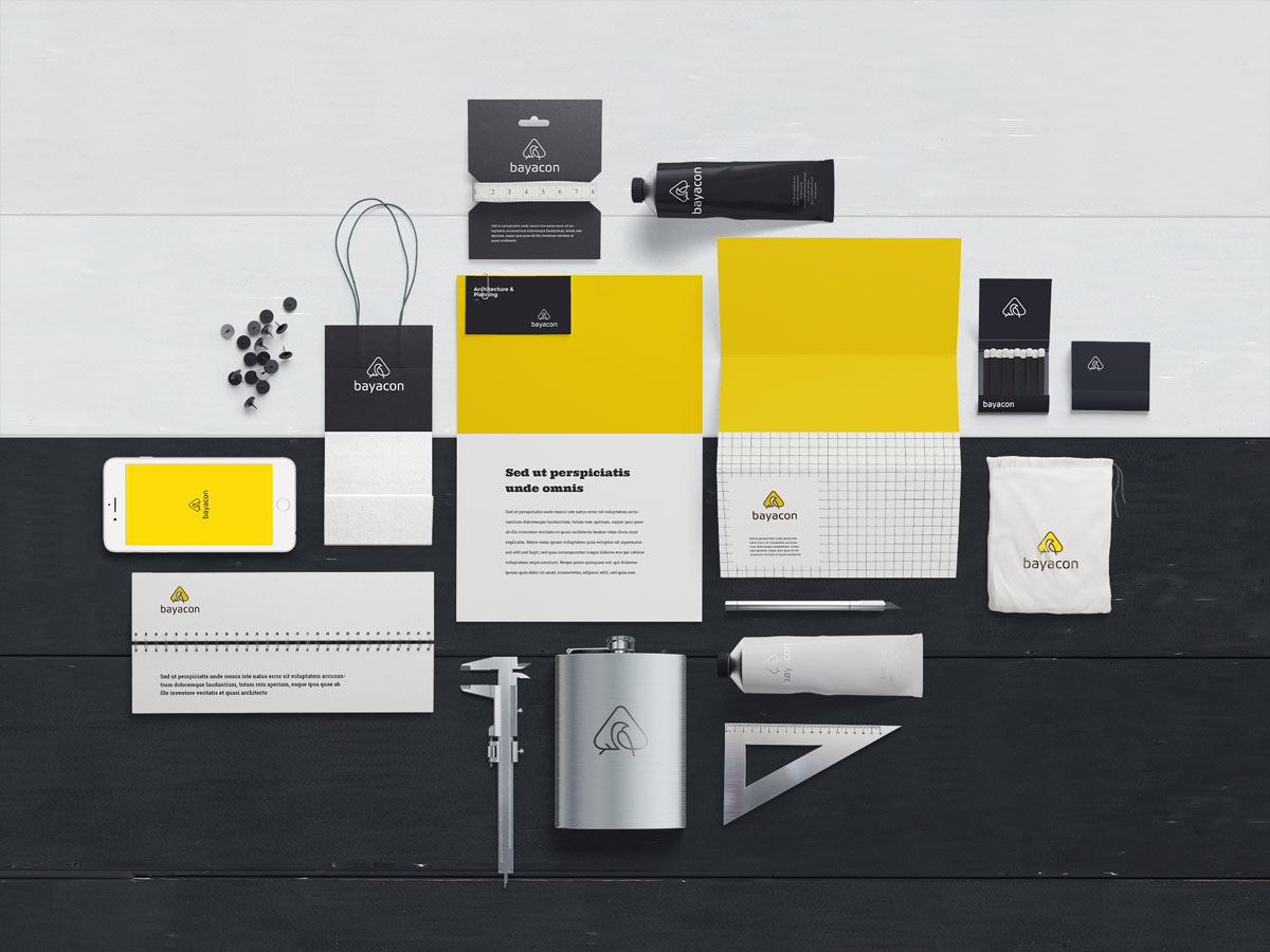
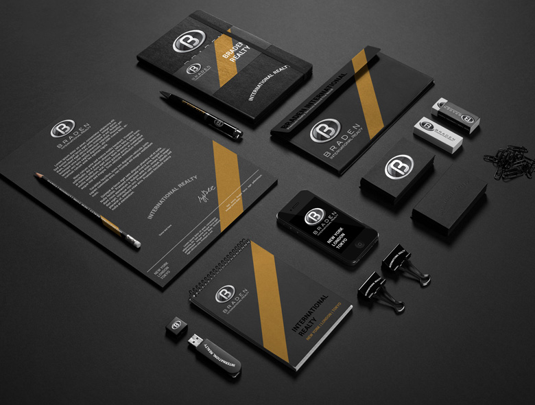
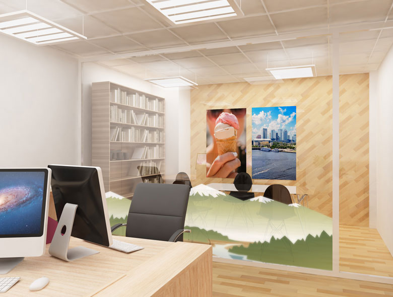
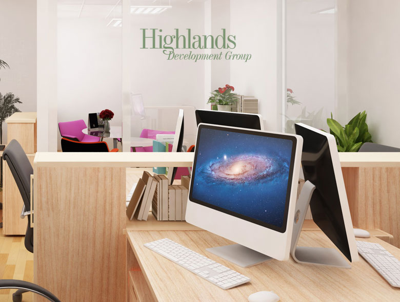
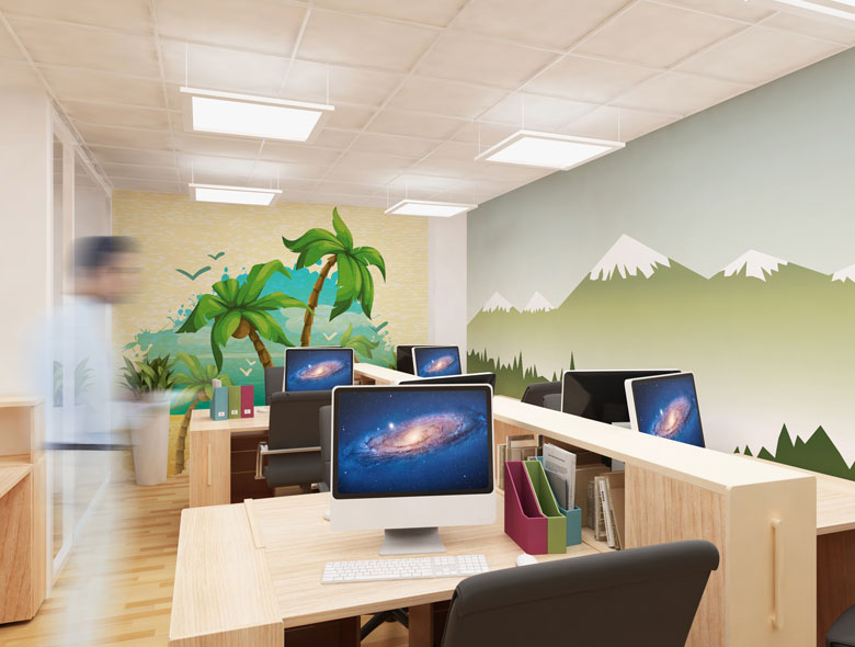
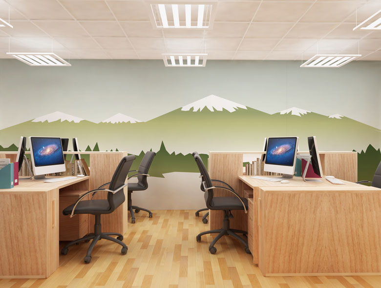
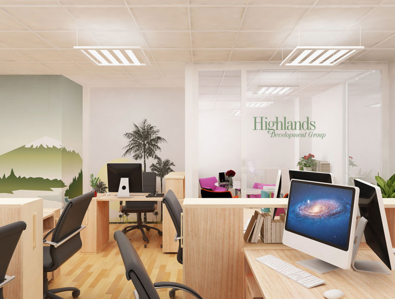
Once we created the logo design, we then used the elements of the design in various brand touchpoints including their office interiors. We created wall-to-wall murals of the mountains and added elegant and subtle touches around the office including the glass dividers and walls.
The result is a stunning-looking office that lifts the company into the modern age and lends a feeling of luxury while still being down to Earth.
This office design:
- Uses design elements: Uses elements of logo design in office interiors
- Creates murals: Wall-to-wall murals of mountains
- Adds elegant touches: Elegant and subtle touches around office
- Includes glass dividers: Glass dividers and walls with design elements
- Lifts to modern age: Lifts company into modern age
- Creates luxury feel: Lends feeling of luxury
- Maintains down to Earth: Still being down to Earth
Result: Brand Identity That Honors Heritage While Building the Future
The brand identity and office design we created for Highlands Development Group successfully honors their heritage while building the future. The comprehensive brand transformation delivers:
Strategic Outcomes
- 60-year heritage: Brand identity successfully honors rich heritage of over 60 years
- Global operations: Visual identity successfully aligns with global operations
- Premium clientele: Brand successfully appeals to premium clientele
- Stay true to heritage: Brand successfully stays true to heritage and humble beginnings
- Office interiors: Brand identity successfully extends to office interiors
- Complete brand system: Logo design, office interiors, and brand touchpoints create unified experience
Implementation Success
Today, Highlands Development Group uses this comprehensive brand identity and office design to attract premium clientele. The stunning logo design that embodies all goodness of highlands with meadows, creeks, mountain peaks and totality of nature, while staying true to heritage and humble beginnings in Highlands of England, combined with regal font and Japanese watercolors looking design, and wall-to-wall murals of mountains and elegant touches around office, creates a brand identity that lifts company into modern age and lends feeling of luxury while still being down to Earth. The brand successfully positions Highlands Development Group as an international real estate agency with offices in New York, London, Hong Kong, Dubai and Lisbon dealing with huge multi-million dollar ventures, with rich heritage of over 60 years that stays true to heritage and humble beginnings while operating globally.