Spellbrand Blog
Top 10 Cell Phone Logos
Looking for a custom logo?
Get a professional, one-of-a-kind logo designed by our award-winning team.
Looking for a custom logo design?
Our professional designers create unique, memorable logos tailored to your brand.
See Our Logo Design Services →When a cell phone rings, everyone in the room reaches into a pocket or a purse. This is because they are ubiquitous in our society—a modern necessity. With almost everyone in the nation carrying a cell phone, these communication logos are seen every day by the general public and therefore must be among the best in the world of business.
Motorola Logo Design
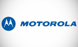
The Motorola logo is in the shape of a friendly circle, but the triangle is incorporated as well. The letter ‘M’ is formed by two triangles, symbols of strength. However, the triangles are rounded at the bottoms so that they could also be interpreted as arrows pointing upward. The implication that this brand is constantly moving upward cannot be missed. The writing is bold and plain, but also slightly slanted to further convey a feeling of movement.
LG Logo Design
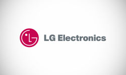
LG tends to offer phones with innovative features and sleek, intuitive designs, so a consumer friendly image is a perfect complement to the overall brand. This logo design is indeed friendly, in the shape of a welcoming circle with a happy, smiling face. If you look closely, this face is formed by the company name, making for a clever and interesting image. A well placed dot is the only embellishment. This simple yet friendly logo both bolsters LG’s image while inviting customers to give this South Korean favorite a try.
Kyocera Logo Design

This cell phone company has incorporated one of the most trendy elements of logo design, the mosaic pattern, into a logo that is both attractive and timeless. The mosaic is a great choice because it represents small parts coming together into a functional whole. It also forms the shape of a letter ‘K’, the company’s initial. The font of the writing is square for a feeling of solid reliability, but rounded to add softness to the hard edges. This logo is different from any other cell phone logo without being cluttered or overdone.
Sony Ericsson Logo Design
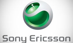
This brand is a joint venture between nations on opposite sides of the world, the Japanese electronics giant Sony along with the Swedish communications innovator Ericsson. The logo, however, is not an amalgam of the two company’s logos, but rather an image that is independent and unique. The logo is in a circular shape that is commonly seen in this industry, with a wavy shape through the center to show the movement of the company. The wavy shape leaves an image that could be interpreted as either an ‘s’ or a lower case ‘e’, tying in to both parent companies.
Samsung Logo Design
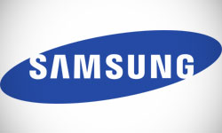
Samsung is one of the world’s leaders in cell phone technology, which why it is so brilliant that the friendly circle in the logo is oriented around the name so that Samsung appears to be a planet. The block writing is bold and attention grabbing, while the way the ‘A’ is drawn incorporates the strength of the triangle into the logo. This logo is simple, modern, and well designed, which is exactly the impression that the company is trying to impart.
BlackBerry Logo Design
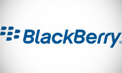
The Blackberry was named this because its tiny keys resembled berry seeds. As such it is only just that the seeds/keys are a major element of the logo. A group of seeds represent a stylized BlackBerry (the fruit). However, despite the tiny keys, the company tries to promote a friendly image. The image is generally circular, while the lettering is also rounded. Movement is another strong theme; the seeds are asymmetrical and appear to be moving, an impression further supported by the slightly slanted writing.
Sanyo Logo Design
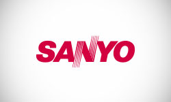
This cell phone company has a simple, memorable logo that subtly communicates a feeling of movement. First, the letters are slightly slanted, as though they are moving. Second, the ‘N’ is formed so that it looks like a stylized wave, another sign of change and improvement. The block letters are bold without being domineering. The ‘N’ could be interpreted as a line rebounding, which is always a positive image. In all, this logo manages to be dynamic despite—or perhaps because of—its simplicity. The companies name means ‘three oceans’ in Japanese, adding another touch of movement.
INQ Logo Design
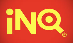
Many Americans won’t recognize this logo… yet. This European cell phone company has chosen to completely go against the crowd in creating a colorful logo in the bright, eye catching colors of red and yellow. The letters are plain, with the ‘Q’ enclosing a circle that could either be interpreted as a friendly shape or the center part of a bull’s eye. The mix of capital and lower case letters along with the slightly skewed orientation of them gives an informal, artistic feeling that appeals to cell phone shoppers all over the world.
Audiovox Logo Design

This company incorporates the solidness of the square with the friendliness of the circle in a rounded square shape that is sure to appeal to consumers looking for low priced cell phones and accessories. The ‘A’ of the logo is made of a single line, adding a feeling of movement. To the right, the company name is written in bold letters with newsy serifs, with a red line emphasizing the ‘V’. This mixture of serious and innovative is a positive image for this company.
BenQ-Siemens Logo Design
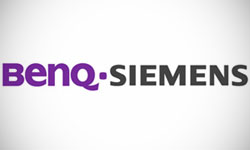
This is another joint venture, but in this case the logo simply incorporates those of the parent companies. The ‘BenQ’ portion is rounded and friendly in a royal purple, while the Siemens logo is square and austere. The lower case letters in the BenQ half along with the thicker writing give it a fun, playful feeling that is a sharp contrast to the serious right half. The two halves are the same size, giving both images equal importance and weight. The impression is that these cell phones offer the best of both worlds.
As you can see, these companies carefully evaluate their market and then have professional logos designed that use shape and color to reach out and make a brand promise to their target markets. Your logo can be just as powerful and memorable if you give it the same importance.

Mash Bonigala
Creative Director & Brand Strategist
With 25+ years of building brands all around the world, Mash brings a keen insight and strategic thought process to the science of brand building. He has created brand strategies and competitive positioning stories that translate into powerful and stunning visual identities for all sizes of companies.
Featured Work
See Our Work in Action
Real brands, real results. Explore how we've helped businesses transform their identity.
Client Love
What Our Clients Say
Don't just take our word for it. Hear from the brands we've worked with.
Jenny Richard
Woods Of Fairfax
"Working with the team at Spellbrand has been fantastic! I spent time researching companies that would help me build brands for each asset that are all in different locations and more specifically build a brand that could help tell each of their unique stories. Spellbrand did just that. The process was easy. To provide them with my initial thoughts through a nicely-outlined input form they sent to me and they took that information and created a number of awesome designs. I was able to incorporate "the story" easily with a design we selected. I'm excited to get it into action and see what's in store for the next project. Also, each person I worked with has been super responsive, knowledgeable, and awesome to work with! Kudos to Mash, Mike, and Eva! I really enjoy working with you!"
Josh Amburn
Lakefront Docks and Lifts
"I came into this project expecting to get the best logo for our brand. That’s exactly what I received. The team at SpellBrand used the descriptions of what we do along with a color palette of our site to design three amazing concepts. Once we decided on what worked best for our needs, they worked diligently to perfect the design. Their use of their project management software makes the collaboration painless. Great work team! We’ll see you on the next project! Josh"
Related Services You Might Love
Based on what you just read, here are services that can help you achieve similar results for your brand.
Free Download
Brand Consistency Checklist
A 27-point checklist to audit your brand across every touchpoint. Used by our team on real client projects.
Success! Check your email for the download link.
Instant PDF download. We'll also send branding tips -- unsubscribe anytime.
Keep Reading
Related Articles
Nov 17, 2025
Top 10 Simple Logos (Yet Effective Logos)
Discover the top 10 simple logos (yet effective logos) logos. Expert analysis of iconic logo designs, their history, and what makes them memorable.
Read MoreNov 17, 2025
Top 10 American University & College Logos
Discover the top 10 american university & college logos logos. Expert analysis of iconic logo designs, their history, and what makes them memorable.
Read MoreNov 17, 2025
Top 10 Car Company Logos
Discover the top 10 car company logos logos. Expert analysis of iconic logo designs, their history, and what makes them memorable.
Read More

