Spellbrand Blog
Top 10 Classic Logos
Looking for a custom logo?
Get a professional, one-of-a-kind logo designed by our award-winning team.
Looking for a custom logo design?
Our professional designers create unique, memorable logos tailored to your brand.
See Our Logo Design Services →While rebranding is a necessary step for most companies as people and societies evolve through the decades, some logos seem to withstand the test of time (see Top 5 Rebranding Mistakes). The following logos are so classic that they can be recognized around the world by people young and old. In fact, all of these companies would be significantly harmed by using any other image to represent themselves. Here are ten classic logos that you likely will recognize at a glance because of their simple, timeless power and adherence to some of the best practices and principles of logo design.
Coca-Cola Logo Design
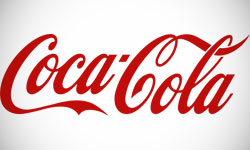
What logo could be more recognizable worldwide? People all over the planet recognize both the distinctive font and the signature red. The font is a classic one that suggests the age of the company, while the many swirls and wavy shapes imply that the company is constantly moving forward. This combination of logo history and modernity has made the Coca-Cola logo one that is both timeless and beloved by millions of people.
Macy’s Logo Design
This department store has been an American favorite for more than a decade, with a logo written in a recognizable font along with the trademark star. The name is usually written in recognizable lower case letters, using a star instead of an apostrophe. The star, which generally implies excellence, has been a part of the company since the very beginning. It actually comes from a star tattoo that that the founder had gotten as a young whaler. The consistent use of the signature font, the same bright red color, and the star both in stores and advertising with the website logo design has allowed Macy’s to achieve a level of brand recognition that most of their competitors must envy.
Morton Salt Logo Design
People all over the world recognize the Morton girl and the familiar tagline: “When it rains, it pours.” The Morton girl has changed over the decades to reflect changes in dress, but slightly enough that the original remains version remains almost identical to the original. This combined with the continuous navy blue and bright yellow brand color palette make Morton Salt food and drink logo a branding success story as well as a good example of a logo that has stood up throughout decades of constant use.
Mercedes Benz Logo Design

This luxury European car maker has a car logo that can be recognized on sight despite having no reference whatsoever to the company name. The circle is a shape that makes people feel included and wanted, while the lines dividing it give a feeling of balance. The three-sided shape is also a reference to the triangle, a common symbol of strength and timeliness. This shape, with its combination of strength and friendliness, makes for a top 10 car company logos that is one of the most recognizable and most respected in the world.
Michelin Logo Design
Logo designers sometimes says that a logo gives a company a face, and in this case it is a very literal face: the smiling, mummy-like Michelin man who is apparently made of white tires. This French tire company may have changed its logo slightly throughout the decades, but it retains the recognizable central figure of the Michelin man. Who would think that a man made of tires would be so successful? In fact, the Michelin man is one of the world’s oldest trademarks and an example of branding par excellence.
Apple Logo Design
While the particular color of the Apple computer logo has changed throughout the years, the signature image of an apple with a bite taken out of it has remained consistent. This is because of several factors. First, the apple is a roughly round shape, which implies friendliness and unity. Indeed, many customers buy a Mac simply because they are seen as the friendlier, smaller computer company. The logo also has an obvious connection to the company name, making it easy for people to recognize it and relate it to the overall brand. Apple the software giant with a new logo is a marketing success story, and the logo is one important part of this.
The Olympic Games Logo Design
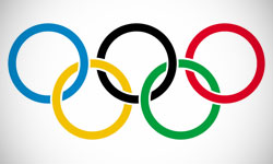
Clearly meaningful logos are not limited to big business. People all over the world recognize the familiar entwined circles. Because circles are shapes associated with unity, and entwined or overlapping shapes even more so, the message of this sports logo is clear. The five circles represent the five inhabited continents of the earth, considering North and South America a single continent. The colors are symbolic as well, representing all of the nations of the planet because all have at least one of these colors in its national flag. The message of inclusion and unity cannot be missed in this classic logo. Check out the top 10 Olympics logos from the past events.
8. Nike Logo Design
The familiar swoosh, which cost the owner a mere $35, is recognized throughout the world and needs no text or explanation. A swoosh or wavy shape represents movement and forward thinking to the subconscious mind, making this single image a powerful representation of the company’s values and one that will withstand the test of time as well.
9. Playboy Logo Design
Playboy Enterprises is a controversial brand, but a classic one as well. The image of the Playboy bunny is recognized worldwide and identified with the brand’s core values of sensuality and luxury. Part of this high recognition is due to the logo’s uniqueness, but another and perhaps greater part is due to the fact that this logo has not changed in the half-century since the company was created. Having a logo that is unique, appropriate, and capable of withstanding changing times is a powerful vehicle to success in any industry.
10. Google Logo Design
The Google logo may have the longevity required to be a true classic—yet—but it certainly earns the designation of a new classic. Google has become synonymous with success, and the simplicity of this design is one key to that image. While the logo’s font has changed slightly, the newsy, thin writing in a bright, elementary color palette has stayed the same. The combination of the straightforward with the playful is powerful enough that this brand is poised to become a classic in future decades. The simplicity of the design along with its avoidance of trendiness and clutter will help it stay relevant and strong in coming years and you can learn a lot of logo design lessons from Google.

Mash Bonigala
Creative Director & Brand Strategist
With 25+ years of building brands all around the world, Mash brings a keen insight and strategic thought process to the science of brand building. He has created brand strategies and competitive positioning stories that translate into powerful and stunning visual identities for all sizes of companies.
Featured Work
See Our Work in Action
Real brands, real results. Explore how we've helped businesses transform their identity.
Client Love
What Our Clients Say
Don't just take our word for it. Hear from the brands we've worked with.
Raymond Chen
RLC Global Archicom, Singapore
"SpellBrand was very accommodating from the beginning of the design process even when we had distinct design ideas, being architect designers ourselves. Jeff responded with many preliminary style options based on our initial sketchy ideas, enabling us to zoom in on the specific feel we were looking for. From that point on, it was just refinement and the final logo was in our hands in a matter of days. We have used SpellBrand on other logos for my clients projects."
Jenny Richard
Woods Of Fairfax
"Working with the team at Spellbrand has been fantastic! I spent time researching companies that would help me build brands for each asset that are all in different locations and more specifically build a brand that could help tell each of their unique stories. Spellbrand did just that. The process was easy. To provide them with my initial thoughts through a nicely-outlined input form they sent to me and they took that information and created a number of awesome designs. I was able to incorporate "the story" easily with a design we selected. I'm excited to get it into action and see what's in store for the next project. Also, each person I worked with has been super responsive, knowledgeable, and awesome to work with! Kudos to Mash, Mike, and Eva! I really enjoy working with you!"
Related Services You Might Love
Based on what you just read, here are services that can help you achieve similar results for your brand.
Free Download
Brand Consistency Checklist
A 27-point checklist to audit your brand across every touchpoint. Used by our team on real client projects.
Success! Check your email for the download link.
Instant PDF download. We'll also send branding tips -- unsubscribe anytime.
Keep Reading
Related Articles
Nov 17, 2025
Top 10 Simple Logos (Yet Effective Logos)
Discover the top 10 simple logos (yet effective logos) logos. Expert analysis of iconic logo designs, their history, and what makes them memorable.
Read MoreNov 17, 2025
Top 10 American University & College Logos
Discover the top 10 american university & college logos logos. Expert analysis of iconic logo designs, their history, and what makes them memorable.
Read MoreNov 17, 2025
Top 10 Car Company Logos
Discover the top 10 car company logos logos. Expert analysis of iconic logo designs, their history, and what makes them memorable.
Read More
