Spellbrand Blog
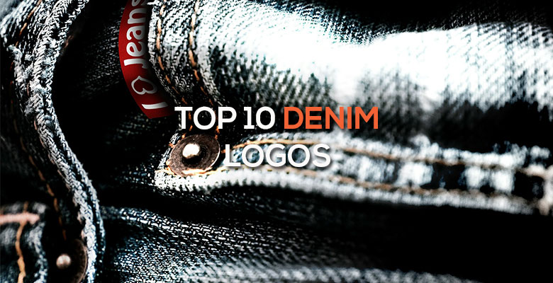
Top 10 Denim Logos
Looking for a custom logo?
Get a professional, one-of-a-kind logo designed by our award-winning team.
Looking for a custom logo design?
Our professional designers create unique, memorable logos tailored to your brand.
See Our Logo Design Services →Almost everyone in the United States wears denim on a regular basis, and most of these people also have a favorite denim brand. Some of this customer loyalty is due to the fit and cut of the jeans in question, but a lot of it is due to the power of the denim brand, including its clothing brand logo. You probably see these fashion labels on pant pockets everywhere, because they represent some of the best in their field.
Evisu Logo Design
The central image of this logo design is a wavelike shape that gives a feeling of freedom and movement. This image is actually a stylized seagull that was hand painted by company founder Hidehiko Yamane. The name of the company is written below in bold, blocky letters that add weight to the flighty image. While creating your own logo rarely is a good idea, in this case, the result is visually interesting and has brought the company immense success and renown. Don’t try this at home!
Lucky Brand Logo Design
This company recently went through a logo change, and the result is an ultra-modern and simple logo design that will be recognized by denim lovers everywhere. While there once was an image of a four-leaf clover, symbolizing luck, the logo now has only text. The wavy, ornate text gives a sense of both tradition and modernity, a fine line that few companies can safely walk. Because this paradox is particularly appropriate in the world of blue jeans, it is appropriate for this logo design.
True Religion Logo Design
The religious reference in the name is bolstered by a logo design with a Buddha as the central image. However, the Buddha is happy, holding a guitar and giving a thumbs-up sign to viewers. The bold, blocky letters add seriousness to an otherwise entertaining image, while the bright red color draws the eye to the logo. This logo ties into the brand name and offers a fun, memorable image while maintaining enough gravity to be taken seriously by the consumer.
Diesel Logo Design
There is nothing mild or meek about this logo. First, a bold red color draws attention to the logo design. The square shape is as straightforward as you can get. The large white letters in all capitals are plain and written in a white color that contrasts with the red, creating a solid and substantial whole. This logo seems plain, but it is expressive nonetheless.
Mavi Logo Design
Again we see a square, blocky logo, but this time with a very different meaning. First, the lower case letters are rounded for a friendly image. The square logo shape this time contains a calming blue color. The word ‘jeans’ is written in small letters to assert the brand’s main product. This friendly logo design is very similar to Diesel’s, yet with a very different emotional result. This difference serves to show the difference that color and font choice can make in the customer’s reaction to a logo.
Ecko Unlimited Logo Design
The central image of this logo design is a rhino shape, which holds great significance to this company. Not only did the designer’s father collect rhinoceroses throughout his life, but the rhino also represents the strong and determined image that the company wishes to project. A round shape surrounding the rhino adds a friendlier, more inclusive image, an impression that is reinforced by the rounded lower case letters. Again, a bright red color attracts attention and asserts dominance.
7 for All Mankind Logo Design
A key part of the brand for this company is the artisan quality of their jeans along with ultra-modern styling. The logo expresses these brand values well. First, the logo appears to be hand drawn and filled in, with the company name written in cursive. This creates a very personalized, artisan image. Second, the lower case letters make the image friendly and approachable. The plain black and white color is simple and sophisticated while allowing all of the emphasis to remain on the logo itself.
Armani Jeans Logo Design
Armani Jeans is a good example of how a company can integrate a line into the parent brand without diminishing either. The name of the company is written in the signature Armani font, with a line separating the name from the brand’s initials written in the same writing. Unlike other lines of Armani, there are no images, however, allowing all of the attention to remain on the name. The black and white color palette is seen commonly in luxury clothing lines such as this and again is used in the parent company as well.
Mudd Logo Design
This brand of jeans is most popular among teenage girls, offering stylish cuts at a value price. The logo is a good representative of the brand. The name of the company is written in a newspaper-like font, with images of a handprint, a heart, and a flower above to make the image more inviting to the target audience. The mud brown color is directly relevant to the name of the company, but also a very trendy color at the moment.
L.E.I Logo Design
This company has a similar market as Mudd Jeans, but they approach their customers in a very different way. First, there are no images here. Instead of a serious, newsy font, a rounded one is shown in all lower case letters, creating a very friendly logo design. The words that the initials represent, ‘life’, ‘energy’, and ‘intelligence’, are written below the main wording. To add visual interest, the ‘e’ of the logo is angled so that it is on its side. Black and white colors make this logo ultra-modern, although still very friendly due to the round shapes and is nowhere near The Levi’s Logo’s Timeless Appeal.
As you can see, these denim companies all have very different logos meant to express a diverse group of brands and appeal to an equally diverse range of customers. Because the effect of a logo design is primarily subconscious, many customers never realize why they are reaching for one pair of jeans over the ones next to them. The next time you buy a pair of jeans, you will be able to see exactly what logo design pull you in with their brand promise.

Mash Bonigala
Creative Director & Brand Strategist
With 25+ years of building brands all around the world, Mash brings a keen insight and strategic thought process to the science of brand building. He has created brand strategies and competitive positioning stories that translate into powerful and stunning visual identities for all sizes of companies.
Featured Work
See Our Work in Action
Real brands, real results. Explore how we've helped businesses transform their identity.
Client Love
What Our Clients Say
Don't just take our word for it. Hear from the brands we've worked with.

Raymond Chen
RLC Global Archicom, Singapore
"SpellBrand was very accommodating from the beginning of the design process even when we had distinct design ideas, being architect designers ourselves. Jeff responded with many preliminary style options based on our initial sketchy ideas, enabling us to zoom in on the specific feel we were looking for. From that point on, it was just refinement and the final logo was in our hands in a matter of days. We have used SpellBrand on other logos for my clients projects."

Steve Turner
Turn2Coaching
"Delighted to have used Spellbrand for our last project. The work was thorough and results excellent. For me it was such a pleasure to work with Mash who was able to keep up with all my last minute requests for small changes. Nothing was too much of a problem and I would have to say that its great to work with people who do actually put the customer needs first! One thing saying it, its another thing doing it – Thanks Mash!"
Related Services You Might Love
Based on what you just read, here are services that can help you achieve similar results for your brand.
Free Download
Brand Consistency Checklist
A 27-point checklist to audit your brand across every touchpoint. Used by our team on real client projects.
Success! Check your email for the download link.
Instant PDF download. We'll also send branding tips -- unsubscribe anytime.
Keep Reading
Related Articles
Nov 17, 2025
Top 10 Simple Logos (Yet Effective Logos)
Discover the top 10 simple logos (yet effective logos) logos. Expert analysis of iconic logo designs, their history, and what makes them memorable.
Read MoreNov 17, 2025
Top 10 American University & College Logos
Discover the top 10 american university & college logos logos. Expert analysis of iconic logo designs, their history, and what makes them memorable.
Read MoreNov 17, 2025
Top 10 Car Company Logos
Discover the top 10 car company logos logos. Expert analysis of iconic logo designs, their history, and what makes them memorable.
Read More