Spellbrand Blog
Top 10 Dental Product Logos

Looking for a custom logo?
Get a professional, one-of-a-kind logo designed by our award-winning team.
Looking for a custom logo design?
Our professional designers create unique, memorable logos tailored to your brand.
See Our Logo Design Services →There is perhaps no field that needs marketing and logo branding as much as dentistry. Most people have negative feelings toward the dental field and dread making their appointments. A high-quality dental identity that follows basic principles of good design will help potential patients feel more at ease, which makes them more likely to choose your practice over others. There are a few things a high-quality graphic designer can do to make your dental logo more effective.
Everyone wants perfect teeth; the difference is the product that we believe will give us this attractive feature. Many people choose a product based on brand loyalty, based on the promise made by the logo and the marketing campaign. This makes dental-related logos very important because a lot percentage of customers are making choices based on this alone. Here are the health logos of ten of the most popular dental products in the United States and how these images have contributed to the product’s success.
AQUAFRESH DENTAL PRODUCT LOGO DESIGN
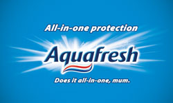
This toothpaste’s logo shows what makes the brand unique along with using one of the graphic designs’ most expressive objects: the wave. In this case, the wave expresses that the brand is forward-thinking, but it also is in the three colors of the toothpaste. The writing is rounded to give a friendly and inclusive feeling. Altogether, few people would think about what this logo is trying to say, which makes it all the more effective.
SCOPE DENTAL PRODUCT LOGO DESIGN
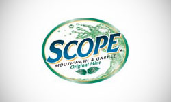
An inclusive circle is used as the primary shape of this logo, with bold, blue letters in a slightly slanted font that implies movement. Green fluid identical to that inside the bottle forms an ocean-like wave. Two mint leaves show the flavor of the mouthwash, bolstered by a predominantly green color scheme. The image is refreshing and cool, which likely inspires many consumers to give it a try.
CREST DENTAL HYGIENE LOGO DESIGN
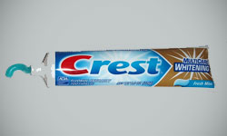
Crest uses blasts of light to give a clean, bright image that is very congruent with the clean teeth that many people want to have, A single red letter is used to get attention, while the other letters are a calming blue. The background of the dental hygiene logo is also blue and soothing. The letters are extremely thick to show strength but slanted slightly to give a feeling of movement.
CREST PRO HEALTH DENTIST LOGO DESIGN
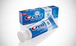
This is a product made by Crest that has a unique brand all its own. The familiar Crest logo is used, but there are additional images that emphasize this toothpaste’s difference from its mother brand. First, the seal of the American Dental Association is displayed prominently and even backlit. A thick white strip showcases the product’s whitening abilities, while the benefits of the toothpaste are listed to the far right of the dentist logo. This dentist logo is similar enough to the original Crest image to maintain the brand while clearly showing how it is different.
CREST WHITESTRIPS DENTAL PRODUCT LOGO DESIGN
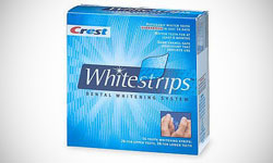
Another Crest product? This one also has a logo that is unique while maintaining a connection to the mother brand. The word ‘Whitestrips’ is written in a slightly thinner version of the font used for traditional Crest products. A star dots the ‘I’, showing consumers how shiny and bright their teeth can be with the help of the product. The calming blue color palette includes the two signature blues used in the Crest logo, as well as lines to give a sense of movement.
ARM & HAMMER DENTAL HEALTH LOGO DESIGN
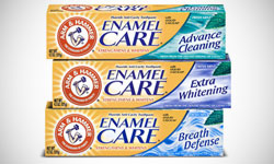
Baking soda once was a popular substitute for toothpaste, so it makes sense that this manufacturer would make toothpaste. Not only does Arm & Hammer include their classic round logo with an arm and a hammer inside, but they also have the product written in a calming bright blue along with a calming river and a mint leaf to the right. Rivers imply purity, while mint refers to the flavor used in these kinds of toothpaste, making this an appropriate image.
TOM’S OF MAINE COSMETIC DENTAL LOGO DESIGN
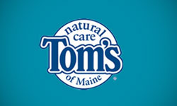
This all-natural toothpaste offers a very different product from the pack and a very different logo as well. Instead of focusing on the brand name, the cosmetic dental logo is in the shape of an inclusive circle. The words ‘natural care’ is the only hint at what sets this product apart from the others, but they are prominently displayed at the top of the logo where viewers cannot miss them. Like many kinds of toothpaste, Tom’s uses a clear, clean blue, adding a touch of brightness as well as a calming feeling, rather than a green or other earthy colors. Photographs on the package indicate the flavor.
MENTADENT DENTAL CLINIC LOGO DESIGN
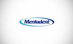
The Mentadent dental clinic logo also uses blue to impart a feeling of calm, but it uses other design principles as well. The writing is surrounded by a circle, which makes it feel friendly to the toothpaste consumer. The writing is slightly slanted to give a feeling of movement. While this logo is hardly different and unique, it nonetheless uses some of the best principles of dental clinic logo design, including using shape and color to convey an image. Sometimes simple dental clinic logos are the most effective.
ACT DENTAL OFFICE LOGO DESIGN
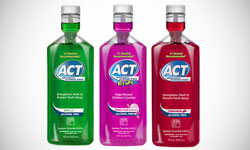
This mouthwash is one of few to maintain both a successful line of mainstream mouthwashes as well as a line just for kids. Part of this success is due to the versatility of the dental office logo. The circular dental office logo shape is seen again, along with the comforting blue. A banner comes out from the bottom of the circle, creating a sense of movement while giving room for a short explanation of the product’s use. Instead of using blue letters, blue background with white letters is used. In the children’s product, the word ‘kids’ is written in boldly colored, childish lettering that appeals to the target audience.
AIM DENTAL CARE LOGO DESIGN
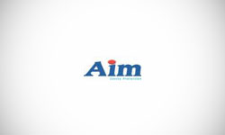
Again we see the attention-getting red along with calming soothing blue. However, Aim has chosen to use a more authoritative font, newsy lettering with serifs, and thick letters. The red dot on the ‘I’ emphasizes the circular shape, another friendly touch. This also reminds viewers of a bullseye, which ties directly into the name.
As you can see, there are several trends in dental product logos for dentists. The color blue and circular shapes are seen in almost all of these dentist logos. While these logos may seem rather similar, there are subtle cues that customers pick up on, building brand loyalty and educating the customer about the aim of the product. Because these are the chief duties of a dentist’s logo and branding in general, it’s easy to see why dental products are a lucrative and ever-growing field.

Mash Bonigala
Creative Director & Brand Strategist
With 25+ years of building brands all around the world, Mash brings a keen insight and strategic thought process to the science of brand building. He has created brand strategies and competitive positioning stories that translate into powerful and stunning visual identities for all sizes of companies.
Featured Work
See Our Work in Action
Real brands, real results. Explore how we've helped businesses transform their identity.
Client Love
What Our Clients Say
Don't just take our word for it. Hear from the brands we've worked with.
Jenny Richard
Woods Of Fairfax
"Working with the team at Spellbrand has been fantastic! I spent time researching companies that would help me build brands for each asset that are all in different locations and more specifically build a brand that could help tell each of their unique stories. Spellbrand did just that. The process was easy. To provide them with my initial thoughts through a nicely-outlined input form they sent to me and they took that information and created a number of awesome designs. I was able to incorporate "the story" easily with a design we selected. I'm excited to get it into action and see what's in store for the next project. Also, each person I worked with has been super responsive, knowledgeable, and awesome to work with! Kudos to Mash, Mike, and Eva! I really enjoy working with you!"
Josh Amburn
Lakefront Docks and Lifts
"I came into this project expecting to get the best logo for our brand. That’s exactly what I received. The team at SpellBrand used the descriptions of what we do along with a color palette of our site to design three amazing concepts. Once we decided on what worked best for our needs, they worked diligently to perfect the design. Their use of their project management software makes the collaboration painless. Great work team! We’ll see you on the next project! Josh"
Related Services You Might Love
Based on what you just read, here are services that can help you achieve similar results for your brand.
Free Download
Brand Consistency Checklist
A 27-point checklist to audit your brand across every touchpoint. Used by our team on real client projects.
Success! Check your email for the download link.
Instant PDF download. We'll also send branding tips -- unsubscribe anytime.
Keep Reading
Related Articles
Nov 17, 2025
Top 10 Simple Logos (Yet Effective Logos)
Discover the top 10 simple logos (yet effective logos) logos. Expert analysis of iconic logo designs, their history, and what makes them memorable.
Read MoreNov 17, 2025
Top 10 American University & College Logos
Discover the top 10 american university & college logos logos. Expert analysis of iconic logo designs, their history, and what makes them memorable.
Read MoreNov 17, 2025
Top 10 Car Company Logos
Discover the top 10 car company logos logos. Expert analysis of iconic logo designs, their history, and what makes them memorable.
Read More
