Spellbrand Blog
Top 10 Green Logos
Looking for a custom logo?
Get a professional, one-of-a-kind logo designed by our award-winning team.
Looking for a custom logo design?
Our professional designers create unique, memorable logos tailored to your brand.
See Our Logo Design Services →Green is more than a color: it is the quiet calm of nature, a representative of health and safety, and even a lifestyle movement. Few colors are as expressive or as heavily loaded with meaning as this one. We wrote about the top 10 blue colored logos in the past too. The following ten green logos use this color to communicate important information about their companies, although they approach this in very different ways.
Greentack Logo Design
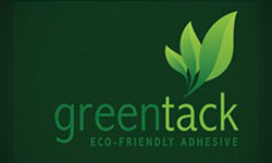
Green living is a huge cause lately, and many people will buy a new product simply because it is the green alternative to the brand they currently use. Greentack is just one of the many green products overtaking the market, and it has logo designs that are representative of the genre as well. The name of the company is written in rounded lower case letters that are friendly and inviting, with the image of a leaf above in a coordinating color of green. Like many green companies, this one uses a tagline to reinforce the idea that they are an ecologically friendly force.
Vivaio Logo Design
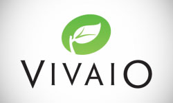
The Vivaio logo design also uses a leaf as the main image, although there are some differences here. First, the lettering is not friendly in any way, but instead sophisticated and upscale in a capital point in black with pointy serifs. This rather severe image is enclosed in a circle, which adds a little friendliness to balance the writing. This is a good example of how the same image—a leaf in this case—can be transformed into two very different logo designs.
The Bug World Experience Logo Design

In this logo design for a museum specializing in insects, the dominant shape is a green sphere relating to the ‘world’ in question. A small bug on the globe looks curiously at viewers. A banner across the globe advertises the museum as a truly interesting experience. This logo design will appeal to families and children visiting the area, which is likely the target audience.
Spring Breeze Medicine Logo Design
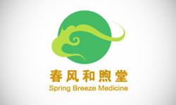
A medical practice with inclinations toward holistic medicine can use green to show their natural side. Again we see a friendly circle in a shocking green shade. A wavelike shape across the sphere gives a feeling of movement. The name is written first in Chinese and then in a very simple font, both in a rich metallic gold that suggests wealth and riches. While this logo design is clearly created for a specific culture, it nonetheless has elements that are successful with a variety of backgrounds.
Wishpot Logo Design
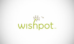
This wish list website has a much more whimsical logo. We see once again the extremely rounded, lower case writing. The sole image is a flower rising out of the H, with petals flying into the wind as though blown off in the midst of a wish. This logo design is whimsical and wistful, enough to make anyone remember their childhood longings and their adult ones as well.
Green Party Logo Design
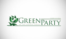
Again we see a leaf, but this time, it is very different from any of the leaf images we have seen so far. The leaf, in this case, is ultra-stylized and set against a black background. The name of the party is written in gray, adding a business-like touch to the mixture. The tagline below is written in the same font as the leaf and offers insight into the political aims of the party itself.
Planet Green Logo Design
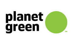
What could make more sense for a company named for a green planet than an actual green planet? In this case. The planet is a friendly, inclusive shape that makes viewers feel as though they are welcome with this business. This friendly image is furthered by the lower case writing in a non-confrontational font. This image is very simple, but every detail has been thought out well, which is a sign of good logo design.
Gifted by Nature Logo Design
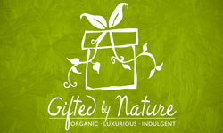
Here we see a green background in a beautiful green print with a white image and wording to create a clean and high contrast logo design. The image is a gift with a leafy vine as a bow. The cursive is artsy and not even a little traditional, creating a Creator archetype that will appeal to their target consumer. A tagline below explains the key brand values, although the logo is expressive enough that it really could do without this. Because Gifted by Nature offers organic and eco-friendly gifts, a green logo design and brand are certainly perfect here.
Chaophya Park Logo Design
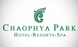
This upscale resort has a brand that demands a green logo design, with natural leanings, organic spa treatments, and food is grown onsite for the restaurants. The writing is serious in upper case letters with serifs, while the dark forest green is more relaxing and soothing than a brighter use of color in the logo would be. The image is off palm fronds combined with a wave, which is very appropriate for a tropical seaside resort. This logo design combines the important and salient aspects of the brand into an attractive and coherent image.
Playdom Logo Design
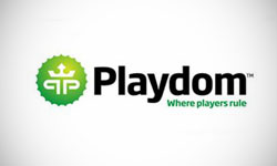
This business specializes in making iPhone applications allowing users to play their favorite Facebook games on their phone. As such, a playful logo design is definitely in order. Although green is often seen as a natural or calming color, here it is modern and bright, hinting at the technology that this business specializes in. The image is a serrated circle enclosing two P’s and a crown, tying into the name while adding a friendly touch. The friendly feeling is furthered by the tagline below. Black solid letters lend a business-like touch without being too overwhelming.
As you can see, a green logo can mean a variety of things and be drawn in many different ways. It doesn’t have to be cliché or boring, or even ecological. If you think green may be the perfect color palette for your new logo design, contact a logo designer about the many possibilities.

Mash Bonigala
Creative Director & Brand Strategist
With 25+ years of building brands all around the world, Mash brings a keen insight and strategic thought process to the science of brand building. He has created brand strategies and competitive positioning stories that translate into powerful and stunning visual identities for all sizes of companies.
Featured Work
See Our Work in Action
Real brands, real results. Explore how we've helped businesses transform their identity.
Client Love
What Our Clients Say
Don't just take our word for it. Hear from the brands we've worked with.
Raymond Chen
RLC Global Archicom, Singapore
"SpellBrand was very accommodating from the beginning of the design process even when we had distinct design ideas, being architect designers ourselves. Jeff responded with many preliminary style options based on our initial sketchy ideas, enabling us to zoom in on the specific feel we were looking for. From that point on, it was just refinement and the final logo was in our hands in a matter of days. We have used SpellBrand on other logos for my clients projects."
Liana Alexander Raye
Harlequin Starr International Styles
"Working with the Spellbrand team has been incredibly easy. Mash has a team of experts who are extremely visionary and pioneering, pulling together ideas and initial thoughts into an actual brand giving you options that you feel best align with your thought process. I have no idea how they created my brand based on the vague brief I gave them, but they have worked wonders and magic. Their design, attention to detail, willingness to ensure the final product is exceptional all counts towards a company who has the client at the forefront of mind at every step of the way. Spellbrand is my Number 1 go to for all branding, website and design concepts moving forward. I look at them as an extension to our marketing arm. Just brilliant."
Related Services You Might Love
Based on what you just read, here are services that can help you achieve similar results for your brand.
Free Download
Brand Consistency Checklist
A 27-point checklist to audit your brand across every touchpoint. Used by our team on real client projects.
Success! Check your email for the download link.
Instant PDF download. We'll also send branding tips -- unsubscribe anytime.
Keep Reading
Related Articles
Nov 17, 2025
Top 10 Simple Logos (Yet Effective Logos)
Discover the top 10 simple logos (yet effective logos) logos. Expert analysis of iconic logo designs, their history, and what makes them memorable.
Read MoreNov 17, 2025
Top 10 American University & College Logos
Discover the top 10 american university & college logos logos. Expert analysis of iconic logo designs, their history, and what makes them memorable.
Read MoreNov 17, 2025
Top 10 Car Company Logos
Discover the top 10 car company logos logos. Expert analysis of iconic logo designs, their history, and what makes them memorable.
Read More

