Minamoru: Resurrection of Style from Days Past
Situation: Creating Brand Identity for Unique Clothing Vision
Minamoru is a unique clothing brand with a passion and vision that is not usually found in most clothing labels that are launched every year in the US or the UK.
Based on the concepts of chivalry, rebellion, old-world charm and grace, history, and the legacy of the bygone eras, Minamoru markets itself as a clothing label that talks to individuals with strong personalities, opinions, and a respect for the bygone days.
The fashion market is saturated with typical clothing labels, making differentiation challenging. Minamoru needed a brand identity that would communicate their unique vision: resurrecting style and charm from days past, combining chivalry, rebellion, and old-world grace.
Task: Create Iconic Logo for Unique Vision
When Minamoru wanted an iconic and powerful logo, they came to Spellbrand. The challenge required:
- Iconic design: Logo that is iconic and powerful
- Unique vision communication: Brand identity that communicates unique vision
- Heritage celebration: Visual identity that celebrates chivalry, rebellion, and old-world charm
- Strong personality appeal: Brand that appeals to individuals with strong personalities and opinions
Action: Strategic Brand Development
Brand Discovery: Focus on Core Essence
Actually, the original name the client wanted to use was different and we started off on a direction that focused on the core of the brand, as we always do. So when the client came back in the middle of the process with a name change, we did not have to restart the process since our discovery phase was focused on the brand story, vision, and philosophy of the label rather than the immediate launch lines or product bases.
This approach:
- Focuses on core: Discovery phase focuses on brand essence, not name
- Enables flexibility: Can adapt to name changes without restarting
- Guides by philosophy: Brand story and vision guide the design
- Future-proofs design: Works regardless of product lines or launch dates
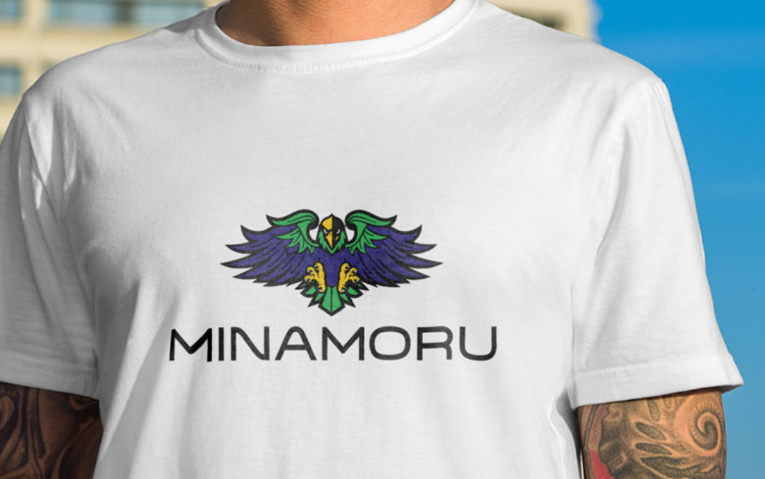
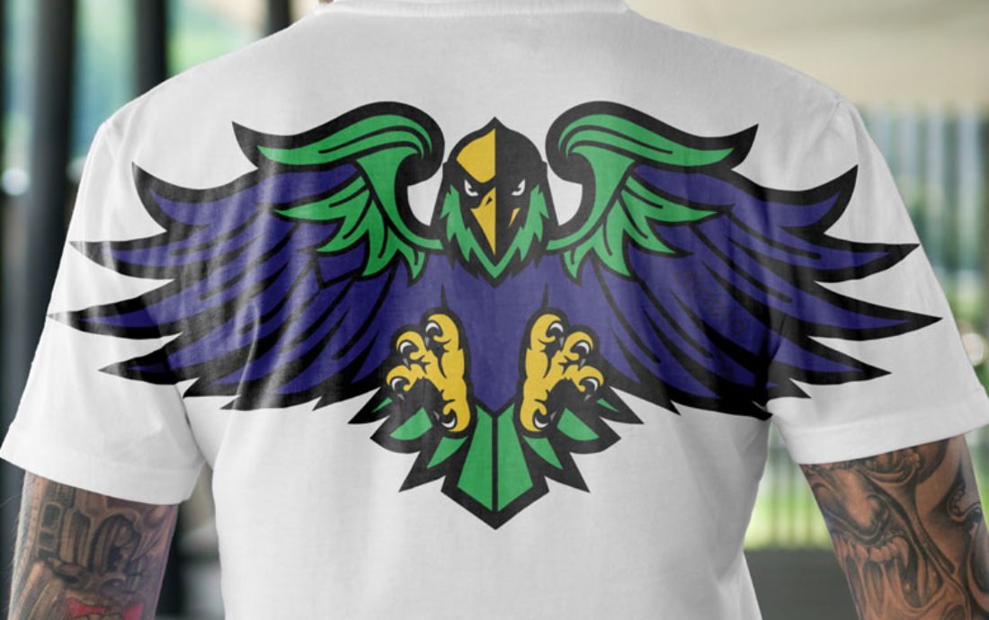
Phoenix Logo Design: Resurrection of Style
The idea was to create an illustration of a phoenix to represent the core essence of the company which was a “resurrection of the style and charm from days past”.
But this illustration had to have an attitude and edge to it. The result is a striking image of a phoenix in full frontal layout with a serious and piercing look while in flight and at the moment it is about to land on a perch. The colors also had significance to the client with a whole backstory to that. Hidden amongst the feathers is a word that is close to the client’s heart and the letter M.
You will have to wait and buy Minamoru clothes to know what that word is!
This design approach:
- Represents resurrection: Phoenix symbol represents resurrection and rebirth of style
- Creates attitude: Serious, piercing look appeals to strong personalities
- Adds movement: Dynamic pose in flight creates movement and energy
- Creates intrigue: Hidden word and letter M create intrigue and discovery
- Adds meaning: Colors have meaningful backstory for the client
Result: Brand Identity That Resurrects Style
The brand identity we created for Minamoru successfully communicates their unique vision of resurrecting style and charm from days past. The comprehensive brand transformation delivers:
Strategic Outcomes
- Iconic design: Logo successfully creates iconic and powerful brand mark
- Unique vision communication: Brand identity communicates unique vision
- Heritage celebration: Visual identity celebrates chivalry, rebellion, and old-world charm
- Strong personality appeal: Brand appeals to individuals with strong personalities and opinions
- Complete brand system: Phoenix logo with hidden elements creates powerful visual representation
Implementation Success
Today, Minamoru uses this comprehensive brand identity to attract individuals with strong personalities and opinions who respect history. The iconic phoenix logo design with its serious, piercing look and hidden elements creates a powerful visual representation of a clothing brand that celebrates chivalry, rebellion, old-world charm, and the legacy of bygone eras. The brand successfully positions Minamoru as a unique clothing label that talks to people who appreciate the resurrection of style from days past, combining chivalry, rebellion, and old-world grace into a modern fashion brand.
Brand Name Strategy: Creating “Minamoru”
The name “Minamoru” was developed through Spellbrand’s strategic brand naming process. Our team researched the competitive landscape, target audience, and brand positioning to create a name that would resonate in the market and support long-term brand growth.
The naming process included linguistic analysis, trademark screening, domain availability verification, and brand storytelling to ensure “Minamoru” would be distinctive, memorable, and legally protectable. Learn more about our brand naming service or explore our full naming portfolio.