Spellbrand Blog
Top 10 Guitar Logo Designs
Looking for a custom logo?
Get a professional, one-of-a-kind logo designed by our award-winning team.
Looking for a custom logo design?
Our professional designers create unique, memorable logos tailored to your brand.
See Our Logo Design Services →Top 10 Guitar Logo Designs: Few of us play guitar, but almost all of us will recognize many of these logo designs. From industry leaders in guitar manufacturing to little-known music teachers, these logos represent a wide cross section of the guitar industry. The one thing they all have in common? A great guitar logo design.
Fender Guitar Logo Designs
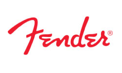
This guitar brand is considered one of the gold standards of the field, with a following of both serious musicians and celebrities who prefer this name over others. Although it seems plain, there are several meaningful elements. First, in this music logo design the cursive font is extremely traditional, and the writing is thick and bold to suggest an industry leader. Upper case E’s in the writing makes it more distinctive, ensuring that people recognize the font and identify it with the brand. The angling gives a feeling of movement and change that balances the traditional image.
Gibson Guitar Logo Design
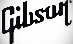
Gibson is another music instrument industry leader, so it makes sense that their font is very similar to that of Fender. However, there are notable differences. First, the letters have long ‘tails’, which is a look that is generally associated with rock and roll. Although Gibson also uses a rather traditional cursive font in thick, bold letters, several of the letters do not connect. This gives a modern feeling and adds to the distinctiveness of the font. It is easy to distinguish this logo design from those of its competitors, even those of competitors with text-only logos such as Fender.
DBZ Guitars Logo Design
This logo design is different from the previous two because, while black is certainly a dominating color, it is not the only color. Metallic gold suggests wealth and riches while maintaining the rock and roll band image that is so important for a guitar company. An eagle suggests excellence while also being a common image used in motorcycle brands and tattoos. The lettering is jagged and highly untraditional, giving it a tough and even harsh look that is very different from that of the company’s competitors. This logo design sets the company apart from the others and suggests a brand that will attract people from the core market.
Liquid Evergreen Productions Logo Design
This is not a maker of guitars, but a company that gives guitar lessons. However, this small business’s logo is interesting enough to stand with the big companies. We see black and white again, although this time the black is in the background. A guitar image appears to have been drawn with a paintbrush, giving a feeling of artisan quality and warmth. The effect is very stylized, which is appropriate for any type of art business. While this classic rock logo design is certainly different from the ones we have looked at so far, it will certainly be attractive to people looking for a place to take lessons, as it implies artistry, knowledge, and even friendliness.
Dean Guitar Logo Design
Dean guitars are not the most popular, but they have a cult following that includes some of the best-known musicians in the world of heavy metal. Their logo adds to this underground feeling. First, the writing is blocky and thick, with not even a hint of friendliness or softness. Wings coming out of the first word give a sense of freedom and flight that will resonate with this industry, while also giving an edgy, biker appeal. There is not a lot to this logo, but it is distinctive and minimalist style enough that guitar enthusiasts all over the world recognize it.
The Guitar Studio Logo Design
This business focuses on selling and repairing guitars, an artisan field that is well served by this logo design. While the font is traditional and even boring, the G is formed by a line that hints at the body of a guitar. This appears to be hand-drawn, which is complimentary to this homespun brand. The line is wavy, which implies movement and change.
Bill Pierce Guitar Logo Design
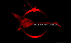
This is perhaps the edgiest and artsiest logo design we have looked at so far on this list. An inclusive circle surrounds a split-tail electric guitar, in a mottled red that commands attention without being overwhelming. The unevenness of the paint, especially the large splash at the top of the circle, give a somewhat graffiti-like feeling to the image. The name of the establishment is written in square, upper case letters that give a sense of formality, but this is balanced by the fact that the I’s are dotted with small stylized flames and looks like a forward thinking logo.
Breedlove Guitar Company Logo Design
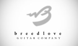
The logo design of this guitar maker is a winner simply because it is so different from the rest. Instead of pointy, bold lettering, the font is lower-case and non-threatening. The image is not of a guitar, but of a bubbly, cloud-like B in a soothing pale gray. Wavy lines and wave logo image give a feeling of movement while adding to the overall dreamlike feeling. The effect is psychedelic yet serene, which will make many guitarists want to give this product a chance. Not all guitarists are heavy metal headbangers, and this logo caters to those who fall outside the box.
Peter Malinoski Art Guitars Logo Design
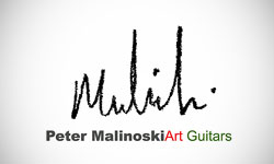
These guitars are a little different from the average, as the name and logo design suggest. The sole image is the last name written in a scrawling signature, giving an artistic feeling. The full name of the business is written below in ultra-traditional, almost boring letters that were likely chosen so as not to take attention away from the image. If we had our druthers, the writing would all be in the same color—the use of red and green is distracting and probably unnecessary—but the logo design is nonetheless attractive and meaningful to the brand.
Guitar Hero Logo Design

In a world where many are too impatient to take the time necessary to master a musical instrument, Guitar Hero may be the closest that most of us get to a guitar. Luckily, the logo design is enticing enough, with a black and white color palette that we have seen in several guitar logos, along with pointed letters that tie into the metal scene. Heavy shading makes the lettering more substantial, while the paint splatter below gives a graffiti look. This logo design is edgy without going so far that potential players will be alienated.
* Unless otherwise stated all copyrights to the top 10 logos shown above belong to their respective owners. SpellBrand has not designed any of these designs unless explicitly mentioned in the review itself.

Mash Bonigala
Creative Director & Brand Strategist
With 25+ years of building brands all around the world, Mash brings a keen insight and strategic thought process to the science of brand building. He has created brand strategies and competitive positioning stories that translate into powerful and stunning visual identities for all sizes of companies.
Featured Work
See Our Work in Action
Real brands, real results. Explore how we've helped businesses transform their identity.
Client Love
What Our Clients Say
Don't just take our word for it. Hear from the brands we've worked with.
Liana Alexander Raye
Harlequin Starr International Styles
"Working with the Spellbrand team has been incredibly easy. Mash has a team of experts who are extremely visionary and pioneering, pulling together ideas and initial thoughts into an actual brand giving you options that you feel best align with your thought process. I have no idea how they created my brand based on the vague brief I gave them, but they have worked wonders and magic. Their design, attention to detail, willingness to ensure the final product is exceptional all counts towards a company who has the client at the forefront of mind at every step of the way. Spellbrand is my Number 1 go to for all branding, website and design concepts moving forward. I look at them as an extension to our marketing arm. Just brilliant."
Joe Russell
VALENSOR
"Mash and his team were amazing. They were able to take our vision and produce a truly creative and unique branding package. What struck me most was their desire to make our company happy alongside ensuring our company has good branding. Mash was always willing to answer our questions and help us arrive at a decision. Overall, SpellBrand is not just creating company names and logos, they are creating character and soul for their clients' companies. I would recommend them to anyone looking to stand-out among their competitors. SpellBrand services are most definitely worth their weight in gold."
Related Services You Might Love
Based on what you just read, here are services that can help you achieve similar results for your brand.
Free Download
Brand Consistency Checklist
A 27-point checklist to audit your brand across every touchpoint. Used by our team on real client projects.
Success! Check your email for the download link.
Instant PDF download. We'll also send branding tips -- unsubscribe anytime.
Keep Reading
Related Articles
Nov 17, 2025
Top 10 Simple Logos (Yet Effective Logos)
Discover the top 10 simple logos (yet effective logos) logos. Expert analysis of iconic logo designs, their history, and what makes them memorable.
Read MoreNov 17, 2025
Top 10 American University & College Logos
Discover the top 10 american university & college logos logos. Expert analysis of iconic logo designs, their history, and what makes them memorable.
Read MoreNov 17, 2025
Top 10 Car Company Logos
Discover the top 10 car company logos logos. Expert analysis of iconic logo designs, their history, and what makes them memorable.
Read More

