Spellbrand Blog
Top 10 Kitchen Appliance Logos
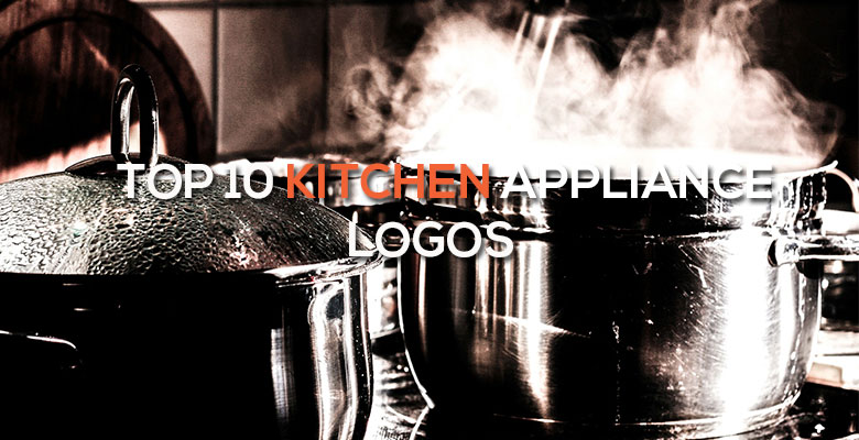
Buying home and kitchen appliances is a confusing process for most people. There are so many options in the United States, each with its own set of special features. For many people, this ultra-practical purchase is made based on personal preference and impulse, rather than more concrete methods such as recommendation and consumer reports. This makes a home appliance logo one crucial way of communicating about the appliance in question.
However, as you will see in this post, home and kitchen logos vary widely. Some want to portray a technologically savvy image while others try to look traditional. Some of these logos are designed to grab attention and stand out in the row of appliances, while others choose a more conventional image. One thing they all have in common is using color, shape, and image to portray important facts about the company. Here are ten appliance logos that you likely have in your home right now, and the subtle messages that they are sending.
Whirlpool Appliance Logo Design
The Whirlpool corporation owns many appliance brands, but maintains its namesake appliances as the company’s flagship product. The logo is eye-catching and different from most other appliance logos. First, the signature whirlpool referring to the company name is featured above the name. Second, an yellow orbital is strategically placed around the name, which adds an inclusive circle to the design along with an attention getting splash of color. Only planets and other large objects have orbitals, so this implies that the company is large and substantial.
Maytag Appliance Logo Design
This appliance company chooses to soothe the consumer with a relaxing blue logo including a wavy shape reminiscent of water. If you look closely, the wave is shaped to also resemble the letter ‘M’, which is the brand’s initial. The wave shape implies forward movement and progressiveness, so customers can rest assured that their appliance will have all of the latest features. The overall square shape gives an honest, straightforward image, which is bolstered by the ultra-traditional font choice.
3. Black & Decker Appliance Logo Design

Mash Bonigala
Creative Director & Brand Strategist
With 25+ years of building brands all around the world, Mash brings a keen insight and strategic thought process to the science of brand building. He has created brand strategies and competitive positioning stories that translate into powerful and stunning visual identities for all sizes of companies.
Featured Work
See Our Work in Action
Real brands, real results. Explore how we've helped businesses transform their identity.
Client Love
What Our Clients Say
Don't just take our word for it. Hear from the brands we've worked with.

Joe Russell
VALENSOR
"Mash and his team were amazing. They were able to take our vision and produce a truly creative and unique branding package. What struck me most was their desire to make our company happy alongside ensuring our company has good branding. Mash was always willing to answer our questions and help us arrive at a decision. Overall, SpellBrand is not just creating company names and logos, they are creating character and soul for their clients' companies. I would recommend them to anyone looking to stand-out among their competitors. SpellBrand services are most definitely worth their weight in gold."

Sue Politte
Success In Focus
"Love it! My brand identity and logo helps quickly communicate what I do. I coach very busy business leaders who want to take their organization to the next level and are tired of all the things that are slowing things down or blocking progress. My brand identity needed to grab visual attention and communicate quickly that I help my clients get focus so they gain and build success. My new brand will help my potential clients identify with me. Thank you!!!!"
Related Services You Might Love
Based on what you just read, here are services that can help you achieve similar results for your brand.
Keep Reading
Related Articles
Nov 17, 2025
Top 10 Simple Logos (Yet Effective Logos)
Discover the top 10 simple logos (yet effective logos) logos. Expert analysis of iconic logo designs, their history, and what makes them memorable.
Read MoreNov 17, 2025
Top 10 American University & College Logos
Discover the top 10 american university & college logos logos. Expert analysis of iconic logo designs, their history, and what makes them memorable.
Read MoreNov 17, 2025
Top 10 Media Company Logos
Discover the top 10 media company logos logos. Expert analysis of iconic logo designs, their history, and what makes them memorable.
Read More