Spellbrand Blog
Top 10 Loving Heart Logos
Looking for a custom logo?
Get a professional, one-of-a-kind logo designed by our award-winning team.
Looking for a custom logo design?
Our professional designers create unique, memorable logos tailored to your brand.
See Our Logo Design Services →Loving Heart Logos – What’s in a heart? Not only is this shape a representative of love and affection, it also is the life force of the human body. A heart can have extremely positive connotations, but it also can be seen as cliché and even childish.
As we will see from the following ten heart logos, there are ways to use this shape in logo design while maintaining adult sophistication and complete seriousness. There are a lot of sectors that use the heart symbol such as church logos, charity logos, and more.
The following ten logos get at the heart of logo design, both literally and figuratively.
Pathos Logo Design
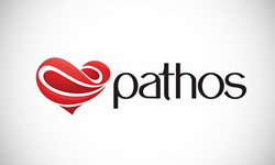
The Pathos logo uses a heart formed from swirling shapes in two barely different shades of red. The waves imply movement while also adding interest to the otherwise mundane heart shape. The writing is friendly in rounded lower case letters with a modern edge. This logo design takes a well-known shape and puts a new and interesting spin on it, which is definitely the thumbprint of a professional.
Webend Logo Design

This company uses a heart, but this time, it is formed out of two of the letters in a clever yet legible manner. Instead of red or pink, this logo design goes for a youthful look with sunny yellow. Again we see the rounded lower case font, and with the same friendly effect. The black lettering is just serious enough to balance the design and lend a little credibility.
Bugluv Logo Design
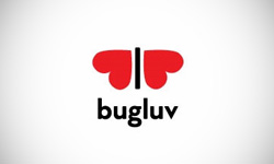
Very few people love bugs, but this logo design manages to create an insect image that many will feel an affection for. The image of a small bug with heart shaped wings is beyond cute and ties perfectly into the name. Rounded, lower case writing seems to be the norm with heart-based logos, and this one is no exception.
Sky of Love Logo Design
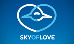
How can you form an airplane out of a heart? This logo design is ingenious just because it manages to perform this impossible task in an attractive and realistic manner. It’s hard to think of a color scheme more appropriate for this subject that a sky blue and fluffy cloud white. As a bonus, Sky of Love ignores the lower case wording that seems to be the norm with this type of logo and instead uses more serious capital letters that nonetheless are rounded to be a little less formidable.
Inlove Logo Design
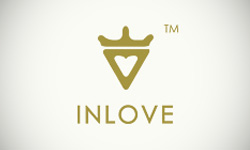
It’s hard to figure out exactly what the image in this logo design is. Obviously, there is a heart. However, is it topped with a crown for royalty, or is it merely a more realistic, anatomically accurate heart? The gold color suggests that royalty is the true meaning of this logo, but there is no way to tell for sure. Either way, the image is attractive and contributes to an interesting logo. The plain writing does not add to or detract from the heart, which is likely the best approach in this case.
Pixellove Logo Design
This logo design features a pixilated heart image, which perfectly complements the business name and brand. Again we see a lower case, rounded lettering, although in a business like black. For the heart, only red would do here. The use of a tagline here is very appropriate because it would be difficult to guess the line of business from the logo design alone. Although the pixelation of the logo design might have led to a busy and overcrowded image, the use of one color alone kept it simple and memorable.
PenPals Logo Design

Instead of using a heart to form another shape, this logo design uses images to create a heart. The pen nibs crossed to form a heart contribute to a visually interesting and yet very relevant shape. The use of red helps to promote the heart effect; in another color, the fact that this is a heart would not have been so clear. Rounded yet thick letters help complete a well-rounded and unique logo design.
Threesome Logo Design
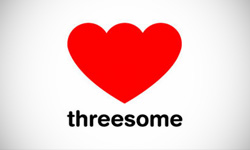
Because the word threesome brings up somewhat naughty images, this logo design has to walk a fine line between being appropriate for the name and being too naughty for the general public. Instead of referring to the name itself, this logo design features an asymmetrical heart that was drawn to have three halves rather than two. This hints at the adult content that the name implies without ever actually referring to it. To be a little friendlier, the writing is in rounded lower case letters in basic black. This logo effectively handles a scandalous name and even defuses it.
Love Your Business Logo Design

Because this logo design obviously is aimed at businesses, the romantic associations of the heart must be played down. A serious, modern color palette is the first step toward this, with a bright, contemporary green against a sober dark brown in the background. This effect is further enhanced by the use of a very plain, newsy font for the wording. Turning the heart on its side to form a ‘B’ is clever enough to grab the customers’ attention without being too playful for a business logo.
I Love Moustache Logo Design
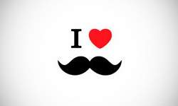
This was actually a personal identity logo for an unknown person, but it has become a cult classic through the internet. An ‘I’ and a heart are used as eyes for the man in question, The logo design is similar to the well known I Heart NY logo, which adds a little sophistication to the mix. The lack of writing is appropriate because it allows people to focus on the simple, attractive image without any distractions. Whoever the person that this brand represents, I can only imagine that it suits them well.
As you can see, these logos have more in common than merely having hearts in them. First, there are many examples here of using rounded lower case writing to add a friendly touch, which is so important in matters of the heart. Second, color weighs heavily in these logos, with people choosing to use traditional colors such as red—or eschew tradition altogether—to make a statement about their company.

Mash Bonigala
Creative Director & Brand Strategist
With 25+ years of building brands all around the world, Mash brings a keen insight and strategic thought process to the science of brand building. He has created brand strategies and competitive positioning stories that translate into powerful and stunning visual identities for all sizes of companies.
Featured Work
See Our Work in Action
Real brands, real results. Explore how we've helped businesses transform their identity.
Client Love
What Our Clients Say
Don't just take our word for it. Hear from the brands we've worked with.
Joe Russell
VALENSOR
"Mash and his team were amazing. They were able to take our vision and produce a truly creative and unique branding package. What struck me most was their desire to make our company happy alongside ensuring our company has good branding. Mash was always willing to answer our questions and help us arrive at a decision. Overall, SpellBrand is not just creating company names and logos, they are creating character and soul for their clients' companies. I would recommend them to anyone looking to stand-out among their competitors. SpellBrand services are most definitely worth their weight in gold."
Raymond Chen
RLC Global Archicom, Singapore
"SpellBrand was very accommodating from the beginning of the design process even when we had distinct design ideas, being architect designers ourselves. Jeff responded with many preliminary style options based on our initial sketchy ideas, enabling us to zoom in on the specific feel we were looking for. From that point on, it was just refinement and the final logo was in our hands in a matter of days. We have used SpellBrand on other logos for my clients projects."
Related Services You Might Love
Based on what you just read, here are services that can help you achieve similar results for your brand.
Free Download
Brand Consistency Checklist
A 27-point checklist to audit your brand across every touchpoint. Used by our team on real client projects.
Success! Check your email for the download link.
Instant PDF download. We'll also send branding tips -- unsubscribe anytime.
Keep Reading
Related Articles
Nov 17, 2025
Top 10 Simple Logos (Yet Effective Logos)
Discover the top 10 simple logos (yet effective logos) logos. Expert analysis of iconic logo designs, their history, and what makes them memorable.
Read MoreNov 17, 2025
Top 10 American University & College Logos
Discover the top 10 american university & college logos logos. Expert analysis of iconic logo designs, their history, and what makes them memorable.
Read MoreNov 17, 2025
Top 10 Car Company Logos
Discover the top 10 car company logos logos. Expert analysis of iconic logo designs, their history, and what makes them memorable.
Read More
