Båvest Investment Advisory: Scandinavian Simplicity Meets Financial Expertise
Situation: Differentiating Investment Advisory Firm in Digital Age
A small Scandinavian investment advisory firm, Båvest works with small companies in various industries, advising them on various investments. During a normal investment, they provide much-needed financial liaison and turnaround management for these companies.
However, the investment advisory industry has changed dramatically in the digital age. More activity is moving into the digital world and away from physical interactions. In the past, investment advisory firms would spend most of their energy on face-to-face interactions with clients. Advisors were the only people with access to the information needed by investors.
With the rise of the Internet and social media, this world has drastically shifted. Advisors no longer have sole control over information. Investors can now turn to the Internet to get the information they need and determine which investment advisory firm they want to choose. This creates a big question mark for any investment advisory firm: how are you supposed to differentiate yourself from the competition and grab the attention of potential clients online?

Task: Create Brand Identity That Differentiates in Digital Landscape
The challenge required:
- Digital differentiation: Brand identity that differentiates in competitive digital landscape
- Scandinavian heritage: Brand that reflects Scandinavian simplicity and heritage
- Professional positioning: Brand that communicates professionalism and expertise
- Online appeal: Logo design that grabs attention online and creates lasting first impression

Action: Strategic Brand Development
Brand Strategy: The Power of a Great Logo
One of the big things to keep in mind is what your logo looks like. Yes, even in today’s digital world, your logo will help to draw in more customers. A great logo is part of that lasting first impression you want to give to investors.
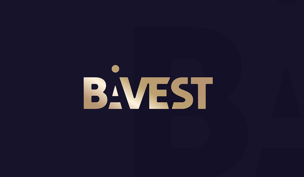
When Båvest came to our talented team at Spellbrand, the first question they asked was about the exact meaning of the brand’s name. Many times, the name of a brand can give a big clue about the message the firm wants to portray. However, there’s actually no literal meaning to “Båvest”—it’s a made-up term. In the end, the Båvest team wanted the logo to be simply text-based and to somehow include the circle symbol on the “å” as part of the final design.


Logo Design: Scandinavian Simplicity
From that point, our branding team started to work on the logo. Per client instructions, the design gives off the feeling of modernity, new ways of thinking, and professionalism. And of course, since this brand has a Scandinavian heritage, the design is super simple and sleek.
When all of this was combined, the logo created portrays an investment firm that’s professional, innovative, and full of expertise. The Scandinavian design aesthetic—known for minimalism and functionality—perfectly suits an investment advisory firm that needs to communicate trust and sophistication.
Result: Brand Identity That Stands Out Online
The brand identity we created for Båvest Investment Advisory successfully differentiates them in the competitive digital landscape. The comprehensive brand transformation delivers:
Strategic Outcomes
- Digital differentiation: Brand identity successfully differentiates in competitive digital landscape
- Scandinavian heritage: Brand reflects Scandinavian simplicity and heritage
- Professional positioning: Brand communicates professionalism and expertise
- Online appeal: Logo design grabs attention online and creates lasting first impression
- Complete brand system: Simple, Scandinavian-inspired logo works across all digital and print applications
Implementation Success
Today, Båvest uses this comprehensive brand identity to attract small companies looking for investment advisory services. The simple, Scandinavian-inspired logo design communicates professionalism and innovation while the text-based approach with the distinctive “å” symbol creates a memorable mark that works across all digital and print applications. The brand successfully stands out in the digital world where first impressions matter more than ever, helping them grab attention online while communicating the trust and expertise that small companies need when choosing an investment advisor.
Frequently Asked Questions
What are the key elements when designing a logo for an investment advisory firm?
Designing a logo for an investment advisory firm requires careful consideration of several key elements:
Simplicity: A logo should be simple yet memorable. Too many elements can make it look cluttered and confuse the intended message. The goal is to create a design that the audience can easily recognize and understand.
Trustworthiness: As an investment advisory firm, trust is paramount. The logo should convey a sense of professionalism, stability, and reliability. This can be achieved through solid shapes, traditional fonts, and conservative colors.
Uniqueness: The logo should help your firm stand out from the competition. This doesn’t mean it has to be flashy or overly complex, but it should have a distinctive element unique to your brand.
Relevance: The logo should be relevant to the financial industry and convey the nature of your business. This might involve using symbols or imagery associated with finance and investment, such as bull, bear, or currency symbols.
Versatility: A logo should be versatile, meaning it should work well in various sizes, in black and white or color, and across different media, such as business cards, websites, or billboards.
Timelessness: Trends in logo design come and go, but your logo should stand the test of time. It’s important to choose a design that will still look good and be relevant years from now.
Alignment with Brand Identity: The logo should align with the overall brand identity of the firm. It should represent the firm’s values, mission, and target audience.
By paying attention to these key elements, you can create a logo that effectively represents your investment advisory firm and resonates with your target audience.
How can a logo effectively communicate the trustworthiness and expertise of my investment advisory business?
A logo can effectively communicate the trustworthiness and expertise of your investment advisory business through its design elements, including color, typography, and imagery:
Color: Colors play a significant role in shaping perceptions. For investment advisory businesses, selecting colors that signify trust, stability, and professionalism is important. Blues and greens are often associated with trust and calm, while grays and blacks suggest sophistication and expertise.
Typography: Your logo’s font choice can also convey trustworthiness and expertise. Serif fonts with small lines or strokes attached to larger strokes often look more traditional and reliable, making them a good choice for financial institutions. Alternatively, modern sans-serif fonts can communicate a sense of innovation and forward-thinking, which could be appropriate if your firm prides itself on its modern approach.
Imagery: The images or symbols used in your logo can directly convey what your business is about. For an investment advisory firm, consider using imagery associated with finance, like graphs, charts, currency symbols, or safe boxes. Ensure the chosen imagery aligns with the other elements of your logo and your overall brand identity.
Simplicity and clarity: A simple and clear logo often appears more professional and trustworthy than a complicated or cluttered one. Ensure your logo is easy to understand at a glance.
Consistency: Ensure your logo is consistent with the rest of your brand identity, including your company’s color scheme, typefaces, and overall style. Consistency helps build recognition and trust over time.
Originality: Make sure your logo is unique and not a copy or close imitation of another logo, particularly one from the same industry. An original logo communicates that your business is legitimate and professional.
Remember, your logo is often the first touchpoint potential clients have with your business, and first impressions matter. An effective logo can go a long way in establishing your investment advisory firm as a trusted and expert entity in your field.
How does the logo design process work if I want to incorporate specific financial symbols or imagery that represents my investment advisory services?
The logo design process is a multi-step journey involving the client and the designer. If you want to incorporate specific financial symbols or imagery that represents your investment advisory services, the process would likely follow these steps:
Discovery and Briefing: In this initial phase, the designer will work with you to understand your business, your brand, and your vision for the logo. During this phase, you can express your desire to incorporate specific financial symbols or imagery. This could include symbols like a bull or bear (representing market trends), or more abstract symbols like arrows or graphs representing growth and financial progress.
Research and Brainstorming: After the briefing, the designer will research the financial industry, your competitors, and the meanings and implications of the financial symbols or imagery you want to include. This phase can also involve brainstorming sessions where the designer will develop various concepts that incorporate your desired imagery.
Conceptualizing and Sketching: The designer will create initial sketches or digital drafts of the logo concepts. These drafts can range from hand-drawn sketches to digital mock-ups. Each concept should incorporate your desired financial imagery in a way that aligns with your brand and appeals to your target audience.
Refining: Based on your feedback, the designer will refine their concepts, adjusting elements such as color, size, and layout to enhance the visual appeal and clarity of the logo. This is the stage where you can ensure your financial symbols or imagery are being used effectively and communicate your brand’s message.
Presentation: The designer will present the refined concepts to you for review. You can then select your preferred logo or request further refinements.
Finalization and Delivery: Once the final logo design is approved, the designer will prepare the final files for delivery. You will receive the logo in various formats suitable for different uses (e.g., print, digital, large-scale).
Remember, communication is key in this process. The more effectively you can communicate your vision and the significance of your chosen financial symbols or imagery to the designer, the more likely the final logo will align with your investment advisory services and resonate with your target audience.
How can I ensure that my investment advisory logo design will remain relevant and effective as my business grows and evolves?
Ensuring that your investment advisory logo remains relevant and effective as your business grows and evolves requires a blend of strategic planning, timeless design principles, and a willingness to adapt.
Here’s a detailed breakdown:
Incorporate Timeless Design Principles: Logos that stand the test of time tend to be simple, clear, and distinctive. Avoid trendy elements that may quickly become outdated. Opt for clean lines, easy-to-read fonts, and a color palette that aligns with your brand identity. Simplicity ensures that your logo will be easily recognized and remembered.
Reflect Core Values and Mission: Your logo should reflect your business’s core values and mission. These aspects will likely remain constant even as your business grows and evolves. This might mean emphasizing trustworthiness, stability, and growth in your logo design for an investment advisory firm.
Scalability and Versatility: Make sure your logo works well in various formats and sizes – from a small icon on a business card or website to a larger print on a billboard or a banner. This will allow your logo to adapt to various marketing needs as your business expands.
Plan for Evolution: While creating a timeless logo is crucial, it’s also important to understand that logos can and do evolve. Many successful companies have updated their logos over time to keep up with changes in their business or shifts in design trends. Be open to refreshing or updating your logo in the future, and work with a designer who can guide when and how to do this effectively.
Consistent Branding: Your logo is a key element of your overall brand identity. As your business grows and evolves, ensure that changes in your services, target audience, or brand positioning are reflected in a consistent branding strategy. This may involve minor tweaks to your logo or a more comprehensive rebranding.
Trademarking: As your business grows, it’s also worth considering trademarking your logo. This can help protect your brand identity from competitors and maintain the uniqueness and effectiveness of your logo.
By incorporating these principles into your logo design strategy, you can create a logo that represents your investment advisory business effectively and grows and evolves with it.


