Spellbrand Blog
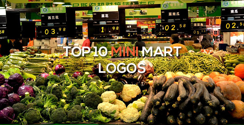
Top 10 Mini-Mart Logos
Looking for a custom logo?
Get a professional, one-of-a-kind logo designed by our award-winning team.
Looking for a custom logo design?
Our professional designers create unique, memorable logos tailored to your brand.
See Our Logo Design Services →Buying Convenience: Top Ten Mini-Mart Logos
Mini-marts are emporiums of impulse purchases. They offer products that people don’t actively shop for, but merely ‘pick up’ while they are in transit from one place to another. Because impulse purchases are made solely in the spur of the moment, marketing is essential to mini-marts. Although they are ubiquitous in the United States, on nearly every major street corner, few people give a lot of thought to their marketing strategies and food and drink logos. However, as you can see from the following ten logos, mini-marts clearly are working hard on wooing their target audience and branding.
QuickChek Logo Design
This is perhaps the most modern mini-mart logo on our list, but it still uses many principles of logo design. The ‘Q’ is designed to look like a bold, thick circle, a friendly and inclusive shape, with a leaf as the dash at the bottom. This gives a greener, more earth-friendly image to a genre that is generally known for being more oriented to speed and convenience. The green color of the logo reinforces this impression. With ecology being one of the key values of many modern consumers, there is no underestimating the effect this has on QuickChek’s success. The company name is written in thin, rounded letters that are friendly as well.
AM/PM Logo Design
This mini-mart has a name chosen to communicate the store’s extended hours. The logo further puts across this message, with the colors of the sunrise and the colors of the sunset running through the logo. The colors are oriented so the daytime colors go through the ‘AM’ while the nighttime colors go through the ‘PM’. The rounded, lower case letters are consumer friendly and invite the consumer to stop in at any time, day or night.
7-Eleven Logo Design
This was one of the first mini-marts, with the original hours being from seven in the morning to eleven at night. Now open twenty-four hours a day, the mini-mart has kept this name because it is an important part of the brand. The square is a trustworthy and straightforward shape, but the rounded corners make it a little more friendly. The green is a soothing color, while the red and the orange are eye-catching and stand out in a crowd. Because there are often many mini-marts in an area, standing out is an important part of success in this industry.
Circle-K Logo Design
This company name brings images of a ranch or farm, so it is appropriate that the logo look like an old-fashioned brand. This logo also matches the name in that there is a circle around a large K. The friendliness and unity of the circle come into play in several ways here. First, the logo is actually in the shape of a circle, but in addition the letter is rounded. However, the bold colors and thickness of the lettering give a feeling of strength. Red is an attention-getting color that helps the logo stand out.
Flying J Logo Design
This mini-mart offers a more modern logo that appeals to modern audiences. Again, the name and logo both resemble a brand in their simplicity and basic circular shape. The friendly circle is seen once again, with a ‘J’ that has been drawn with wings to resemble a plane. Planes denote going places, so this is appropriate for a market on the go. This is reinforced by the slanting writing. The gold color of the logo implies high quality, while the simple black color of the wording along with the basic, sans-serif font give a more common-sense feel without detracting from the simple beauty of the image itself.
Love’s Logo Design
This minimart has a very different name from those discussed so far, but it is actually the last name of the original owners. This unusual name, however, is worked into the logo design with a series of overlapping hearts. A serious square adds weight to the image, while the red and yellow color palette is one commonly used by fast food. This logo gets immediate notice, making it a winner.
White Hen Logo Design
This regional mini-mart has an unusual name as well, but the logo is different in more ways than that alone. Instead of bold colors, a calming blue is used as the main color along with gold accents. The white hen mentioned in the company name is the central image. While the logo is generally in the shape of a square, there is a circle in the middle to give a friendly feeling. The plain, white writing neither adds to nor detracts from the logo.
Allsups Logo Design
This Southwestern mini-mart company has a logo that shows their heritage. The gold and green colors are very different from those seen in other mini-mart logos, but very relevant to this geographical area. The writing is bold and takes center stage. A stylized Southwestern sun is the key graphic, adding the friendliness of the circle to this logo.
Speedway/Super America Logo Design
This is actually not one, but two logos, for mini-marts operated by the same company. The logos, however, are very similar. Both use square-like shapes that lend gravity to the design. Both use the same red, white, and blue color palette to draw in the patriotic customer. While they use different fonts, in both cases the initials of the business are the central image. Speed lines imply movement and swiftness, which suggests that these stores are for people on the go. The Super America logo features a more triangular shape along with pointed letters that resemble triangles as well, giving an extra shot of strength to the logo.
Pilot Travel Centers Logo Design
Pilot Travel Centers use a red and yellow color palette that is familiar to the industry, along with a few retro elements to appeal to travelers looking for a little piece of nostalgia. The writing is in bold letters that are drawn to be three-dimensional. The letters are square, as is the central shape, but all elements are rounded to add that important friendly touch.

Mash Bonigala
Creative Director & Brand Strategist
With 25+ years of building brands all around the world, Mash brings a keen insight and strategic thought process to the science of brand building. He has created brand strategies and competitive positioning stories that translate into powerful and stunning visual identities for all sizes of companies.
Featured Work
See Our Work in Action
Real brands, real results. Explore how we've helped businesses transform their identity.
Client Love
What Our Clients Say
Don't just take our word for it. Hear from the brands we've worked with.

Gracienne Myers
Banana Vital
"If you are looking for a company to design your company’s identity or even rebrand your current brand, Spellbrand is the company that you would choose, they designed my company, Banana Vital’s logo, and provided me with 6 design to choose from which made it hard to choose because they were all very good. Just recently I hired them to rebrand Mechanical Bull Sales and again every logo was great and well thought out. I am very pleased with the work that Spellbrand has provided and I am looking for to continue working with them."

Christian Nocera
Dapper Yankee
"Delighted to have used Spellbrand for our last project. The work was thorough and results excellent. For me it was such a pleasure to work with Mash who was able to keep up with all my last minute requests for small changes. Nothing was too much of a problem and I would have to say that its great to work with people who do actually put the customer needs first! One thing saying it, its another thing doing it – Thanks Mash!"
Related Services You Might Love
Based on what you just read, here are services that can help you achieve similar results for your brand.
Free Download
Brand Consistency Checklist
A 27-point checklist to audit your brand across every touchpoint. Used by our team on real client projects.
Success! Check your email for the download link.
Instant PDF download. We'll also send branding tips -- unsubscribe anytime.
Keep Reading
Related Articles
Nov 17, 2025
Top 10 Simple Logos (Yet Effective Logos)
Discover the top 10 simple logos (yet effective logos) logos. Expert analysis of iconic logo designs, their history, and what makes them memorable.
Read MoreNov 17, 2025
Top 10 American University & College Logos
Discover the top 10 american university & college logos logos. Expert analysis of iconic logo designs, their history, and what makes them memorable.
Read MoreNov 17, 2025
Top 10 Car Company Logos
Discover the top 10 car company logos logos. Expert analysis of iconic logo designs, their history, and what makes them memorable.
Read More