Spellbrand Blog
Top 10 Multicolored Logos
Looking for a custom logo?
Get a professional, one-of-a-kind logo designed by our award-winning team.
Looking for a custom logo design?
Our professional designers create unique, memorable logos tailored to your brand.
See Our Logo Design Services →Every competent logo designer will tell you that the use of color is a very important part of your logo design and your brand. Colors invoke very powerful emotions and can have a greater effect on your customers than any other part of your brand. This leads us to start: what is communicated by a logo design that uses every color of the rainbow? In some cases, it can make the company in question feel more creative; in others, it speaks about diversity and variety. Examining some of the best examples of this logo design strategy can help you decide if this might be the right type of logo for your company. You can also read the 5 ways to incorporate color into your brand.
This Is Not My Destination Logo Design
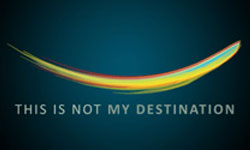
It’s easy to tell from the name that this company is a little different from the norm, but the logo design does a great job of expressing this as well. Here, multiple colors are used to show multiple different influences blending into one progressive wave, implying change and movement. The use of a very simple, well defined shape, as well as very simple writing, keeps this blend of colors from being overwhelming or overly busy.
Nosotros Multicolored Logo Design
Because the word ‘nosotros’ is Spanish for ‘we’, the use of several multicolored triangles combined into a single hexagram is certainly an appropriate image. While triangles imply strength, hexagrams and more complicated geometrical shapes are often seen as representing technology and innovation. Combining the two in a single colorful image creates a visually pleasing image that perfectly represents the brand. Again, we see simple, bold writing that doesn’t compete for attention with the image.
Zone Trader Logo Design
As we have seen, one very successful way to handle a multi-colored logo is to place the colors within a simple, well-defined shape. The Zone Trader logo design takes this approach, using differently colored zones fit within a simple, inclusive circle. This obviously ties into the name, as does the use of uncolored space to create a Z and a T. The simply, the blocky wording is white to contrast well with the black background and to stand out even when combined with a very colorful and catchy image.
Vivid Ways Logo Design
A rainbow-colored wave might sound familiar, but the Vivid Ways logo design is otherwise very different from that used by This Is Not My Destination. First, the colors move in a smooth progression rather than being mixed together throughout the wave. Second, the wave is actually a V and a W, tying into the company name. Another key difference is that the writing here is lower case to give a friendlier, more informal feeling. The use of a tagline is a good choice here because the logo design and the name give very few hints as to the nature of the business.
Grabup Multicolored Logo Design
The image of a piece of paper moving upward in a series of bubbles is appropriate for a company that specializes in helping users upload screenshots. In this case, the image is multicolored not because it ties into the company name or purpose, but because it creates a fun and memorable image that implies that the business is creative. The eggplant-colored background helps to create a recognizable visual identity because very few companies use this color. Another notable touch is the lack of a company name in the logo design, which implies that the company expects customers to identify the image with their name without any assistance. With such an original image, this just may be the case.
Goal.com Logo Design
In this case, the multiple colors represent the many different soccer teams that are reported on in this all-inclusive soccer website. The use of a circle relates both to this inclusiveness as well as to the round ball used in this globally loved sport. Unlike many of the multicolored logos that we have looked at, Goal.com uses a handpainted look rather than having clearly defined boundaries for their shape. However, the simple circle combined with relatively few colors being used keeps this from looking cluttered or busy.
Australian Art Supplies Logo Design
There is perhaps no company more suited to a multicolored logo than an art supply company. Australian Art Supplies has a logo design that uses a single, multicolored line to fill in a shape of the continent. The colors of the rainbow are arranged in order, while the name of the company is written in simple lower case letters to the side. The way the name is located off-center creates a well balanced and interesting image that is nonetheless artsy and inviting.
Cerebral Art Logo Design
Again we see an art company using a multicolored logo, this time using a very different approach to the way this color is used in their logo design. Because of the use of the word ‘cerebral’ in the name, using a more structured approach than Australian Art Supplies was a must. In this case, the colors are neatly arranged into lines spelling the word ‘art’. The writing underscores this artistic image by using two different thicknesses. The use of black and white allows all of the attention to be focused on the simple yet powerful image.
Action Now! Logo Design
In this case, multiple colors are used in a logo design to imply several different types of people coming together for a common cause. These multicolored arms are wrapped around the globe, which is highly relevant to the activist nature of the name. The circle is not just the shape of the globe, but also an inclusive shape that compliments the message that the multicolored arms are trying to communicate. The black, upper case writing with an exclamation point add extra emphasis to the message.
GoPlay Multicolored Logo Design
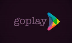
In this case, the company is using a multicolored palette to create a sense of playfulness and fun in their logo design. The arrow-like shape filled with these colors is clearly referring to the word ‘go’ in the company name. Using violet for the wording gives a modern yet soft feeling that is underscored by the use of simple lower case letters. The black background contrasts with the colorful nature of the image.

Mash Bonigala
Creative Director & Brand Strategist
With 25+ years of building brands all around the world, Mash brings a keen insight and strategic thought process to the science of brand building. He has created brand strategies and competitive positioning stories that translate into powerful and stunning visual identities for all sizes of companies.
Featured Work
See Our Work in Action
Real brands, real results. Explore how we've helped businesses transform their identity.
Client Love
What Our Clients Say
Don't just take our word for it. Hear from the brands we've worked with.
Liana Alexander Raye
Harlequin Starr International Styles
"Working with the Spellbrand team has been incredibly easy. Mash has a team of experts who are extremely visionary and pioneering, pulling together ideas and initial thoughts into an actual brand giving you options that you feel best align with your thought process. I have no idea how they created my brand based on the vague brief I gave them, but they have worked wonders and magic. Their design, attention to detail, willingness to ensure the final product is exceptional all counts towards a company who has the client at the forefront of mind at every step of the way. Spellbrand is my Number 1 go to for all branding, website and design concepts moving forward. I look at them as an extension to our marketing arm. Just brilliant."
Christian Nocera
Dapper Yankee
"Delighted to have used Spellbrand for our last project. The work was thorough and results excellent. For me it was such a pleasure to work with Mash who was able to keep up with all my last minute requests for small changes. Nothing was too much of a problem and I would have to say that its great to work with people who do actually put the customer needs first! One thing saying it, its another thing doing it – Thanks Mash!"
Related Services You Might Love
Based on what you just read, here are services that can help you achieve similar results for your brand.
Free Download
Brand Consistency Checklist
A 27-point checklist to audit your brand across every touchpoint. Used by our team on real client projects.
Success! Check your email for the download link.
Instant PDF download. We'll also send branding tips -- unsubscribe anytime.
Keep Reading
Related Articles
Nov 17, 2025
Top 10 Simple Logos (Yet Effective Logos)
Discover the top 10 simple logos (yet effective logos) logos. Expert analysis of iconic logo designs, their history, and what makes them memorable.
Read MoreNov 17, 2025
Top 10 American University & College Logos
Discover the top 10 american university & college logos logos. Expert analysis of iconic logo designs, their history, and what makes them memorable.
Read MoreNov 17, 2025
Top 10 Car Company Logos
Discover the top 10 car company logos logos. Expert analysis of iconic logo designs, their history, and what makes them memorable.
Read More
