Spellbrand Blog
Top 10 Over The Counter Logo Designs
Looking for a custom logo?
Get a professional, one-of-a-kind logo designed by our award-winning team.
Looking for a custom logo design?
Our professional designers create unique, memorable logos tailored to your brand.
See Our Logo Design Services →Over the counter medications are selling more than a pill or syrup with a prescription from a clinic. They are also selling a solution to many of life’s most vexing problems: headaches, colds, and sleeplessness to name a few. As such, they need a brand that speaks of their strength and healing powers as can be seen with the role of health care logo design. Here are the top ten most compelling over the counter clinical logo designs as well as the elements that make them so successful.
Nyquil Logo Design
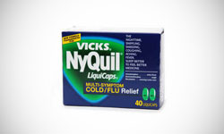
A generation of adults grew up trusting this cold and cough medicine. This logo is just as memorable. First, a blue and green color palette is used because of the calming nature of this medicine. A triangle is the central shape of the logo, implying strength, but the edges are rounded to make the image a little more friendly. The thick white letters also give the image of strength. Nobody thinks about the Nyquil logo, but almost everyone recognizes it, making it a true branding success story.
Claritin Logo Design
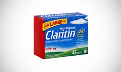
Claritin’s logo is a winner because it shows exactly what it is selling: no more worries about dealing with outdoor allergies. The name is written in a very plain white font. In the background is a beautiful grassy field with a sun shining in a blue sky. This is a powerful image, as people with allergies are often unable to enjoy these beautiful days. The message is that Claritin offers not a pill, but a calm serene day outside. This is an image that millions of people will pay for.
Centrum Logo Design
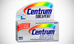
This vitamin superbrand makes a vitamin for just about everyone, but why do people keep buying them? Part of this may be due to the eye catching logo of the brand. The word Centrum is written in bold blue letters that are slightly slanted to give the impression of movement. In the background, a colorful circle attracts attention while displaying the brand’s friendly image. The lines of color also give a sense of movement, which is important as active lifestyles are important to health logos conscious people.
Alli Logo Design
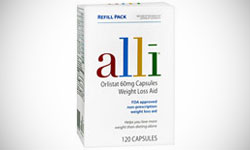
This is a weight loss product with a branding and marketing scheme worthy of a big name. Unlike most pharmaceutical products, the name is written in thin, lower case letters, reducing the medicine-y appearance. The name is purposely misspelled with an ‘I’ instead of a ‘y’ to give it a friendly image and make it appear more like a person’s name. The letters of the name are colorful, with calming blues and attention-grabbing reds taking center stage, while an all-white background ensures that nothing detracts from the name. It is clear that the brand wants to be a friend and ally in weight loss.
Nature Made Logo Design
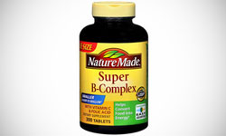
This line of natural supplements has a logo that adds a sense of legitimacy and professionalism to their brand. The writing is in a newsy font that makes it seem factual and informative, with a period after the brand name to add finality. The rough shape of the background is that of a street sign. Both of these elements are used in logo design to give a sense of authority and trustworthiness. After all, who questions a street sign? Leaves are added at the top to hint at the company’s leaning toward more natural products. This mixture of legitimacy and nature are perfect for this supplement and vitamin company.
Tums Logo Design
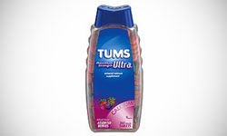
Tums has a very simple logo, but this is part of what makes it so effective. The letters are thick and white, but rounded to soften the overall image. In this background is a faint white circle, a shape that implies unity and friendship. The message is that this is a strong but friendly medicine. There is little clutter, adding to the overall soothing effect.
Icy Hot Logo Design
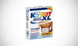
Icy Hot may not be a big name product like the others on this list, but its logo uses color to show its use in a way that is notable. Like many over the counter drugs, Icy Hot uses thick bold letters in all capitals to show the strength of the product. A graded rainbow of colors moves across the letters, with the calming blues on the word ‘icy’ and the warmer yellow, orange, and red on the word ‘hot’. Few people notice the way the colors are distributed, so this has a powerful subconscious effect.
Advil Logo Design
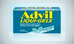
This pain relief standard has a logo that is recognizable and subtle. The words are thick and bold in a bright yellow with all capital letters. In the background is a grid, which both ties into the medication’s marketing scheme and adds a touch of the scientific. The blue is calming and serene. If you look closely at the grid, it is drawn so it appears to be at an angle to the viewer, giving a sense of movement. The message is that Advil has the technology to help you move beyond your aches and pains, a message that has sold millions of these bottles.
Triaminic Logo Design
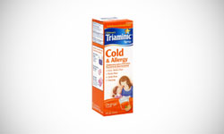
This is one of the best selling brands in children’s cold and cough products. Their logo features bold white lettering in a serious font, but the words ‘children’, written above, and ‘syrup’, written below, are in friendlier lettering. A gold star, a symbol of excellence, embraces a smaller blue star. The message is that you can be a nurturing ‘gold star’ parent by using this product when your own little star is feeling under the weather.
Band-Aid Logo Design
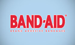
This product may have a simple logo, but it is remarkable in that it has remained relatively the same for decades, allowing for superior pharmaceutical branding and recognition. Band-Aid has become not just the go-to brand in its field, but a generic term for any adhesive bandage. The letters are bold and thick in an eye-catching red that is reminiscent of blood, the most common reason for needing this product. The words “brand adhesive bandages” are still written below, although most people are aware of the products use. This logo is recognized worldwide, making it a branding winner despite the simplicity of its design.

Mash Bonigala
Creative Director & Brand Strategist
With 25+ years of building brands all around the world, Mash brings a keen insight and strategic thought process to the science of brand building. He has created brand strategies and competitive positioning stories that translate into powerful and stunning visual identities for all sizes of companies.
Featured Work
See Our Work in Action
Real brands, real results. Explore how we've helped businesses transform their identity.
Client Love
What Our Clients Say
Don't just take our word for it. Hear from the brands we've worked with.
Christian Nocera
Dapper Yankee
"Delighted to have used Spellbrand for our last project. The work was thorough and results excellent. For me it was such a pleasure to work with Mash who was able to keep up with all my last minute requests for small changes. Nothing was too much of a problem and I would have to say that its great to work with people who do actually put the customer needs first! One thing saying it, its another thing doing it – Thanks Mash!"
Sue Politte
Success In Focus
"Love it! My brand identity and logo helps quickly communicate what I do. I coach very busy business leaders who want to take their organization to the next level and are tired of all the things that are slowing things down or blocking progress. My brand identity needed to grab visual attention and communicate quickly that I help my clients get focus so they gain and build success. My new brand will help my potential clients identify with me. Thank you!!!!"
Related Services You Might Love
Based on what you just read, here are services that can help you achieve similar results for your brand.
Free Download
Brand Consistency Checklist
A 27-point checklist to audit your brand across every touchpoint. Used by our team on real client projects.
Success! Check your email for the download link.
Instant PDF download. We'll also send branding tips -- unsubscribe anytime.
Keep Reading
Related Articles
Nov 17, 2025
Top 10 Simple Logos (Yet Effective Logos)
Discover the top 10 simple logos (yet effective logos) logos. Expert analysis of iconic logo designs, their history, and what makes them memorable.
Read MoreNov 17, 2025
Top 10 American University & College Logos
Discover the top 10 american university & college logos logos. Expert analysis of iconic logo designs, their history, and what makes them memorable.
Read MoreNov 17, 2025
Top 10 Car Company Logos
Discover the top 10 car company logos logos. Expert analysis of iconic logo designs, their history, and what makes them memorable.
Read More
