Spellbrand Blog
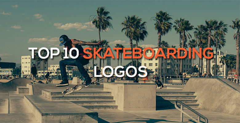
Top 10 Skateboarding Logos
Looking for a custom logo?
Get a professional, one-of-a-kind logo designed by our award-winning team.
Looking for a custom logo design?
Our professional designers create unique, memorable logos tailored to your brand.
See Our Logo Design Services →Skateboarding brands are generally thought of as being run in a way that is counter to consumer culture, but they must follow the same basic branding rules as every other company. Like more traditional businesses, a skateboarding company must create a brand image and use their logo design to communicate information about their brand and the quality of their products. These brands all have a sports logo design that helps create a brand that appeals to their target market, skateboarders and adolescents all over the nation.
Birdhouse Logo Design
This logo design has a main image that is a lower case B in the shape of a curving road. Not only is this image directly relevant to both the company name and the industry, it gives an impression of movement as well as a casual feeling. The name of the company is written below in similarly friendly rounded, lower case letters, with a small bird dotting the I to tie in to the name. This image obeys one of the cardinal rules of skateboarding logos: create an image that is simple and iconic enough to be recognized both from far distances and while the logo itself is attached to a moving object.
Circa Logo Design
The main graphic of this logo design is two bars wrapped around a rounded inverted triangle, which refers directly to the name Circa. The triangle is generally seen as a symbol of strength, but the rounded edges give a more friendly feeling. The bold but gently curving letters add to the general message of strength and friendliness. The way the I is formed to resemble a number 1 implies excellence in their field, a positive image for a company aimed at creating products for a competitive sport.
Plan B Logo Design
Most people recognize immediately that the central image is that of a stylized B, but if you turn the image on its side, it looks like a skateboard shape. The square communicates straightforwardness and quality, which sets the brand apart in a genre where rounded shapes dominate. The green is a fresh, organic color that is a pleasant contrast to the reds and other bright hues typically seen in a skateboarding logo design. The wording is simple and neither adds to nor detracts from the power of the image.
4. Osiris Logo Design
This image may look vaguely like an eyeball looking down at the company name, but it is in fact an O situated at the bottom of an inclusive circle. The circular graphic is interesting and definitely attracts the eye, which makes it effective in this constantly moving industry. The writing is plain and rounded to compliment the image. There isn’t a lot to say about this simple image, but it is definitely attractive and unique, making it highly effective as can be seen in the role of the sports logo design post.
Independent Logo Design
Many people think that the cross image in this logo design is an Iron Cross, but it in fact is an Alisee cross that has been used dating back to the Templar Knights and the Crusades. Shortly after the company was formed in 1978, the Pope was featured on the front of Time magazine wearing a similar image. The founders thought it was iconic and strong, which is the image they wanted to give their burgeoning company. The rounded nature of the logo makes it a little less threatening, while also resembling a skateboard wheel. Because the Independent cross has been the symbol of the company for more than three decades, it’s easy to call this logo design a success and should in fact have been included in the top 10 sports teams logos.
Girl Logo Design
Despite the distinctly feminine name, this company does not make skateboarding products for females alone; in fact, most of their sponsored skateboarders are male. The name refers to the fact that the original Girl skateboards were splashed with images of attractive and scantily clad women. The image that makes up this logo design is the classic girl image seen on bathroom doors everywhere, giving the logo a recognizable and slightly dirty brand that is distinctly counterculture. Although the logo is not always printed in this feminine mint green, this nonetheless is an attractive and appropriate color for the company and should have been included in the Top 10 Sports League Logos.
Adio Logo Design
This name comes from an African tribal word for unity, but this theme is unfortunately not incorporated into the logo design. Nonetheless, this is an attractive logo, with an A formed into a wavy shape that is reminiscent of many of the concrete ramps seen at skateboarding parks while also communicating movement. The writing is bold and angular, lending strength to the image. This heavy image is bold and recognizable, although not entirely connected to the name.
Sessions Logo Design
This is the brand of skateboarding stars; at least, that is what this logo design communicates. The winning star is enclosed in a pentagon, which for obvious reasons is associated with intelligence and strength. The wavelike S in the center is a wavy shape that communicates movement while also resembling a road. No wording is included, but none is necessary due to the uniqueness of this logo.
Toy Machine Logo Design
While many skateboarding companies choose a simple, abstract image for their logo design, Toy Machine goes against the current by having a monster, one that has now reached icon status in the industry. Not only does this tie in (loosely) to the name, the monster is frightening enough to be edgy and cool. The all lower case, rounded writing gives a friendly, informal image that makes the image more fun than frightening, creating a balanced design that can be seen on skateboards everywhere.
Destructo Trucks Logo Design
Again we see a strong image, this time also looking like two roads converging into one. Because trucks are roughly triangular, this shape ties into the product as well. The rounded lettering balances the strength of the image, while the E turned on its side adds interest to an otherwise very plain image. If you look closely, the lines in the image are the same thickness as the letters, creating a balanced and cohesive logo design.

Mash Bonigala
Creative Director & Brand Strategist
With 25+ years of building brands all around the world, Mash brings a keen insight and strategic thought process to the science of brand building. He has created brand strategies and competitive positioning stories that translate into powerful and stunning visual identities for all sizes of companies.
Featured Work
See Our Work in Action
Real brands, real results. Explore how we've helped businesses transform their identity.
Client Love
What Our Clients Say
Don't just take our word for it. Hear from the brands we've worked with.

Gracienne Myers
Banana Vital
"If you are looking for a company to design your company’s identity or even rebrand your current brand, Spellbrand is the company that you would choose, they designed my company, Banana Vital’s logo, and provided me with 6 design to choose from which made it hard to choose because they were all very good. Just recently I hired them to rebrand Mechanical Bull Sales and again every logo was great and well thought out. I am very pleased with the work that Spellbrand has provided and I am looking for to continue working with them."
Ernest Bannister
M.O.R.E
"My experience with the Spell brand team has been nothing short of excellent. From the beginning Mash and team made me feel very comfortable with the design process. I am extremely happy with the results of my design and look forward to working with Spellbrand; exclusively! I have told many family, friends and peers about the great work the Spellbrand team has done in creating my design. Thanks again for all your patience and professionalism; I look forward to working with you in the future."
Related Services You Might Love
Based on what you just read, here are services that can help you achieve similar results for your brand.
Free Download
Brand Consistency Checklist
A 27-point checklist to audit your brand across every touchpoint. Used by our team on real client projects.
Success! Check your email for the download link.
Instant PDF download. We'll also send branding tips -- unsubscribe anytime.
Keep Reading
Related Articles
Nov 17, 2025
Top 10 Simple Logos (Yet Effective Logos)
Discover the top 10 simple logos (yet effective logos) logos. Expert analysis of iconic logo designs, their history, and what makes them memorable.
Read MoreNov 17, 2025
Top 10 American University & College Logos
Discover the top 10 american university & college logos logos. Expert analysis of iconic logo designs, their history, and what makes them memorable.
Read MoreNov 17, 2025
Top 10 Car Company Logos
Discover the top 10 car company logos logos. Expert analysis of iconic logo designs, their history, and what makes them memorable.
Read More