Spellbrand Blog
Top 10 Sun Logos

Looking for a custom logo?
Get a professional, one-of-a-kind logo designed by our award-winning team.
Looking for a custom logo design?
Our professional designers create unique, memorable logos tailored to your brand.
See Our Logo Design Services →Top 10 Sun Logos: Depending on your area, the sunshine may be all that you see when you look outside this time of year. However, the sun is also a popular symbol of heat, energy, and power. The following ten logos come from a variety of industries, from beverages to television networks to solar energy, but they all use the sun as central sun logo images. However, as we shall see, all design elements do so in very different ways and with equally disparate meanings.
Sunkist Sun Logo Design
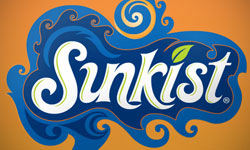
A cooling beverage logo with the sun in its name almost has to use the sun in its logo design. However, this offers somewhat of a dilemma as a cold beverage needs to communicate refreshment as well. This logo offers a perfect balance, with eye-popping orange and blue representing the sun, the orange flavor, and refreshing water at the same time. Wave-like shapes throughout the image add to the cooling image. The way the blue and orange is positioned gives the impression of a sun over a clear, clean ocean.
Sunny Isles Beach Resort Logo Design
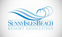
Again we see a sun and ocean, this time without even a hint of orange and yellow. The calming blue waves swirl around into a round shape representing the sun without being too obvious. The plain, upper case writing combined with the use of straight horizontal lines balances the image with a solid feeling. The use of several different blues is calming but offers a palette for developing the association’s brand.
Sonbeam Sun Logos Design
This children’s Christian TV Channel Logos uses a play on the word sun and therefore includes a stylized sun in their logo. The use of gray lettering around the golden O makes it appear to be the sun, with a similar color used in the second half of the word. The writing is slightly uneven, with a mixture of upper and lower case letters that gives it a childlike feeling. In all, this logo design is subtle yet effective and offers a distinct color palette, font, and style that can be used throughout the brand for a cohesive and memorable effect.
Sunny Delight Logo Design
Again we see a beverage with the word ‘sun’ in its name, necessitating the use of a sun in the logo without overheating what is supposed to be a cooling image. In this case, a bold orange sun is being overtaken by blue waves of liquid, implying a quenching effect. The modern writing at a slant gives a feeling of movement while keeping the logo design youthful and appealing.
Sunny Solar Logo Design

Another industry that can benefit from using the sun in its logo is that of solar energy and related accessories. This company is a good example. The lettering is in lower case, with the O in solar formed to appear to be the sun. Colored squares below balance the orange and charcoal gray, adding interest to a logo design that might otherwise be a little too plain. This solar energy logo design is very simple, but it is memorable and interesting while strongly indicating the field for which it was designed.
Sunnyside Natural Market Logo Design
Can you make the sun without even a hint of orange? As we saw above in another example, the answer is a resounding yes! In this case, olive green and cherry red are the color palette for a sun-based logo design. The round, olive sun has sprigs with fruit instead of traditional rays, giving this celestial object a decidedly earthly feeling. The circular shape is also inclusive, inviting people to visit this natural market. The use of lower case letters adds a touch of informality that is balanced by the capital letters immediately below.
The Sunny Patch Sun Logos Designs

This produce supplier offers produce to area stores, so the sun is an appropriate image. However, in this case, the sun is fashioned to resemble a piece of ripe fruit by using a green leaf as an accent. The leaf is made of several lines, giving it a less substantial and more artistic feeling. Simple black and white writing in a modern yet nondescript font neither adds nor takes away from the simple and multi-faceted image.
Caribbean Sun Tanning Logo Design
Many tanning and beauty salons use the sun in their logos, but few do so in such an interesting way. In this case, the sun has tentacle-like rays, resembling a popular tattoo design and infusing this logo design with a youthful, edgy feeling. Circular shapes around the sun give a friendly feeling and make the image seem finished. The use of two different fonts balances the less substantial writing with a more solid type. Black combined with red and yellow tones gives a sunny yet almost aggressive feeling to this logo design. While the sun can certainly be potent, few logo designs use this aspect as effectively as this one does.
Surya Jewelers Sun Logo Design
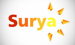
Most jewelry logos focus on sophistication and use a lot of black in their logo designs. This will help this logo design stand out from the pack. The exotic name is written in bold yet plain lettering, giving a modern feeling. Jewel shapes radiate out from the A, which in this case has been styled as the sun. This logo design is ultra simple, but it is warm and inviting. It also is relevant to its field—after all, jewels are meant to sparkle in the sun—while also being very different from most logo designs in its field. This fine line can be very difficult to achieve.
Sunny Hotels Logo Design

Sometimes there is nothing wrong with using an old standard. In this case, a very ‘status quo’ theme, of the sun over an ocean, is made personal. The sun is separated by modern lines to add interest and a little movement, while the writing below is plain and blue, to imply an ocean. This hotel has a vacation logo that ties into its name while hinting at its simple, no-frills style, which makes it very appropriate indeed.

Mash Bonigala
Creative Director & Brand Strategist
With 25+ years of building brands all around the world, Mash brings a keen insight and strategic thought process to the science of brand building. He has created brand strategies and competitive positioning stories that translate into powerful and stunning visual identities for all sizes of companies.
Featured Work
See Our Work in Action
Real brands, real results. Explore how we've helped businesses transform their identity.
Client Love
What Our Clients Say
Don't just take our word for it. Hear from the brands we've worked with.
Josh Amburn
Lakefront Docks and Lifts
"I came into this project expecting to get the best logo for our brand. That’s exactly what I received. The team at SpellBrand used the descriptions of what we do along with a color palette of our site to design three amazing concepts. Once we decided on what worked best for our needs, they worked diligently to perfect the design. Their use of their project management software makes the collaboration painless. Great work team! We’ll see you on the next project! Josh"
Christian Nocera
Dapper Yankee
"Delighted to have used Spellbrand for our last project. The work was thorough and results excellent. For me it was such a pleasure to work with Mash who was able to keep up with all my last minute requests for small changes. Nothing was too much of a problem and I would have to say that its great to work with people who do actually put the customer needs first! One thing saying it, its another thing doing it – Thanks Mash!"
Related Services You Might Love
Based on what you just read, here are services that can help you achieve similar results for your brand.
Free Download
Brand Consistency Checklist
A 27-point checklist to audit your brand across every touchpoint. Used by our team on real client projects.
Success! Check your email for the download link.
Instant PDF download. We'll also send branding tips -- unsubscribe anytime.
Keep Reading
Related Articles
Nov 17, 2025
Top 10 Simple Logos (Yet Effective Logos)
Discover the top 10 simple logos (yet effective logos) logos. Expert analysis of iconic logo designs, their history, and what makes them memorable.
Read MoreNov 17, 2025
Top 10 American University & College Logos
Discover the top 10 american university & college logos logos. Expert analysis of iconic logo designs, their history, and what makes them memorable.
Read MoreNov 17, 2025
Top 10 Car Company Logos
Discover the top 10 car company logos logos. Expert analysis of iconic logo designs, their history, and what makes them memorable.
Read More
